The powerful experience of ArcGIS Notebooks is now seamlessly integrated into ArcGIS Pro. Because the experiences are collocated, you can produce immediate actions and results right within your workstation.
ArcGIS Notebooks are a dynamic way for you to conduct, visualize, and iterate on analysis and data science workflows through interactive mapping, symbology, charts, and selections.
They’re also also highly collaborative. Through seamless integration of open source libraries, you can extend your spatial data science workflows in intuitive ways. By incorporating inline visuals and context alongside your methodologies, you can maximize readability and repeatability.
Interactive mapping
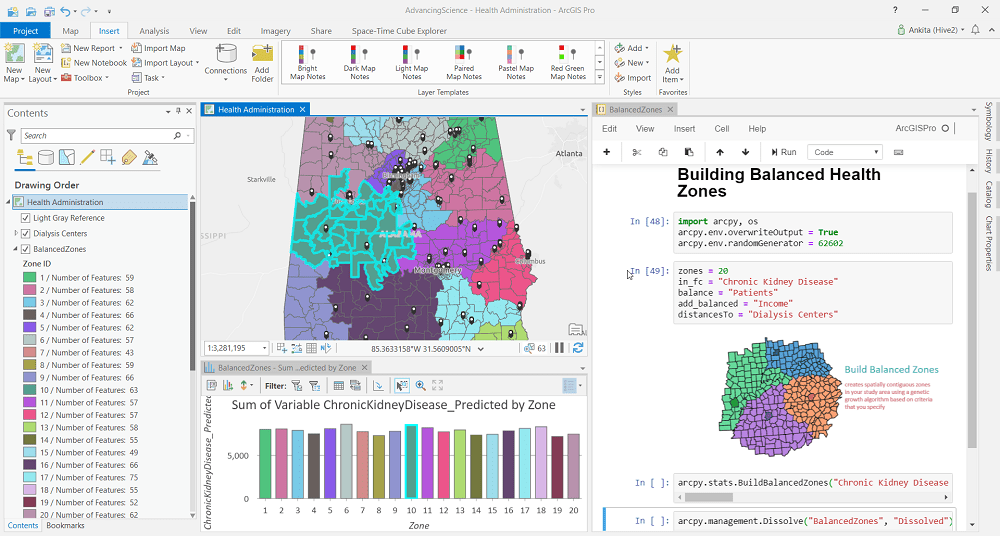
In her first demonstration, Ankita used CDC data to model predicted population percentages of those affected by chronic kidney disease in the state of Alabama.
Ankita extrapolated balanced administrative zones based on a set of attribute values such as patients in need, income levels, and distance to dialysis centers.
The results of her analysis could then be used to inform health care decisions and improve efficacy of care for individuals in need.
Throughout her analysis, Ankita showed how seamlessly her actions and results were integrated into ArcGIS Pro through mapping, symbology, and interactive charts and selections.
She used markdown to optimize her analysis with meaningful context, including a title, visuals, as well as interactive charts.

Extend your analysis
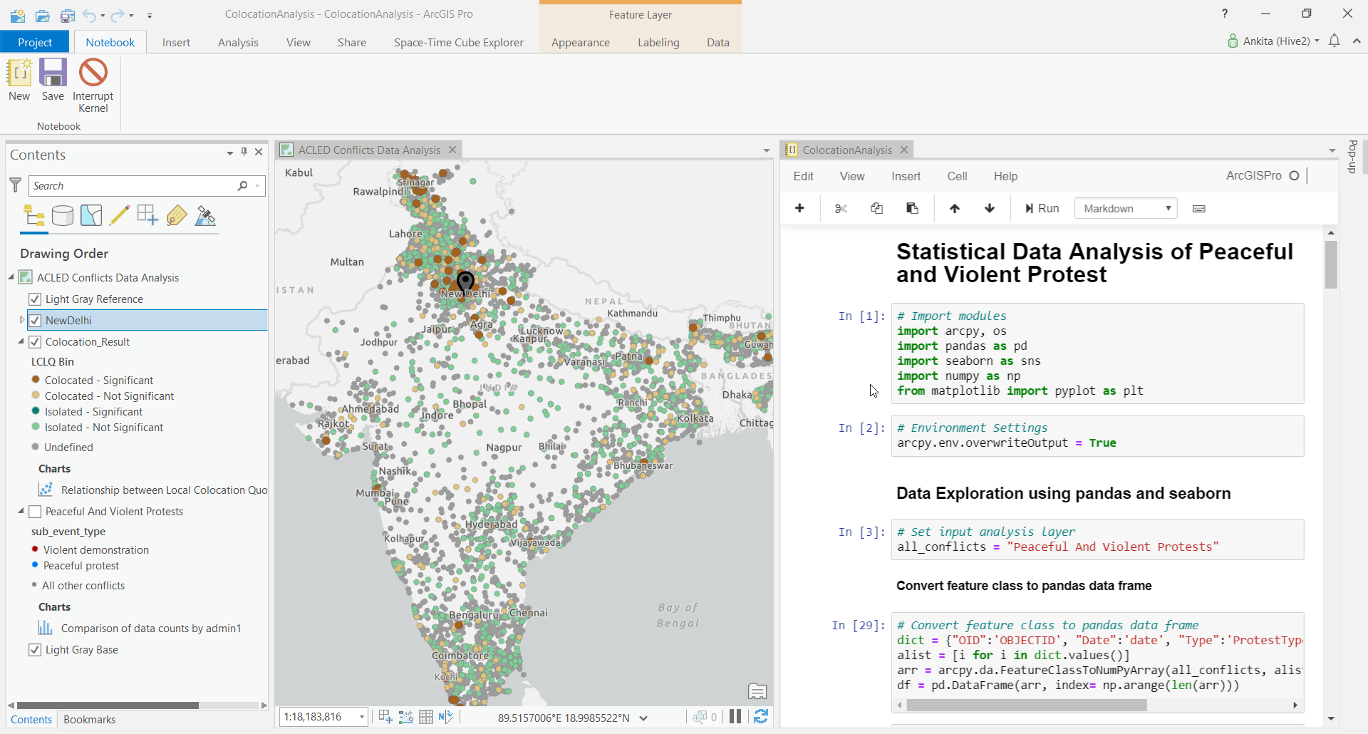
In her second demonstration, Ankita leveraged open source libraries to study peaceful and violent protests in India.
In this scenario, Ankita considered a series of events that occurred over the past several years and mapped them in two distinct categories.
She then imported open source libraries to enhance her analysis. First, she viewed and selected attributes in tabular format by converting her existing feature class to a pandas DataFrame. Next, she used seaborn to incorporate statistical graphics and charts to visualize the data in space and time.
Finally, to determine the statistical likelihood of a spatial relationship between her categories of conflict, she used ArcPy’s colocation analysis tool. She drew and symbolized her results in the map to illustrate statistically significant areas where collocated categories of conflict occurred.


Article Discussion: