Note: This blog covers the classic Esri Story Maps. Story authors are encouraged to use the new ArcGIS StoryMaps to create stories; however, Esri will continue to maintain the classic templates for your use. For more information, see the Product road map.
Story Maps have become a very useful and engaging communication tool for many organizations. One of the reasons for this is that Story Maps can contain many types of rich, interactive content like web maps and 3D scenes, videos, web pages, other ArcGIS web apps, and even other story maps. While this is a great feature, overusing it can detract from an otherwise great story map.
This post has recommendations for using web content effectively in the Story Map Journal, Story Map Series, and Story Map Cascade apps.
Is embedding right for your story?
First and foremost, it’s best to be selective about embedding apps and websites in your stories. In general only embed something when you need readers to interact with it without leaving your story. Otherwise, it can be much more effective to:
- explain the app or website and why it’s important in your narrative,
- provide a screenshot of it in the main stage or side panel (optional), and
- include a hyperlink to it in your story text.
Using this technique, your audience will be able to focus on the main ideas of your story rather than what to click or where to navigate. They can choose when or whether to visit a site to explore on their own. The idea here is that it’s often better to treat apps and websites as supporting material in your story rather than part of the story experience.
One exception to this is when you are using your story map as a presentation tool rather than designing it for your audience to read through on their own. In this case, embedding websites or GIS apps may be an effective way to demonstrate them during your presentation without leaving the story map.
When linking to a website or app (as described in #3, above) you can use a regular hyperlink that opens in a new browser tab, or — if you’re using Story Map Journal — you can configure a story action so the content opens inside your story map.
Know your audience
Having your audience in mind is storytelling 101. For example, if you’re creating a story for geospatial analysts then including a GIS-style app is probably ok; however, if you are targeting a general audience or a non-technical group then GIS apps can introduce unnecessary complexity that detracts from your story’s ability to communicate.
Regardless of your specific audience, all readers appreciate simplicity, so do your best to make your story easy to use and read. This does not mean you shouldn’t use interactive content like web maps and apps; nor does it mean that you need to dilute the content in your story so that it’s no longer compelling. Rather, look to use interactive content when it best supports your ideas, and find ways to compose your story to simplify the interaction required by readers.
A great way to keep things simple for your audience is to use a Journal with story actions. This helps you as the author use maps to tell your story in a very deliberate way rather than turning your audience lose with generic GIS tools or widgets. Here are some examples of good use of story actions to tell a story:
- New Russian Gas Export Projects – by Exprodat
- Climate Change and Water – by U.S. Bureau of Reclamation
- Understanding the New National Flood Standard – by Esri’s Federal Team
If you do embed an app in your story, be sure to briefly describe its purpose and how to use it. It also may be helpful if you provide a short example of what can be done with the app so it’s easy to see how it can be useful.
Some apps are worth embedding…some aren’t
Some apps that can work well when embedded in a story map are listed below. For more information, be sure to read these related posts on tips for embedding story maps in other story maps, making a time-aware story map, and tips for embedding 3D scenes in story maps here and here.
- Story Map Swipe and Spyglass
- Story Map Tour
- Time-Aware configurable app
- Simple Web AppBuilder apps (with a few basic widgets)
- ArcGIS web scene viewer
Apps that tend not to work well inside stories are any (configurable or custom) app with a lot of buttons and/or a long list of layers to toggle. If you want to include an app like this in a story it’s better to use the technique described above where you add a screenshot, describe the app in your story, and provide a link to open it in a new browser tab.
One situation to avoid is using an app with a side panel inside a storytelling app that also has its own side panel. This will create parallel narratives that can confuse readers. To prevent this choose a different app, disable the side panel in the embedded app’s configuration, or don’t use the description panel in Series sections where other side panel apps are embedded.
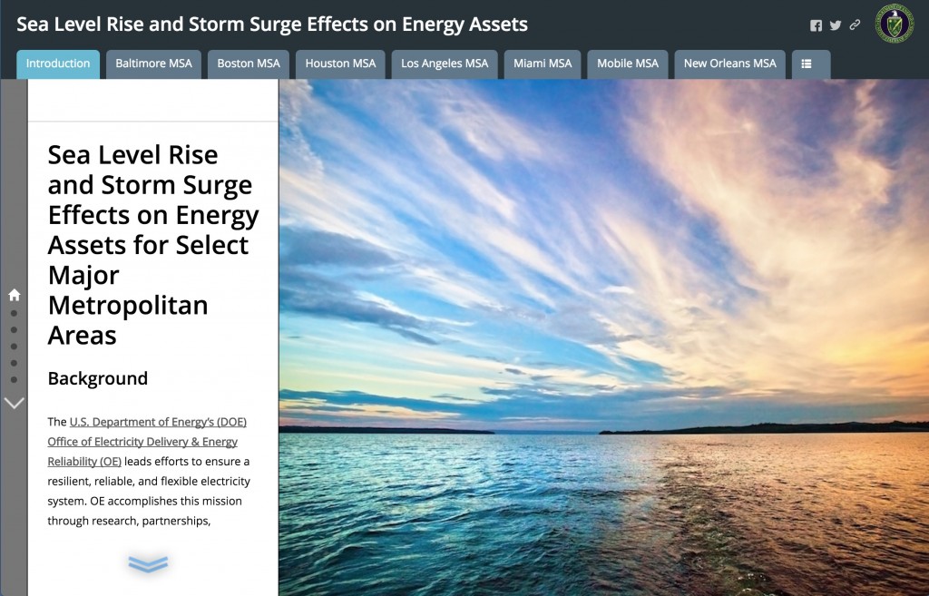
A good combination of story maps can be using one or more Journals or Cascades inside a Series (Bulleted or Tabbed layout with no side panel in sections that have a Journal). This can be a good way to break a long Journal into chapters. Here’s a nice example of this from the U.S. Department of Energy.
Other tips
Don’t embed complex or text-heavy web pages in stories. Some websites have complex navigation or are poorly designed. It’s best not to embed (or even include a screenshot of) these sites since they will detract from the usability and appearance of your story. Just link out to them as supporting information.
When embedding apps in Story Map Cascade, use the Button to enable option in Appearance > Interaction to prevent the scroll wheel from inadvertently interacting with the app. While embedding apps can work well in a Cascade story, it’s not recommended to embed websites in a Cascade since it can create a confusing scroll experience for readers.

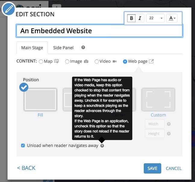
When embedding apps and web pages in Journal or Series, always use the Fill position (this is the default) so the content fills the entire main stage. Also consider disabling the option to “Unload when reader navigates away” if it makes sense for your content according the the instructions shown in the help tip.
Also, try to match colors and themes of embedded apps to the main story as much as possible. It’s best to use neutral colors when combining different apps.
Troubleshooting
If you’ve decided that embedding an app or web page is a good idea for your story and it’s not working, see this blog that describes some troubleshooting tips and solutions to common issues.
This post was originally published in April 2016 and was revised in May 2017.


Commenting is not enabled for this article.