Organizations worldwide are working to eliminate inequities, and mapping is a big part of that work. For example, if you’re working with health or economic data, you probably want to address the differences by occupation, age group, sex, race/ethnicity, veteran status, or educational attainment.
Instead of making a separate map for each and every group, you can present the breakdowns in one map. This minimizes work for you, and also helps your audience more able to digest the information since they won’t be overwhelmed by multiple maps. There are few different techniques for incorporating and presenting breakdowns by different groups in your maps: configuring the pop-up to show a simple chart or short list, using a whole range of different mapping styles, and even labeling the map in certain ways. The result will be fewer but more informative maps that can help identify opportunities to address inequalities.
Presenting breakdowns in pop-ups
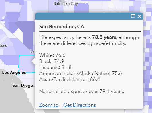
Configure your pop-up to show a custom attribute display. Add media and Arcade Expressions, and the sky is the limit for crafting a pop-up that conveys the information you want. Here are two examples that convey breakdowns by race/ethnicity of the overall attributes being mapped: home ownership using a simple chart, and life expectancy using a simple list.
Display a simple chart
We can map the overall attribute we’re interested in, for example, home ownership, and then present some differences in the pop-up by way of a column chart. Here’s a map of home ownership that does just that.
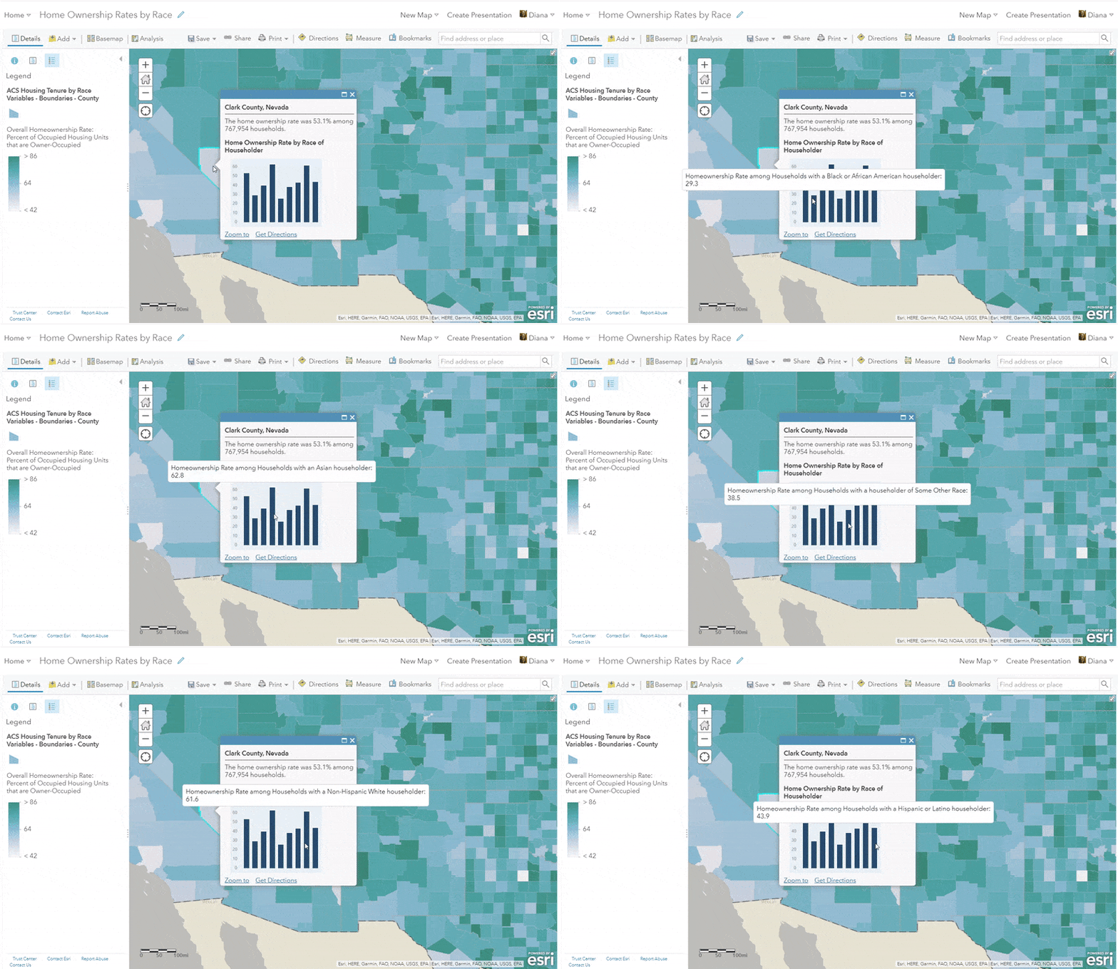
A column chart is just one example of the type of chart you might want to use. This blog post on incorporating charts into your pop-ups provides an overview of the different chart options available.
Display a brief list
We can also create a text-based display of differences by creating a short list in the pop-up. This option doesn’t require the audience to hover over any pieces of the chart. Here’s an example of a map entitled “Where should we focus on improving life expectancy?” that does this nicely:
Mapping styles to display differences
Mapping the differences with the above-and-below theme, predominance mapping, and even dot density mapping are all styles that can be effective for this type of work.
Map the difference itself with above-and-below mapping
This works well when there are only two groups of interest, such as men and women, owners and renters, or veterans and nonveterans. One approach is to literally calculate X – Y, and then use the above-and-below theme centered at zero, which helps to illuminate the magnitude of the difference. For example, in a map entitled “Are veterans or nonveterans more likely to hold a bachelor’s degree?” we can see that in the lighter areas, the difference isn’t so big. In the darker areas, we see that there is a big difference. The color shows us which group is higher.
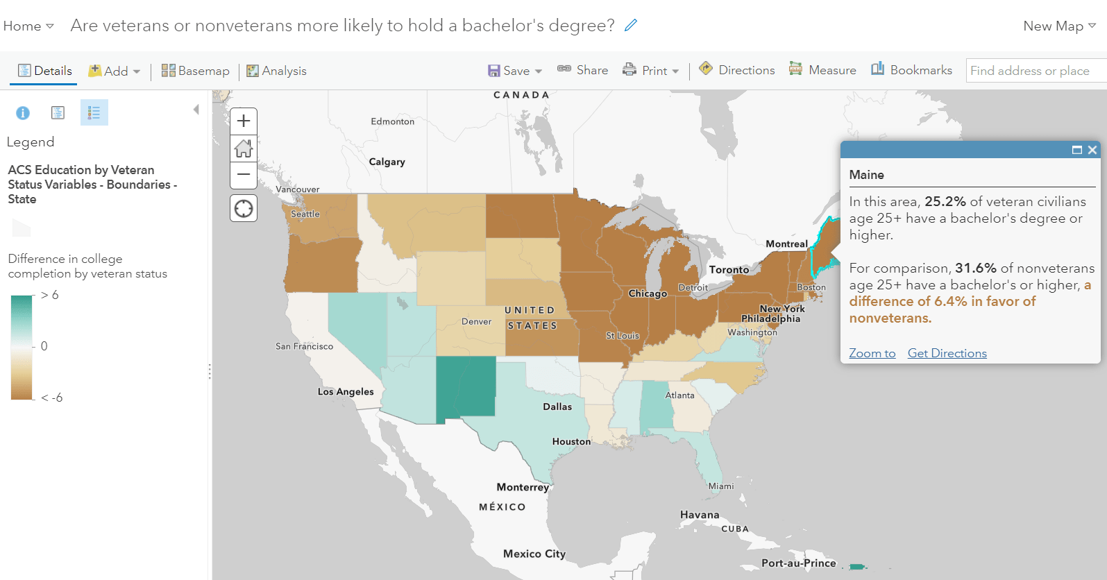
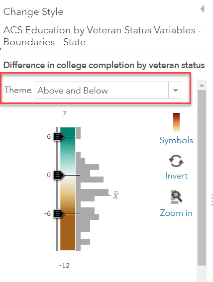
To achieve this map, we can take a look at the Change Style panel. The attribute selected is the difference itself, and the theme chosen is Above and Below:
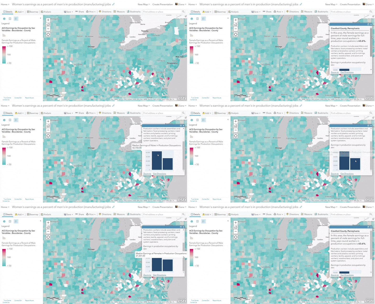
Another approach is to map the difference as a percentage. When mapping differences, make sure you are comparing “apples to apples” as much as possible. For example, here we have a map of women’s earnings as a percent of men’s earnings for full-time year-round production and manufacturing workers. We know that women are more likely than men to work part time, so by limiting our universe to only full-time workers, we can really narrow in on the wage gap. Again we are using the above-and-below theme, but this time, centered on 100.
Map the most frequent group with predominance mapping
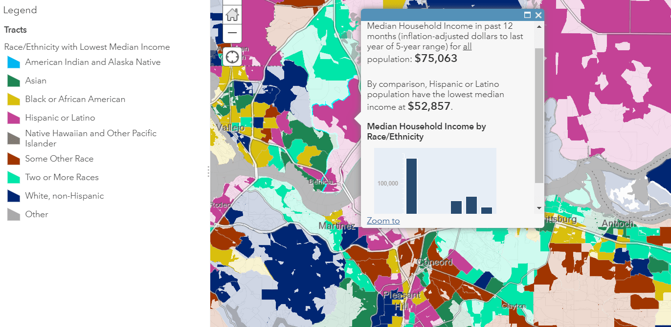
A predominance map is a map that considers multiple attributes in your data and displays the most common or highest value. Predominance mapping is a great choice when there are more than two groups, such as race/ethnicity, educational attainment, or occupations. For example, here’s a look at a predominance map that shows the race/ethnic group who has the lowest median household income:
For comparison, we also have a map that shows the race/ethnic group who has the highest median income.
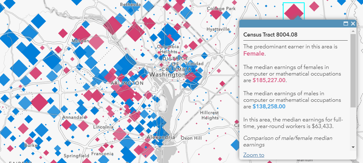
This technique can also be used when there are only two categories as well, for example: who earns more in computer/math occupations?
Show both concentrated and mixed areas with dot density mapping
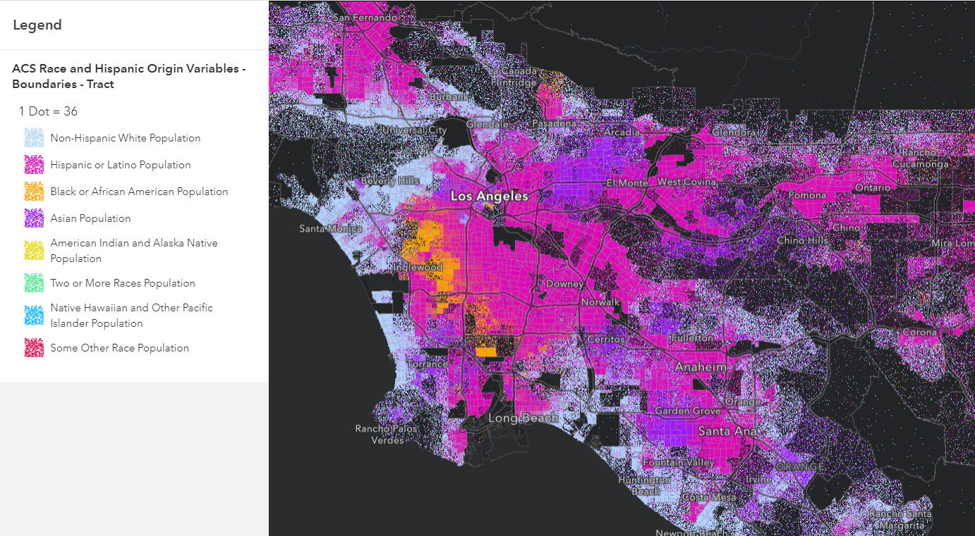
The new Map Viewer allows for dot density mapping, which takes predominance mapping even further by showing both concentrated and mixed areas through blending. Dot density works when you want to display multiple count or integer values inside a polygon. In this case, we display different racial/ethnic groups residing in different census tracts in Los Angeles. The areas that display a mix of two or more colors reflect a more mixed community.
Using labels to present breakdowns
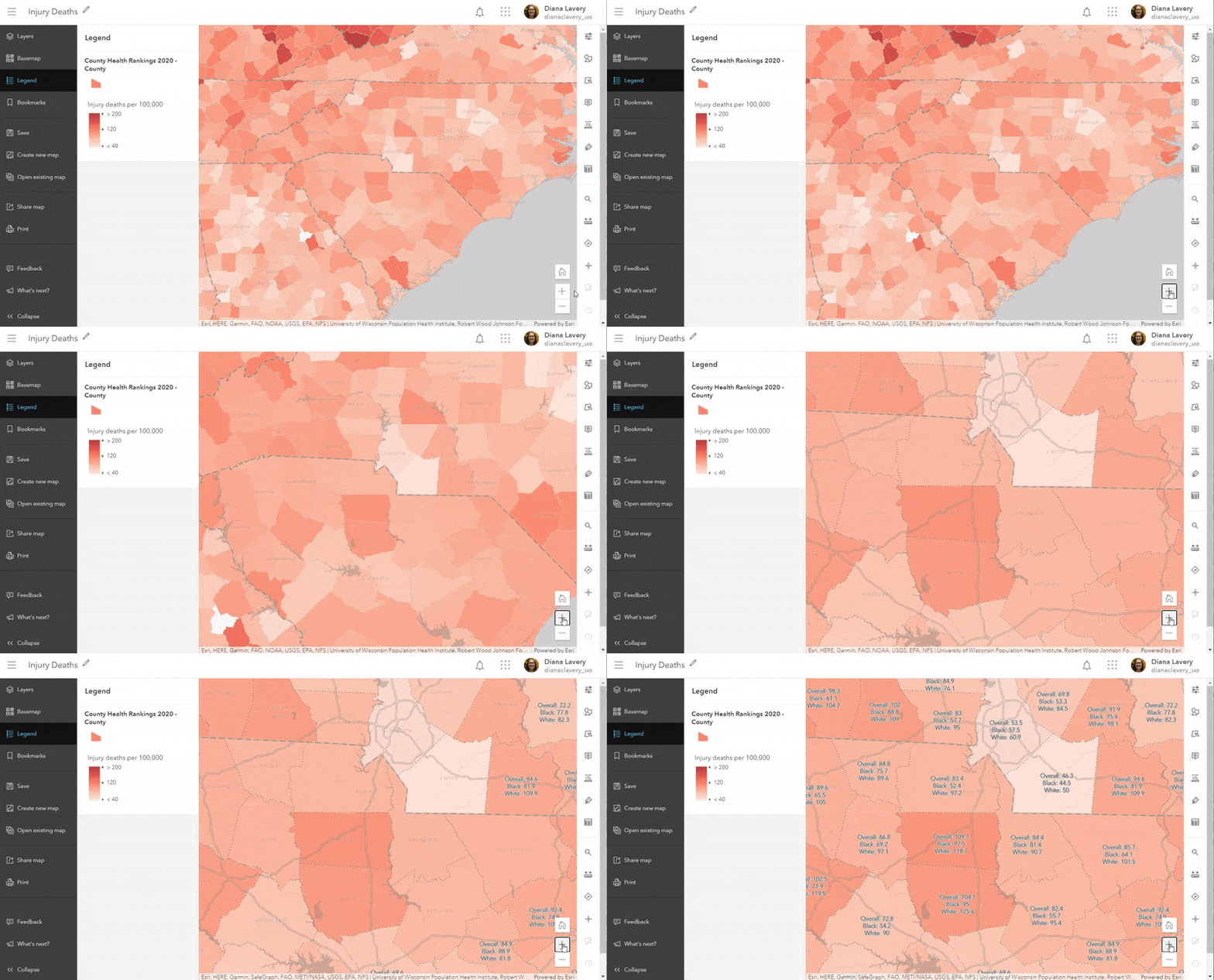
The increased labeling potential available in Map Viewer can be used to highlight breakdowns as well. Labels work well when zoomed in to take a close-up look of an area. Here we have a map of overall injury death rate: deaths from injuries per 100,000 people. We can set labels to turn on when someone viewing this map zooms in to an area, and those labels can convey the racial breakdowns.
These maps are just the start
These types of maps are often only the first step in a much larger project. Displaying and mapping breakdowns by different groups can shed light on where to implement and strengthen intervention programs. Differences will most likely be larger in some areas than others, so knowing where to allocate scarce resources is helpful. Knowing where some underrepresented groups actually have better outcomes than other groups is also valuable information.
Informative maps that show necessary information such as breakdowns by race/ethnicity are often key pieces in decision-support discussions, discussions that GIS Analysts are well-positioned to contribute to!
All these maps and more can be found in Esri Maps for Public Policy. Contribute to the conversation on GeoNet’s GIS for Equity and Social Justice space.
Note: This blog post was updated on 7/2/21 to remove the word “Beta” from references to Map Viewer.

Article Discussion: