I was enjoying a great hike under blue skies and cotton ball clouds in Yosemite National Park’s high country, one of my favorite places to go to enjoy amazing scenery, clear alpine lakes, and a bit of solitude.
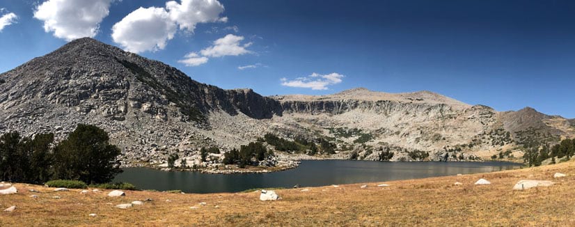
After a lakeside lunch break, I noticed clouds of smoke coming in from the southeast. By early afternoon the smoke was so thick it obscured the sun.
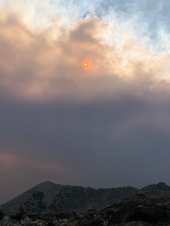
I did not know it at the time, but the Creek Fire (which had started the previous evening) had “blown up” earlier in the day as I began hiking. Located about 45 miles away, it rapidly grew in size sending smoke tens of thousands of feet into the air, forcing evacuations, and threatening several communities. It was yet another devastating fire in what was already an unprecedented fire season in California.
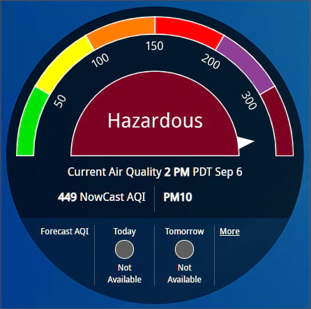
The impact of any fire is not limited to those in close proximity to the active perimeter, but can extend hundreds of miles to far away communities where smoke impacts air quality. For example, Bishop, California, is approximately 55 miles away from the Creek Fire as the crow flies, on the opposite side of the Sierra Nevada range. According to the NowCast Air Quality Index, that afternoon in Bishop the air quality was rated hazardous due to the smoke.
Make a smoke and air quality map
ArcGIS Living Atlas of the World includes authoritative live feeds and other content that helps you learn more about current and predicted smoke conditions and current air quality. Follow these steps to make your own smoke, fire, and air quality map in a minute, maybe less.
Step 1 — Sign in to your ArcGIS account and open Map Viewer. There are two ways to add layers from the Content (dark) toolbar:
(1) Click Add, then Browse layers.
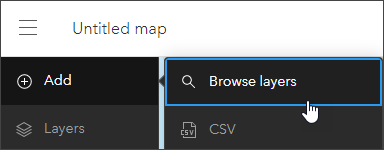
or (2) Click Layers, then Add layer.
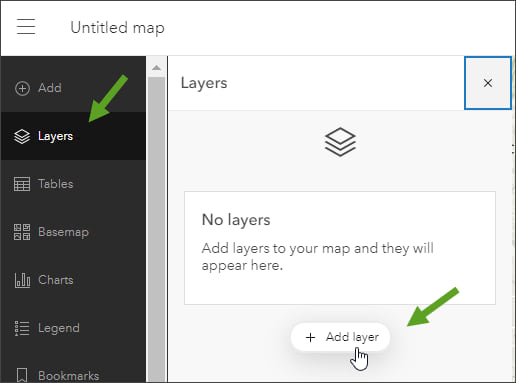
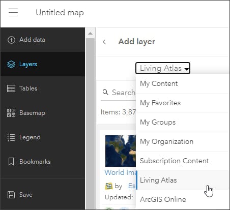
Step 2 — Choose Living Atlas from the Add layer drop-down.
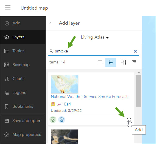
Step 3 — Enter “smoke” in search to locate matching layers from the Living Atlas. Locate the National Weather Service Smoke Forecast layer and click (+) to add it to the map.
Tip: To learn more about any layer, click the layer title to View item details.
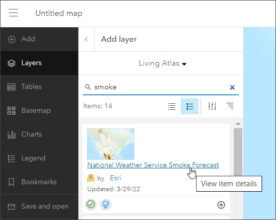
From the National Weather Service Smoke Forecast item details we learn that the data is sourced from the National Digital Guidance Database (NDGD). The time enabled layer displays projected visible smoke across the contiguous United States for the next 48 hours in 1 hour increments. It is updated every 24 hours by the National Weather Service.
Step 4 — Enter “air quality” in search and locate the AirNow Air Quality Monitoring Site Data (Current) layer and click (+) to add it to the map.
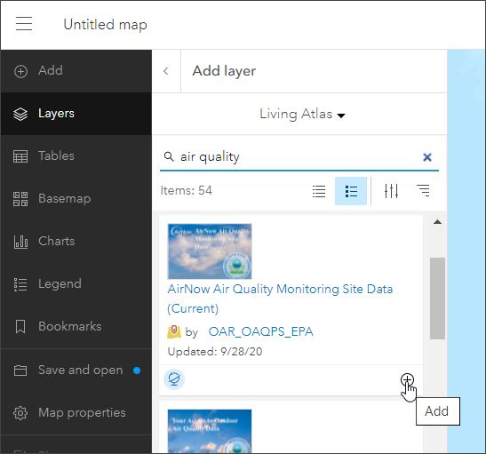
From the AirNow Air Quality Site Data (Current) item details we learn that the source is the United States Environmental Protection Agency (US EPA) and is updated hourly.
The smoke and air quality map
In just a few clicks a map showing smoke and air quality has been authored.
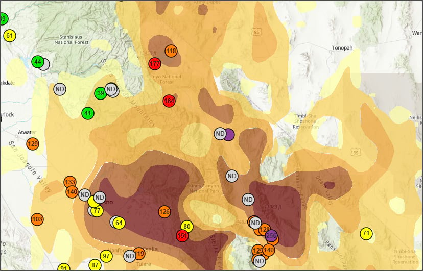
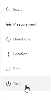
Since the National Weather Service Smoke Forecast layer is time-enabled, you can display a time slider at the bottom of the map. In the Settings (light) toolbar on the right, click Time.
A time slider appears at the bottom of the map. Using the time slider you can (a) play or pause the animation, (b) adjust the time slider interval, (c) step forwards or backwards in time intervals, or (d) open Time slider options to adjust time settings to set the playback speed, time span, and time display.

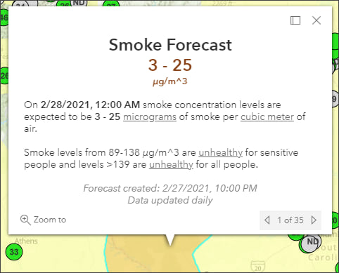
Click smoke polygons to view the pop-up and learn more about the smoke forecast.
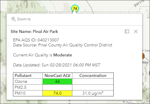
Click air quality stations to open the pop-up to learn more about current conditions.
Improve your map
Experiment with different basemaps to see which you like best. You can alter layer transparency and symbols to emphasize the content you want. Use Effects to emphasize layers or alter their display.
The map shown below uses the following:
- Terrain with Labels basemap.
- Sepia and Brightness & Contrast effects applied to the World Hillshade base layer.
- Drop Shadow has been applied to the AirNow locations layer to make them pop.
- Blur has been applied to the Smoke Forecast layer since the polygons are only an approximation of the actual smoke areas.
For more information, see Use effects.
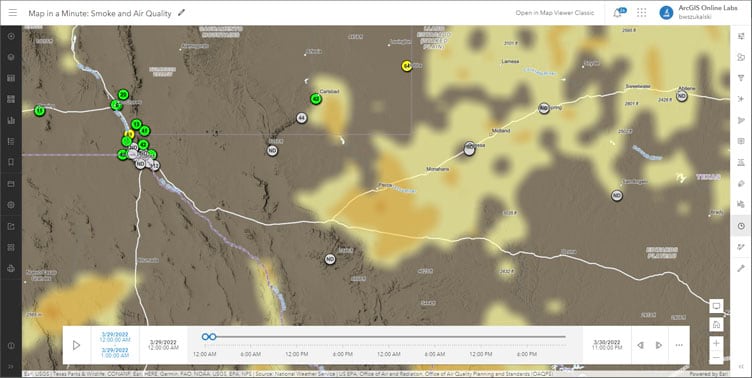
Optionally, add additional layers such as USA Current Wildfires, Satellite (VIIRS) Thermal Hotspots and Fire Activity, or Current Weather and Wind Station Data to provide additional context. Use one of the ArcGIS Instant Apps to create an application that can be used by anyone with just a few more clicks.
Use Air Quality Aware
Air Quality Aware is a Living Atlas app intended to provide information about the current conditions of air quality in the United States, along with the potential human health impacts. Use the app to create an an air quality map for any location in the United States.
Click on a location in the U.S. to see the Air Quality Index (AQI), including ozone and particulate matter, for now, later today, and tomorrow. The National Weather Service’s 72-hour forecast for wind will also be displayed along with population data and key demographics.
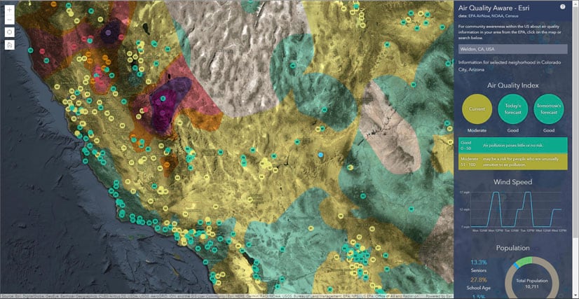
The app includes authoritative Living Atlas content from the EPA’s Air Now program for current and future air quality information, NOAA National Weather Service wind forecasts, and demographic data from the U.S. Census Bureau American Community Survey.
For more information, see Access the latest air quality and human impact information with Air Quality Aware.
More information
For more information, see the following:
- ArcGIS Living Atlas website
- View time maps (Help)
- Configure time settings (Help)
- The air we breathe (Story)
This blog article was originally published on September 7, 2020, and has been updated.

Commenting is not enabled for this article.