Most of northern California, Oregon, and Washington are bracing for yet another atmospheric river that is forecast to bring damaging winds, flooding, mudslides, and lots of snow in mountain areas. Just days ago, a large storm was making its way across the central and eastern US, bringing flooding and tornadoes and heavy snow to parts of the Plains and Upper Midwest.
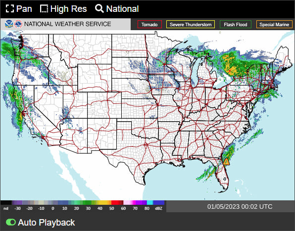
According to NOAA, flooding is the major threat for inland populations. Flash flooding can occur in the blink of an eye due to intense rainfall, often accumulating from some distance away. Flooding along rivers and streams can last for many days after a storm has passed.
Make a flood map
ArcGIS Living Atlas of the World includes authoritative live feeds and other content that helps you learn more about current and predicted flood conditions. Follow these steps to make your own flood map in a minute (or less) using Living Atlas content.
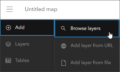
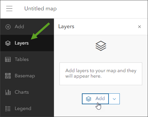
Step 1 — Sign in to your ArcGIS account and open Map Viewer. There are two ways to add layers from the Content (dark) toolbar:
(1) Click Add, then Browse layers.
or (2) Click Layers, then Add.
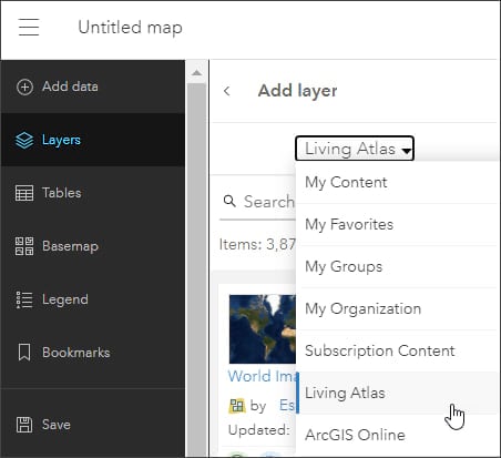
Step 2 — Choose Living Atlas from the Add layer drop-down.
Step 3 — Enter “flood” in search to locate matching layers from Living Atlas. Scroll down to locate the Live Stream Gauges layer and click (+) to add it to the map. You can also enter “stream gauges” to narrow down the search results.
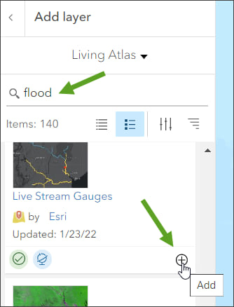
Tip: To learn more about any layer, click the layer title to View item details.
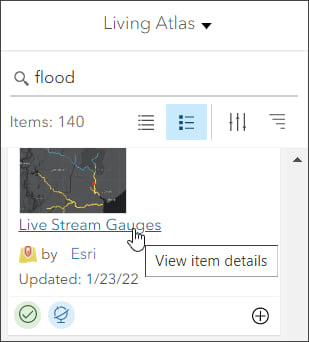
From the Live Stream Gauges item overview we learn that the layer shows near real-time stream gauge readings compiled from a variety of sources. The layer is updated hourly. Once added to the map, the legend shows the current flood status.
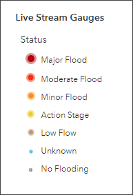
To simplify the map and focus on stream gauges showing flood conditions, a filter can be applied.
Step 4 — Click Filter in the Settings (light) toolbar on the right. Note there is an existing expression that filters for gauges with recent updates.
Click Add expression.
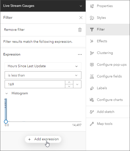
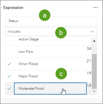
Step 5 — Construct a filter expression as follows:
a – Select Status as the attribute from the list.
b – Select includes as the operator from the dropdown list.
c – Click Select values, then choose the desired values from the dropdown list.
Step 6 — Click Done, then Save, when finished.

The map shown below is the result of applying the following expression:
Status includes Minor Flood, Major Flood, Moderate Flood.
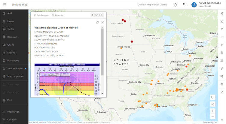
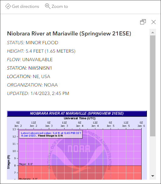
Click any gauge to view its pop-up for more information.
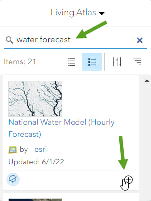
Step 7 — Return to Add layer and search using “water forecast” and scroll down to locate the National Water Model (Hourly Forecast) layer. Click (+) to add it to the map.
From the National Water Model (Hourly Forecast) item details we learn that the layer presents a time-enabled model from the National Weather Service that forecasts streamflow volume and velocity for the entire United States. The model predicts the flow in every river reach of the National Hydrography Dataset.
Note that the layer is time enabled, so a time slider appears that you can use to explore the hourly forecasts.
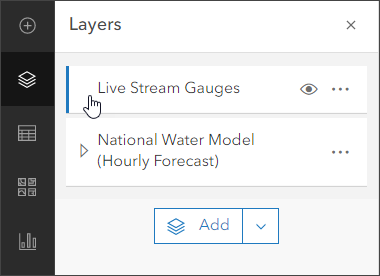
Step 8 — Adjust the layer order to draw the gauges on top of the streams. In Layers, grab the Live Stream Gauges layer and drag and drop it above the National Water Model layer.
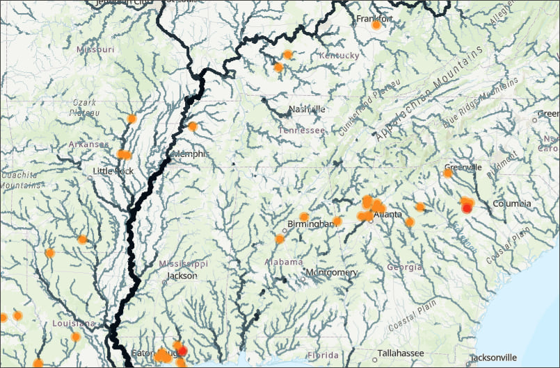
The flood map
In a minute or so, with just a few clicks, a map showing current flood conditions and hourly stream forecasts has been authored.
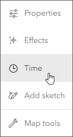
Since the National Water Model (Hourly Forecast) layer is time-enabled, you can open a time slider that appears at the bottom of the map. Select the hourly forecast layer, then in the Settings (light) toolbar click Time.
Using the time slider you can (a) play or pause the animation, (b) adjust the time slider interval, (c) step forwards or backwards in time intervals, or (d) open Time slider options to adjust time settings to set the playback speed, time span, and time display.

Click a stream to identify it and view forecast flow and deviation from normal flow for the time period selected using the time slider.
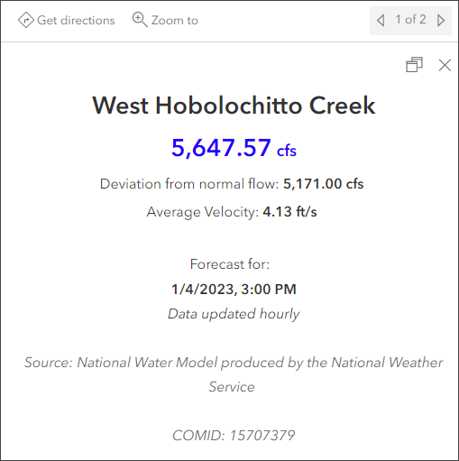
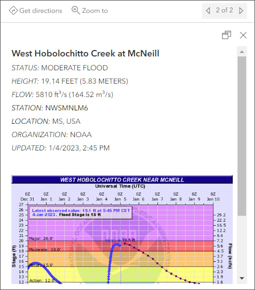
Click a stream gauge to learn more about the current flow and status. Click the image in the pop-up to view the graph.
Improve your map
Experiment with different basemaps to see which you like best. You can alter layer transparency and symbols to emphasize the content you want. Add other related layers from Living Atlas to add additional context.
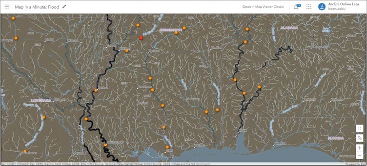
The map shown below uses the following:
- Terrain with Labels basemap
- Sepia and Brightness & Contrast effects applied to the World Hillshade base layer.
- Saturation and Brightness & Contrast effects applied to the World Terrain Base base layer.
- Bloom and Drop Shadow applied to the Live Stream Gauges layer.
For more information, see Use effects.
More information
For more information, see the following:
- Configure time settings (Help)
- View time maps (Help)
- ArcGIS Living Atlas website
- ArcGIS Living Atlas earth observations content
This blog article was originally published on September 17, 2020, and has been updated.

Commenting is not enabled for this article.