Want to make a beautiful pop-up to match your map or website? With a little elbow grease, CSS, and a keen eye for design, it’s easy. Here’s how you can skin the ArcGIS API for JavaScript pop-up widget.
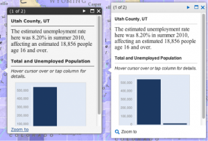
The pop-up widget provides an attractive user interface for displaying information about a feature or set of features on a map. In this post, I’ll be showing how to improve the default popup style (shown at above left) using my own color scheme and icons (shown at upper right).
Before we get started, you can view the finished pop-up style or grab the code.
You haven’t created it yet, but you need to name your masterpiece theme. The theme name will be assigned as a CSS class. I’ve named my custom theme “modernGrey,” but you can define your own like “blueSteel” or “magnum”. Make sure it doesn’t have any spaces or symbols.
Next, we need to create a style sheet for the new pop-up styles and link it in the head of our HTML document we’ll be embedding that killer webmap in.
<link rel="stylesheet" type="text/css" href="css/modernGrey.css">
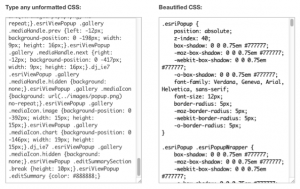
Grab the CSS that the pop-up widget uses from the API URL. The CSS from the API is minified to reduce file size. You can make it readable by using a site like cleancss.
Then, you can paste the formatted code into a new empty CSS file. This CSS will let you easily recognize what styles are being applied so you can identify the ones you need to overwrite without having to use a browser’s DOM inspector.
Now we’re ready to start styling with CSS.
In my “modernGrey.css” style-sheet, I can copy all the selectors that I would like to modify without their properties and paste them into my modernGrey.css. I need to add my “modernGrey” class to the selector, so that each of my style-sheet’s selectors overwrites the default ones.
.esriPopup.modernGrey {

// Put styles here!

}
I can add all the attributes and their properties to the selectors to give my style the look and feel I want. To easily create multi browser compatible CSS gradients, rounded corners, shadows and text-shadows, CSS3Generator.com is a great resource. Ajax-load.info can help you create an animated GIF image to match your pop-up.
.esriPopup.modernGrey {

-webkit-box-shadow: 1px 1px 3px #dbdbdb;

box-shadow: 1px 1px 3px #dbdbdb;

-webkit-border-radius: 2px;

border-radius: 2px;

font-family: Arial, Helvetica, sans-serif;

font-size: 12px;

line-height: 16px;

}
The pop-up also uses images for icons and each tail of the popup. These images are combined into one image called a sprite. The advantages of having them in a sprite are the reduced file size and once one is loaded, all of the images are already cached in the browser. You’ll likely want to modify the pop-up’s sprite image to match your new theme’s CSS as well.
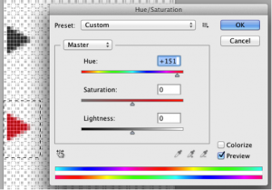
You may just want to simply change the hue/saturation of the icons with a program like Adobe Photoshop.
You can open the popup.png sprite in your favorite image editor and change what you need or create your own unique sprite.
If you change the size, layout, or position of an image inside of the sprite, you’ll need to adjust the CSS positioning as well.
.esriPopup.modernGrey .titleButton.prev {

background-position: 0 -224px;

}
Now we need to use JavaScript to tell our map about our cool new theme.
Create your popup Dijit and assign it to a variable. I’ve configured my pop-up with the highlight symbol disabled. Make sure to assign it to a variable that you can access a few lines later.
var customPopup = new esri.dijit.Popup({

fillSymbol: false,

highlight: false,

lineSymbol: false,

markerSymbol: false

}, dojo.create("div"));
Then, we need to apply the theme to the variable’s DOM node (Document Object Model) as a class name, so the styles we create will get applied to this node.
dojo.addClass(customPopup.domNode, "modernGrey");
Lastly, when creating our map, we need to set the map options to use our custom pop-up instead of the default.
var mapDeferred = esri.arcgis.utils.createMap(webmap, "map", {

mapOptions: {

infoWindow: customPopup, // Use our popup

slider: true

}

});
Other examples of styled pop-ups include the Public Gallery template in red, blue and green.
Applying a fresh coat of paint to the pop-up goes a long way but don’t forget about the content inside. Refer to the recent Designing web map pop-ups blog post for tips on how to display content within a pop-up.
Happy styling!


Commenting is not enabled for this article.