Now that the new Map Viewer Experience is out of Beta, we want to take a minute to introduce its design and tell you about recent enhancements that will make your authoring experience smoother and faster than ever.
Intuitive layout
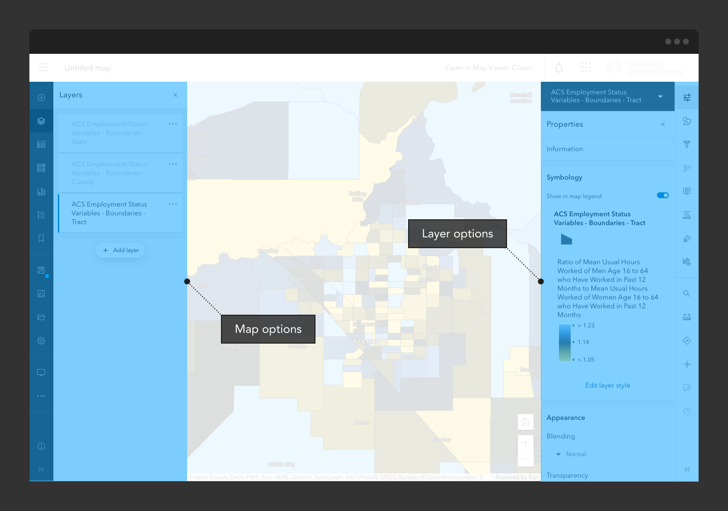
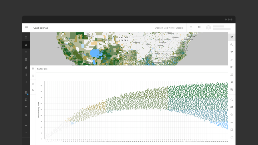
This is perhaps old news for users coming from our beta releases, but this concept is core to Map Viewer’s overall design: High level map settings and options live to the left of the map, while layer-specific options and some map widgets live on the right. This layout allows for a predictable experience and a logical flow of information from left to right (or right to left depending on your locale).
Switching between layers on-the-fly
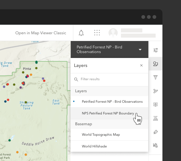
While the above layout makes for a predictable experience, users with larger screens may have an additional consideration: it can be cumbersome to move your mouse back and forth across the screen in order to change the layer selection. To make this easier, we introduced the “Layer switcher” in this release which allows you to select different layers from the top of any layer options panel. With the layer switcher you can now configure a bunch of layers in rapid succession with barely a flick of the wrist.
Minimizing the interface to see more of your map
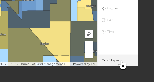
When you open the Map Viewer for the first time, you may notice that all the icons on the left and right have labels beside them. This is to help users get familiar with the interface options. After you have used the app for a while, you may find that you no longer need the labels. You can easily hide the labels by clicking the “Collapse” arrows at the bottom of each toolbar and reclaim that space for your map.
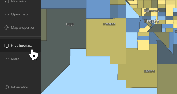
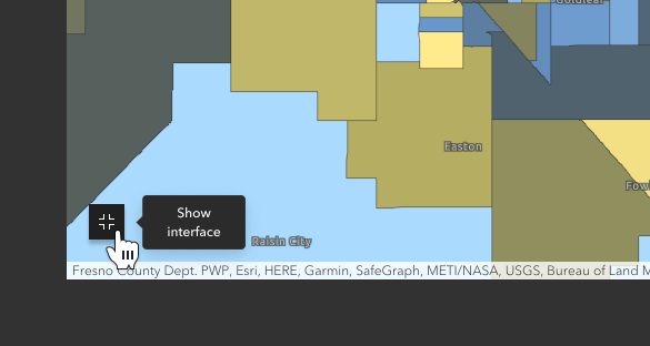
A new feature at this release allows you to hide the interface altogether, effectively maximizing the size of the visible map area. This is especially helpful when you need to grab a screenshot of your entire map.
Click the “Hide interface” button in the map options toolbar to see the map full-page.
To get the interface back, just click the “Show interface” button in the bottom left.
Multiple paths to success
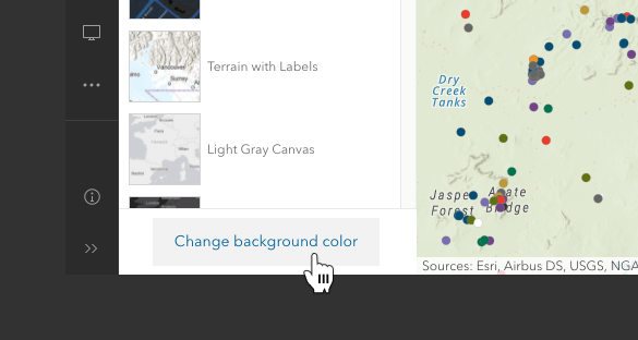
Over the past few beta releases, we have conducted many usability studies to observe how real people navigate the Map Viewer to accomplish tasks. This release, we have made some small (but mighty!) improvements to certain areas of the Map Viewer to allow users to connect related workflows. For example, you can now navigate directly to the Background color property from the Basemap panel.
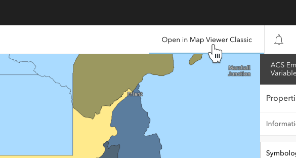
Also, should you find you still need something from Map Viewer Classic, we have made it easy to launch that experience from within the new Map Viewer.
Join the conversation
The ArcGIS Online Esri Community (formerly known as GeoNet) provides a forum for questions, discussions and feedback. The ArcGIS Online team closely monitors this space to understand how you are using the map viewers, what you like, and where you see opportunities for improvement. With the release out of beta, the Map Viewer Beta place will be closed, and the content will be relocated to the ArcGIS Online place. Use your ArcGIS account with Esri access enabled to participate in the community.


Article Discussion: