The glowtastic Firefly symbols in ArcGIS Online are lots of fun (I mean a practical and pragmatic spatial visualization mechanism for the foundational concept of geographic dependence, i.e. the proximally-diminishing influence a feature has on its surroundings).
By the way, that image, and the ones below, look way better when read in this story map.
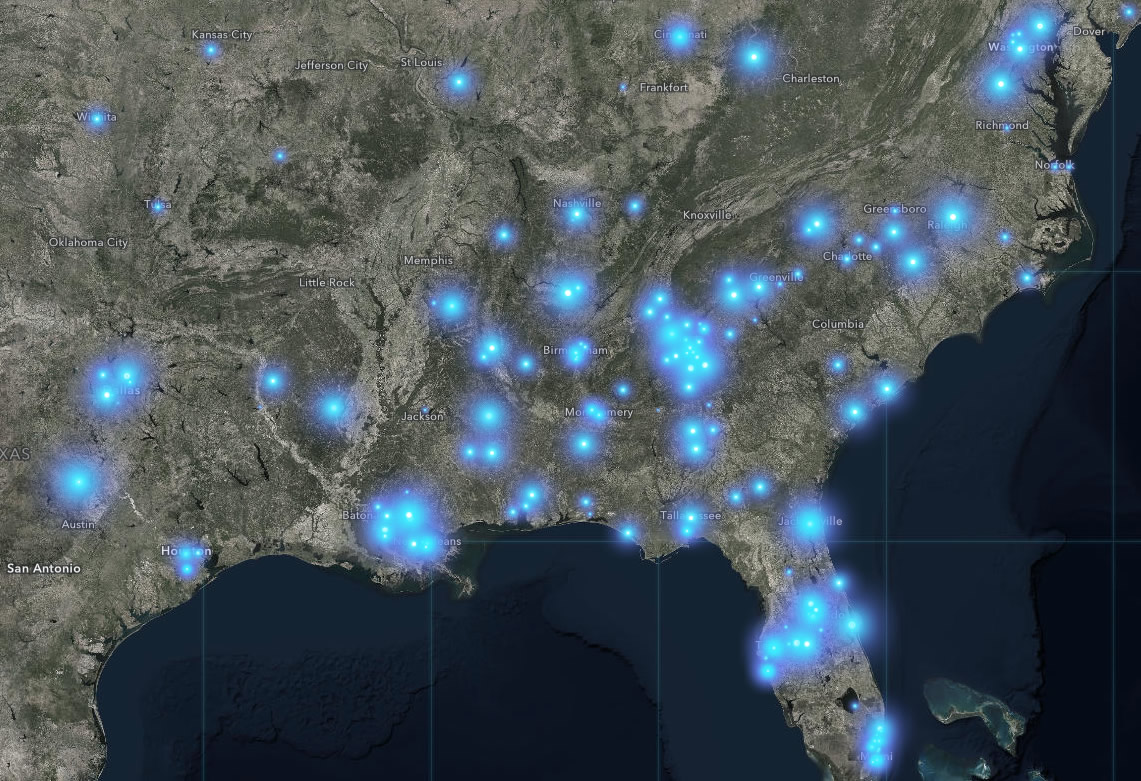
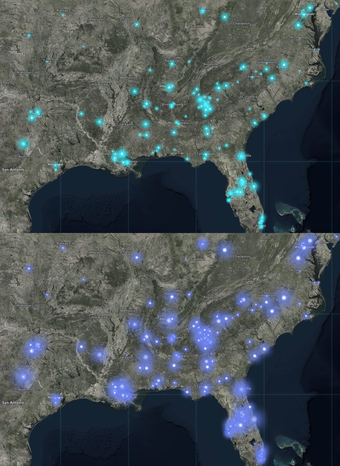
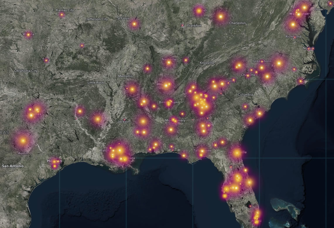
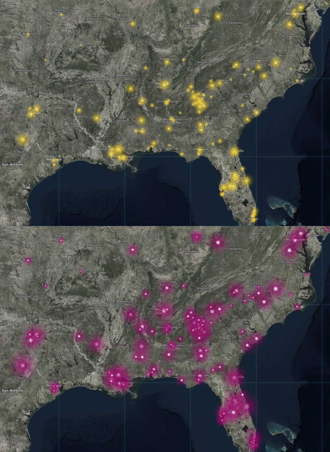
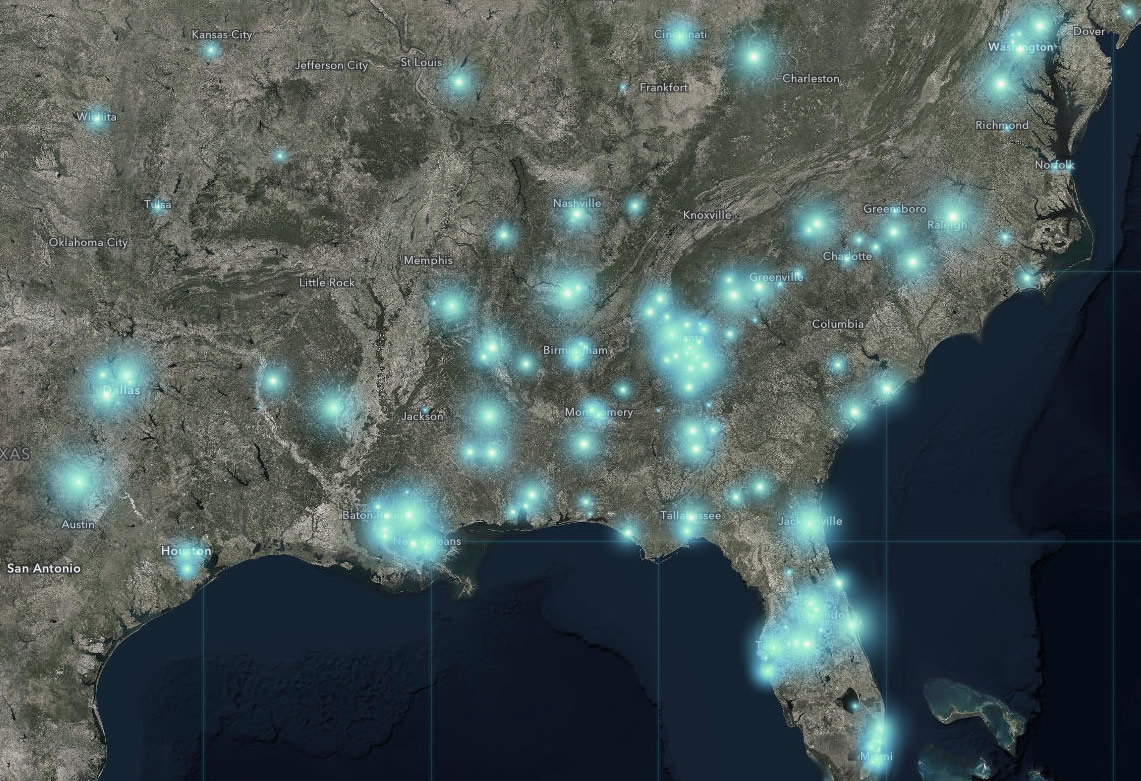
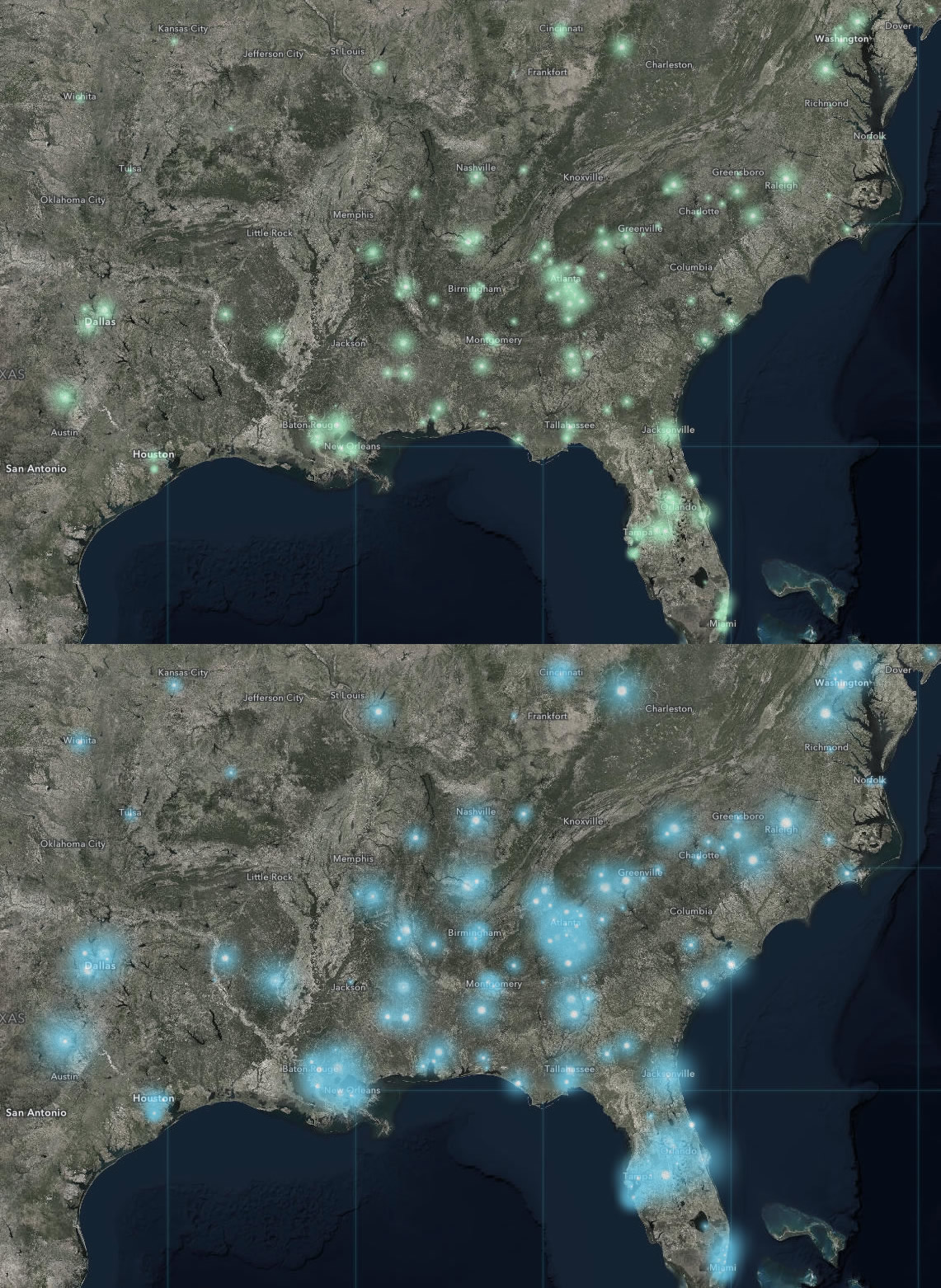
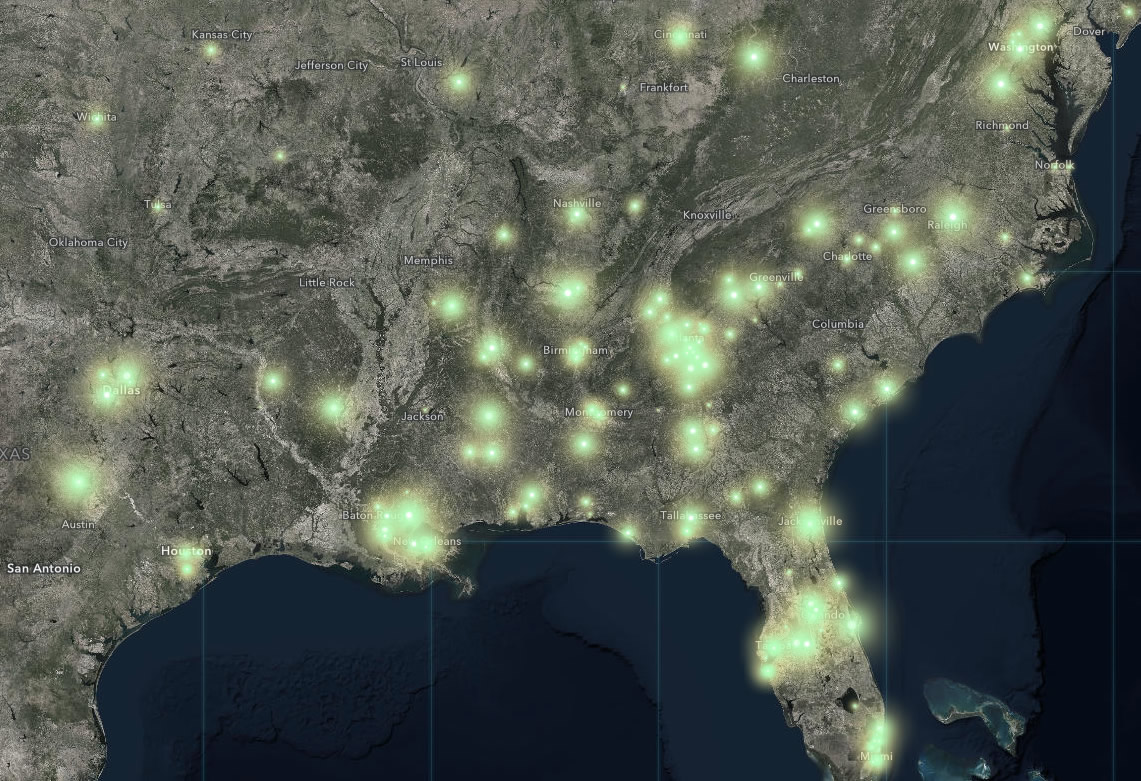
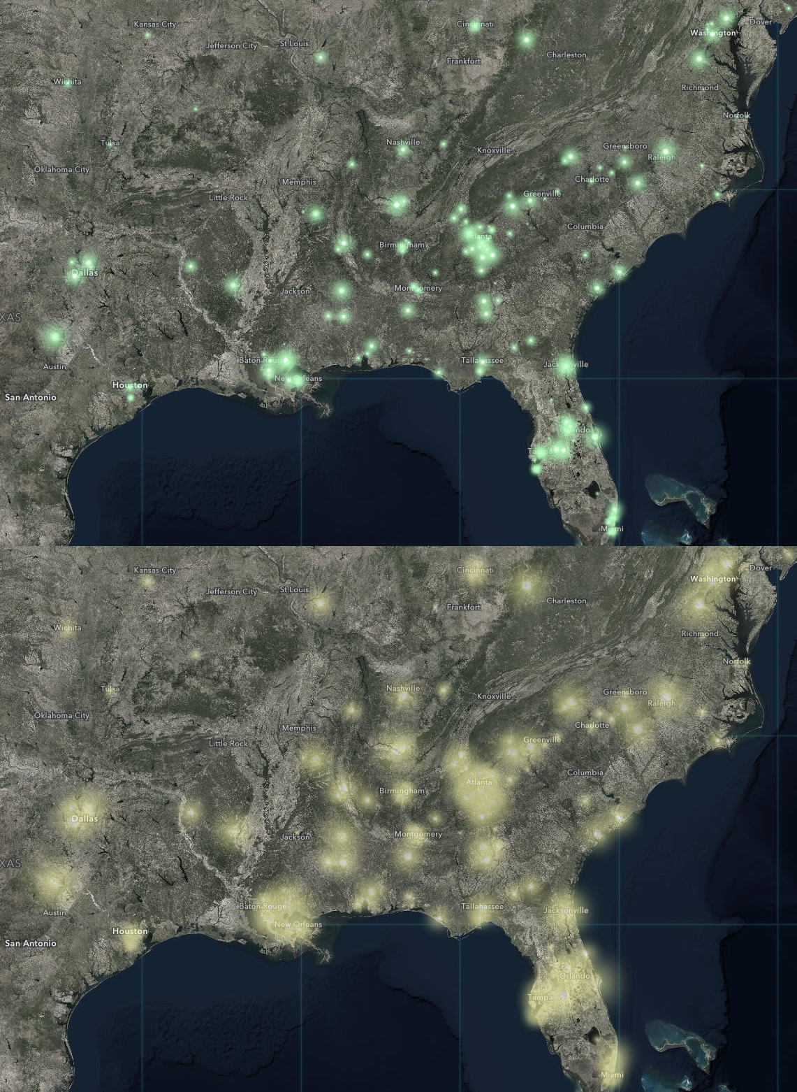
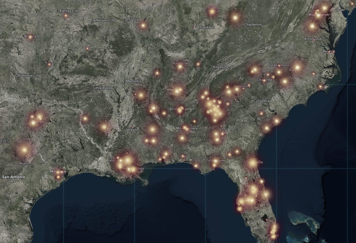
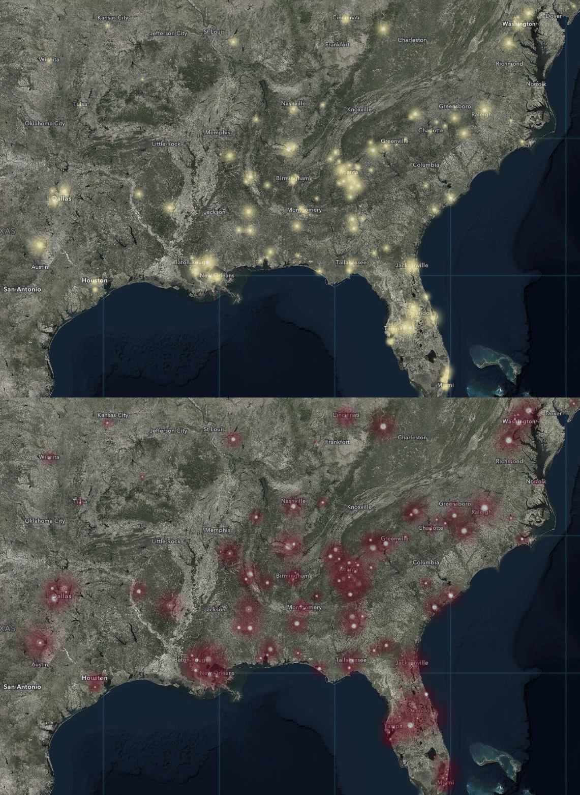
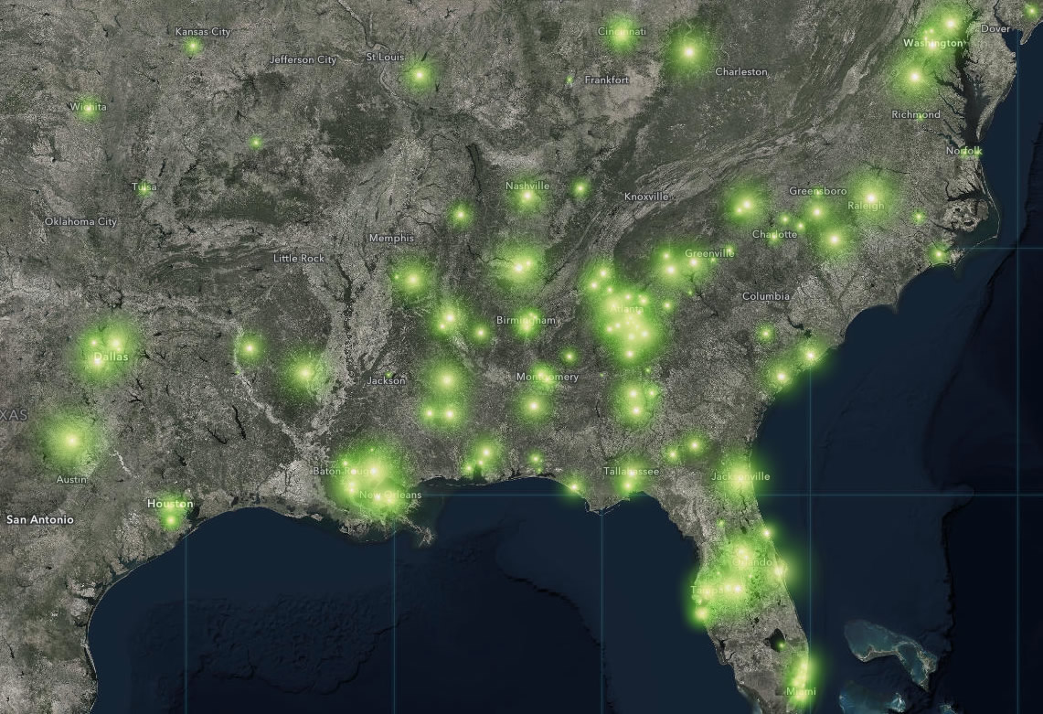
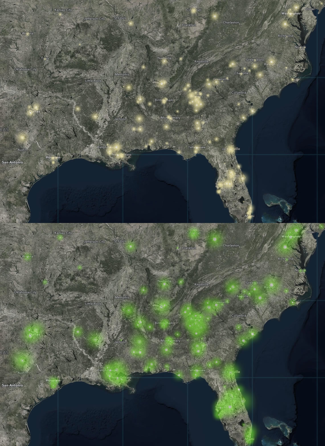
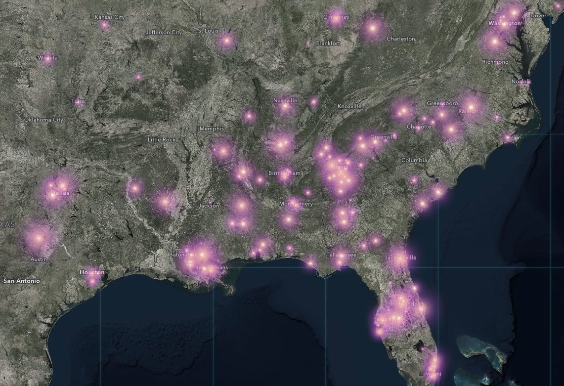
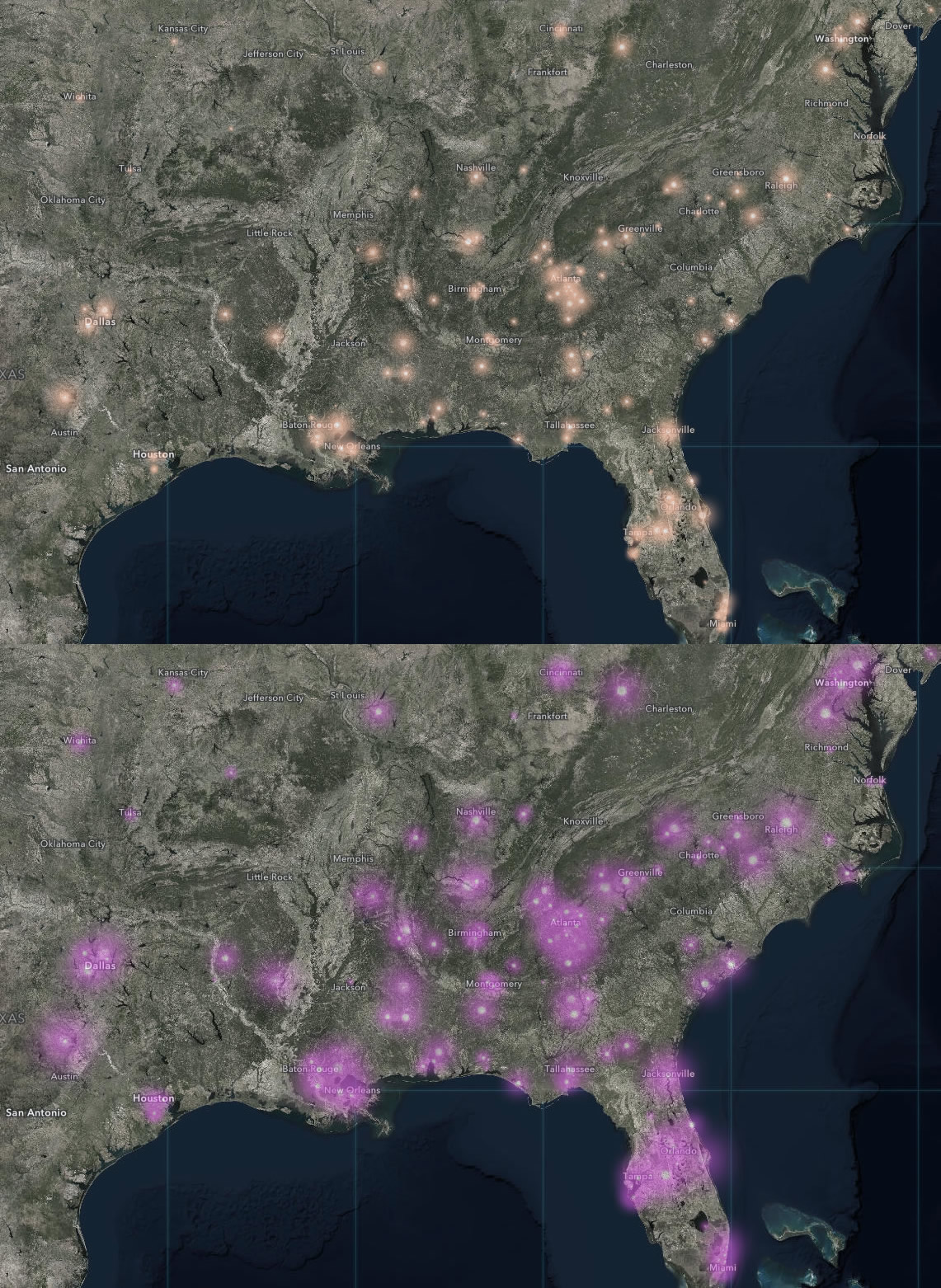
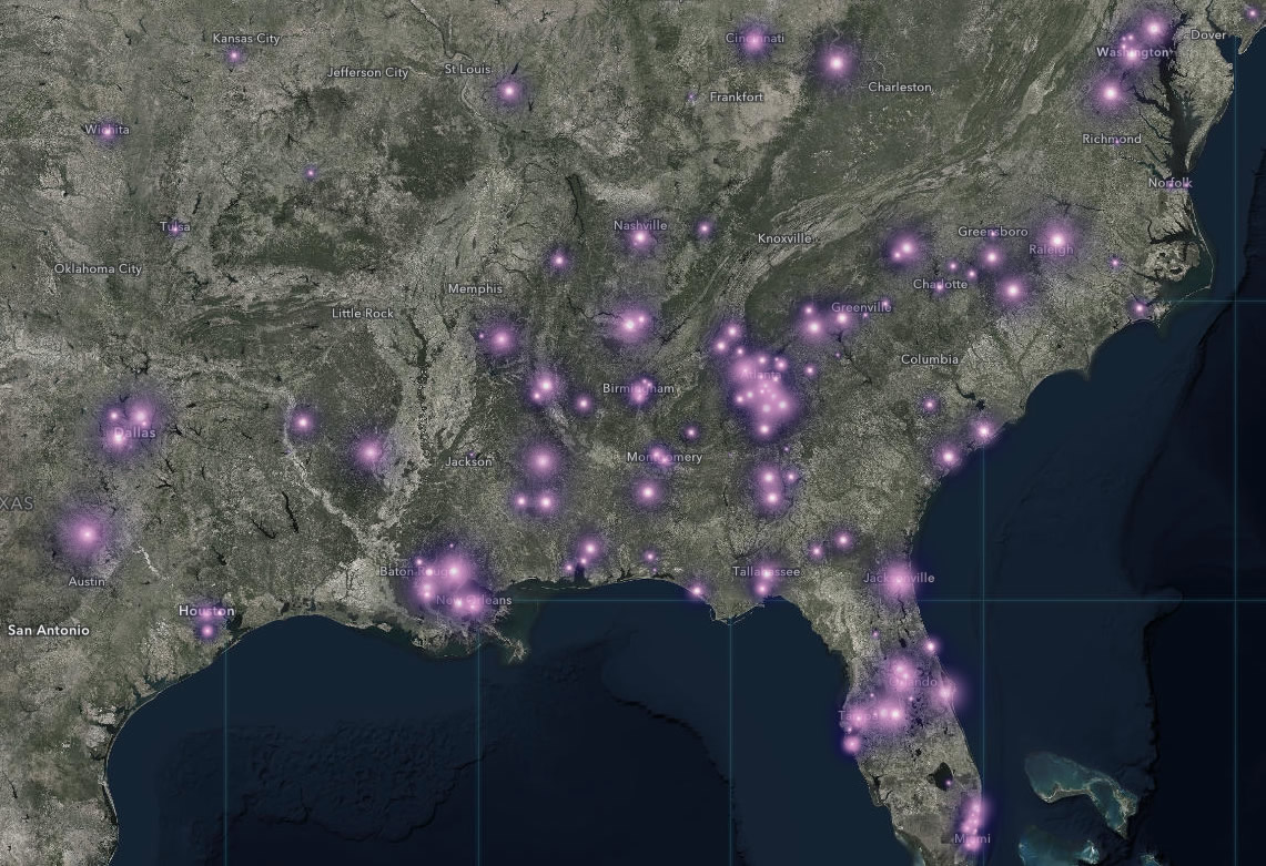
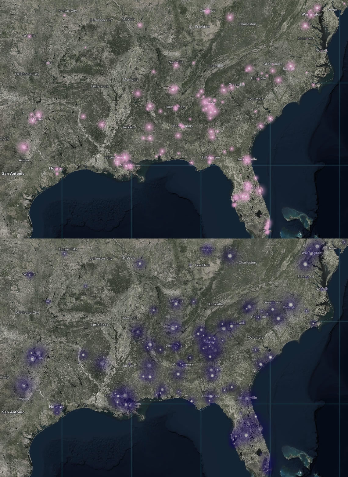
Each symbol in the library is a monochromatic radial decay in opacity. One color. But you can whip up some really beautiful symbols by stacking a couple of these hues. In ArcGIS Online, you just duplicate the layer, and apply your design will to it. In these examples I pushed the symbol transparency to 50 or 75%, and I gave the topmost layer a bit smaller symbol size. You’ll also want to remove the pop-up for one of the layers, so you don’t get redundant overlapping pop-up interactions. Ok, all the boring bits have been addressed, let’s dive into the chromatic fun…
Fjord:
Plasma:
Neptune:
Streetlight:
Outbreak:
Boreal:
Koselig:
Anodised:
Some advice when picking your own color combinations. Choose colors that are relatively close to each other on the spectrum. I’ve found that combining colors far from each other on the spectrum (or on opposite sides of the color wheel) wind up looking like a real dog’s dinner. I also tend to choose colors for the topmost layer from the lighter, washed out, Firefly symbol options. This reinforces the effect of a glow. But, of course, you will do what you feel is right.
If you create your own Firefly recipes and want to share them with your fellow map nerds, we’d all love to see them! I sure would. Feel free to share links in the comments. I’ve made a head-start ArcGIS Online map for you to play with if you like.
Happy Firefly Mapping! John


Article Discussion: