Effects were added to Map Viewer in the September 2021 update. This is Part 3 in an on-going series of blog posts that show how to get the most from them [here are Part 1 and Part 2]. Effects allow us to easily add graphics software-like editing to any part of a web map, such as adding a dropshadow to map symbols, a glowing bloom to the labels, or changing the colors in a basemap. Not all maps need Effects, but they offer great artistic control over the look of our maps. And they’re fun to use. Take your time to experiment and don’t forget to try different combinations of Effects with Blend Modes (in the Layer properties panel) to really unlock the cool stuff.
Effects don’t require a lot of work. In this post I show how to transform Esri’s popular Light Human Geography and Dark Human Geography Basemaps in 4-5 clicks. Created by the uber talented Andy Skinner, these are some of my favorite basemaps and I use them all the time since they’re the perfect backdrop for smart mapping.
NOTE: If you don’t see these maps listed in your Org’s list of basemaps, open them directly here (Light) and here (Dark).
Pro Tip: Effects don’t just work on basemaps! They work great on any map layer, including smart mapping and sketch layers.
Map 1: Antique-ify the Light Human Geography basemap
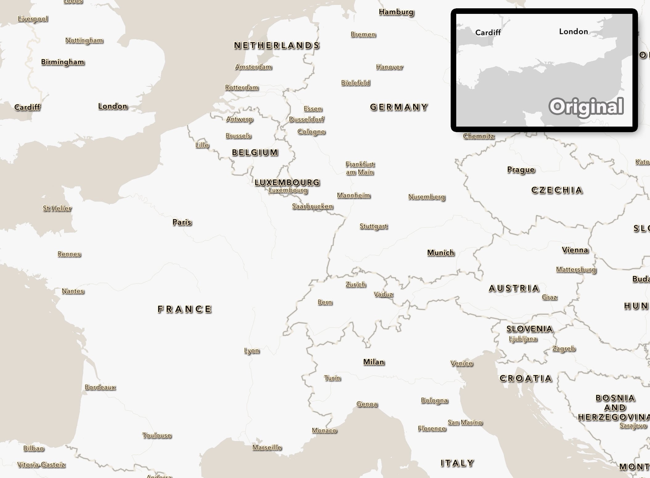
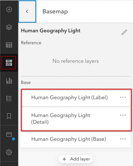
Log into ArcGIS Online and open MapViewer. Using the Basemap selector, switch to the Light Human Geography basemap. This basemap has 3 layers to it: labels, details, and base. We are going to be adding Effects to labels and details.
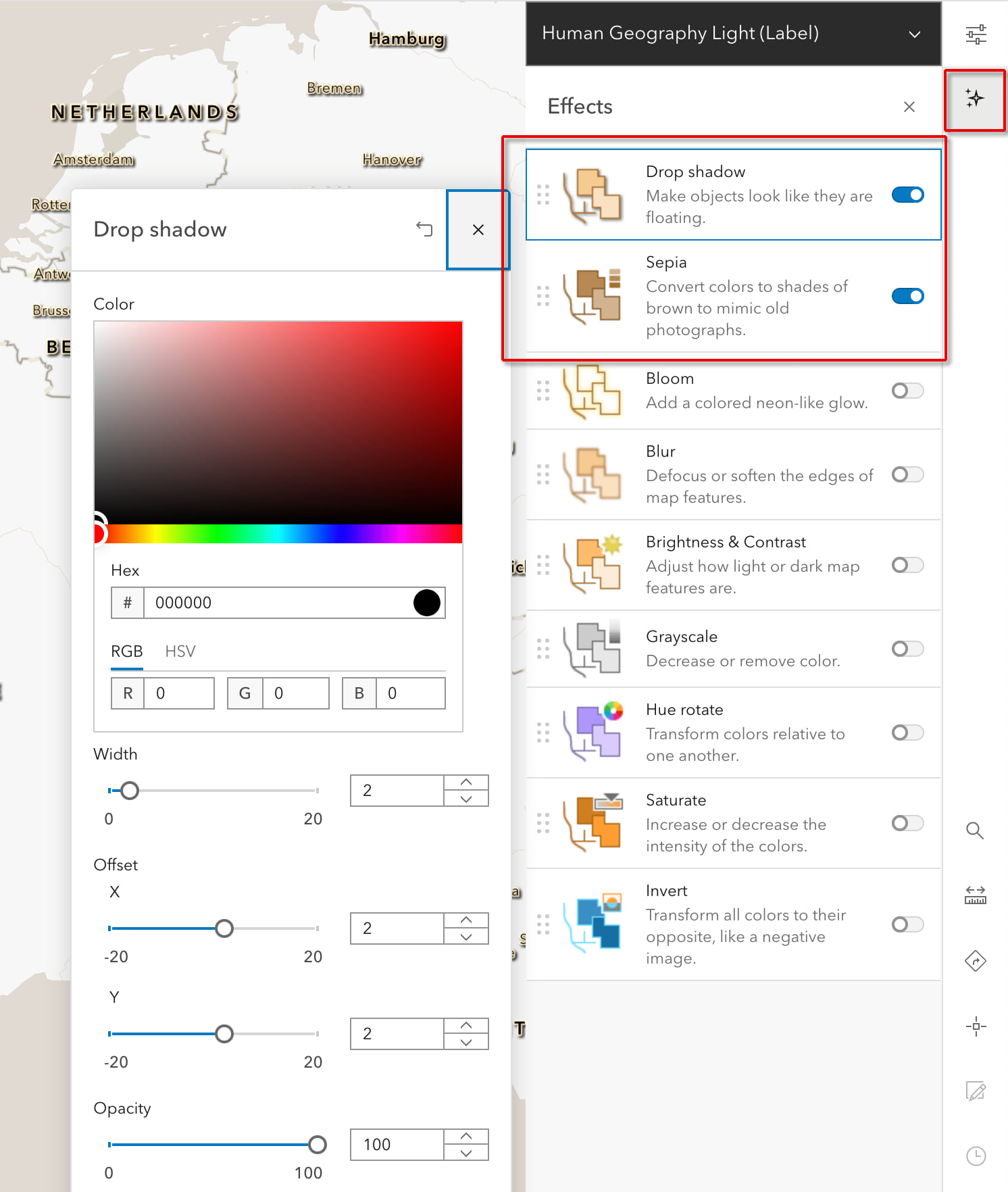
Select the label layer to make it active. Click the Effects icon in the contextual menu (runs down the left side of the screen) and turn on Dropshadow to give the labels some visual depth and a 3D look. We will keep the shadow color as black (the default) but modify the Width, X and Y Offset to 2 pixels each. This makes the shadow a bit tighter/crisper which is needed for small features like text. Next turn on Sepia to add warmth to the labels. The default value is fine.
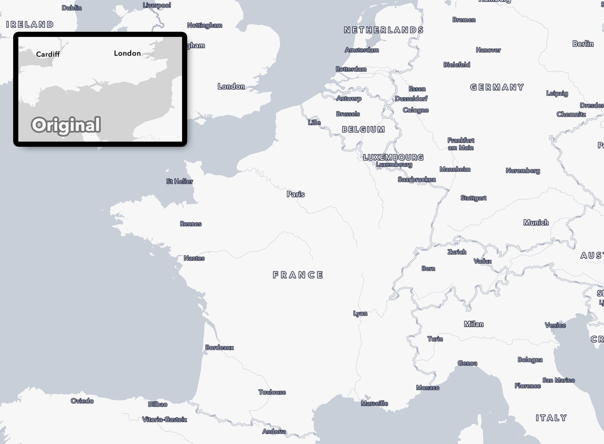
Now make the detail layer in this basemap active. Add a Sepia tone to this layer also to add that warm tone to the oceans. That’s it!
View live map.
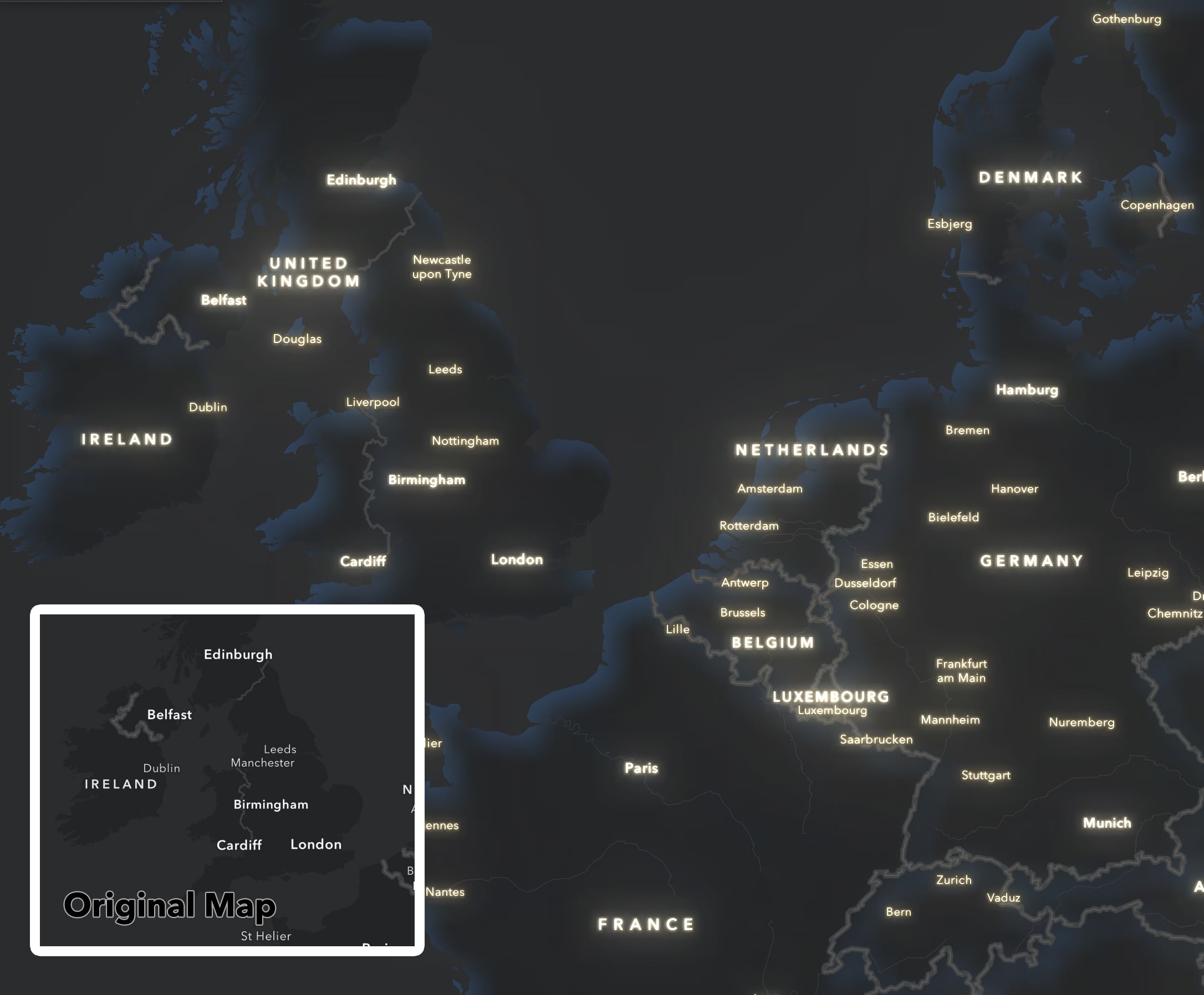
Map 2: Cool Modern Human Geography in 3 more clicks
Keep the map you just made open and let’s take it in a different artistic direction. The nice thing about Effects is if you don’t like what you’ve done, it’s easy to turn them off or change your mind.
Make the label layer active again. Turn off the Dropshadow and replace it with Invert. Invert takes colors and makes them their opposite in the color wheel.
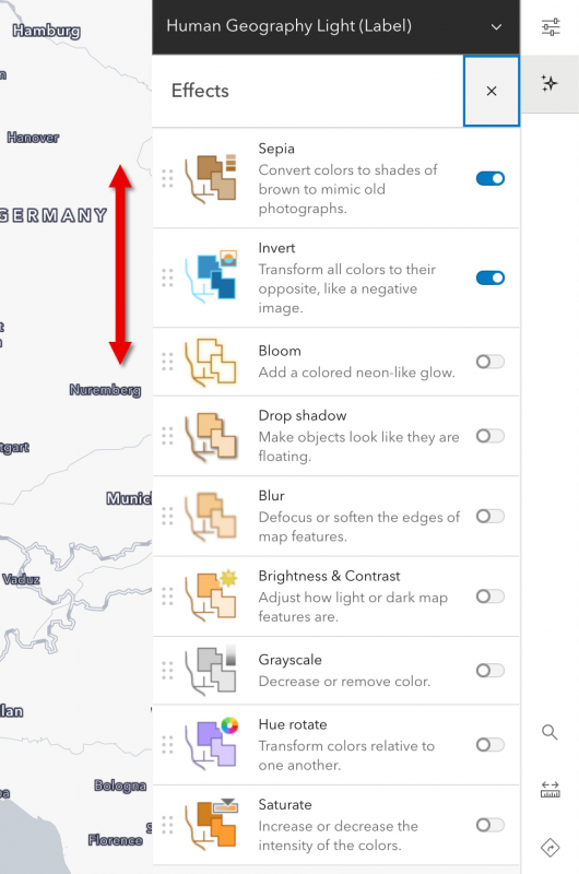
Pro Tip: Make sure the Sepia effect is first on the list, so it is performed first, since the order of operations here matters.
Lastly, make the details layer in the basemap active and add Invert to it as well. Make sure the Invert is happening after the Sepia, so it adds a cool blue color. That’s it!
View live map.
Map 3: Add some magic to the Dark Human Geography Basemap
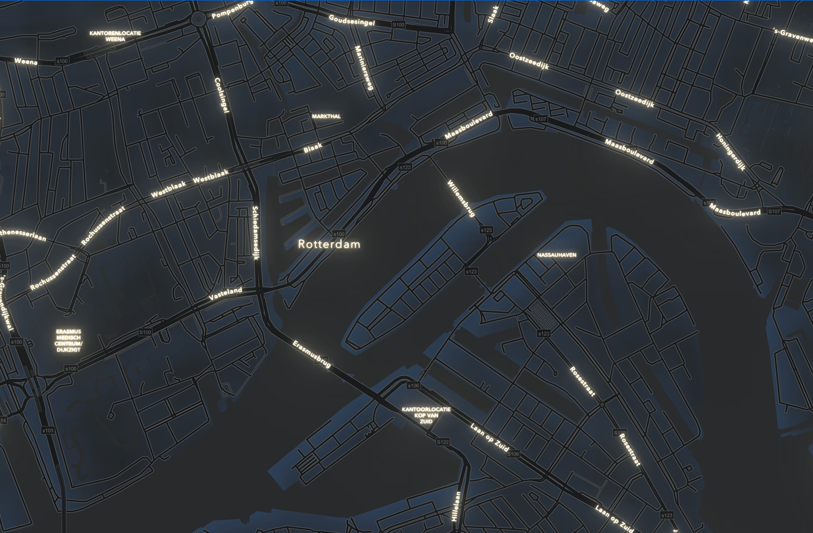
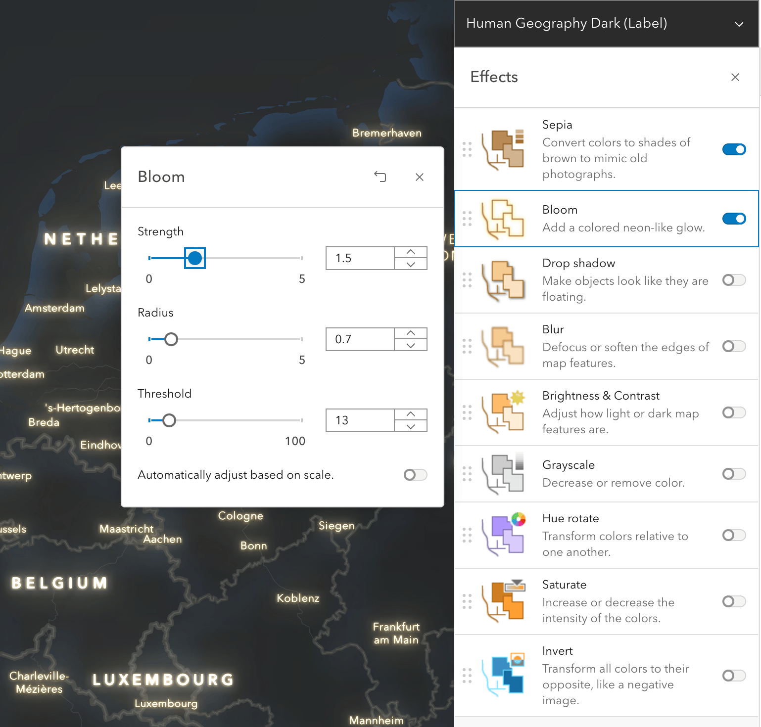
Let’s switch now to the Dark Human Geography basemap. Just like the Light Human Geography basemap, we’ll be adding effects to the labels layer and the details layers. Drill into this basemap to see these layers just like we did before.
With the label layer active, click the Effects icon to open the panel. First add Sepia tone to the labels to give them some color. This time maximize the coloring by moving the slider to 100. Now add a Bloom to the labels. Experiment with the 3 sliders to see what looks best to you, but here were the settings I used:
Now make the details layer active and add a Dropshadow to this layer. Here we are going to use Dropshadow in a somewhat unorthodox way, as a means to add an inner color gradient to portions of the map. We do this by (1) making the effect huge (max-out the sliders), and (2) by adding color to the shadow, in this case a dark rich midnight blue.
Here are the settings I used.
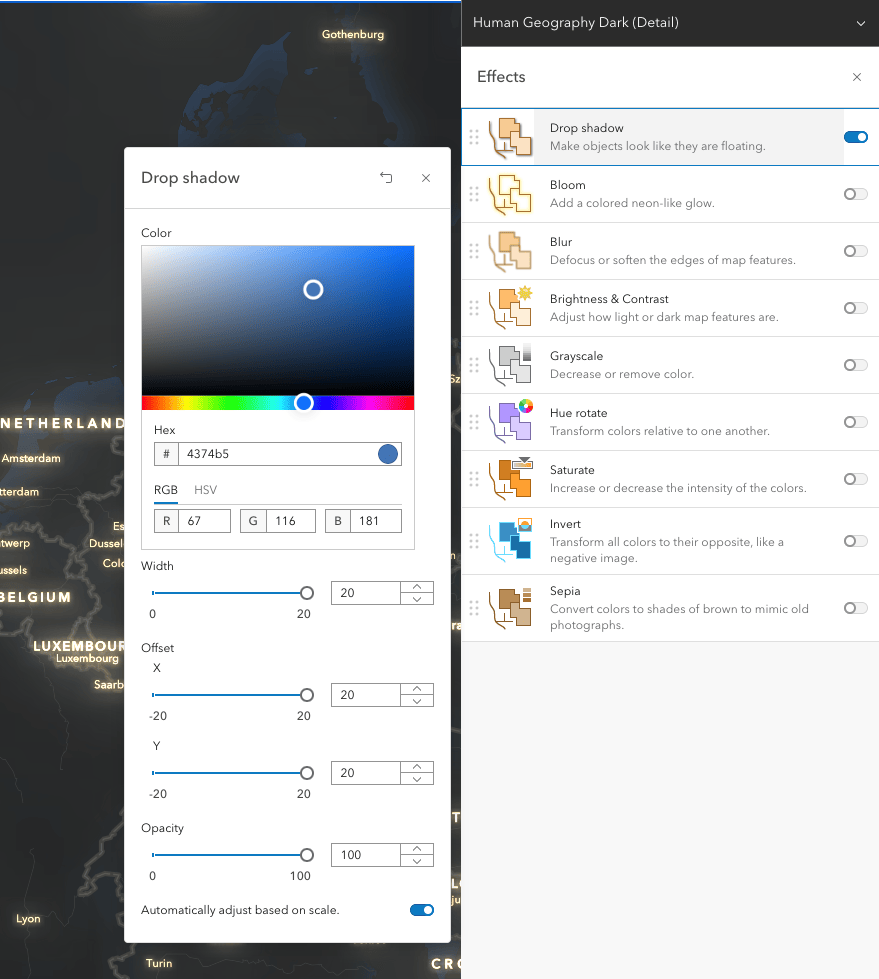
Pro Tip: Not all dropshadows need to be black! Tinting the size and color of the shadow can create gradient color fills.
View live map.
Going Further
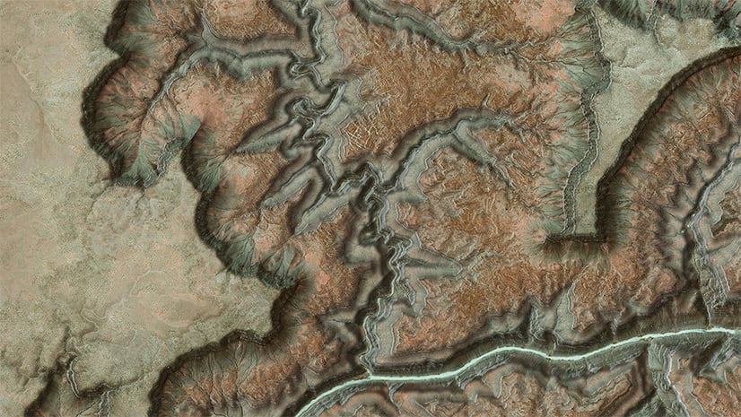
The sky’s the limit with Effects, such as with this heavily modified version of Cooper Thomas’s lovely Sirocco basemap. I was going for an antique, parchment paper quality and wanted to see what’s possible keeping to a mostly monochrome palette. Monochrome basemaps can make wonderful backdrops for other layers.
Effects can be as simple as making a colorful basemap greyscale, or adding water blurs, color gradients and compositing blend modes as we see in the example above. More blog posts in this series coming soon, so please stay tuned.
Happy Mapping!
Special thanks all the folks who worked on Effects in the JS API and the MapViewer; this was very much a team effort to get to this point.


Article Discussion: