This post was originally published on April 26, 2012, and has been updated. The last previous update was July 12, 2024.
Photos or other images in ArcGIS Online web map pop-ups can add both interest and interesting information. You can add a single photo or add multiple photos which you can display stacked vertically or as a media group navigated horizontally.
Photos can also be stored in feature layer attachments and can be configured for display in different modes. In addition, photos can be included in pop-ups by adding links to photo galleries.
For an overview, see Pop-ups: the essentials. This blog tutorial focuses on using pop-up image elements, covering the essentials to enable you to use them effectively.
Quick links
Use the links below to jump to sections of interest.
- Image elements
- About the example map
- Default pop-up
- Single image
- Stacked images
- Images in media groups
- Images in attachments
- Links to web galleries
- Additional tips
Image elements
Pop-ups are composed of different elements: Text elements, Chart elements, Arcade elements, and Image elements. Once added to a pop-up, they can be configured and ordered.
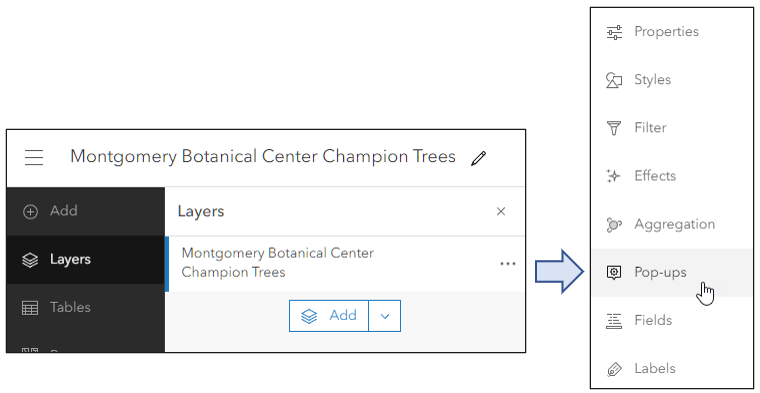
To configure layer pop-ups, select the layer in the Layers pane in the Contents (dark) toolbar. Next, click Pop-ups from the Settings (light) toolbar.
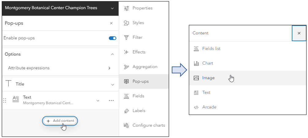
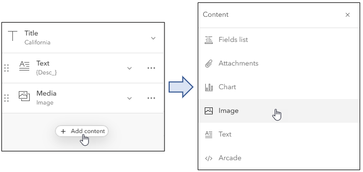
To add an image element, click Add content to display a list of pop-up elements, then choose Image.
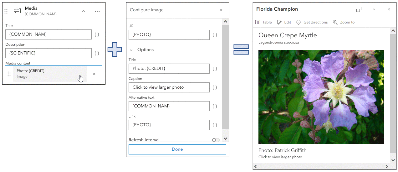
Add images (PNG, JPEG, or GIF format) by entering a URL or obtaining the URL from the contents of a field. Each Image element is type of Media element (along with Charts). Image elements can be configured with a title, caption, links to related websites or larger images, and alternative text.
The settings shown below are from the Montgomery Botanical Center example. Experiment with the caption and titles to achieve the desired result.
About the example map
The following sections use the California – Pop-up image examples map. Once you open the map, Sign In to save the map to your Content. You can also follow along without signing in. Each pop-up configuration is presented in a unique layer, with the layer name and title indicating how the pop-up has been configured.
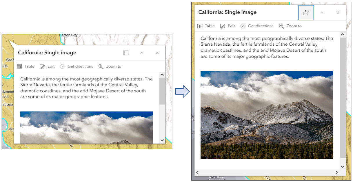
Open the Layers pane from the Contents (dark) toolbar, then toggle the visibility to show the desired layer. Click the California boundary to view the pop-up. By default, pop-ups are undocked but can be docked to display more information. Click the Dock button in the upper right of the pop-up.
Shown below is an example showing the undocked pop-up on the left and docked on the right.
To view the pop-up configuration, select the layer (a blue highlight bar will display along the left). Then click Pop-ups from the Settings (light) toolbar to see how the pop-up has been configured.
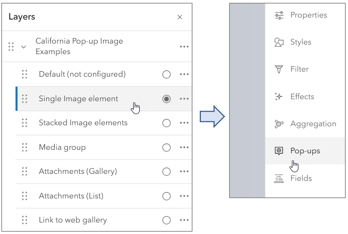
The example map focuses on various configurations for displaying images. The map contains seven layers that are described in the sections below.

Default (not configured)
This layer has not been configured and can be used to follow along in this tutorial. The pop-up uses a Fields list element to display a list of fields and values. Many of the fields have links to images which will be used in other examples, detailed below.
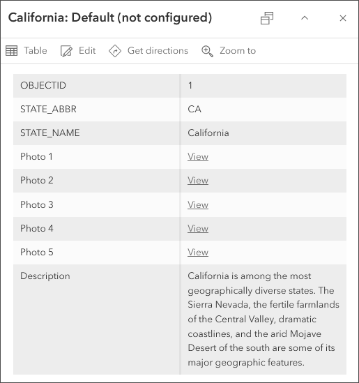
Single image
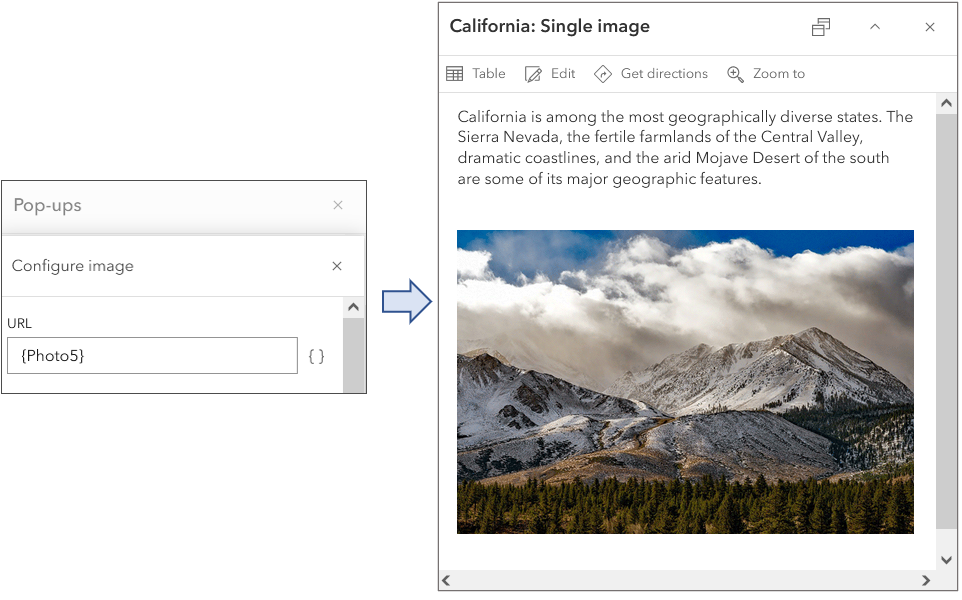
This layer has been configured with a Text element followed by a single Image element, using a URL stored in the attribute {Photo5}.
Stacked images
This layer has been configured with multiple Image elements which are stacked. When you add multiple image elements, you create a vertical stack of images that scroll from top to bottom.
After adding the first image, click Add content, then choose and configure another Image element.
Each Image element uses different fields in their configuration, each field containing a different image URL.
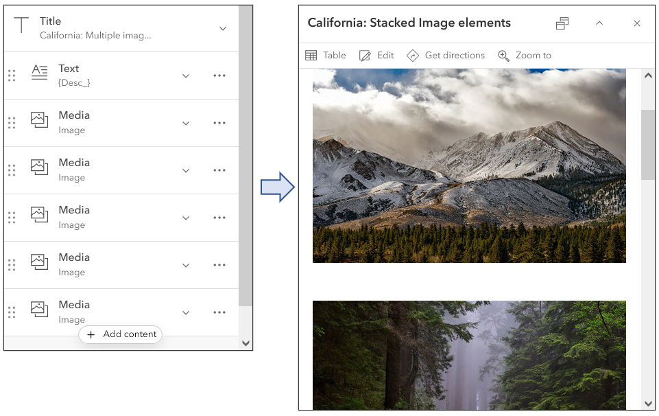
Move through the images using the scroll bar.
Images in Media groups
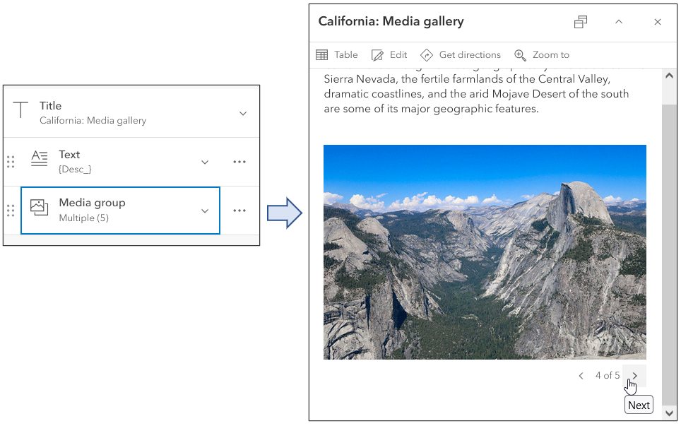
Instead of navigating multiple images in a stacked order, as described above, you can create a Media group which provides horizontal navigation across multiple images.
Media groups are created when you add an image or chart to an existing media element. To create a media group of images, add an image element and expand the pane and click Add media (instead of Add content below it).
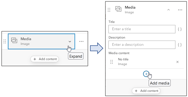
The arrows at the bottom of the pop-up provide forward and backward advance through the images.
Images in attachments
Attachments are files that are included with features in feature layers. Attachments are typically photos captured using ArcGIS Field Maps, Survey123, QuickCapture, and others, but photos and other documents can also be added via the feature layer item pages and ArcGIS Pro. Attachments differ from links in that the images or documents are stored within the feature itself.
To add attachments in the feature layers item pages, open the Data tab, select Table, and click the field containing the attachments.
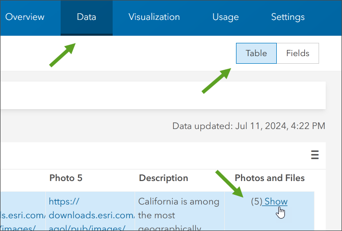
A pane appears that enables you to view, download, and delete existing attachments, or add new ones.
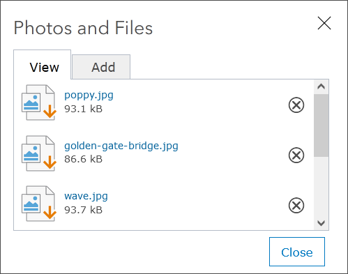
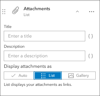
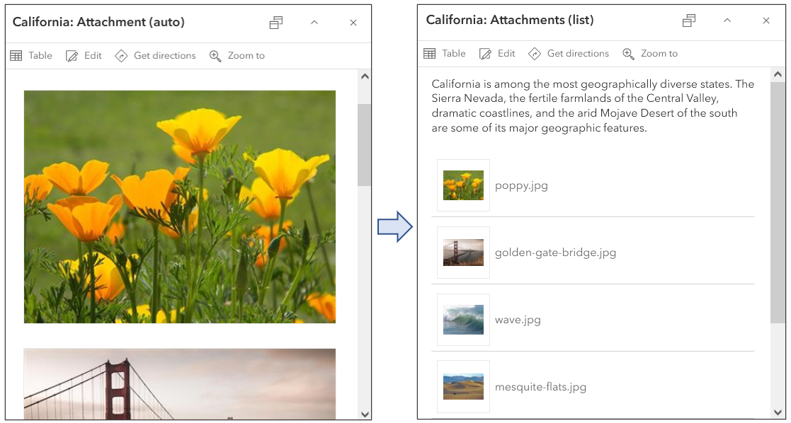
Image attachments can be displayed in pop-ups in several different configurations: Auto, List, and Gallery. Auto is the default, and will adjust the attachment display for the best fit on any device.
Below, pop-ups are configured with Gallery on the left and List on the right.
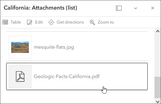
Attachments can include more than images, and can also display links to files such as PDF or Word documents. Scroll to the bottom of the attachment gallery or list to view the attached PDF file.
Links to web galleries
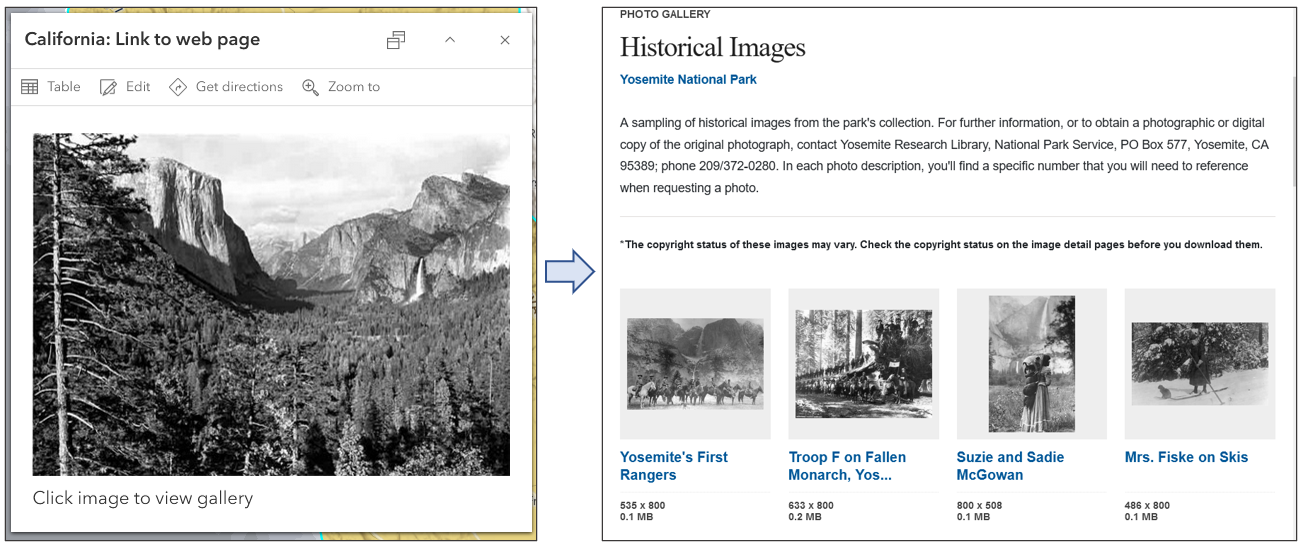
Another way to include images in your pop-ups is to create a web-based gallery and link to the gallery. There are many options to create image galleries, such as Flickr, SmugMug, ArcGIS Hubs, custom web pages of your own design, and more. Links can be included to open the gallery, which can be navigated using the available gallery tools.
Shown below is an example of a link from an Image element opening a web site gallery of images.
Additional tips
Here’s tips and considerations for getting the best results using photos and images in pop-ups.
- Optimize the image for web display for best performance. You can link to a larger photo if needed.
- If you want the image to fill the full horizontal pane dimensions of the pop-up, use a width of 400px or greater.
- Ensure that the photos you use will not be accidentally deleted. See How to prevent accidental deletion for more information.
- If you’re adding photos from a field and do not have a complete set of photos, use a placeholder image stating there is no photo available.
- You can use ArcGIS Online for photo storage, but they must be publicly shared to obtain the URL. The public URL can be found on the item page in the lower right.
- You can set a refresh interval for photos and images if they update, for example traffic snapshots.
- Remember to configure other parts of the pop-up properly, all parts of the pop-up experience will contribute to the image element.
- When using the web map in configurable apps, experiences, or custom apps note that the pop-up display may vary in size and aspect ratio depending on the app you use. You may want to consider which app is your intended goal to optimize the experience in the target app.
More information
For more information see:
- View pop-ups (Help)
- Configure pop-ups (Help)
- Pop-ups: the essentials (Blog)
- Adding and using photos and images in ArcGIS Online (Blog)

Commenting is not enabled for this article.