This article was originally published on March 17, 2011, and has been updated. The last previous update was December 9, 2024.
Authoring web maps is easy, although authoring a truly great map requires a bit of additional thought and tradecraft. Smart mapping guides us to choices that help us use one or more attributes to present data in effective and meaningful ways, and makes it easier than ever to create visually compelling maps that unlock the stories in your data. Effects and blending are additional tools that help us craft truly expressive maps.
Going beyond styles and effects, layer pop-ups are also an essential and important part of crafting the complete map information experience. Pop-ups can transform an otherwise dull list of attributes into a far more meaningful display of intuitive and engaging information for your audience. While it’s also easy to craft good pop-ups, they are often are overlooked. But with a little knowledge and tradecraft, it’s easy to push your pop-ups to the next level, turning attributes into enlightenment.
Quick links
Use the links below to jump to sections of interest.
Pop-up basics
Explore examples
- Pop-up examples map
- Explore examples:
- Default configuration
- Configured fields
- Text from one field
- Formatted text
- Text and photo
- Text and video
- Text, photo, and chart
- HTML
- Arcade expression
- Attachments
Doing more
See the difference
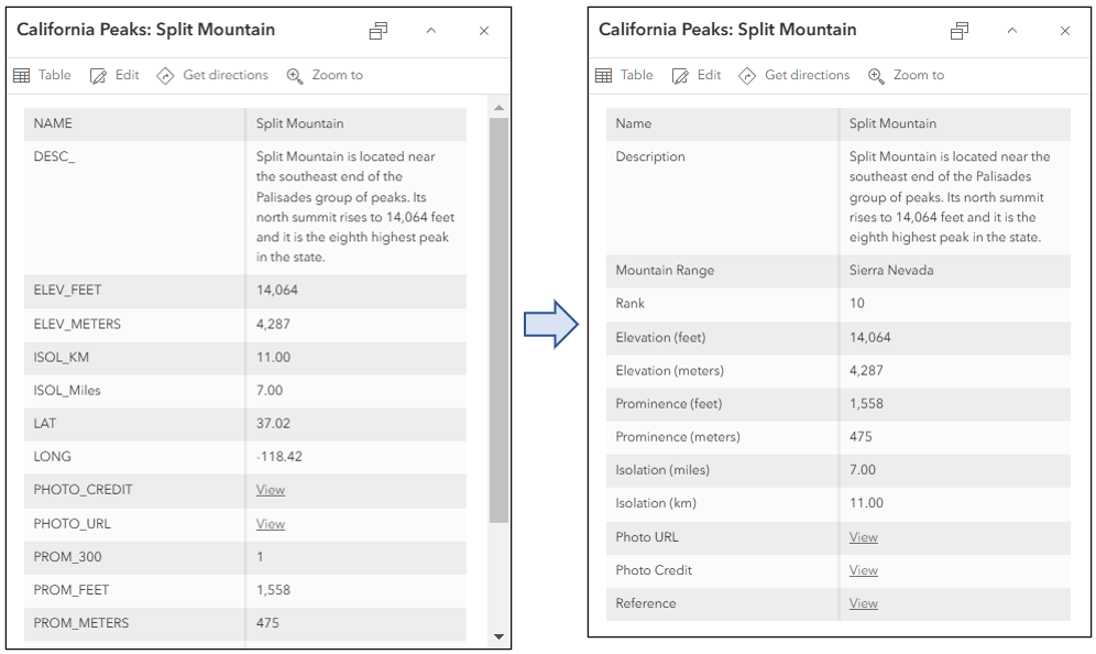
It’s easy to see the difference between an unconfigured pop-up and one that is well-crafted. The default pop-up appearance for a layer is a plain list of attributes with default field names. As a map or layer owner, you can reconfigure the pop-ups to define the list of visible and hidden fields, create field aliases, format numbers and dates, add charts and images, and choose how information for features in your map is best presented.
Rather than display the default unconfigured list of attributes, you can provide a rich information display by providing custom-formatted text and charts. With additional configuration capabilities, such as using Arcade expressions, HTML, or data from related tables, you can do even more. For an overview, see Configure pop-ups.
Compare the two examples below. Which delivers the more meaningful and engaging experience?
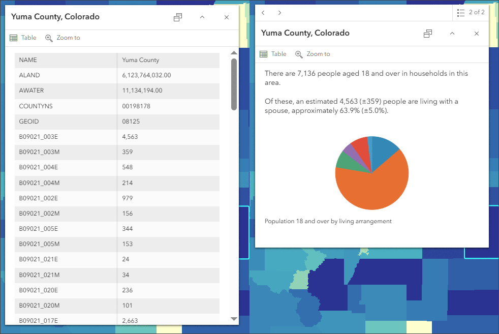
For the rest of this blog tutorial, you can follow along using the California Fourteeners sample map, which displays a variety different pop-up configurations. The map is described in more detail in the Pop-up examples map section.
Configure fields
The first step to creating a better pop-up is to configure the attribute fields. Follow these steps:
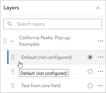
Step 1 — In the Layers pane, select the layer whose fields you want to configure.
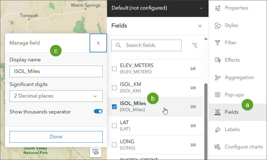
Step 2 — Configure the Display name, and if numeric, the use of commas and decimal places.
a – Click Fields in the Settings (light) toolbar.
b – Click the field you want to configure.
c – Edit the display name (alias) and, if numeric, the use of commas and decimal places. Click Done when finished.
Pop-up title
The pop-up title appears at the top of the pop-up. It can be blank, display text, fields, or a combination of text and fields. Follow these steps to configure a title:
Step 1 — Click Pop-ups from the Settings (light) toolbar. Ensure that Enable pop-ups is toggled on.
Step 2 — Click Title to expand the panel.
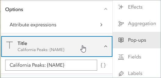
Step 3 — Configure the title.
Click the field drop-down { } to add field values. The field name appears within the curly braces – {field_name} – and the contents will be populated by the value for the specific feature that is clicked.
Here are a few examples:
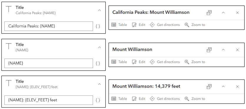
You can also use HTML to format the title. For example, using the markup shown below, the font, size, and color of the title will be changed.
<font face=’verdana’><font size=’4′><font color=’0066cc’>{NAME}

Pop-up content
Pop-up content fills the main part of the pop-up window. Click Add content to display a list of pop-up elements.
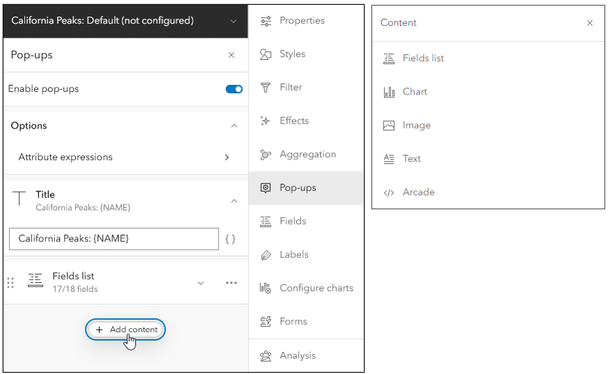
The unique pop-up elements are:
Fields list — A list of fields is displayed by default for each feature layer you add to the map. The fields can be configured as described in the Configure fields section above. In the Field list, you can also choose which fields to display and can rearrange fields.
Chart — Add charts to graphically display the values of numeric attribute fields. You can add bar charts, line charts, and pie charts.
Image — You can include images in pop-ups by providing a URL to an image (PNG, JPEG, or GIF format). The URL may also come from a field. The images can include a title, caption, links to related websites or larger images, and alternative text. Tips: If you want the image to fill the full horizontal pane dimensions of the pop-up, use a width of 400px or greater. Always optimize the image for web use by reducing size.
Text — Include descriptive text. The typography and colors can be changed. Fields and links can be used in conjunction with plain text. HTML can also be added.
Arcade — Arcade is an expression language in ArcGIS. In pop-ups, it can be used in two ways. The first way is to create expressions which can be treated like fields in text. Expressions are very useful to evaluate, format, and deliver information that can be embedded into the pop-up. Arcade is also a unique content element. As a unique content element it can return a complete section in a pop-up, such as a a chart, HTML, or text that has been completely formatted via Arcade.
Attachments — When a feature layer includes attachments in its data, the attachments are added to the layer’s pop-up. You can show the attachments as a list or in a gallery. You can also remove attachments from the pop-up. Clicking attachments in a pop-up opens the attachment in a new browser tab.
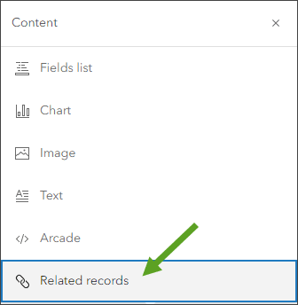
Related records — Some layers may contain preestablished relationships to other tables or layers through a common field. If your layers have relationships, they are detected automatically and you can configure pop-ups to display the related records. An additional option to configure related records will appear at the bottom of the pop-up content elements. For more information, see Show related records.
Save a layer pop-up configuration
When you configure layer pop-ups in Map Viewer, the configurations will be saved with the map. If you have appropriate privileges you can override and modify existing pop-up configurations and save them in a new map.
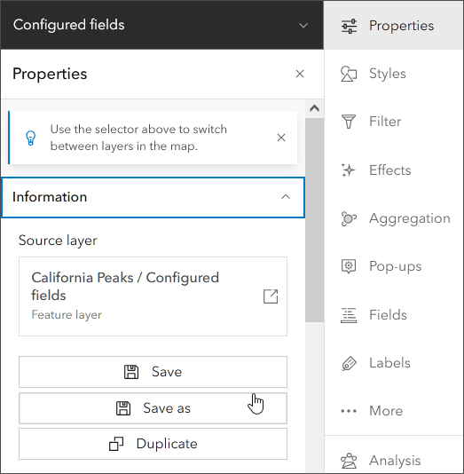
To make your feature layer configurations available for use in other maps, you can save the layer as an item in My Content. If you make changes to the properties of an existing feature layer and want to save your changes without modifying the source layer properties, you can save the layer as a new item. For more information, see Save and duplicate layers. Options are:
- Save — Saves changes to an existing layer item. This option is available when you own the layer item or have privileges to edit it.
- Save as — Creates a new item in My content from a layer in the map. The new item stores the layer properties and becomes the source for the layer in the map.
- Duplicate — Creates a new layer in the map from an existing layer in the map. The duplicate layer references the data in the source layer.
To Save the layer, or Save as a new layer item, click Properties from the Settings (light) toolbar and open the Information pane.
Configured pop-ups will display across apps such as ArcGIS Instant Apps, ArcGIS StoryMaps, ArcGIS Dashboards, and so on. Note that older apps will show a slightly different pop-up.
Pop-up examples map
You can view the examples outlined in this blog article using the pop-up examples map. Once you open the map, click Sign In to save the map to your Content. You can also follow along without signing in.
Each pop-up example is represented by a unique layer that is contained in California Peaks: Pop-up Examples, an exclusive visibility group layer that allows only one layer at a time to be visible.
Each layer name describes how the pop-up has been configured. Open the Layers pane from the Contents (dark) toolbar and open the California Peaks: Pop-up Example group layer. To view the pop-up, toggle the layer visibility on.
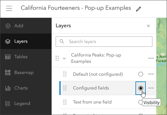
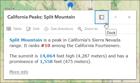
Then click a feature in the map to view the configured pop-up.
Tip: Click the Dock button to dock the pop-up and view more of its content.
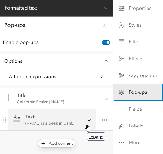
To see how the pop-up is configured, select the layer in the Layers pane and click Pop-ups in the Settings (light) toolbar. Click to expand the content elements to see how it has been configured. Note that some layers use multiple pop-up elements.
Explore the examples
The following is a description of each layer in the pop-up examples map and how it has been configured.
Default (not configured)
The default pop-up appearance for a layer is a plain list of attributes, with attribute field names “as-is” from the source and default formatting for numbers. This is the default pop-up from the California Peaks: Default (not configured) layer.
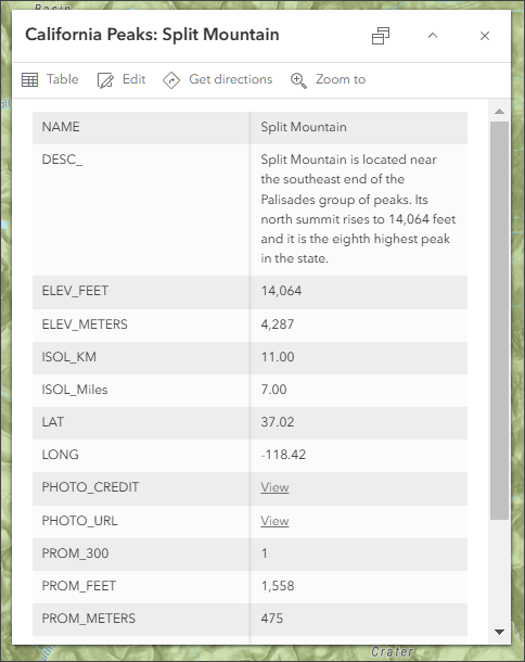
A few simple changes can be made to improve the information display. For example, some fields are not needed and can be hidden, such as LAT and LONG. Field aliases can be used to change all caps to mixed case for better readability. Field display names (aliases) can be used to make them more understandable, for example changing DESC_ to Description. In addition, numeric displays can be formatted to remove or include commas and specify decimal places.
Some fields, such as PHOTO_URL, PHOTO_CREDIT, and REF, contain links that can be used to further enhance the pop-up.

Configured fields
The California Peaks: Configured fields layer takes the next step. Using configurations applied in the Fields pane, display names have been changed and numeric displays have been configured.

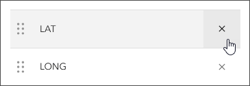
In the pop-up fields list element, you can remove fields (such as LAT and LONG) by clicking the x to the right of the field.
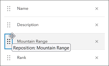
Fields can also be reordered to provide better organization, grab the field handle on the left and drag and drop it into a new position.
Compare the unconfigured (shown on left) and configured (shown on right) field list element. With a few simple changes the pop-up has been improved significantly.
Text from one field
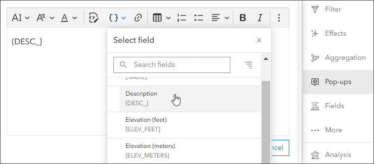
The Description field contains descriptive text for the peak. The California Peaks: Text from one field layer pop-up uses the {DESC_} field in the Text media box.

To select the field, open the text editor and open the Fields list tool or begin by typing { (open curly brace). Choose Description from the drop-down list of fields.
Formatted text
The California Peaks: Formatted text layer uses a text element that combines fields and text with colors and typography (changed from the default to 14 pt. Verdana). A More info… link has also been added using the URL from the REF field.

Text and photo
California Peaks: Text + photo uses the same text element as above and adds an image element from a URL stored in the {PHOTO_URL} field. If you want the image to completely fill the width of the available pop-up space, use an image that is 400 px wide or wider.
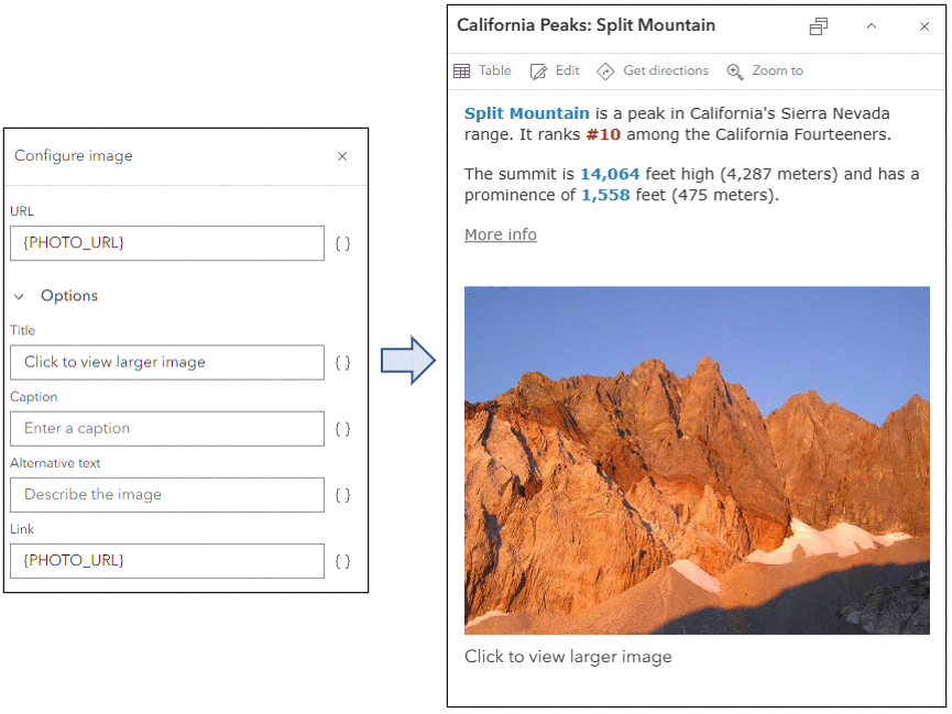
Tip: While the image will be fitted within the pop-up, it’s always best to reduce the physical size of the image to optimize display performance. Create a reduced size photo for use in the pop-up and link to a larger version of the photo if needed.
Text and video
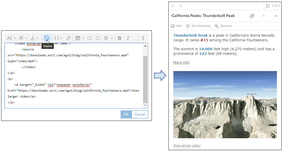
California Peaks: Text + video layer is similar to the layer above it, but replaces the photo with an auto-play video. The video can be added via the HTML Source button in the editor.
Videos are supported using the HTML5 <video> tag and associated elements. For more information, see W3Schools HTML Video.
Text, photo, and chart
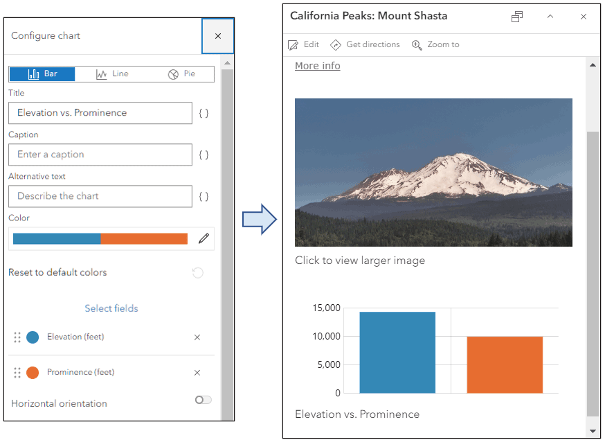
California Peaks: Text, photo, chart builds upon the layer above and adds a chart element that compares the peak elevation to prominence, a measure of the height of a mountain relative to the lowest contour line encircling it but containing no higher summit within it.
When adding a chart, choose the desired fields and, depending on the data, how to display the values; as a bar, line, or pie chart.
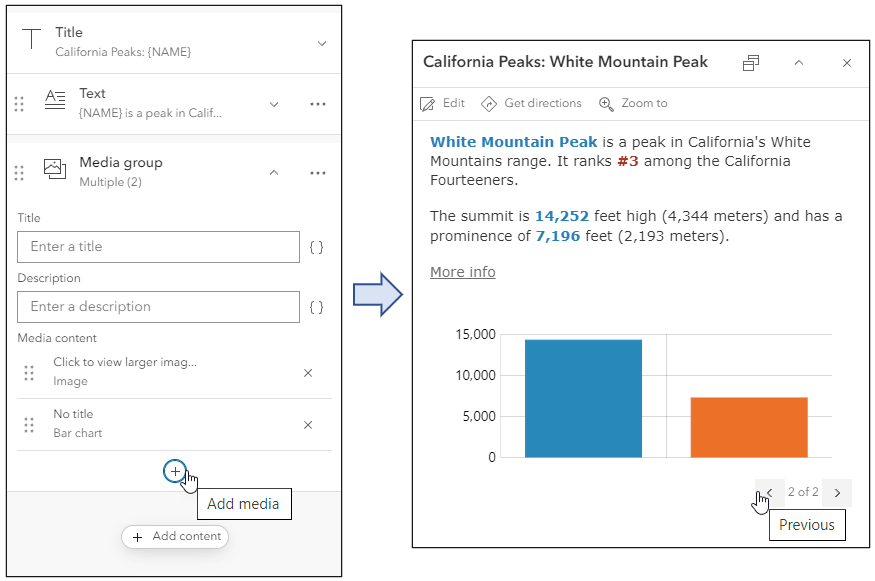
Charts and images are both media elements. You can add multiple media elements within an image or chart element to create a media group. This results in a horizontal, rather than vertical, pop-up experience that can be navigated using left and right arrows which appear on either side of the chart or image.
HTML
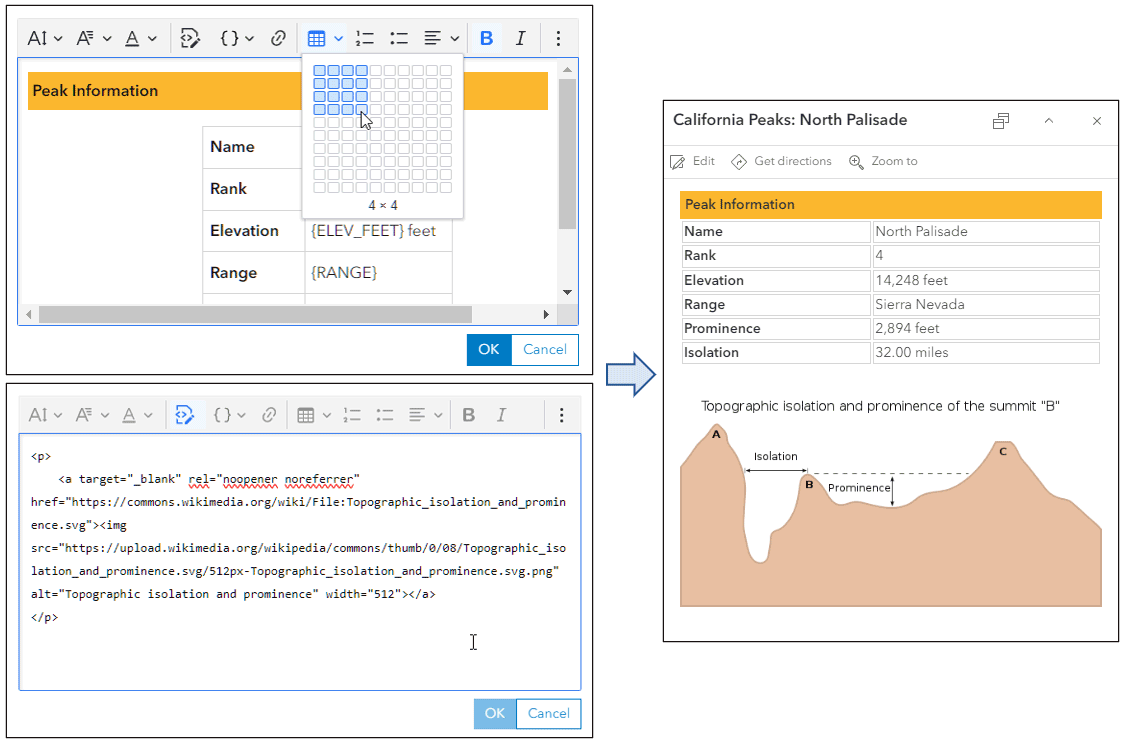
California Peaks: HTML uses two text elements using Hypertext Markup Language (HTML) to create a table and add a graphic with links to the attribution.
The topmost text elements uses the Insert table tool to begin creating a table, though it is finished using the HTML source editor. The second text element uses the Source tool to enter the HTML.
Arcade expressions
Arcade is an expression language that is supported across ArcGIS. It can be used to perform calculations, manipulate text, and evaluate logical statements.
In pop-ups, Arcade is used in two ways; to create expressions in text elements that can be evaluated like fields, or as separate elements that return a block of content.
California Peaks: Text + Arcade expression uses a single expression ({expression/expr0}) to return a string describing the ranking of the prominence.

To create, edit, or view expressions, click Manage expressions, then click the expression or click Add expression.
For more information, see Pop-ups: Arcade essentials.
Attachments
Attachments are files or images that are included in feature layers. Attachments are typically photos captured using ArcGIS Field Maps, ArcGIS Survey123, ArcGIS QuickCapture, and others, but photos and other documents can also be added using the Map Viewer and ArcGIS Pro. Attachments differ from links in that the documents are stored within the feature itself.
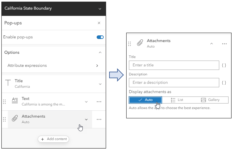
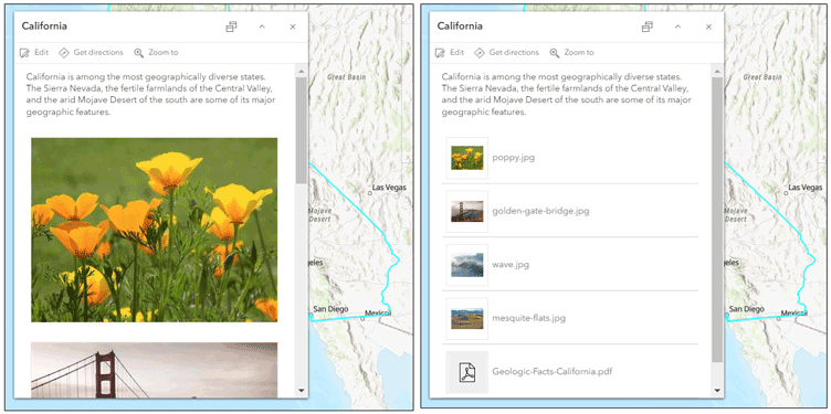
The California State Boundary: Attachments layer has several attachments: three photos and a PDF file. When a layer has attachments the Attachments element will automatically be available in the Pop-ups configuration pane. Attachment element configurations include title, description, and options for display.
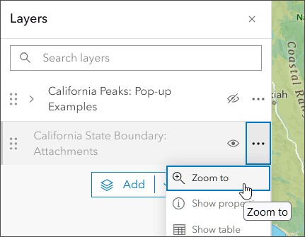
The layer is styled so that it is only visible when zoomed out to the state. Toggle the layer visibility on then click options (…) to select Zoom to.
Click within the state boundary to display the attachments. The default attachment display option is Auto which enables the app to display the attachments in the best way, but the attachment display can also be configured as a list.
Pop-ups in apps
Once a pop-up has been configured, it is used across all apps and devices. For example, the pop-up configured with HTML in the example above is shown below in a story created using ArcGIS StoryMaps.
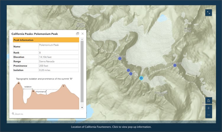
Tip: Though the essential pop-up configuration persists across apps and devices, note that some configurable apps and app builders will display pop-up contents slightly differently. If your goal is to craft a map for a specific app or device, for best results test your configuration in the app and make adjustments in the layer pop-up configuration accordingly.
More information
For more information, see:
- View pop-ups (Help)
- Configure pop-ups (Help)
Blog articles in this series
- Pop-ups: the essentials (Blog)
- Pop-ups: text element essentials (Blog)
- Pop-ups: chart element essentials (Blog)
- Pop-ups: tips for adding photos (Blog)
- Pop-ups: use color in text elements (Blog)
- Pop-ups: Arcade essentials (Blog)
Other resources


Commenting is not enabled for this article.