ArcGIS Online lets you better understand the world around you by connecting people, locations, and data using interactive maps. Work with smart, data-driven styles and intuitive analysis tools that deliver location intelligence. Make maps and apps to share your insights with your organization or to the world. ArcGIS Online can be used as complete, cloud-based solution, or use it to extend and complement the capabilities of ArcGIS Pro and ArcGIS Enterprise.
Don’t have an ArcGIS account? See Create an ArcGIS Account.
September 2020 release
ArcGIS Online is updated regularly. This release adds many new features and enhancements including new home page customization capabilities, improvements to Map Viewer Beta, a redesigned organization profile experience, and more.
Other related products are released on independent timeframes, but are part of the online ecosystem. This article also summarizes related product development that has occurred since the June 2020 ArcGIS Online release. For additional details, see the What’s new help topic or view all posts related to this release.
Quick links
Use the links below to jump to topics of interest.
ArcGIS Online
Core and featured products
- ArcGIS Living Atlas of the World
- Esri Maps for Public Policy
- ArcGIS Hub
- ArcGIS StoryMaps
- ArcGIS Velocity
- ArcGIS Business Analyst Web and Mobile
App builders
Apps for field operations
Other apps and information
- ArcGIS Maps for Microsoft Power BI
- ArcGIS Insights
- ArcGIS Maps for Adobe Creative Cloud
- ArcGIS Earth
- Learn ArcGIS
- More information

Featured in this release
Administration
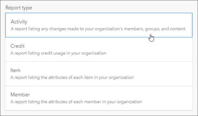
Default administrators can now create two new types of detailed reports: activity reports and credit reports. These asynchronous reports can be exported for further analysis, and are saved as items in your organization for future reference.
Administrators can add a custom GeoEnrichment service to the organization. The content being served by the custom GeoEnrichment service can include ArcGIS Business Analyst Enterprise data or a custom dataset published to a federated server in your ArcGIS Enterprise deployment. Using a custom GeoEnrichment service can help focus analysis performed by the organization on particular subjects or variables.

Home page improvements
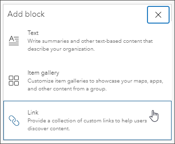
When configuring the home page, organization administrators can now include link blocks to help members and visitors discover more content. In addition, the number of content blocks—text, galleries, and links—you can include in the home page body has increased to 15 and is no longer limited to block type.
Using new page visibility settings, organizations can specify navigation bar access (tab visibility) for the main website pages. These tabs are seen across the top of the organization home page: Gallery, Map, Scene, and Groups.

Home is always visible to everyone, Content is always visible to members, and member roles determine Organization and Notebook visibility.
These new settings enable administrators to provide a more customized experience for visitors. For example, administrators can make the Groups tab visible for organization members only, or for everyone who visits the site. For more information, see Navigation bar or De-clutter your organization’s navigation bar.

ArcGIS Configurable apps
Configurable apps are template applications that you can configure easily, without any coding. They help you publish apps quickly to support a variety of users and workflows. Configurable apps are the fastest and easiest way to go from a map to a shareable app.
A new configuration experience is available for the Media Map template in ArcGIS Configurable Apps. Build your Media Map app using the express setup or configure it using the full setup, and see your changes as you make them. Express setup makes it easy and fast to deliver a fully configured app with any map. Media Map now joins other apps using the new experience: Attachment Viewer, Interactive Legend, Minimalist, Nearby, and Zone Lookup.
The new configuration experience has been improved with new capabilities. You can now use search to quickly find settings and tools available in the app. Other highlights include a new position manager to customize your app layout, the ability to define the navigation extent of your map within the app, and a screenshot widget that captures a screen shot of your app for the item thumbnail.
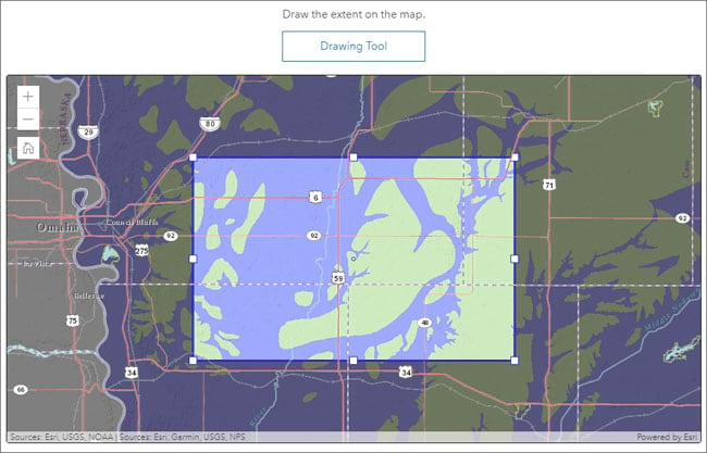
In addition, Category Gallery, one of the configurable apps for groups, now allows you to open the gallery to a specific category or subcategory via the URL. This enhancement makes it easy to share content of specific interest with others.
For more information, see What’s new in Configurable Apps.

Data Management
When sharing an editable hosted feature layer or feature layer view with the public, you must now turn on a new setting to designate the layer for public data collection. The setting is available in the item’s Settings tab.
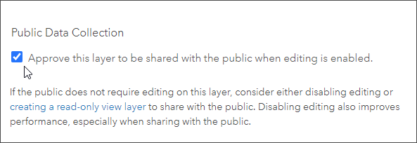
When you enable editing on a layer that is shared with everyone—for example, in a crowdsourcing or public polling app—anyone with access to the layer, including people who find the layer in an app or through a generic search, can edit it. The new setting prevents editable layers from being unintentionally shared with the public, which can result in data loss and data integrity concerns.

Sharing and collaboration
You can now share items in bulk with a group you own or manage by adding them directly from the group page. Use the search, filters, and sort options to find items to share, check multiple items, then share into your group.

Other enhancements
Map Viewer Beta
Map Viewer Beta is the next generation map authoring app for ArcGIS Online and ArcGIS Enterprise. It’s designed to inspire experimentation and creativity while providing an enhanced experience for map authoring workflows.
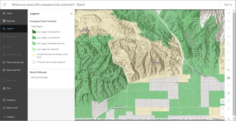
With this update to Map Viewer Beta, several enhancements have been added including the following:
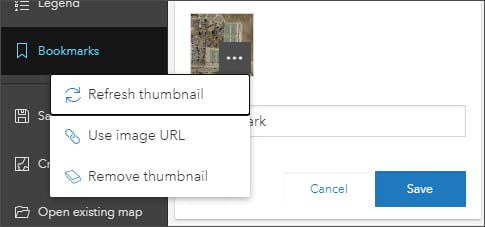
Bookmarks can now be customized to include the map rotation. Thumbnails can be added to bookmarks generated from the map, or a custom thumbnail can be added via its URL.
ArcGIS Server services can be added from a URL. Feature services and tiled map services are supported in the current release, with additional layer types planned for future updates.
Standalone tables are now supported.
You can configure time animation for time-enabled layers.

Spatial analysis
The Enrich Layer tool delivers demographic and landscape data for the people, places, and businesses associated with your point, line, or area data locations. You can now use a custom GeoEnrichment service when you run the tool.

Enriching your data using a custom GeoEnrichment service does not consume credits, unless a travel mode is specified to define the enrichment area. In that case, credits will be consumed by Esri Service Areas.

3D visualization
You can now apply patterns to polygons in Scene Viewer. Choose a color and pattern style for all the polygons or visualize polygons with different patterns based on attributes.
Point scene layers load and display up to two times faster by converting them to I3S version 1.7 This allows you to render scenes with large numbers of points more efficiently, such as when visualizing thousands of trees in a rural area.

ArcGIS Living Atlas of the World
ArcGIS Living Atlas of the World is the foremost collection of geographic information from around the globe. It includes curated maps, apps, and data layers from Esri and the global GIS user community that support your work. Visit the ArcGIS Living Atlas of the World website where you can browse content, view the blog, and learn how you can contribute. Here’s what’s new, been recently released, or is coming soon.

ArcGIS Living Atlas apps
Content from ArcGIS Living Atlas of the World is used to make valuable apps for visualization and analysis. These apps can be found under the apps tab at the Living Atlas website.
CovidPulse
CovidPulse visualizes the rates of COVID-19 cases and deaths in the United States as compact trend lines that are updated daily. CovidPulse shows the trends of the epidemic for all 50 states (including the District of Columbia) and all 3,000+ counties.
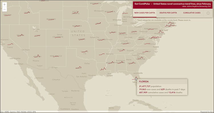
CovidPulse provides three day-over-day trend visualization options: new cases per capita, deaths per capita, and cumulative cases. The trend lines reach back to February, just before confirmed cases of SARS-CoV-2 began appearing in the United States (though the spread had already begun).
For more information, see CovidPulse and A tour of CovidPulse and its inception.

Wildfire Public Information Map
The Wildfire Public Information Map has been updated. The application is hosted by the Esri Disaster Response Program and uses Living Atlas live feeds to provide current wildfire incidents and perimeters, along with satellite (MODIS and VIIRS) thermal hotspot locations, smoke forecast, and weather watches and warnings.
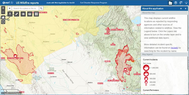
For more information, see New wildfire and weather map for public information or visit the Disaster Response Program website.

Air Quality Aware
Air Quality Aware is the latest in a series of easy-to-use apps that simplify access to environmental and demographic information. Air Quality Aware is intended to provide information about the current air quality conditions in the United States, along with the potential human health impacts.
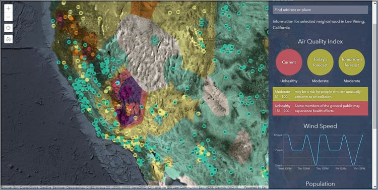
For more information, see Access the latest air quality and human impact information with Air Quality Aware. Check out other Living Atlas apps under the apps tab on the Living Atlas website.

ArcGIS Living Atlas Indicators of the Planet (Beta)
ArcGIS Living Atlas Indicators of the Planet is a new addition to the Living Atlas, and a one-stop destination where you can learn about various global indicators and see the current status and conditions. The app showcases authoritative information via geocards for 18 themes of interest for tracking the state of the planet.
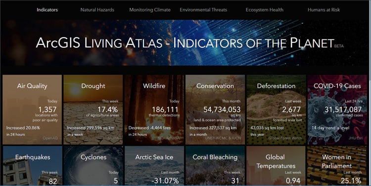
Each card presents information about a specific topic and displays the current status. Each topic includes customized pages that contain additional information and apps that leverage existing Living Atlas live feeds content, automatically updating at various intervals. For example, Conservation content is updated monthly, drought is updated weekly, and air quality and wildfire daily or hourly.
For more information, see Introducing ArcGIS Living Atlas Indicators of the Planet (Beta) and Live Feeds powering updates of ArcGIS Living Atlas Indicators of the Planet.

Basemaps
Esri basemaps are updated regularly with data from commercial, open, and community sources. The following summarizes recent changes and additions.
All vector basemaps have been updated using data from Here, SafeGraph Places, and content contributed to the Community Maps Program.
An updated World Topographic vector basemap including contours is now in beta. This web map provides a detailed vector basemap for the world featuring a classic Esri topographic map style with contours and includes World Hillshade. The vector map and layer requires the use of Map Viewer Beta to view contours. Contours have also been incorporated into the tile layer version which does not require Map Viewer Beta.

For more information, see Topographic (with Contours) Multisource vector tile layers.

In order to focus on vector tile basemaps moving forward as the primary version of basemaps available to users in webmaps and apps, in July 2020 several raster basemaps have entered Mature Support:
- Arctic Ocean Reference
- DeLorme World Base Map
- World Ocean Reference
Additional basemaps will be entering Mature Support in July 2021. For more information, see Esri’s hosted raster basemap services moving to Mature Support. Also see Esri Product Life Cycle Policy (PDF).

Imagery
World Imagery content is continually updated, with many improvements and enhancements.
NAIP 2019, high-resolution aerial photography from the National Agriculture Imagery Program, will soon be available through the Living Atlas NAIP Image Service.
Time enabled MODIS and VIIRS imagery visualization layers, sourced by NASA GIBS, are available in Living Atlas. MODIS is not new to Living Atlas, but the VIIRS layers are.
Use the World Imagery Publication Summary app to stay current with content updates.

Environment
A new USA Wildfire Hazard Potential with Demographics layer is now available, enabling you to explore areas where people and their communities are at risk from wildfire. This new feature layer contains wildfire hazard potential (WHP) statistics for the conterminous United States based on the USDA Forest Service, Fire Modeling Institute’s wildfire hazard potential analysis. Wildfire hazard potential provides information on the relative potential for a wildfire that would be difficult for fire crews to contain.
The data has been aggregated into seven levels allowing the display of WHP in a variety of familiar ways: by state, congressional district, county, ZIP code, tract, block group, and 50 km hex bins. Demographic attributes were added to the dataset to let you visualize where people live that also have high wildfire potential.

For more information, see Wildfire Hazard Potential Enriched with Demographics now in ArcGIS Living Atlas. You can also view a map gallery and group containing maps using the layer.

Collecting consistent information on when a fire starts, the cause, and how large of an area they impact can be difficult as many different agencies (local, state, federal) are involved in responding. Using Landsat’s 40+ year archive of satellite observations of burn scars, the USA Fire Burned Areas 1984-2018 layer is able to consistently assess and document the effects of fire at a national scale. Currently showing 1984-2018, the layer will be updated annually from USGS and USFS.


A new collection of global air quality content, including layers, maps, and story maps, has been added to the Living Atlas. These help you explore and learn more about how global air quality patterns have changed over time and how poor air quality impacts human populations.
Global Particulate Matter (PM) 2.5 between 1998-2016 shows particulate matter concentrations aggregated from NASA Socioeconomic Data and Applications Center (SEDAC) gridded data into country boundaries, administrative 1 boundaries, and 50 km hex bins.

At each geography level you can learn more about trends, statistical patterns, and the human impacts of air quality at global, regional, and local levels. A series of map have been authored answering questions such as:
- How many people are impacted by poor air quality globally?
- How many people have died from air pollution causes?
- What is the global trend in air quality between 1998 and 2016?
- What is the population weighted impact of air quality globally?
- Where are there hot spots of poor air quality globally?
- Where do people live in comparison to air quality patterns?
- Which year had the worst air quality?
For more information, see:

Recent Conditions in Air Quality (PM2.5) shows the latest values for global air quality (PM2.5) from ground-based monitoring stations. The source is the OpenAQ community which reports measured concentrations on a global scale by aggregating station data from national networks of air quality.
Activities such as driving, burning coal for electricity, wildfires, running factories, and even cooking and cleaning release particles into the air. Small particles of 2.5 micrometers or less (PM2.5) are an irritant and health hazard since they can get deep into the respiratory system and damage tissue.

The layer is updated every hour using the Aggregated Live Feed (ALF) methodology. It shows the latest PM2.5 value of the stations in the OpenAQ data set with at least one value reported in the past 30 days.

A series of layers and maps are available in Living Atlas that provide the Standardized Precipitation Index (SPI) for the latest 1, 3, 6, 9, and 12-month periods, along with 40 years of past measurements.

The Standardized Precipitation Index (SPI) is used to analyze meteorological droughts. Droughts occur when areas go for prolonged periods of time with lower than normal precipitation. One way to estimate drought intensity is to use the SPI, which classifies how much rain has fallen in an area compared to normal.

A new Wildfire and Weather Information map has been published, improving situational awareness around wildland fires. It has been pre-configured to be used as-is. The intention was to provide a clear and readable map for both fire staff or citizens in or near wildfire areas.

For more information, see New Wildfire and Weather Map for Public Information.

GOES Satellite Imagery Colorized Transparent Background is a new tile layer from NOAA. The layer updates every 10 minutes with near-global coverage from three satellites. Cloud top temperatures are colorized to reveal areas of intensity and lower levels are transparent, allowing underlying data to show through.


The Half-Earth Project continues to contribute new layers to Living Atlas that show areas deserving of conservation efforts. Their latest layer shows the intersection of species richness and species rarity. For more layers, maps, and apps, view the Half-Earth content in the Living Atlas.

World Elevation
Living Atlas provides foundation elevation layers and tools to support analysis and visualization across the ArcGIS platform. These layers are updated quarterly with high-resolution elevation data from various sources and the Community Maps Program. Recent updates include the following:
World Elevation dynamic image service layers (Terrain and TopoBathy ) are updated with Natural Resources Canada’s HRDEM 1 m, Värnamo Kommun’s (Sweden) 0.5 m and IGN Spain 2m. TopoBathy was updated with GEBCO_2019 15 arc sec (~ 464 meters) global dataset, which enhanced the bathy resolution twice.

These layers are suitable for analysis and visualization. See High resolution data updates to Living Atlas World Elevation Layers (July 2020) for more information.
World Elevation tiled layers (World Hillshade, World Hillshade (Dark), Terrain 3D and TopoBathy 3D) are enhanced with high resolution elevation datasets from USGS 3D Elevation Program (3DEP) 1 m, 3DEP Alaska 5m, Australia 1m (South East region) from Geoscience Australia and Moreton Bay regional council.

Other Living Atlas content additions
California Fire Perimeters have been updated to include 2019 perimeters. This layer now contains fire perimeters from 2019 and dating back to 1878 for California.

Perimeters are sourced yearly from the Fire and Resource Assessment Program (FRAP) and are updated shortly after the end of each calendar year. For more information see Historical California wildfire perimeters in Living Atlas.

The Home Owners’ Loan Corporation (HOLC) was created in the New Deal Era and trained many home appraisers in the 1930s. The HOLC created a neighborhood ranking system known today as redlining. Local real estate developers and appraisers in over 200 cities assigned grades to residential neighborhoods. These neighborhood ratings set the rules for decades of real estate practices.
A redlining layer of 143 cities is now available in ArcGIS Living Atlas. This ready-to-use layer of historical redlining data can be used to help understand how historical inequities continue to contribute to inequities today.

For more information, see Historical redlining data now in ArcGIS Living Atlas.

Support for new content types has been added to the ArcGIS Living Atlas. These are: Deep learning packages (.dlpk), Raster function templates (.rft), Web Experience, and Web Experience Templates.

Community Maps
The Community Maps Editor is a free web app that enables you to edit parts of the Esri Community Maps basemap to add detailed features for universities, schools, parks, landmarks, and other special areas of interest. The app has grown in popularity with over 1,400 editors worldwide who have added over 160,000 features which are incorporated int Living Atlas basemaps.

To use the app, join the Community Maps Editor group. For questions and more information, or to request a demonstration of the app, contact the Community Maps team via email to communitymaps@esri.com.

Living Atlas maps in a minute
Maps in a minute is a series of quick tutorials which show how you can use ArcGIS Online and ArcGIS Living Atlas to make maps of timely events in a minute, often less. The tutorials use a stepwise approach to guide anyone through creating simple and informative maps using Living Atlas live feeds content. For more information, see the maps in a minute series at the ArcGIS blog.

Esri Maps for Public Policy
Policy maps clearly show where there is an opportunity to intervene. Esri Maps for Public Policy provides you instant access to useful maps that illuminate areas where your work can make a difference. Free to the public to view and use, these policy maps give your team a head start understanding the people, organizations and issues in your community.
Use the Policy Maps web app to browse focused, useful maps on specific topics about your community. Use the app to view maps and click Collect to add a map to your collection. Then share your collection of maps with anyone via email or social media, so they see the exact maps you want them to see.
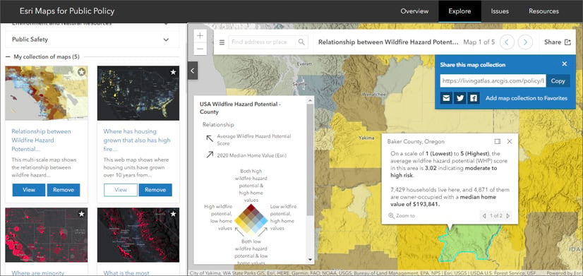
Esri Maps for Public Policy is continually updated and now includes maps crafted from the latest data, including U.S. Census Bureau’s American Community Survey (ACS) and U.S. Bureau of Labor Statics (BLS). Esri Maps for Public Policy includes environmental topics, such as wildfire risk, air quality and solar potential summarized by state, county, congressional district and other useful geographic boundaries.
Some collections you can explore and share:
- Wildfire risk to population
- Unemployment
- Air quality and demographics
- Race and ethnicity maps for your community
- COVID-19 trends
These collections are only a sample of the available policy maps. To learn more, and explore and create your own collections, visit Esri Maps for Public Policy.

ArcGIS Hub
ArcGIS Hub is a cloud-based engagement platform that helps organizations work more effectively with their communities. It is available at two license levels: Basic and Premium. ArcGIS Hub Basic is included with ArcGIS Online and delivers data sharing and site creation capabilities. ArcGIS Hub Premium includes additional capabilities for deeper level engagement working with teams of people, including members of the community at-large. With ArcGIS Hub Premium you can also share events, create supporting teams, and use the template builder to create templates of your sites, apps, and other content.
The following new features were released between June and September of this year.
You can now try out site changes before publishing them. Any changes you make to a site or page, including updates to its layout, settings, and theme, can be saved as a draft. Draft changes can be shared with stakeholders via a link for approval before changes are published and made live.
New group-based row visibility options let you control which rows of content appear for different audiences who visit your sites. This feature provides new and powerful flexibility as one site can serve many audiences—share something with everyone, or keep content private and share it only to your core team, or to a supporting team.
Use Hub settings to provide your own logo to greet visitors when they sign in to access content on your site. You can also add custom terms and conditions by configuring your hub’s sign in experience.
Improved gallery cards now float as site visitors hover over them. You can opt to remove Explore buttons to streamline the look of your gallery.
Expanded content metadata editing lets you edit more of an item’s metadata in ArcGIS Hub (such as adding a thumbnail image, setting tags and categories, and populating descriptive information) without needing to leave Hub and go into ArcGIS Online.
A new download experience that includes alerts on download progress and new download version options has also been added.
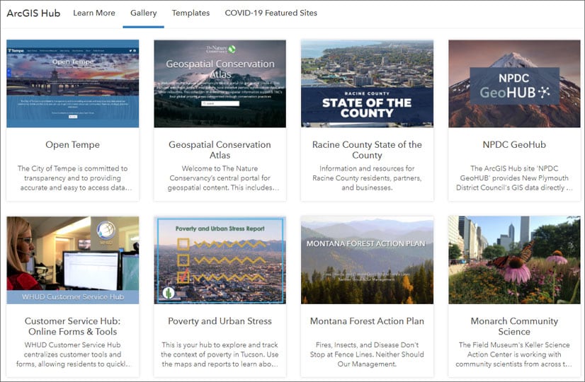
For more information, see the new ArcGIS Hub resources site for links to blogs, lessons, videos, webinars and more. You can also find inspiration and see recent examples in the ArcGIS Hub gallery.

ArcGIS StoryMaps
ArcGIS StoryMaps make it easy to create inspiring, immersive stories by combining text, interactive maps, and other multimedia content. Publish and share your story with your organization, or with everyone around the world. ArcGIS StoryMaps continues to evolve with improvements to enhance your experience when telling stories with maps. The following new features and capabilities have been recently added.
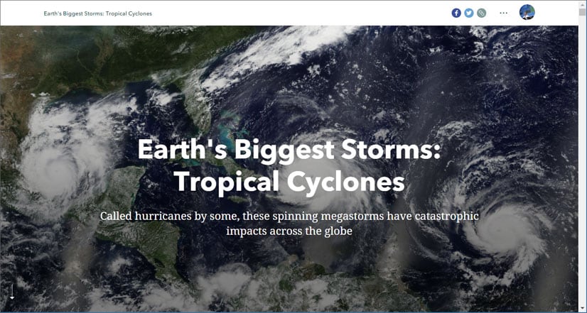
Customize your story to make it stand out from the rest. Change colors, fonts, and styles using the new theme builder for exceptional stories that match your organization’s branding. For more information, see Tips on using the new ArcGIS StoryMaps theme builder.
Inspired by the classic Story Map Shortlist template, a new explorer tour has been introduced . It provides a way for readers to browse larger sets of places in a grid or list layout. For more information, see Explorer tour has been added to StoryMaps.
Many people create and work on stories with a group. Now, authors will receive a simultaneous editor warning which prevents someone from saving over others’ work. People in groups with update capabilities can now duplicate stories and collections which saves everyone time and works well for templates that keep your organization on brand.
Swipe has been enhanced to work not only with maps, but also with images, offering an interactive way to compare before and after images.
Attribution is now available for cover images and images in immersive media panels.
You can now automatically add tour points to a map using geotagged photos. Simply upload geotagged photos from your field work, vacation, or other events to place them on your map.
To gauge a story’s impact, you can now add Google Analytics to see which maps your audience interacts with, which links they click, readers’ languages, and more.
For more information about these and other improvements, see What’s new in ArcGIS StoryMaps (August 2020) and What’s new in ArcGIS StoryMaps (July 2020), or visit ArcGIS StoryMaps. For information on the latest updates, see What’s new in ArcGIS StoryMaps (September 2020).

ArcGIS Story Maps competition
The 2020 ArcGIS StoryMaps Competition for Sustainable Development Goals is now open. Esri and the United Nations Sustainable Development Solutions Network (SDSN) are teaming up to solve global challenges through GIS and storytelling. Simply create an original story that addresses one or more of the Sustainable Development Goals (SDGs) and submit it by November 25th for a chance to be featured at the 2021 Esri User Conference. For more details about the competition, visit the 2020 StoryMaps Competition website.

ArcGIS Velocity
ArcGIS Velocity enables you to easily connect to sources of streaming sensor data, analyze it for incidents and patterns, and take actions and send notifications. Combine powerful out-of-the-box analysis tools into automated workflows whether you are working with data in real-time, in near real-time, or over time.
At this release, the product has been renamed from ArcGIS Analytics for IoT to ArcGIS Velocity to more broadly encompass the capabilities for working with real-time and big data at scale.
The September 2020 release of ArcGIS Velocity contains new features and enhancements including:
- Three license levels, enabling powerful real-time and big data analysis across different tiers of data velocity and volume.
- Feeds now consume significantly less compute for equivalent velocities of processing.
- New real-time analytics tools and capabilities include Calculate Motion Statistics, Detect Incidents, and enter and exit geofencing in Filter by Geometry and Join Features.
- New rendering capabilities for output map image layers and class break rendering now supports over 300+ color ramps.
- Feeds are now automatically displayed in an embedded map widget on the Feed details page so that you can immediately confirm if data is being ingested as expected.
- Output data formats for delimited, Feature JSON, and GeoJSON have been standardized so that datetime representation is consistent across all formats.
- Improvements to app cross-browser functionality, localization, and internationalization.
- Logging improvements for HTTP and feature layer outputs.
ArcGIS Velocity is licensed as an additional subscription on top of ArcGIS Online. For additional details on ArcGIS Velocity, see What is ArcGIS Velocity, the ArcGIS Learn discovery path, and product blogs.
For more information, see What’s new in ArcGIS Velocity.

ArcGIS Business Analyst Web and Mobile Apps
See people and opportunities clearly using ArcGIS Business Analyst. Through desktop, web, and mobile apps, ArcGIS Business Analyst provides location-based intelligence for planning, site selection, and customer segmentation. Combine demographic, lifestyle, and spending data with map-based analytics for accurate reports and dynamic presentations.
The September 2020 release of ArcGIS Business Analyst Web and Mobile includes the following new features and capabilities:
New business search data from SafeGraph is available in Business Analyst Web App. Business Analyst users can now search for businesses or other points of interest and perform workflows using SafeGraph’s USA Places data. SafeGraph features 5.3 million points of data that will allow users to do analyses and export reports and infographics with full business addresses.
Improved sharing options let users share individual layers with their coworkers or organization. Previously, sharing required users to share an entire project. With the September 2020 update, users can select layers within a project to be made visible as hosted feature services in their organization’s Contents folder.
Optimized infographic viewing on phones and tablets streamlines the mobile experience for Business Analyst users. Users view infographics in full-screen mode when their tablet is rotated to landscape. In addition, infographics on phone screens feature a new layout specifically designed for small screens, making viewing easier while maintaining full infographic functionality.
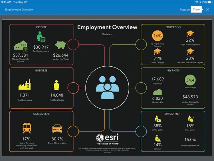
Data updates in the September 2020 release provide new demographic data for Canada (Environics) and Germany (Nexiga), and updated business, shopping center, and traffic locations for USA.
For more information, see ArcGIS Business Analyst resources and What’s New in ArcGIS Business Analyst (September 2020).

App builders
App builders let you easily create custom apps, no coding required. App builders have been updated with the following enhancements.
ArcGIS AppStudio
ArcGIS AppStudio lets you turn your maps into beautiful, consumer-friendly mobile apps ready for Android, iOS, Windows, macOS, and Linux. Share your apps with members of your organization using AppStudio Player, or publish them to all popular app stores. With AppStudio, organizations on the ArcGIS platform can now build cross-platform native apps easily.
In the current 4.3 release, the Map Viewer template includes support for enhanced html popups and Arcade expressions. The Map Viewer template also adds a new sketching tool to quickly draw shapes, arrows, and text on a map. The map sketches are then available to quickly send to others through email, text, chat and other methods supported by your operating system’s sharing capabilities.
Additionally, with this release the ArcGIS Runtime for Qt has been updated to version 100.8, and Android 10 Google Play requirements for secure storage are supported. There are also new samples and updated templates demonstrating both new and improved components.
For more information, see Whats new in AppStudio, visit the AppStudio GeoNet Place, or view the Whats new in AppStudio video.
ArcGIS Web AppBuilder
ArcGIS Web AppBuilder delivers a way for you to easily create web apps that run on any device, using a gallery of ready-to-use-widgets. You can customize the look of your apps with configurable themes and can host your apps online or on your own server.
Two widgets have been improved in ArcGIS Web AppBuilder. When configuring the Business Analyst widget, you can now customize the content for the widget’s home screen and configure export options for infographics. The Threat Analysis widget’s threat type categories now include liquid propane gas (LPG) threats. For more information, see What’s new in ArcGIS Web AppBuilder.

Apps for field operations
ArcGIS apps for field operations help you use the power of location to improve coordination and achieve operational efficiencies in field workforce activities. Reduce or even replace reliance on paper and ensure that both fieldworkers and office staff use the same authoritative data to reduce errors, boost productivity, and save money.
ArcGIS Field Maps (beta)
ArcGIS Field Maps is Esri’s new premier field maps app available on Android and iOS devices. You can use Field Maps to explore the maps you make in ArcGIS, collect and update your authoritative data, and record where you’ve gone, all within a single location-aware application.
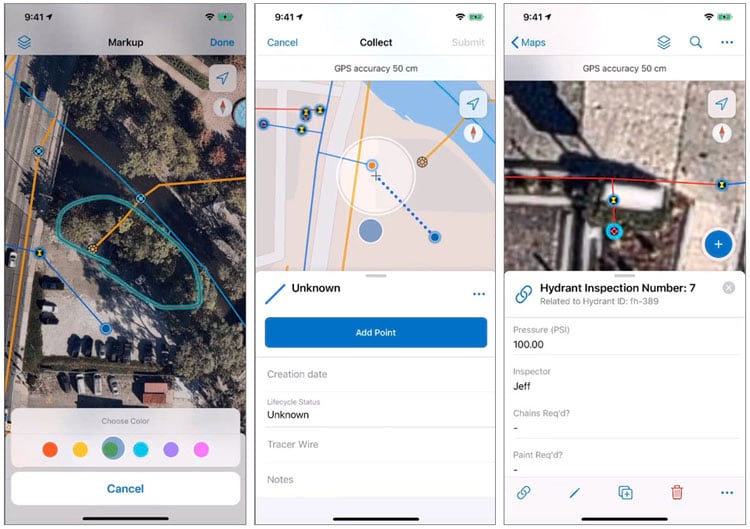
Field Maps will be released in three phases that will ultimately combine the following capabilities into a single app that is easy to use and simple to deploy:
- Simple map viewing and markup
- High accuracy field data collection and inspection
- Battery-optimized location tracking
- Work planning and task management
- Turn-by-turn navigation
Field Maps includes a companion web app that allows you to streamline workflows and deploy maps to the field. The Field Maps web app is now in public beta and available for anyone to access from the app launcher. The web app includes the following capabilities:
- Drag and drop form authoring for data collection
- Enabling web maps for offline use
- Feature template management
- Configuring sharing settings
The first phase of the Field Maps mobile and web apps is in beta and ready for you to try. The mobile app is planned for release the week of October 23rd, and the web app release is planned to coincide with the December update of ArcGIS Online.
Join the early adopter program to access help documentation, ask questions, leave feedback, and learn how ArcGIS Field Maps will transform the way you do field work.
ArcGIS Survey123
ArcGIS Survey123 is a simple and intuitive form-centric data gathering solution that makes creating, sharing, and analyzing surveys possible in just three easy steps.
The upcoming release (version 3.11) improves web accessibility compliance with improved keyboard navigation and compatibility with screen readers. Ranking questions and choice randomization are available in both the web and field app, and choice lists in the field app can be loaded from CSV files. There are many discrete bug fixes and enhancements, for additional information keep an eye on Whats new in Survey123 and the Survey123 GeoNet Place. Join the Early Adopter Program to try these changes now.
ArcGIS QuickCapture
ArcGIS QuickCapture is the fastest way to collect field observations. With this app, you can quickly record field observations from vehicles, conduct aerial surveys, or assess damage. Data can be sent back to the office for analysis in real time, eliminating time spent manually processing handwritten notes. ArcGIS QuickCapture is integrated with ArcGIS, so new data from the field can be used instantly for better decision-making.
In version 1.7 you can create buttons that link to documents or apps. Choose to add a link to an instruction document for guidance, or to Survey123 to complete more detailed data collection. More device variables can be captured including geometry lengths and areas, USNG coordinates, photo location and direction. Choice lists can be used for project user input and buttons can be made even bigger.
Download QuickCapture or to learn more, see Whats new in QuickCapture and the QuickCapture GeoNet Place.

ArcGIS Maps for Microsoft Power BI
Unlock the power of location in your business intelligence with ArcGIS Maps for Power BI. You can create beautiful map visualizations that surface patterns and trends in your data and gain context with ArcGIS maps and demographic data.
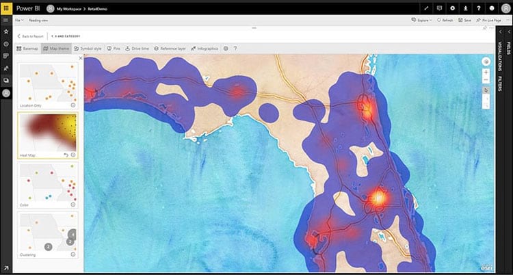
The most recent update of ArcGIS Maps for Power BI features a fully updated user experience, along with several new features. Enhancements and new features included the following:
- A new integrated user interface provides quick access to map tools without obscuring the map.
- Upgraded intelligent defaults automatically generate compelling maps based on the nature of your data.
- Report designers now have more freedom to customize the map experience for consumers.
- An improved search feature lets consumers look up an address or place of interest and use the search results to perform analysis.
- Enhanced security; Apps designed using secure content from ArcGIS will only display secure content after a user signs in using an ArcGIS account with the appropriate permissions.
- ArcGIS demographics have been updated for 2020.
For more information, see the What’s new help documentation.

ArcGIS Insights
ArcGIS Insights is analysis software that fuses location analytics with open data science and business intelligence workflows. Answer questions you didn’t know to ask, analyze data completely, and unlock new insights. Empower analyst of all skill levels, across departments, to directly connect data, perform advanced analytics, and take results into 3rd party systems.
Insights has added even more analysis, charting, and mapping capabilities. New enhancements and features include:
- The ability to calculate geometry for line and polygon areas.
- Create maps with chart symbols (pie and column charts) using numeric and ratio data.
- Customize scatterplot point sizes.
- Filter cards to show either the top n number of records or the bottom n number of records.
For a more complete understanding of what’s new, check out the Insights release blog or Insights help documentation.

ArcGIS Maps for Adobe Creative Cloud
ArcGIS Maps for Adobe Creative Cloud, an extension for Adobe Illustrator and Adobe Photoshop, enables map-makers to develop exciting narratives using data-driven maps. Use the power of ArcGIS to discover and add geographic content to design projects as editable vector layers and high resolution images.
The extension is included with ArcGIS Creator or GIS Professional license and should be downloaded and installed separately. With this extension GIS professionals and graphic artists can work with maps and layers from ArcGIS Online and ArcGIS Pro inside their familiar design tools.
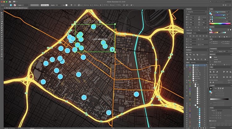
The latest release includes new improvements to the ability to create maps by specifying coordinates and addresses key issues reported by the user community. For more information, see ArcGIS Maps for Adobe Creative Cloud 2.1 is now available.

ArcGIS Earth
ArcGIS Earth is an interactive 3D experience for users to plan, visualize, and evaluate events on the globe. On desktop and mobile devices, ArcGIS Earth provides situational awareness for improved decision-making.
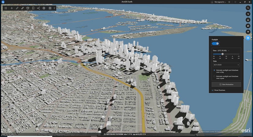
The upcoming ArcGIS Earth October 2020 release will include new 3D capabilities, support for new data types, and user experience enhancements. Here are a few highlights:
- Sunlight and shadows: You can layer dynamic sunlight and shadows on scenes that can be labeled with the time and date, in any time zone.
- Underground navigation: Go underground or under the sea with new subsurface navigation tools.
- New data support: Expand your workflows by adding GPX, WFS, and GeoJSON to your ArcGIS Earth workspace.
- Updated bookmarking: Create and manage multiple bookmark groups and add more context to your bookmarks with customizable informational pop-ups.
- Symbology: Start using the new symbol types: Type (Unique Symbol) and Counts and Amounts (Colors).
To learn more, and to download ArcGIS Earth, see the ArcGIS Earth overview.

Learn ArcGIS
Learn ArcGIS is a website containing timely and engaging guided lessons that are based on real-world problems, covering the entire ArcGIS platform. Whether you are new to GIS, or are a seasoned analyst, Learn ArcGIS has resources to help you build your GIS skills. Learn at your own pace based on your needs and interest. Learn ArcGIS is continually updated with new lessons paths to contribute to your success.
New ArcGIS Online lessons for beginners
Make a map of China: Learn the basics of working with maps and layers.
Map the highest mountains: Make a map of five of the highest mountains in the world and create custom interactive pop-ups.
Map a historic cholera outbreak: Use GIS to learn about a historic example of geographic problem-solving.
Explore Paris with ArcGIS Online: Learn the basics of navigating and creating maps in ArcGIS Online.
New Python lesson
Get Started with Python in ArcGIS Pro: Start learning Python in ArcGIS Pro. Write code to determine the number of features for all the feature classes in a workspace.

Learn ArcGIS Hub for Everyone
The Learn ArcGIS team is excited to announce the official release of the Learn ArcGIS Hub. Visit learn.arcgis.com to choose an experience that’s right for you. Choose between the following:
Within each of these experiences are collections of activities on topics relevant to the audience, and the very best resources curated from our collection of over 400 lessons, activities, StoryMaps, and videos.

Teach with GIS Hub for Educators
Teach with GIS is designed for educators with little-to-no GIS experience who want to add interactive tools to enhance teaching and learning across the curriculum. Educators seeking new tools and technology to enhance their curriculum will find a variety of ready-made apps, activities, and learning opportunities for teachers new to GIS.
- Teacher and GIS education advocate videos
- Teaching tools
- Skills & knowledge
- Lessons & ideas
- Explore with National Geographic Explorers
- Community Corner to learn about what’s happening in the GIS education community
To become a member of the Teach with GIS community, receive notifications on new content, participate in initiatives and outreach to your peers, click the Follow button at the bottom of the site.

More information
For more information and additional details about this release, see the What’s new help topic or view all posts related to this release.

Commenting is not enabled for this article.