The beer/wine topic was a trap! To get us thinking about value-by-alpha. But now you’re here, and you might be like, well, I might as well read about value-by-alpha while I look at booze maps.
{Would you like to read this post as a Cascade story map?}
So, in this age of uncertainty and great questioning, how can we apply the unparalleled strength of our analytical tools and the unknowable wealth of information at our fingertips to ply at humankind’s greatest mysteries?
If you were hoping to read, here in the third paragraph, that these powers were focused on the preference of beer or wine across the great counties of the United States, then hope no more.
It’s on. The beer vs. wine map battle is upon us.
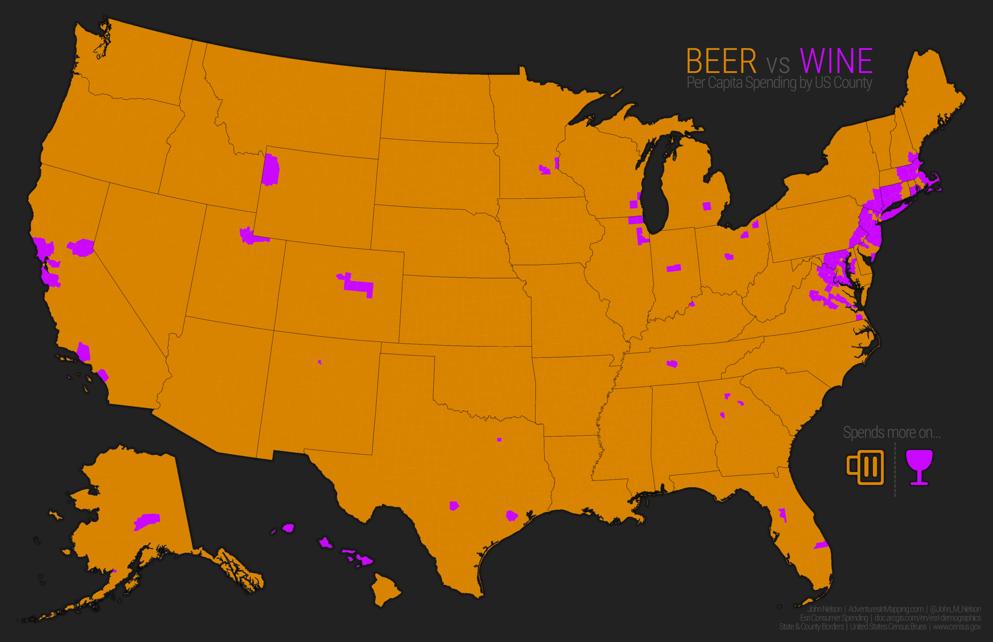
Here’s a map showing where, per person, spending is higher for beer or for wine. It’s a real boozy map-off.
I’ll be using beer and wine spending from Esri Demographics’ Consumer Spending data. I calculated per-capita spending for either beer or wine, as well as the per-capita spending on both. These maps lead us through one approach to cartographicizing this data, and how a value-by-alpha treatment might help our interpretation of it.
—
Beer looks like it’s dominating our palates but that’s a common evil trick of county-level mapping like this. Big, sparse, counties dominate the view. So in the sake of cartographic goodness, here are some numbers to help balance your interpretation…
3,012 counties, with a combined population of 273,074,386, buy more beer.
130 counties, with a combined population of 50,500,013, buy more wine.
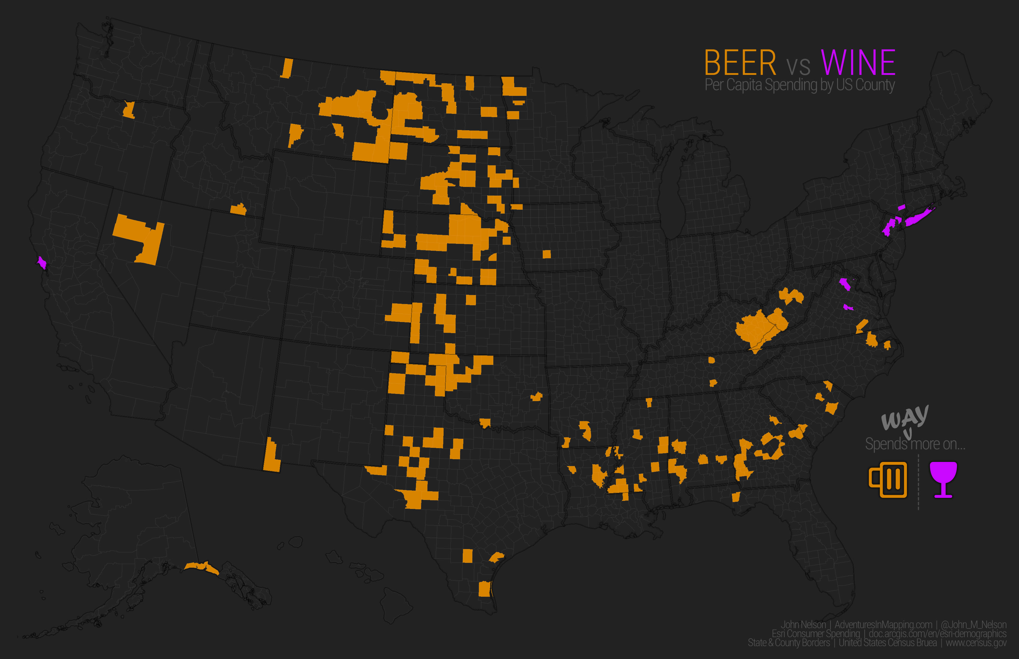
Cool. But how about those counties that spend way more on one versus the other? Glad you asked. So, based on the breakout above, this map shows the most extreme (1.8 standard deviations and stronger) beer-favoring and wine-favoring counties…
Now we’re talking! Shoot, those folks in the western plains and the cotton belt either really like beer or they really hate wine. Maybe both.
The suburbanites of New York City have a distinct preference for wine. Same for metro DC. Do not bring beer to a dinner party in Marin county, as if you needed to hear that.
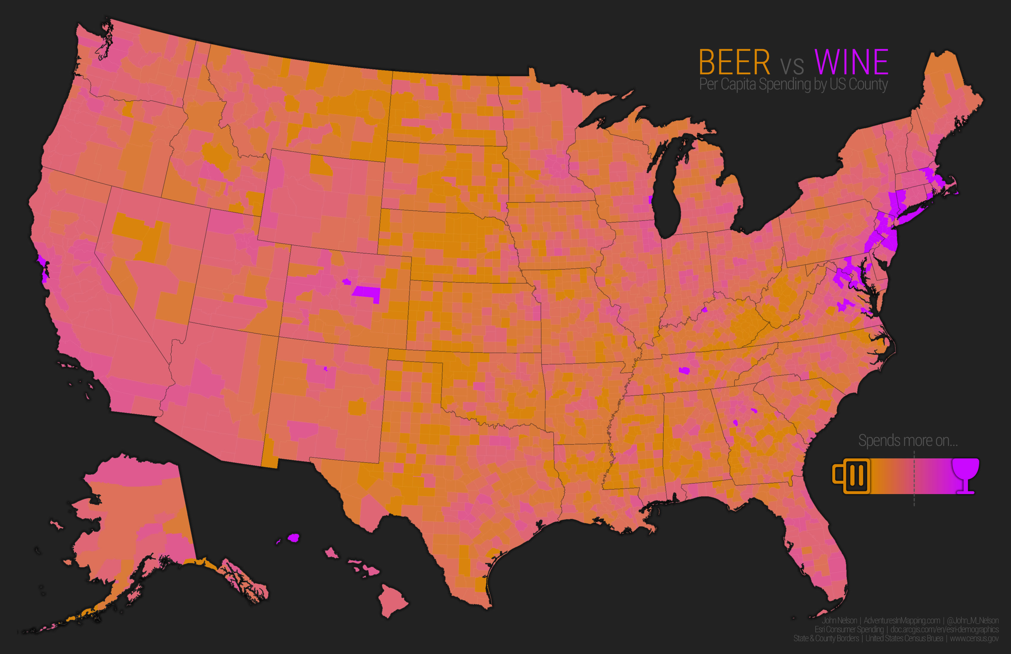
How about some nuance? Here are all the counties once more, but this time showing a gradient between mega beer counties and mega wine counties. I’ll leave it to you to propose whatever correlations you might suspect. I am firmly in beer/wine mentality and refuse to be pulled into your interdependence suppositions.
Anyway, we can still see the regional patterns of preference, but now there is painted-in a sense of the overall variation of taste, and some local outliers in Colorado, Tennessee, and Georgia come to light.
But that map isn’t really fair. Were you just complaining about how sparsely populated counties tend to be big and hog all of the visual prominence? Good! Sure, some places might really prefer beer or wine, but that doesn’t necessarily mean they’re buying much of it.
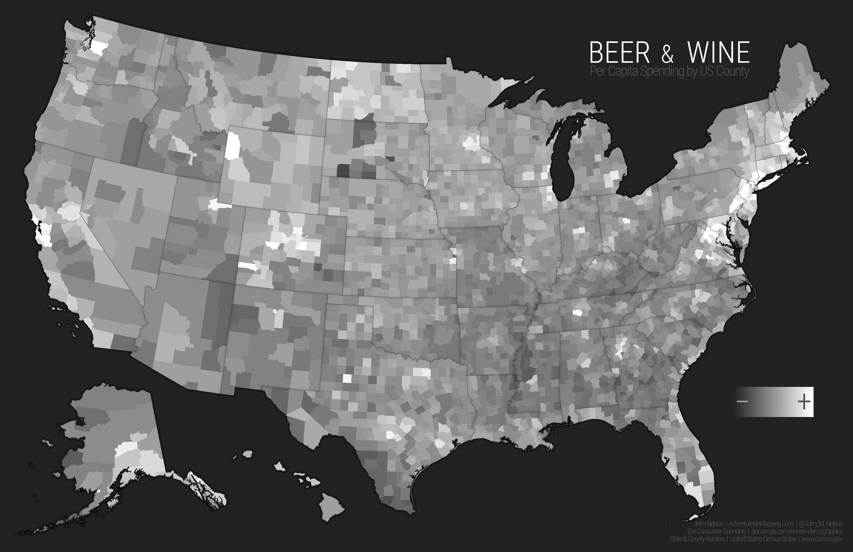
So let’s take a look at a way to make this map a little more equitable. I think a good way to do this is to look at combined per capita spending for both beer and wine. This will give us an overall terrain of more and less spending, regardless of preference. Here is what that map looks like, for what it’s worth (get it…worth?). Can you see the sea, mountain vistas, or tall buildings where you live? Then you are likely enjoying your view with some booze…
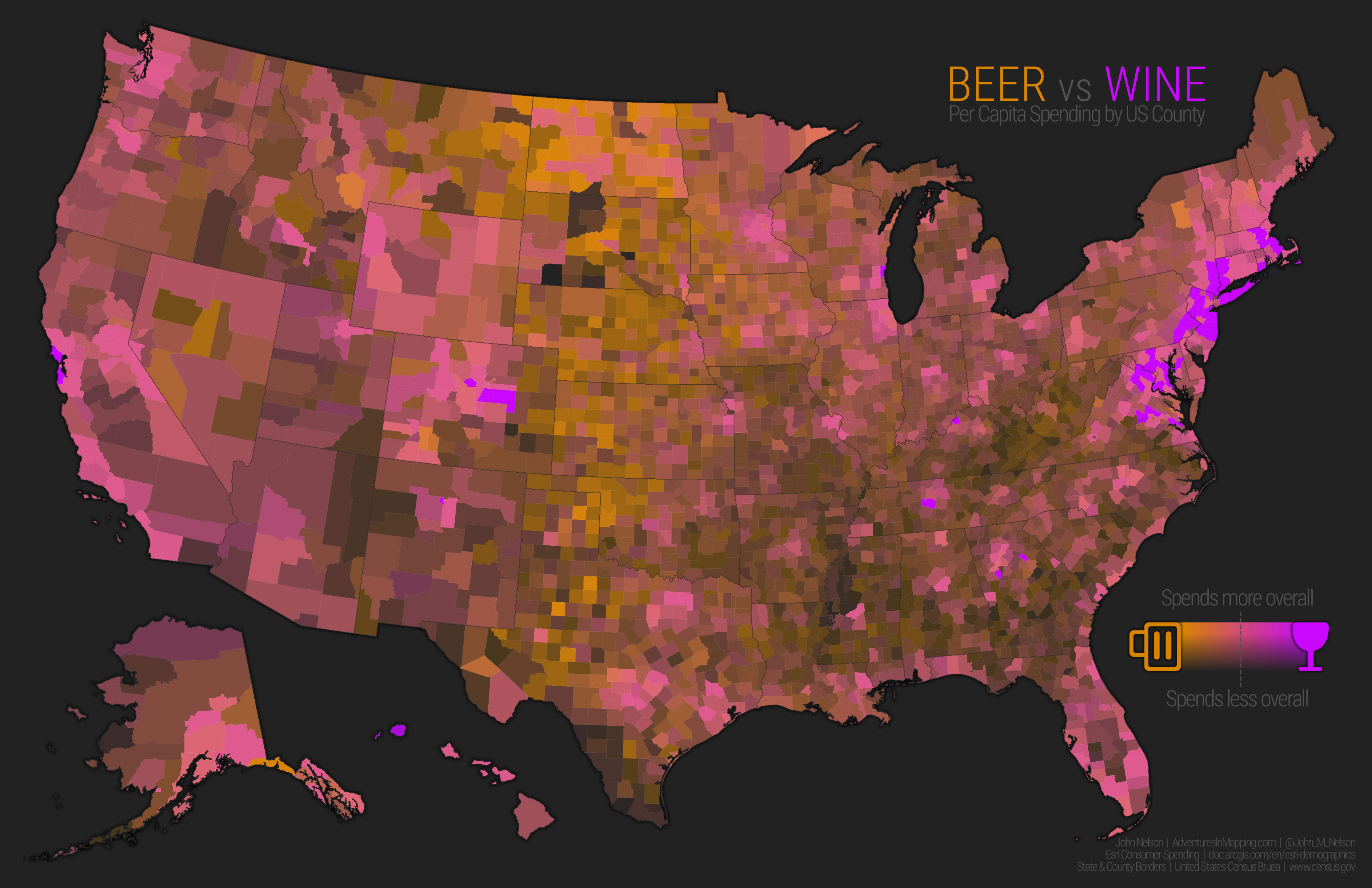
Ohhh yeahhh; almost time to rock and roll. Now we can use that overall spending layer to visually tamp down places where beer and wine spending is low, and highlight places where it is high. The result is a bivariate map showing a smooth beer vs. wine preference, normalized by the rate of purchase…
Not only do we see where there is a preference one way or the other, but where overall spending is low or high.
Remember the distinct beer preference along the cotton belt? It pretty much disappears now. Sure, they like beer there more than they like wine, but aren’t really buying much of either. “I don’t always buy booze, but when I do, I buy beer.”
The folks of the western plains, however, do buy booze. And they don’t like grapes in it.
And when the folks around Metro New York, Denver, and San Francisco buy wine (which they much prefer), they really dive in.
So that’s that. There are worlds of interpretive insights we get when we add the visual dimension of transparency.
You can do this in ArcGIS Online in the styling menu. You can also do it in ArcGIS Pro’s advanced symbology options, or by just adding a new layer on top of your map that transitions to an opaque version of your background color. As Ken Field says, there are usually lots of ways to get to the result you need.
So, what do you think? Spot anything interesting? Want to try out this sort of mapping yourself? I hope so on both counts. Thanks to Christopher Vaillancourt for introducing me to the gold that is Esri demographic data. And thanks to you for hanging in there! Happy mapping.
Cheers, John


Article Discussion: