This blog article was originally published on June 20, 2012, and has been updated. The last previous update was July 10, 2024.
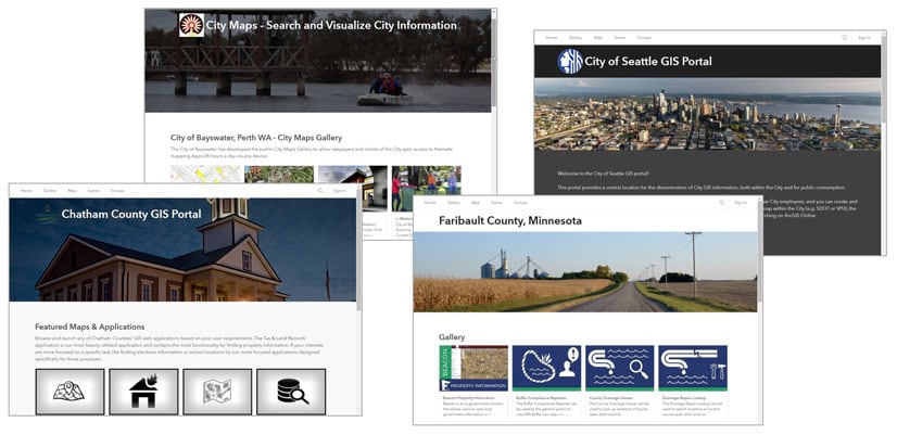
Your organization home page is the place visitors and organization members will start. How your home page looks will create first impressions – not just about you as a GIS organization, but also about the quality and veracity of the maps and apps people will find there.
People do judge books by their cover, so it’s important to have a professional looking, aesthetic, and well-organized home site, whether you’re exposing it only within your organization, or to a more public audience.
The home page can also deliver helpful resources and content for organization members and public visitors. You can configure a modern and professional-looking home page that reflects your organization’s branding and mission and showcases the maps, scenes, apps, and layers that are most important to your community.
In this blog article, we’ll take a closer look at how to build your organization’s home page and create a great destination.
Getting started
The organization administrator, or those with home page editing privileges, can edit the organization home page and modify it at any time. Those with sufficient privileges will see the Edit home page button on the organization home after signing in.

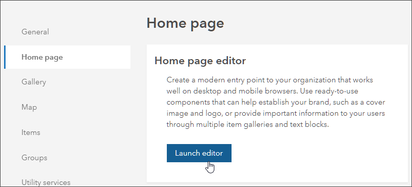
Administrators can also launch the editor from the Home page tab in the organization settings.
Home page editor overview
After you have launched the editor, you will see the home page contents showing:
a – A list of sections that define the header and contents of the home page, plus color and typography options.
b – A preview of current settings.
c – Viewing options that show how your home page will look on different devices.
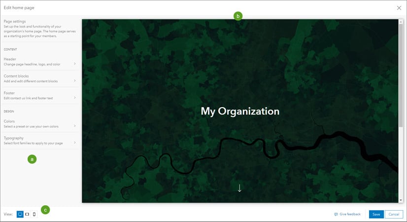
The Page settings contains Content and Design sections.
Header – Configure the title and add a logo and cover image.
Content blocks – Add and arrange content blocks such as text blocks, item gallery blocks, and link blocks.
Footer – Edit your contact information and footer text.
Colors – Choose a color scheme.
Typography – Choose the font families to apply to your page.
Click the desired setting to configure it.
Configure the header
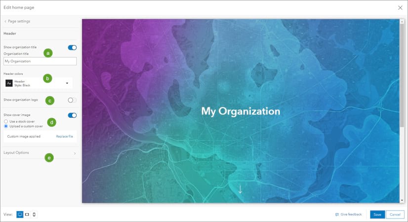
The home page header can include any of the following elements: a cover image, an organization title, and an organization logo. These configurations are found in the header panel as shown below:
a – Show or edit the organization title.
b – Change the header color scheme.
c – Show or change the organization logo.
d – Set a cover image from stock covers included in the editor, or choose your own custom cover.
e – Click Layout Options for more configuration choices.
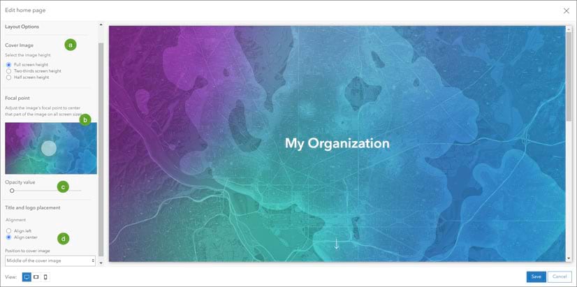
In Layout Options you can:
a – Set the height of your cover image.
b – Adjust the focal point. The image will be centered at this location on all screen sizes.
c – Set the overlay opacity to make your header text pop when placing a title over the image.
d – Choose the placement and alignment of your title and logo.
Content blocks
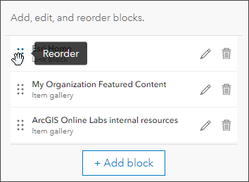
The body of your home page can contain three types of content blocks: text blocks, item gallery blocks, and link blocks. Up to 15 blocks can be added, but using only what is essential will keep the home page experience simple.
Use text blocks to configure headlines and other text-based content about your organization. Configure item galleries to showcase maps, scenes, apps, and other content items. Use link blocks to help users discover content or other destinations.
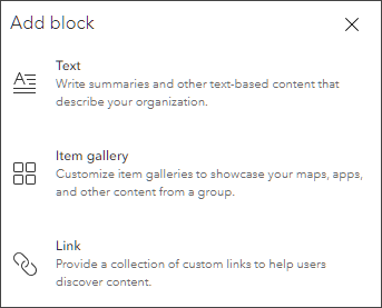
Once blocks are added, you can edit and reorder them as desired.
Add a text block
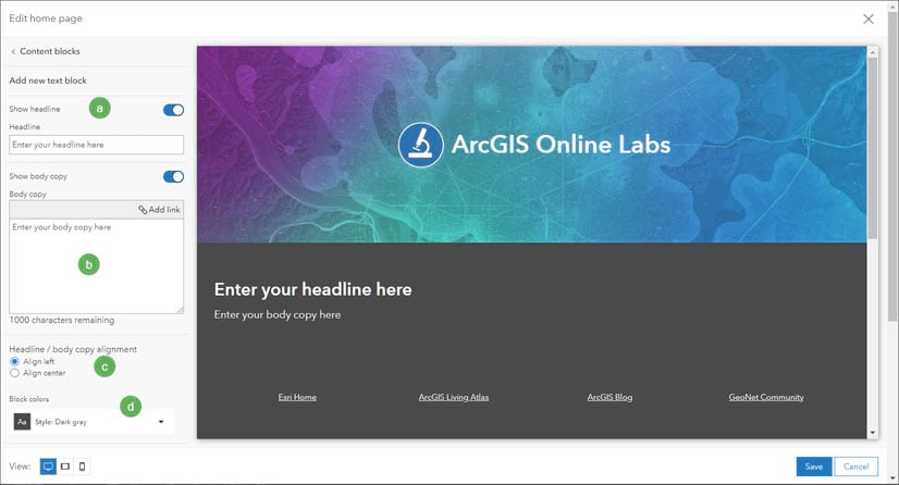
Text blocks allow you to put descriptive information on your home page consisting of a headline and descriptive text, both of which you can turn on or off. Text block settings are:
a – Headline above the body copy text. This can be turned on or off.
b – The body text that appears below the headline, which can also include hyperlinks. This can be turned on or off.
c – Alignment of the headline and body text.
d – The background color of the text block.
Add an item gallery
Use item galleries to showcase content on your home page.
When you configure an item gallery, you specify a group that contains the items you want to display. This allows you to configure custom galleries to display different content for different audiences. For example, an organization that allows anonymous access may want some items to be visible only to organization members and hidden from nonmember visitors to the site.
If a group can be viewed publicly, anyone who can see your home page will see the item gallery. Only organization members will see item galleries configured with groups viewable only to the organization.
The items that are visible in an item gallery can vary depending on sharing settings for the items. As with groups, only publicly shared items will be visible to anonymous visitors. Thus, by carefully configuring group visibility and item sharing, you can control what visitors to your home page can see.
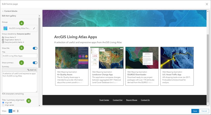
Item gallery settings:
a – The group whose content is used to populate the item gallery.
b – The title displayed above the gallery. The title can be toggled off or on.
c – The summary displayed below the title. The summary can be toggled off or on.
d – Alignment of the title and summary text.
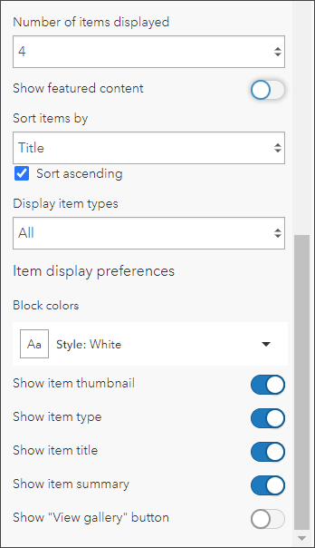
Scroll further down to see additional settings that control how the gallery appears. You can set the number of items that are shown, use the featured content (if configured), set the sort order, choose an item type, and set the background color. You can configure the item cards by toggling the visibility of the thumbnail, item type, title, and summary. In addition, you can toggle a View gallery button which opens the group used to populate the item gallery.
Add a link gallery
Use link galleries to display a collection of custom links to help users discover content and other destinations.
When you configure a link block you can add up to 8 links. Each link has a title and a website URL (https is required) or mailto link. The links can include images and button outlines if desired. Links can be reordered by dragging and dropping them to a new position.
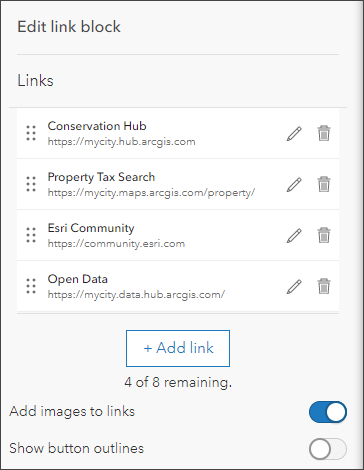
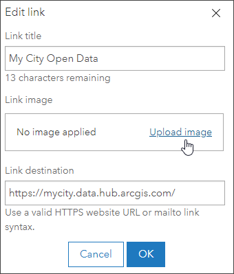
To add images, toggle Add images to links on. After toggling the option you can add or edit images when you edit the link.
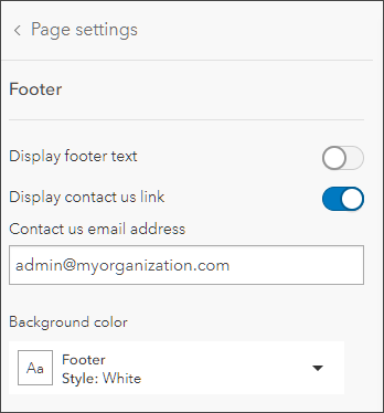
Configure the footer
The footer appears at the bottom of the home page. By default, the footer contains three preconfigured links: Trust Center, Contact Esri, and Report Abuse. You can also add a Contact us link, add text to the footer above the links, and choose a background color.
Any legal notices or other conditions can be added by setting Display footer text to visible.
Colors
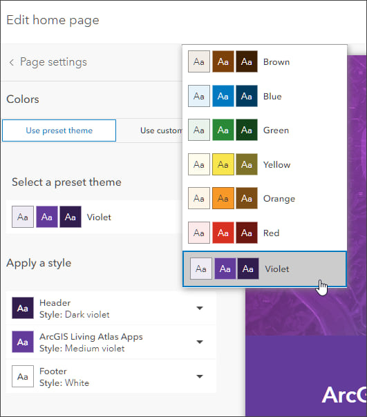
Colors provide a unique look to your organization and are often part of your organization branding. You can design a scheme to match your website, hubs, and other destinations. Choose a preset theme, or set up a custom theme to suit your needs.
Typography
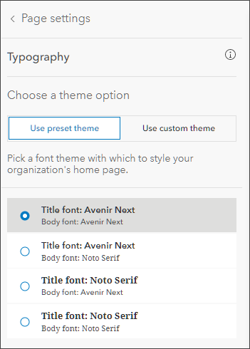
Pick a font theme to quickly make your page content look great. Each theme contains a title and body font. Or set up a custom theme by selecting title and body font combination from common fonts to align to your specific style.
Tips and best practices
Here’s a few tips and best practices to consider when crafting a professional looking home page.
Experiment with color and style
Harmonize the look and feel of the entire home page, from banner graphics, to background colors of sections, to item thumbnails if shown in a gallery. It’s easy to make changes and see how things look. Use Colors to quickly change and harmonize your theme.
Avoid text and logos in your header image
The entire home page is designed to be responsive to look great on any device. Burning text and other graphic elements directly into banner images might lead to undesirable results when viewed at different sizes and on different devices.
Keep text blocks short and to the point
Provide enough information to be useful, but avoid adding too much text.
Streamline your item galleries
You might not need to show all the information for items in your item galleries. For example, the item type might not be needed, or the item summary. You can clean-up the look of your site by seeing what you can remove instead of adding unneeded information.
Use great thumbnails
If using thumbnails in item galleries, avoid blurry images or the use of small, non-contrast text. Don’t duplicate the title or item type in the thumbnail. Keep thumbnails simple.
Add a contact
Consider adding a contact us email link in the footer section of your site.
More information
For more information, see:
- Create a home page (Help)
- Time for a new home page (Blog)


Commenting is not enabled for this article.