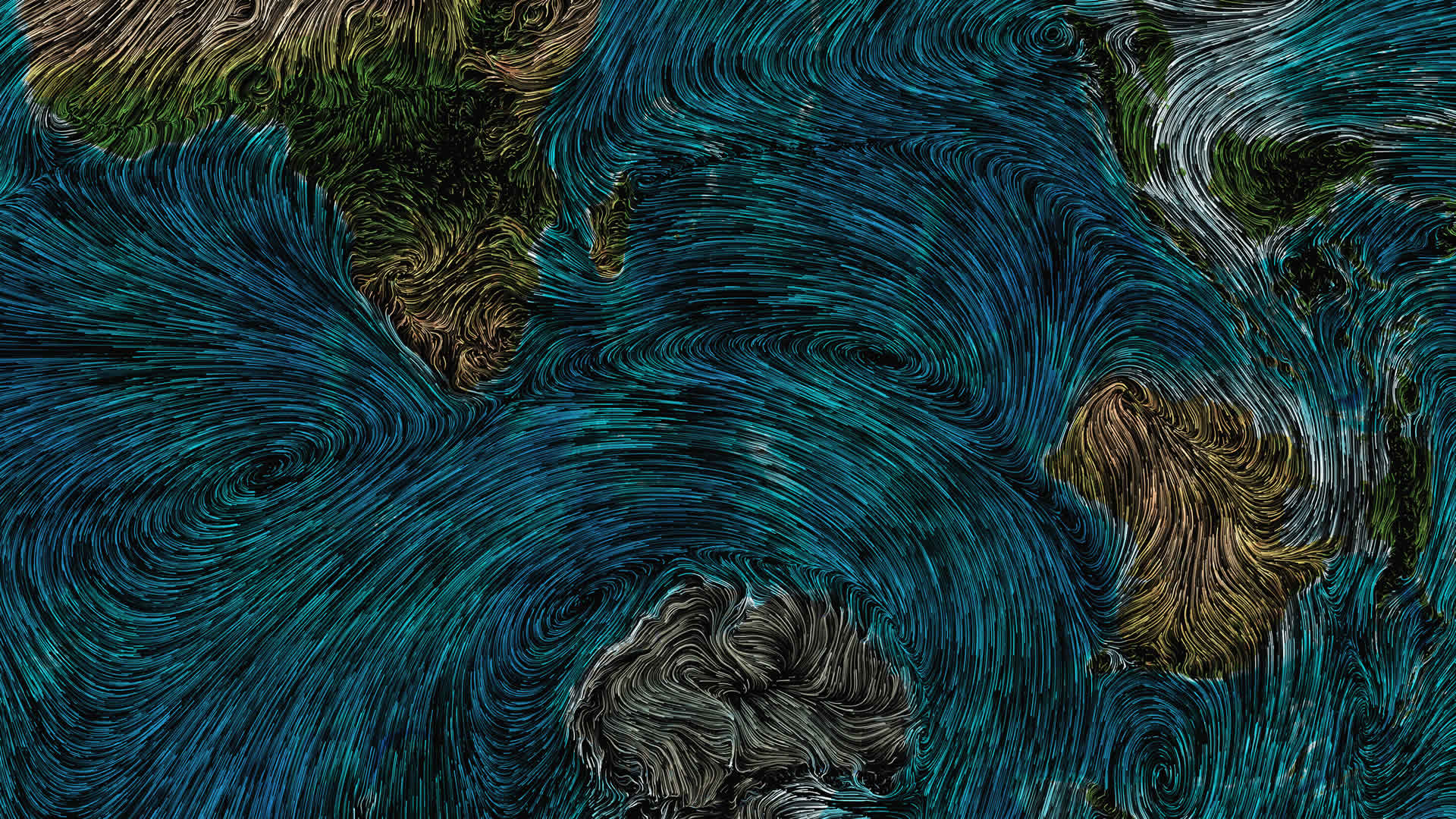
Here’s how to use compositing to tint flowing wind patterns by underlying terrain colors. Why? Because rather than a basemap providing some context around a layer that inherently blocks your view of it, you can leverage the amazing compositing blend modes of the ArcGIS Online Map Viewer to make the phenomenon reveal context rather than obstruct. Also it looks cool.

The Global Average Wind Speeds by Month and Altitude is…well, just what it says it is: a world-wide 25-year average of wind speeds, available per month, at four optional altitudes (surface, windfarms, bird migration, commercial jets).

Dan Pisut, a colleague in Living Atlas, aggregated it from the vast stores of the EU Copernicus program, and composed it as a hosted vector tile layer of magnitude and direction, which means it is perfectly suited for the beautiful flow renderer.
Here is a how-to, walking through creating the van Gogh-like merging of the wind layer with imagery, and then some background on how the layer was created in the first place.
How to composite the wind layer with imagery
0:00 Scintillating introduction
0:18 Brightening the underlying World Imagery basemap
0:43 Pulling in the flowy wind layer
0:58 Optionally selecting month and altitude
1:35 Styling and compositing the wind
2:47 Scaling-the-browser, a handy hack for screenshots
Background on how the wind layer was created
3:22 Downloading the source wind data
5:04 Mosaic all the downloaded files into a Multidimensional file
5:24 Aggregating per month
5:57 Uploading layer to AGO as hosted tiled imagery service
6:27 Running raster function to structure as new magnitude/direction layer
6:53 Style the layer in the Map Viewer with the Flow Renderer
We hope you find this layer useful, and we hope you try out the compositing blend modes to visually merge layers to make something beautiful and insightful.
Love, John


Article Discussion: