Remember unfolding that crisp new map at the onset of roadtrip planning…and then trying to re-fold it back into submission? Over time the maps we love get a lived-in feel of texture and utility. They aren’t unsightly wrinkles or creases, they are earned marks of a partnership between the map reader and the map.
One of the joys of print cartography is the knowledge that the result will be handled, traced, folded, pocketed, rolled-up, tattered, spilled on, and in general loved by its reader. Oh, and digital cartography too!
Here are five vector tile layers that you can drape atop your map to breathe a little bit of tactile life into it…
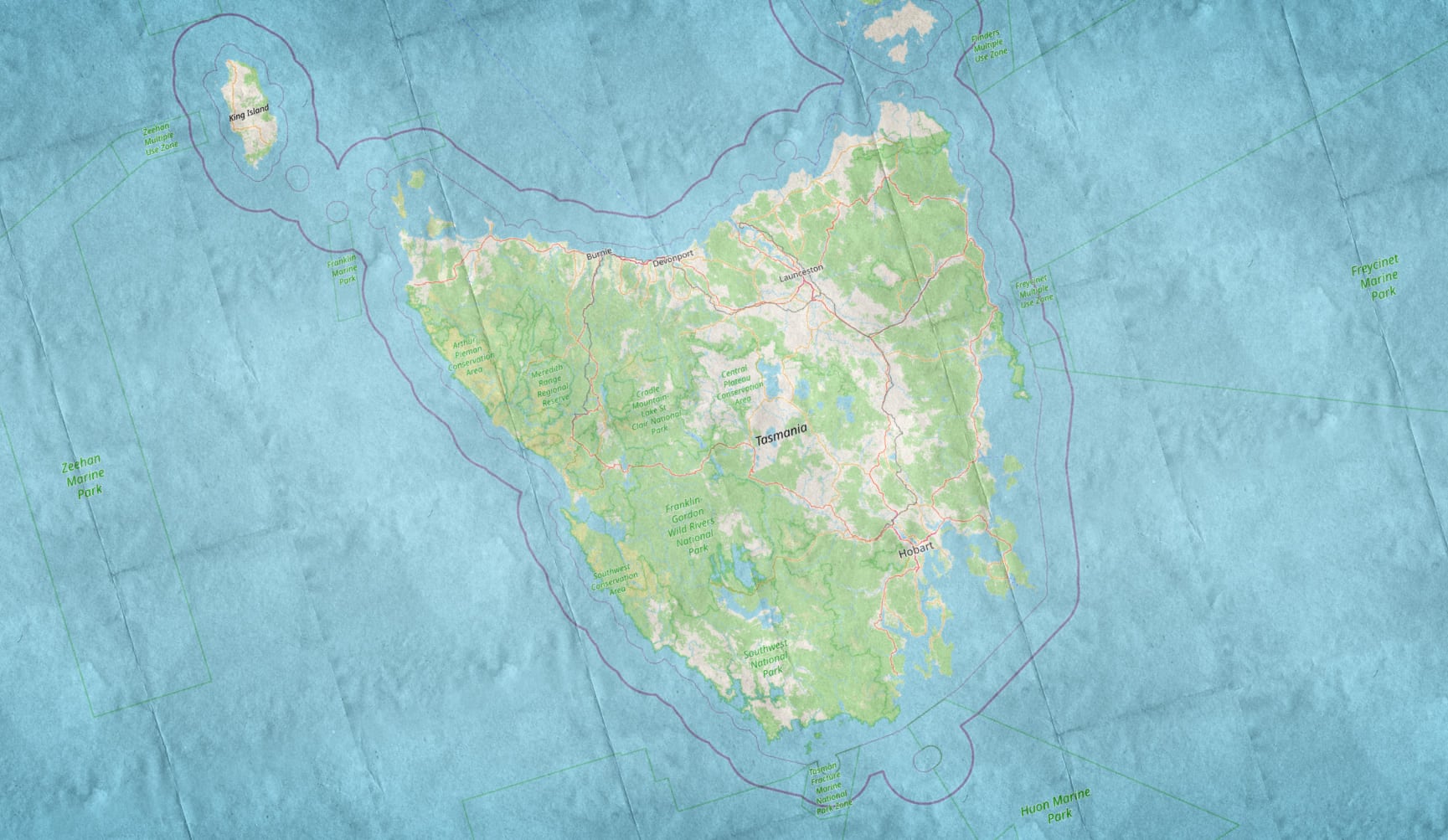
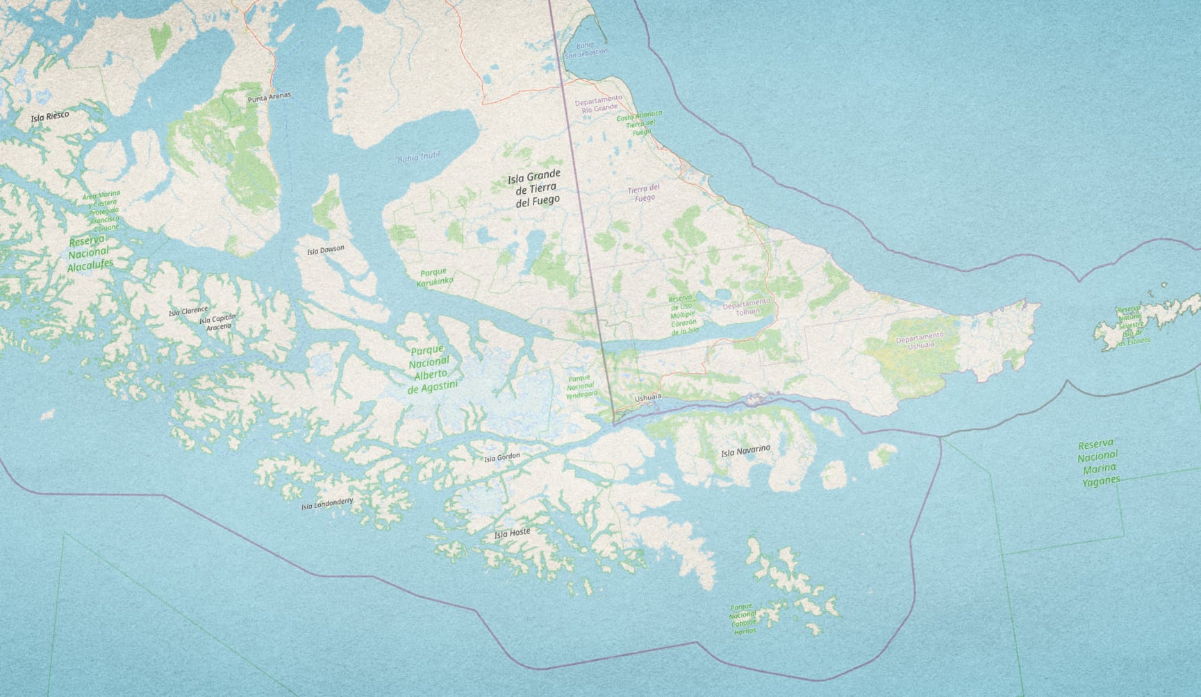
Folded Paper Texture
Just admit it. You’ll never get this folded back the original way.

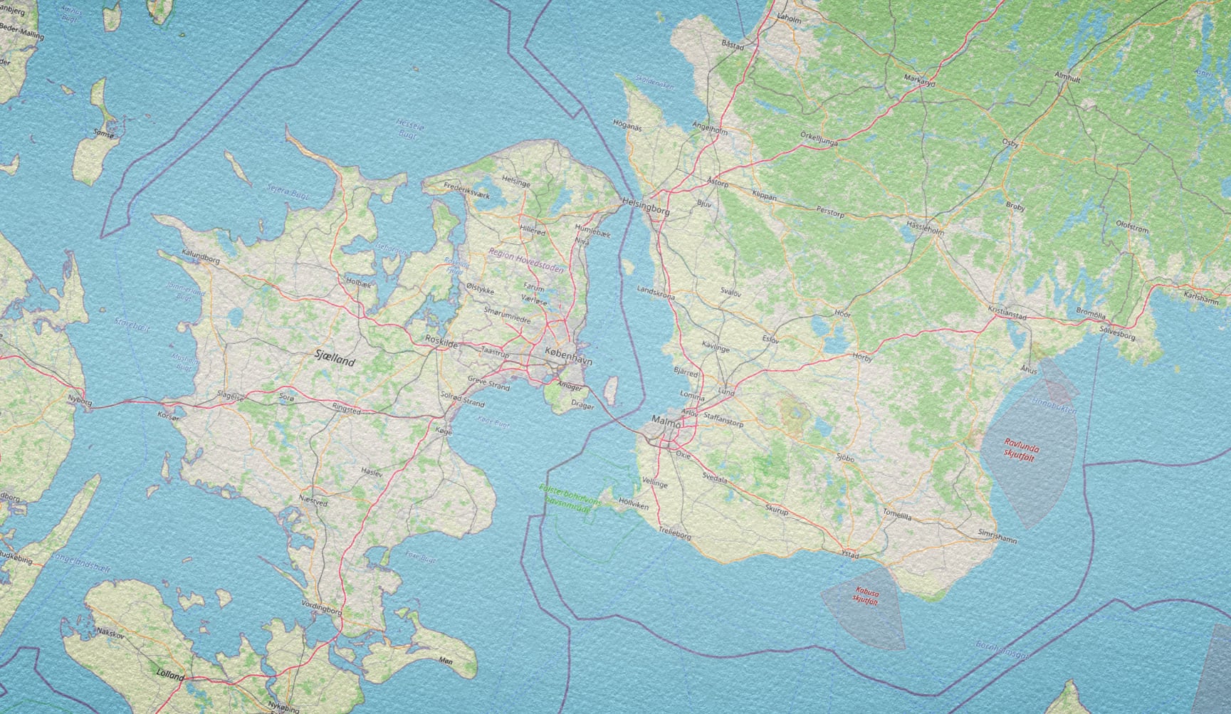
Watercolor Paper Texture
I just want to pencil in some notes right on top of this map.

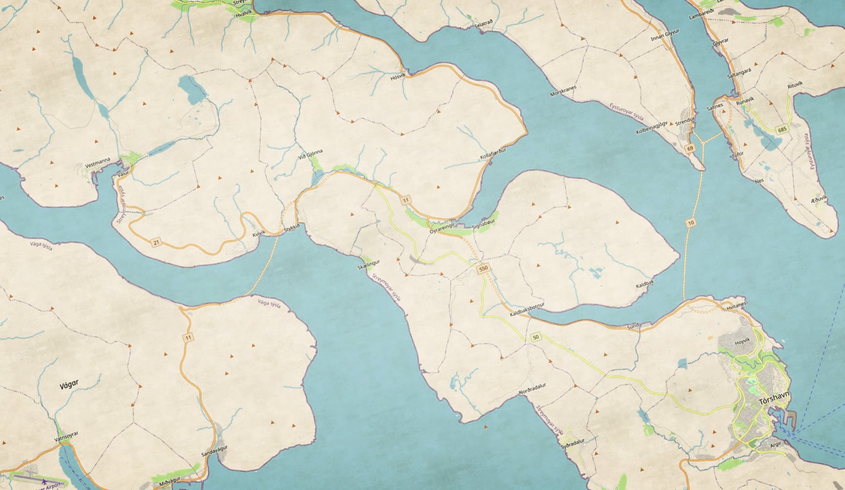
Parchment Texture
Hey this map looks like it was ripped right out of a library book!

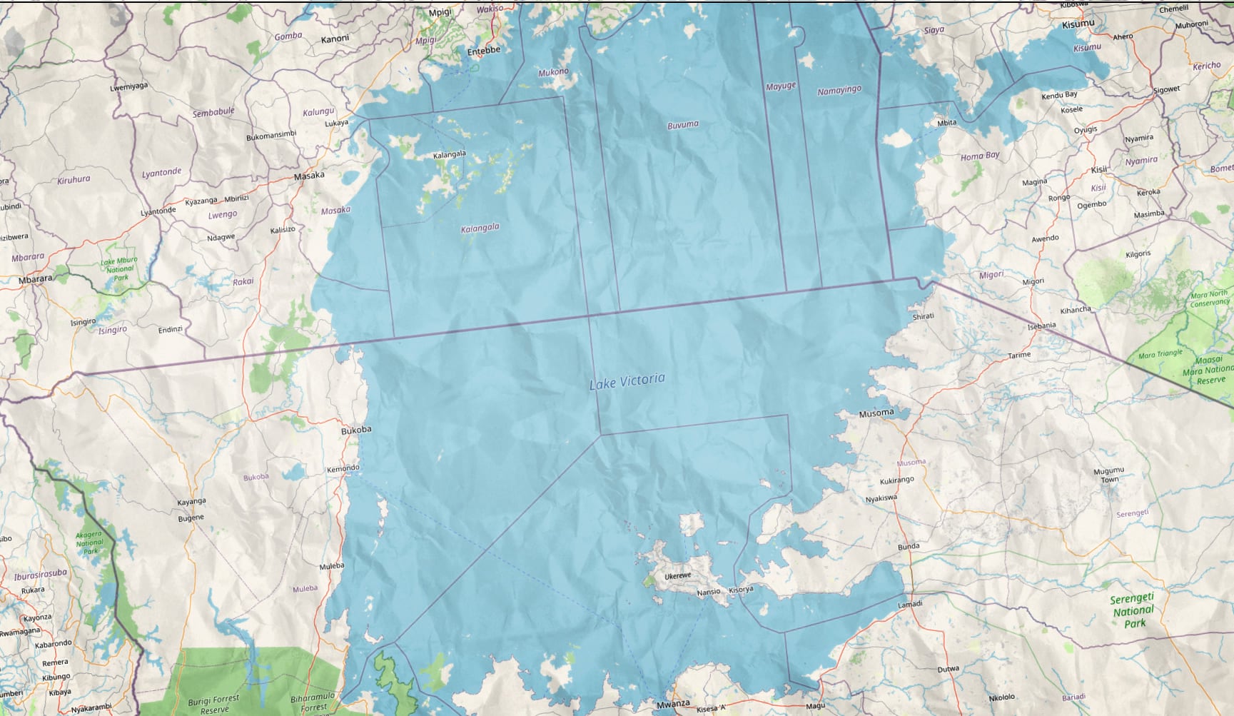
Crinkled Paper Texture
If this map could talk! I want to grab it with my fist and stuff it into my duster pocket for a fast getaway.
Poster Paper Texture
Ok ok, I see, just a little bit of fade and grain; looks like it could be plastered on the wall outside of a theater.

See? Imbue a sense of story and tactile charm right into your map.
Tips
- How to add to a Pro map? Copy the URL of the item details page, and use the Add dropdown’s “Data from Path” option.
- How to add to an Online map? Add a layer and search for Texture Tile.
- Texture a little too strong? Use the transparency slider to set it just how you like.
- Texture a little too weak? Add the layer twice, and fine-tune with the transparency slider.
- Can the textures be combined? Sure, stack them up!
- Textures making your map a little washed out? Try a blend mode. I find that “luminosity” helps retain the underlying map colors.
Here is an ArcGIS Online group where you can peruse them all at once. Looking forward to seeing your rough-up, folded-up, dusted-up lived in maps!
Happy texture mapping! John

Article Discussion: