In the news: It’s been very hot… Over the last few days at Esri’s corporate headquarters in Redlands, California, temperatures passed into the low-100s. Last week, a heat wave scorched parts of the U.S., pushing the heat index into the 90s and well over the 100s in some areas. This week, the heat has shifted once again to the central U.S., driving temps up in Oklahoma, Arkansas and Missouri. As of Monday morning, National Weather Service meteorologists have issued either heat advisories or excessive heat warnings for 23 states, with heat impacts expected to worsen before relief can be found.
Make a severe heat map
ArcGIS Living Atlas of the World includes authoritative live feeds and other content that helps you learn more about current and predicted weather conditions including severe heat events. In this tutorial we will:
- Add weather warning layers from ArcGIS Living Atlas.
- Make changes to layer visibility to display or hide layers.
- Use filters to further focus the scope of our severe heat map.
- Improve the map using alternative basemaps, transparency, and other effects.
Follow these steps to make your own severe heat map in a minute, maybe less.
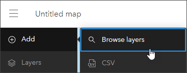
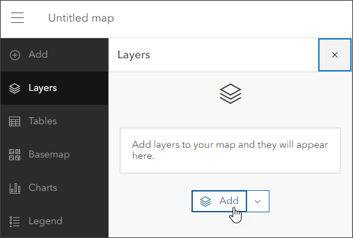
Step 1 — Sign in to your ArcGIS account and open Map Viewer. There are two ways to add layers from the Content (dark) toolbar:
(1) Click Add, then Browse layers.
(2) Click Layers, then Add.
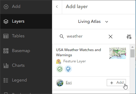
Step 3 — From the Add layer drop-down choose Living Atlas. Search Living Atlas by entering “weather” to locate the USA Weather Watches and Warnings layer. Click [+ Add] to add it to the map.
Step 4 — View the layer information to learn more.
Click the layer card to view the item information pane, providing quick access to the overview, description, details, and more.
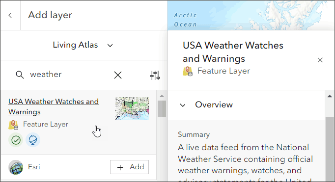
To open the full item pages, click View item details at the bottom of the pane.

Looking at the USA Weather Watches and Warnings details, you can learn that the layer is a live data feed from the National Weather Service containing official weather warnings, watches, and advisory statements for the United States. The layer is updated every five minutes using the Aggregated Live Feeds methodology.
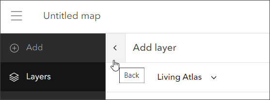
Step 5 — Click the left arrow to return to the Layers pane in the Contents (dark) toolbar.
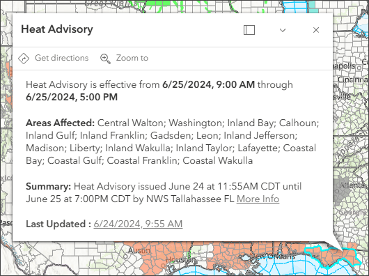
Step 6 — Click features on the map to view the layer pop-ups. Note that the layer is a group layer containing other layers.
While the Living Atlas weather layer shows all types of advisories, for this map we will want to focus on heat advisories. These additional steps will filter for anything heat related.
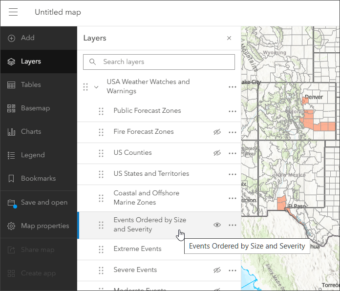
Step 7 — Expand the USA Weather Watches and Warnings group layer by clicking the arrow next to the layer name.

Step 8 — In the Contents (dark) toolbar, select the Events Ordered by Size and Severity sublayer.
Step 9 — In the Settings (light) toolbar, select Filter.
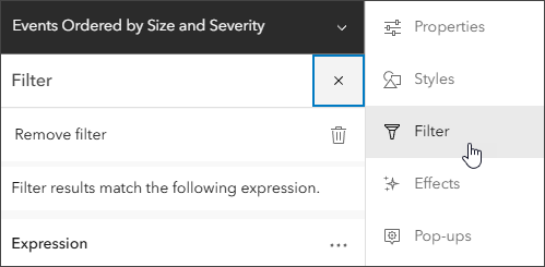
Step 10 — In the Expression section, build the expression as shown below.
a – Select the Type field.
b – Select the Includes operator.
c – Enter the string “heat” in the field values search.
d – Select the values Heat Advisory, Excessive Heat Warning, and Excessive Heat Watch.
e – Click Done when finished, then click Save to save your layer filters.

Step 11 — Change layer visibility.
USA Weather Watches and Warnings is a group layer containing 11 sublayers, with four visible by default. In the Layers pane, you can toggle the visibility for layers or remove unwanted ones. For our hot weather map, only two sublayers need to be visible, highlighted in yellow below. Toggle the layer visibility to show only these layers.
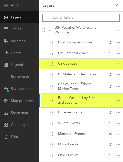
Congratulations! Save your work. You’ve created a heat advisory map in under a minute.
Improve the map
Experiment using different basemaps and layer settings until you get the desired result. For layers such as Weather Watches and Warnings that draw above underlying features, a basemap with reference layers that draw on top of the layer (such as Physical Geography Basemap) is a good choice. You can also change the weather layer settings to achieve the desired results by changing colors, transparency, or adding effects and blending.
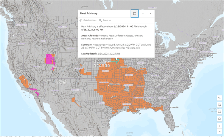
The final map shown below uses the following changes:
- Terrain with Labels Basemap was selected. This basemap was chosen because it has a reference layer which displays above other layers in the map.
- The World Hillshade base layer in the basemap was darkened using Brightness and Contrast effects.
- Saturation was added to the Events Ordered by Size and Severity sublayer (using Effects).
- US Counties sublayer was changed to use a lighter gray outline, so as not to compete with the basemap or advisories.
There are many variations you can apply, experiment until you get the desired result. View the sample map authored in this tutorial.
More information
There are other weather related maps, apps, and layers you can explore. Browse Living Atlas to learn more.
For more information, see the following:

Commenting is not enabled for this article.