At the beginning of 2023 we added the Enhanced Contrast and Enhanced Contrast Dark basemaps to our gallery. They are designed to provide a suitable foundation for you in building an Accessible map.
However, one feature of an accessible map is that contrast is increased. Applying that to a basemap pushes some of its detail up into the visual space we normally reserve for your information. That means that, although they fulfill many of our criteria, they can be difficult to use effectively.
One way I tried to mitigate that was by ensuring that a grayscale conversion (using ‘Effects’ in ArcGIS Map Viewer) retains the functionality of the basemap. I did this by applying some textured fills to reinforce the tonal separation of some features. They work well, but they are very busy maps, and they can still be a challenge to use.
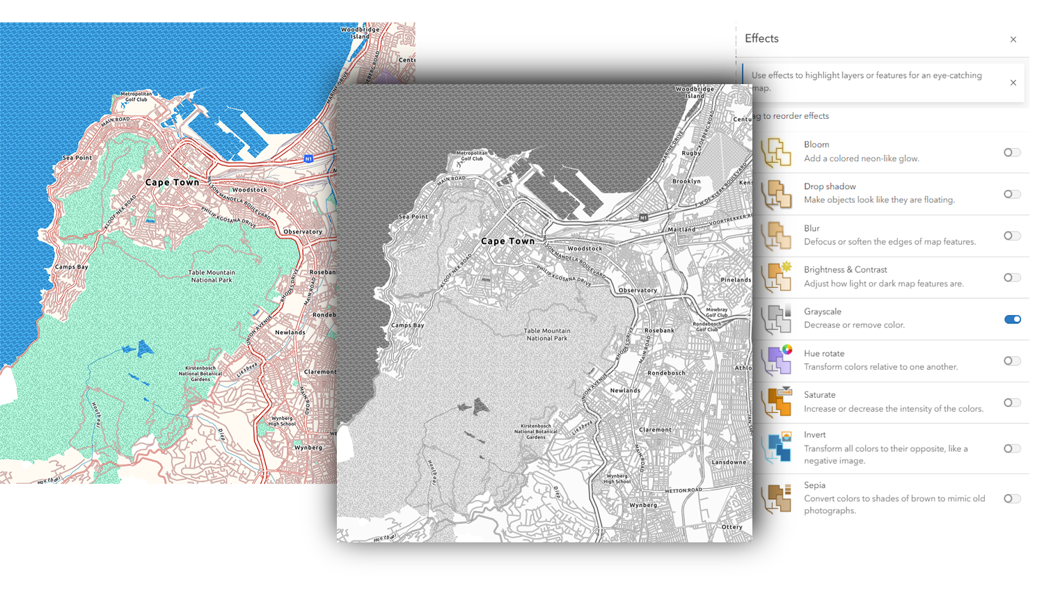
But we have other grayscale basemaps! So, what would it take to make them acceptable alternatives?
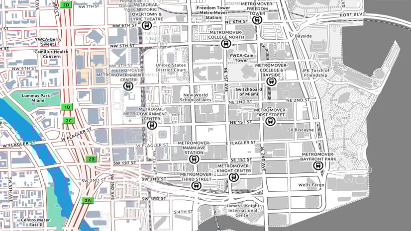
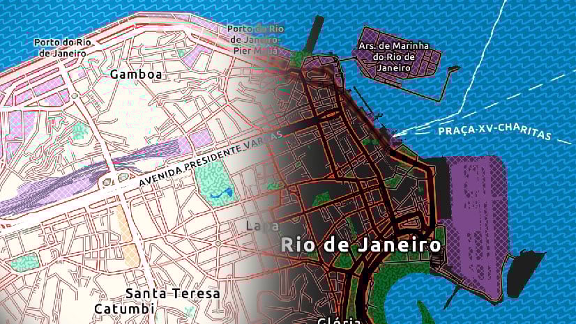
With that in mind I’ve made a few adjustments to the Human Geography and Human Geography Dark basemaps. Both feature reduced content. As long as there is enough in them to support what you are doing, they may be a more flexible alternative to the Enhanced Contrast maps. For those of you who are not thinking about accessibility, you should find them easier to read anyway.
Here are the adjustments:
The Light Gray Map
- My aesthetic preferences tend towards lighter fonts, but in this case that can be a disadvantage. With one or two exceptions I’ve made the labels heavier.
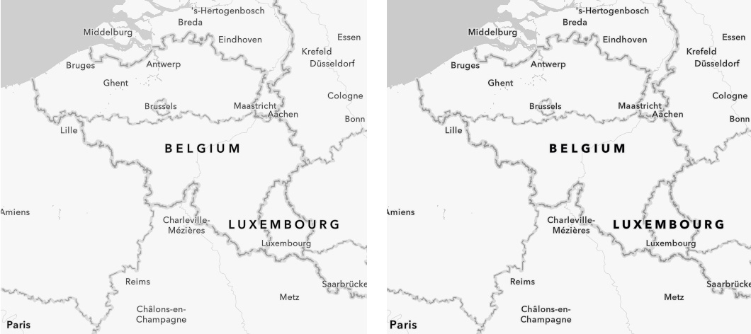
- I’ve increased the size and effectiveness of label haloes. Coupled with the heavier labels this should mean that we observe WCAG contrast criteria.
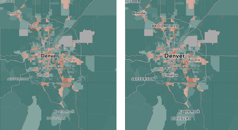
- Where I could, I increased label sizes. This is always going to be a challenge at small scales, where improving readability of labels can be at the expense of the more critical locational information. At larger scales I was more generous! In some cases, I brought the labeling of features in a scale later to enable the increase in size.
If a label is difficult to read at small scales it should be possible to zoom in and find it more legible.
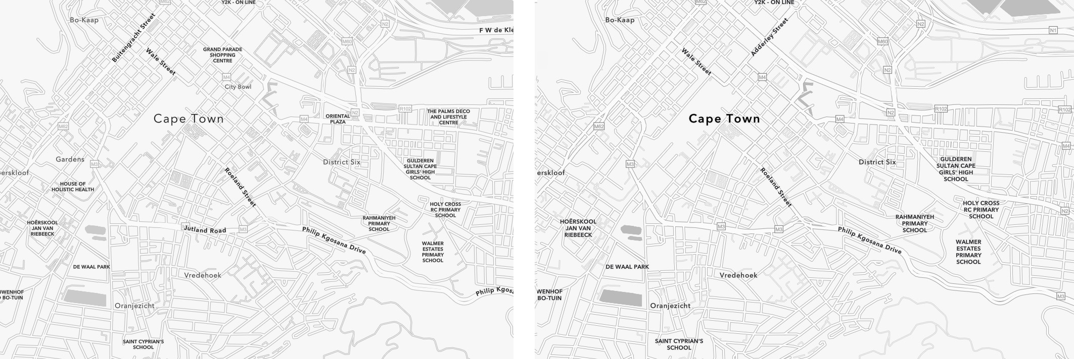
- At very large scales I increased the street widths so that they are clearer, and don’t interfere with the street labels as much.
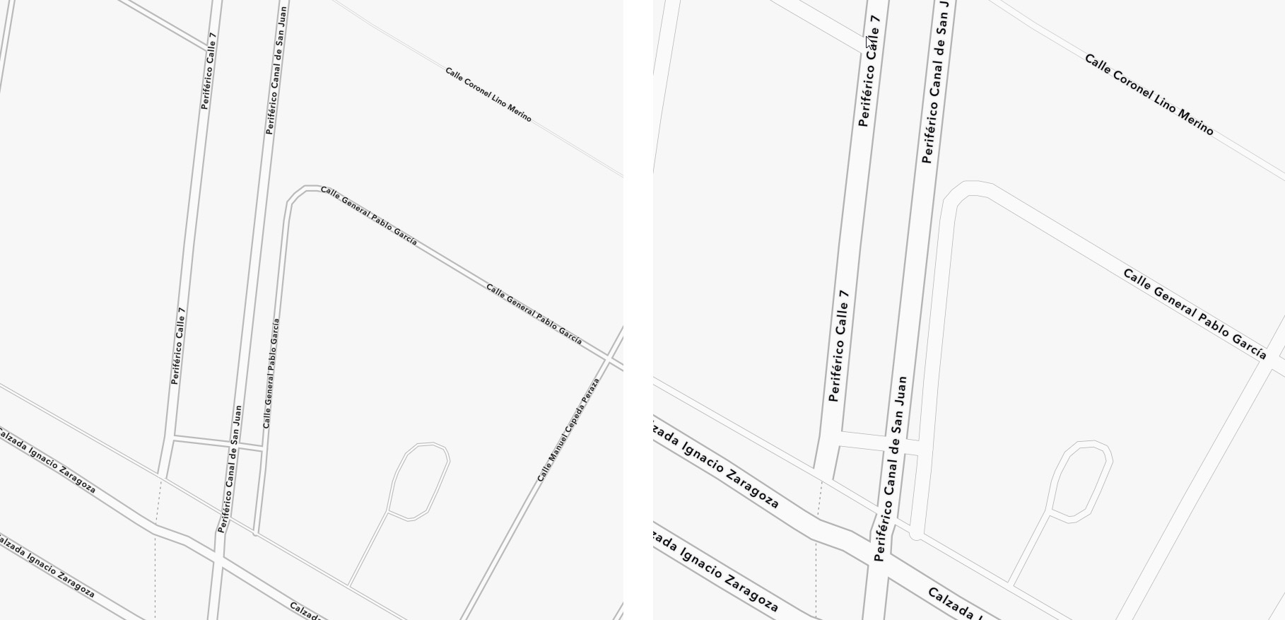
- The Detail layer is designed so that the transparency setting can be adjusted to suit. That is still the case, but I’ve changed the default setting in the web maps from 60% to 50%.
The Dark Gray Map
The changes are basically the same:
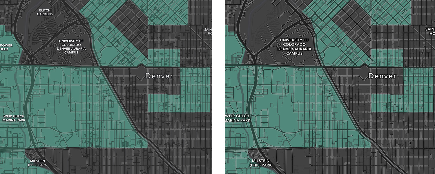
- Heavier labels.
- Adjusted haloes.
- Label size changes
- Street widths increased at large scales.
- Adjusted transparency setting in the web maps.
The Results
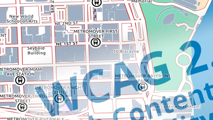
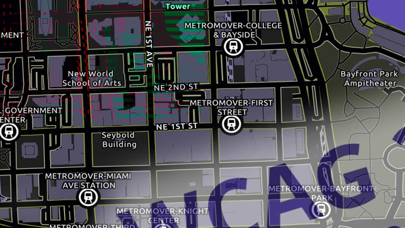
So they are not perfect, but you should see an improvement in the readability of both of these basemaps. You can use them as a starting point for building an accessible map, but remember that they are just the starting point! The effectiveness of the full map will depend on how careful you are in building your part of it.

Article Discussion: