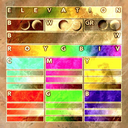
Blend modes can be a complex thing to wrap one’s head around. Experimentation is the best teacher, but even then there are lots of variabilities involved, depending on the layer you use to experiment. The Blend Mode Helper Map (and its constituent Blend Mode Helper layer) reduces that complexity by providing a reference graphic of colors and tones (and transparencies) that can be used to visually track the visual effect that a blend mode has on any underlying map. And how each blend mode compares to the others.
If you are using the ArcGIS Online map viewer, add a layer, and search for “Blend Mode Helper” from the Living Atlas option. If you are using ArcGIS Pro, click the add data button, then choose the Living Atlas tab on the left and paste “Blend Mode Helper” into the search.
It’s a cheat sheet for blend modes.
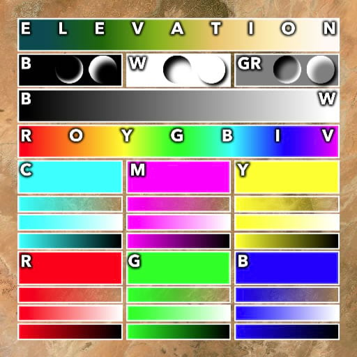
For example, here is the Blend Mode Helper over an imagery basemap, with no blend mode (AKA “normal”).
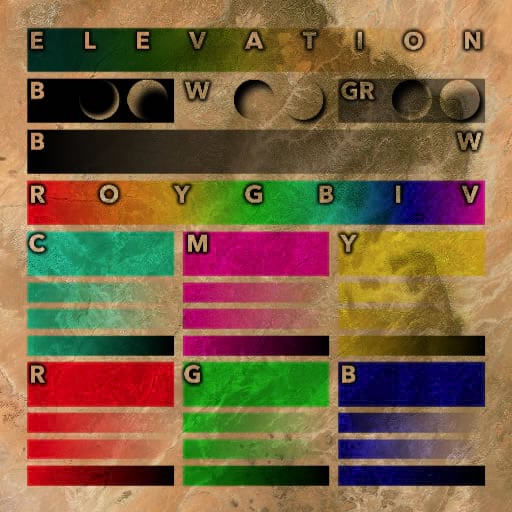
Here it is with a “multiply” blend mode. Multiply ignores white. So a gradient of black to white will effectively look like a gradient from black to transparent. Notice how the white text becomes invisible, and only the black shadows can be seen. The white outlines around all the boxes are gone. And colors have the effect of tinting the background to that hue. Applying a “multiply” blend mode to a choropleth layer will bake its hues into the underlying map so that details like streets and terrain below can still be seen.
Here it is with a “screen” blend mode. In some ways the opposite of “multiply”, the “screen” blend mode ignores black. So a gradient of white to black will effectively look like a gradient of white to transparent. The white text is visible, but the black shadows are transparent. I like to use screen on DEMs so they look like mist!
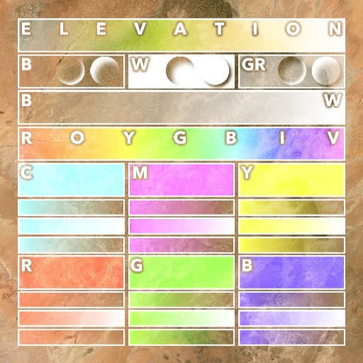
The “hard light” blend mode is effectively “screen” and “multiply” at the same time. White is visible and black is visible, but gray is ignored. This is useful if you want to retain the more extreme tones of a layer and make mid-tones invisible.
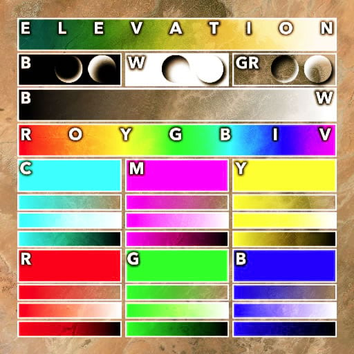
The “overlay” blend mode boosts contrast. White areas make the background brighter and black areas make the background darker. Gray is ignored. “Overlay” can be applied to a grayscale hillshade layer sitting on top of a map, so that the shadows and highlights apply contrast to the underlying content rather than obscuring it. This makes hillshaded maps vibrant and attractive.
If you’d like a tiny bit of background and some examples, here’s a frenetic video with disquieting pacing, jarring narration, and a distracting background score.
Could you tell that the greenscreen also removed my green eyes rendering my appearance hauntingly soulless? Keying out a color is actually a type of blend mode.
Anyway, try out all the other blend modes and see what you notice! This can be a useful tool for gaining familiarity with the sometimes perplexing land of blending.
Happy blending! John

Article Discussion: