The Esri Vector Tile Style Editor makes the customizing of vector tile maps a relatively simple process. More so now that the Editor is available through the map viewer. The easiest to work with are base layers like the Canvas Maps. The reduced content and the blank ‘canvas’ provided by the gray palette makes them very adaptable. However, that does not mean that the more complex basemaps are out of reach for restyling.
I’m going to work with the National Geographic Style basemap as an example of this Arguably it has the richest palette of our core basemaps, it has a lot of content, and only part of the information can be restyled. So how do you start with a map like this? (If you want to jump ahead to the final result, the new map is here).
Planning
A bright and intricate map like the National Geographic Style does not lend itself to sweeping change, so don’t be over ambitious when you are planning out what you want to do. Let the new style evolve, and you might be surprised by the result.
In this example, I’ve decided my starting point is to give the basemap an autumnal feel, then see where the process takes me. I want to make some broad changes to the palette.
Starting out
Raster layers
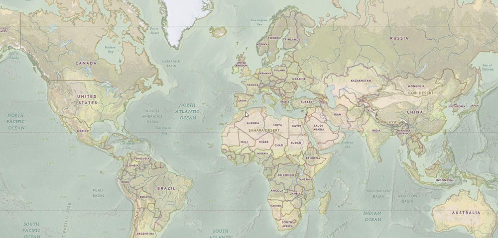
I need to give myself some room to maneuver. The strong background layer incorporating the water and land colors defines the look of the map at small scales, but it is raster-based, and therefore not customizable. What I can do is use a transparency setting to fade it back. I’ve set it to about 45% of the full saturation.
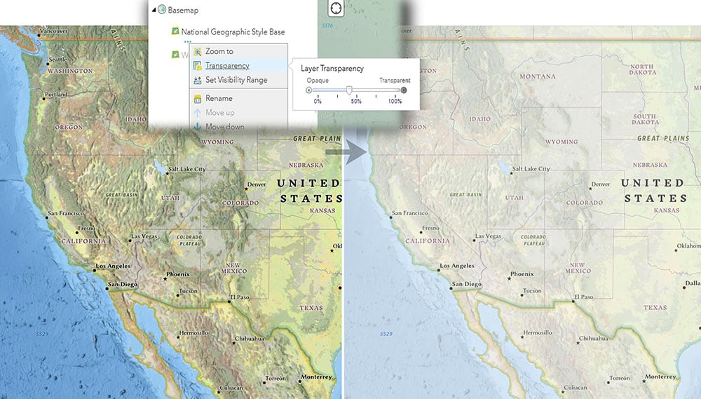
At larger scales the background is the ‘’World Hillshade’ raster layer, so I’ve made the same adjustment to that to tone it back
Vector layers
Now I can switch to the vector tile layer, which carries the rest of the information. I’ve saved a copy of the original and called it ‘National Geographic Style Autumn’. This IS customizable using the Vector Style Editor.
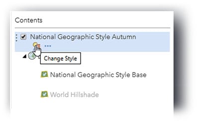
I need to find some features that will overlay the background so that I can shift the overall color of the map. The Reference Document can help me with that. The basemap has a land polygon limited on the current map to larger scales only. But the reference document (starting on p14) tells me that it is available at levels 0-18. In the Style Editor I can adjust it to the full scale range (it resamples at zoom levels beyond 18).
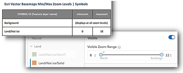
Similarly, the ‘Marine Area’ layer is available at all of my required scales. These polygons now overlay the background at smaller scales.
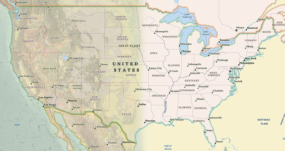
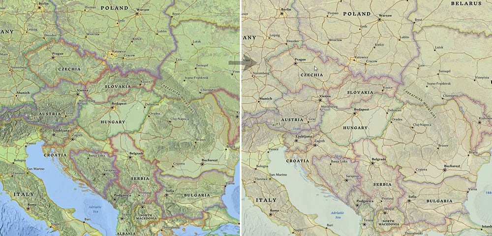
Now I can use a combination of color and opacity on the overlying polygons to change the feel of the base. By lowering the opacity level (increasing the transparency), I can set colors that work with the background layer to create the new look. I keep a graphics app alongside my work to try things out (in my case it is Adobe Illustrator), and I’ve used it to calculate these new color values. The results are a bit startling in the Style Editor (right) – yellow and pink! But when set over the muted background (left) they are giving me that Autumnal feel.
Boundaries
The distinctive ‘Tint Band’ effects used along the boundaries on the National Geographic Style map are tricky, because there are many layers to deal with, and on this paler background they need to be less pronounced. I could work out a new palette to suit this map, then use the ‘Edit by Color’ option in the Style Editor to apply the new values, but I decided on a different approach.
Instead I have kept the existing colors and lowered the opacity value on all of the layers (increased the transparency). The new ‘land’ color blends into the adjusted tint bands giving them a much more complementary feel.
Next steps
The overall look of the map is established, but now I need to review the details. This is where much of the time is spent. All of the information, at all zoom levels, needs to be examined to see if it is still working with the new palette. Symbol conflicts must be addressed, but beyond that you may want to make changes for aesthetic reasons.
In this case I’ve decided that boundary lines and roads are okay, but some other features do need to be adjusted. For example, enclosed water polygons (lakes, etc.) are on separate layers, and they need to be changed to match the new aggregated color of the open water areas. I’ve sampled the combined color, captured the value in my graphics app, then applied it to the water polygons.

There are other features at various scales that either require or would look better with some adjustment.
The fun part
Once the basic look is nailed down you can start to play!
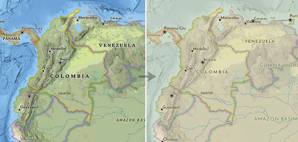
One change that can be dramatic is to switch the font treatment. I’ve decided I want a simpler look, so I’ve used Josefina Sans and Josefina Slab (These fonts are available as options in our basemaps). Not all labels need to be switched (I left streets alone for example), but I’ve gone through level by level and changed those that make a significant difference.
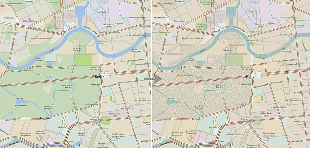
I’ve also introduced a ‘fall trees’ pattern for parks and forests at larger scales (See ‘Icons & Patterns’ for more information on how to do this). I’ve used transparency settings to blend them into the solid color at smaller scales.
The result
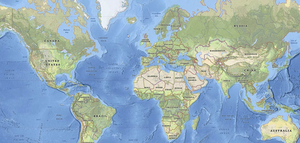
Here is the link to my final basemap again. I think you’ll agree that it looks very different to the source.
Below are before and after images:
The impactful changes I’ve made in customizing this basemap are limited:
- Reducing the strength of the background and the boundary tint bands.
- Two color adjustments to affect the overall look.
- A change of font.
- A new pattern fill.
It’s not all I’ve done – I’ve made a lot of subtle adjustments to the symbolization at all scales, but these four are the ones that define the new basemap (Compare it to the original National Geographic Style basemap and work through the scales if you want to see what the other changes are).
The level of work you want to put into this sort of project is up to you, and even with a map as distinctive as this it doesn’t need much to change its appearance. Be careful though! It’s very easy to underestimate the amount of effort involved in the details, and to lose yourself in them. Depending on how you intend to use it, and how diligent you want to be, the work involved in finishing such a transformation can be as little or as much as you want.

Commenting is not enabled for this article.