An orthographic projection is the best approximation of a view of the earth from space. It’s an azimuthal perspective projection which creates an illusion of a three-dimensional globe.
It’s an old projection, believed to have first been developed by the Ancient Egyptians and Greeks. In our time this perspective feels natural since our culture has assimilated how our planet looks from a spacecraft. A good example is Earth’s first portrait, taken from Apollo 8 mission astronauts in 1968:
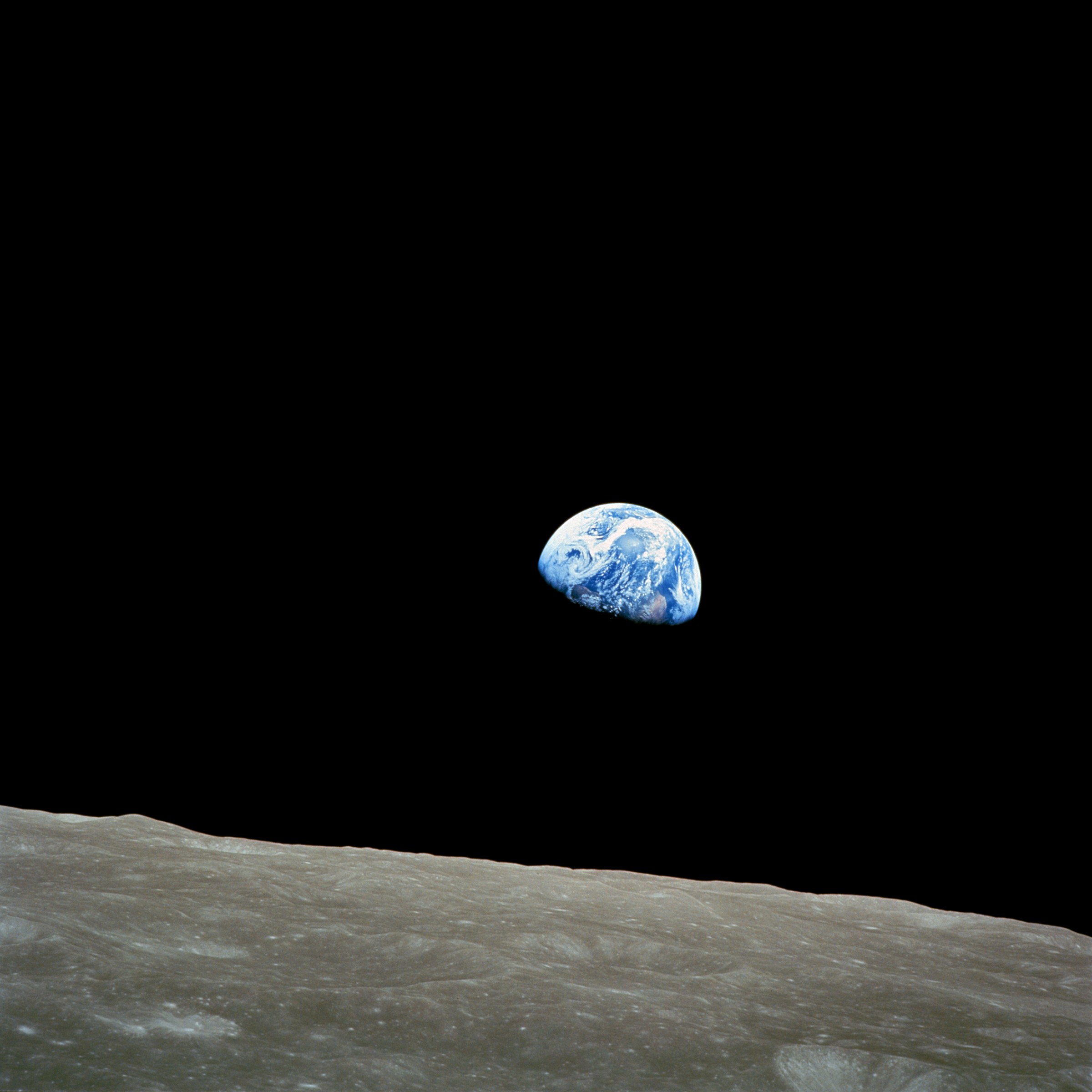
This projection only shows a portion of earth at any given time. Cartographers can use this projection effectively to highlight a particular view of earth in a way that is immediately and intuitively understood.
For our example we are going to be helping people understand Hurricane Basins. We will create custom orthographic maps and then export them as .png files (you could do .svg) to become icons we can use and share. Icons are simplified pictures that represent real things. Quite often they are small so they need to be straightforward and uncomplicated.
Our example is focused on the Hurricane Basins that border the US – Eastern Pacific and North Atlantic. From the ArcGIS Online and Living Atlas bring in Hurricane Basins, World Countries Generalized, and Global Background. Change the World Countries layer to white with no outline and make the Global Background black.
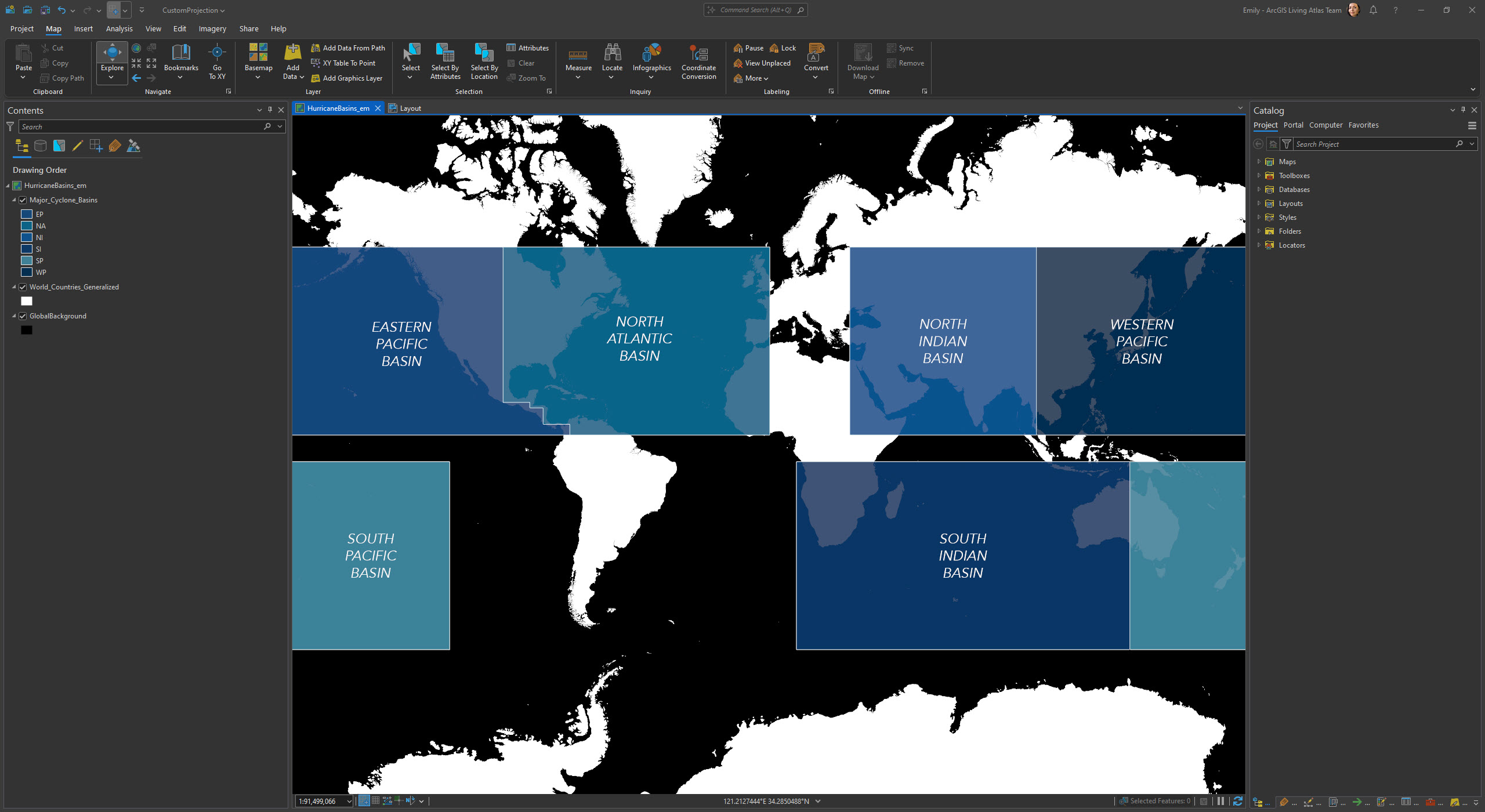
In ArcGIS Pro only two orthographic projections are defined – for the North and South Pole. Thankfully it’s easy to customize the orthographic projection to pivot the planet to be seen from a desired point of view. You may think as if you were on a spacecraft looking down at the earth. All you need then are two coordinates, the latitude and longitude below your viewing position.
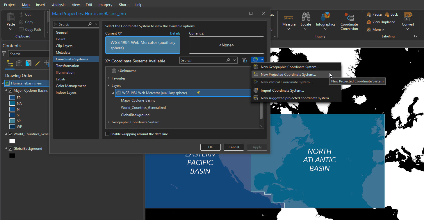
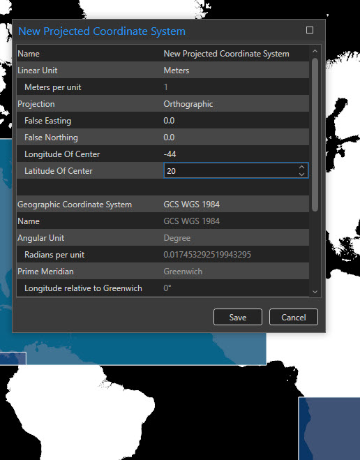
Let’s start by making a map of the North Atlantic Basin. Right click on the map and open the Properties. Under Coordinate System select New Projected Coordinate System.
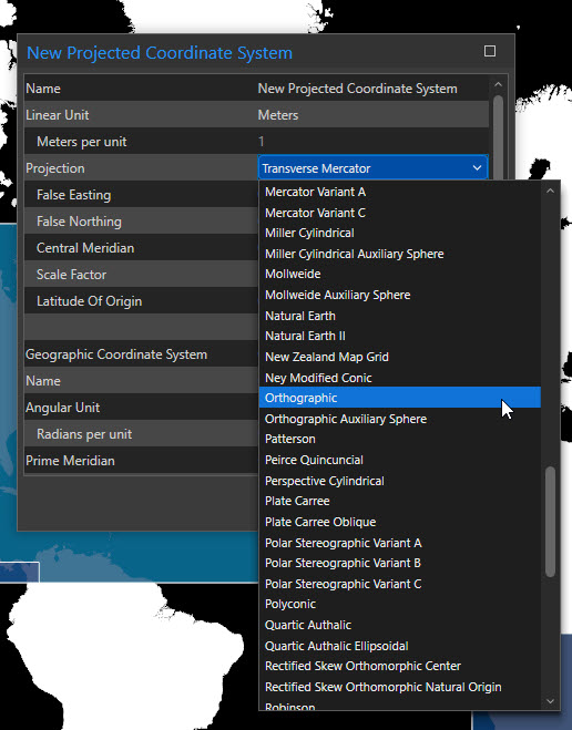
First change the projection to Orthographic.
To highlight the North Atlantic Basin we will center the projection on the coordinates of 44 degrees west longitude (-44) and 20 degrees north latitude. Click Save and OK.
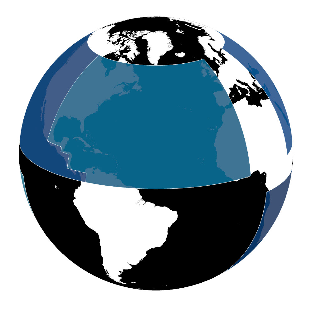
Here’s our new map highlighting the Atlantic Basin.
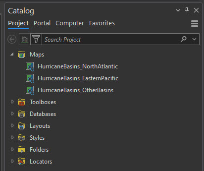
Let’s make the two other ones that we need, one for the Eastern Pacific Basin and one that ‘generally’ covers most of the other Basins. Copy your map two times so you can specify each of them with their own custom orthographic projection.
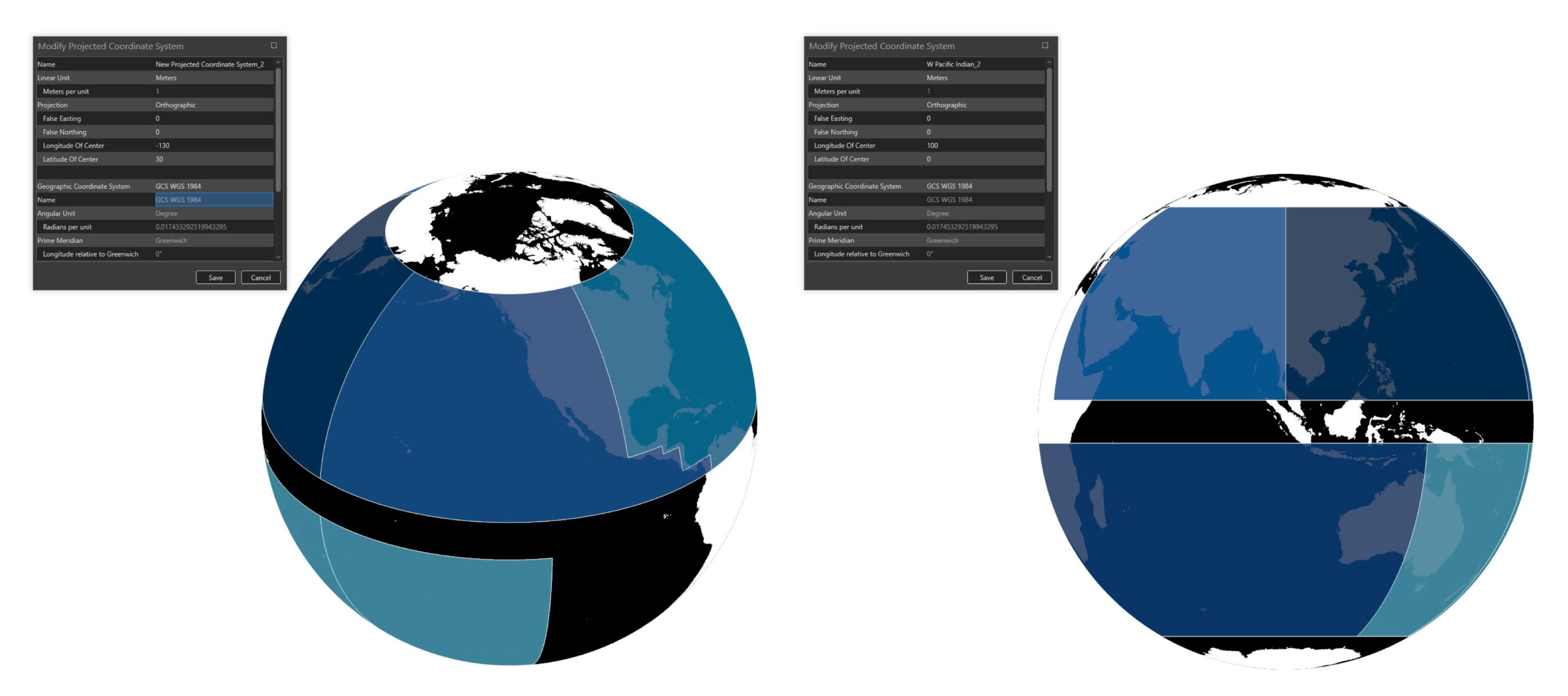
Follow the same process for the Eastern Pacific having coordinates of 130 degrees west longitude (-130) and 30 degrees north latitude; and all Other Basins to be coordinates of 100 degrees east longitude (100) and 0 degrees south latitude.
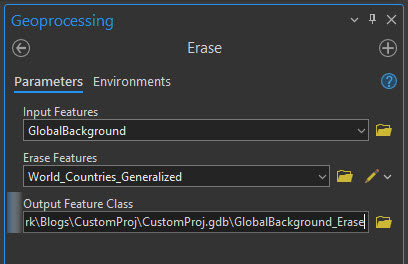
Go back to the North Atlantic map and turn off the basins. Open up the Geoprocessing Toolbar and search for the Erase tool. Because the Global Background is a giant shape that covers the entire earth we can use it as a base layer from which things will be removed. For this we are going to ‘erase’ World Countries from the Global Background. This will leave us with only the ocean and not the land.
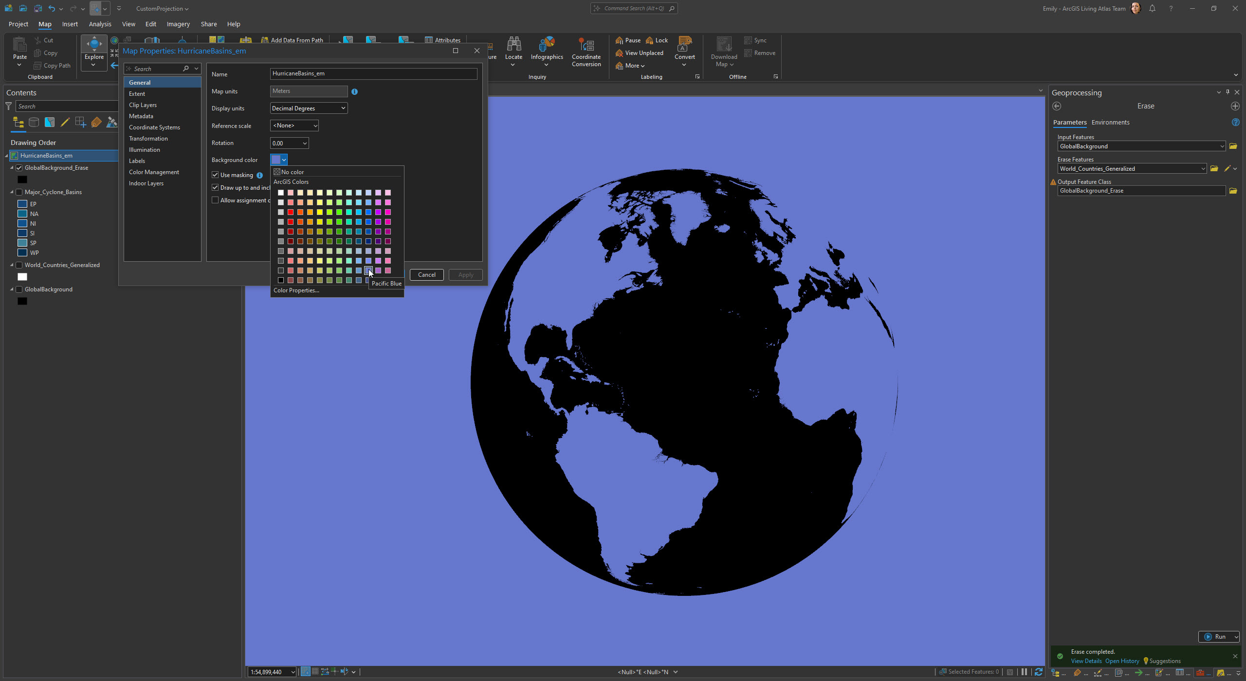
Here is the result. In order to see the results of the Erase tool in this image we temporarily set the map background color just for this screen shot to Pacific Blue. Repeat this same process for the Eastern Pacific and Other Basins maps.
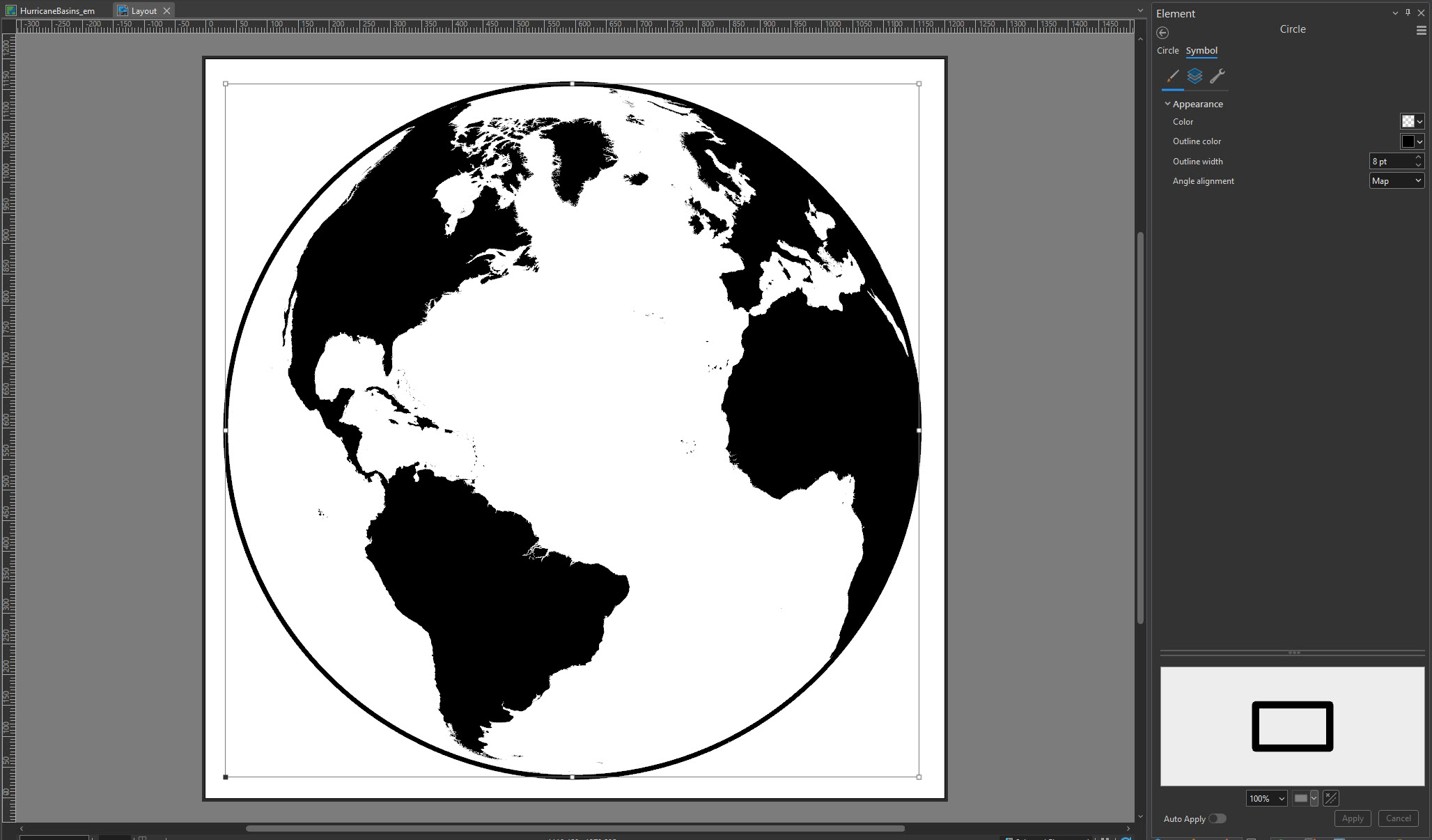
Next create a layout (we used square shaped 1200×1200 px) and then place the North Atlantic map. We used a scale set to 1:32,074,099. To mask out the little edges of land along the edge of the map and to give our new icon some presence, we drew a hollow circle over the map and set the size of the outline to 8 points.
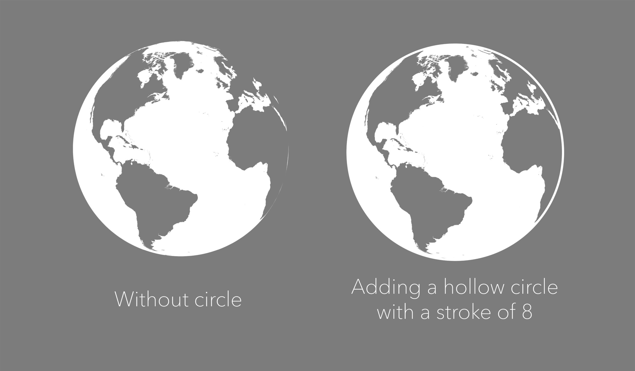
Here are views from before and after the circle was added.
For our purposes we want a white globe. We will change the color of the land and the circle over the map to white. (In the image below, the land and circle are white with a transparent background. The canvas looks blank, but its not.) You can export the map as a .png with a transparent background or as an .svg. We are going to do a .png file.
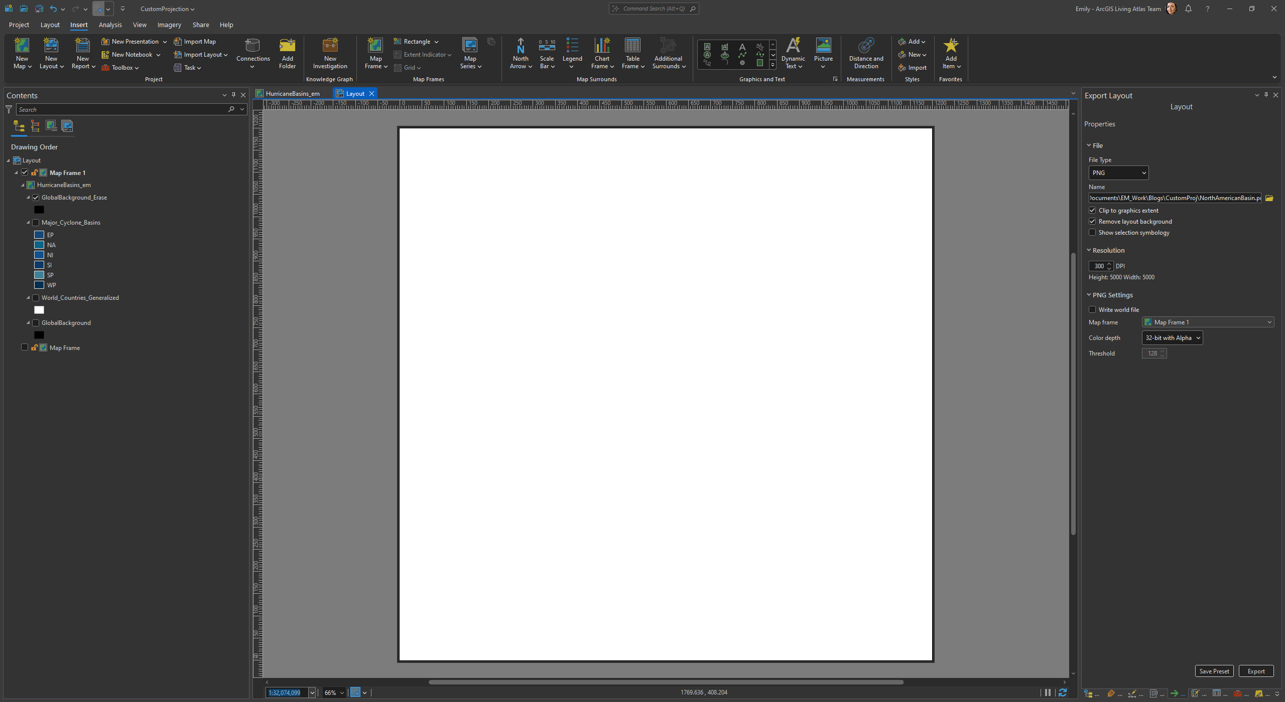
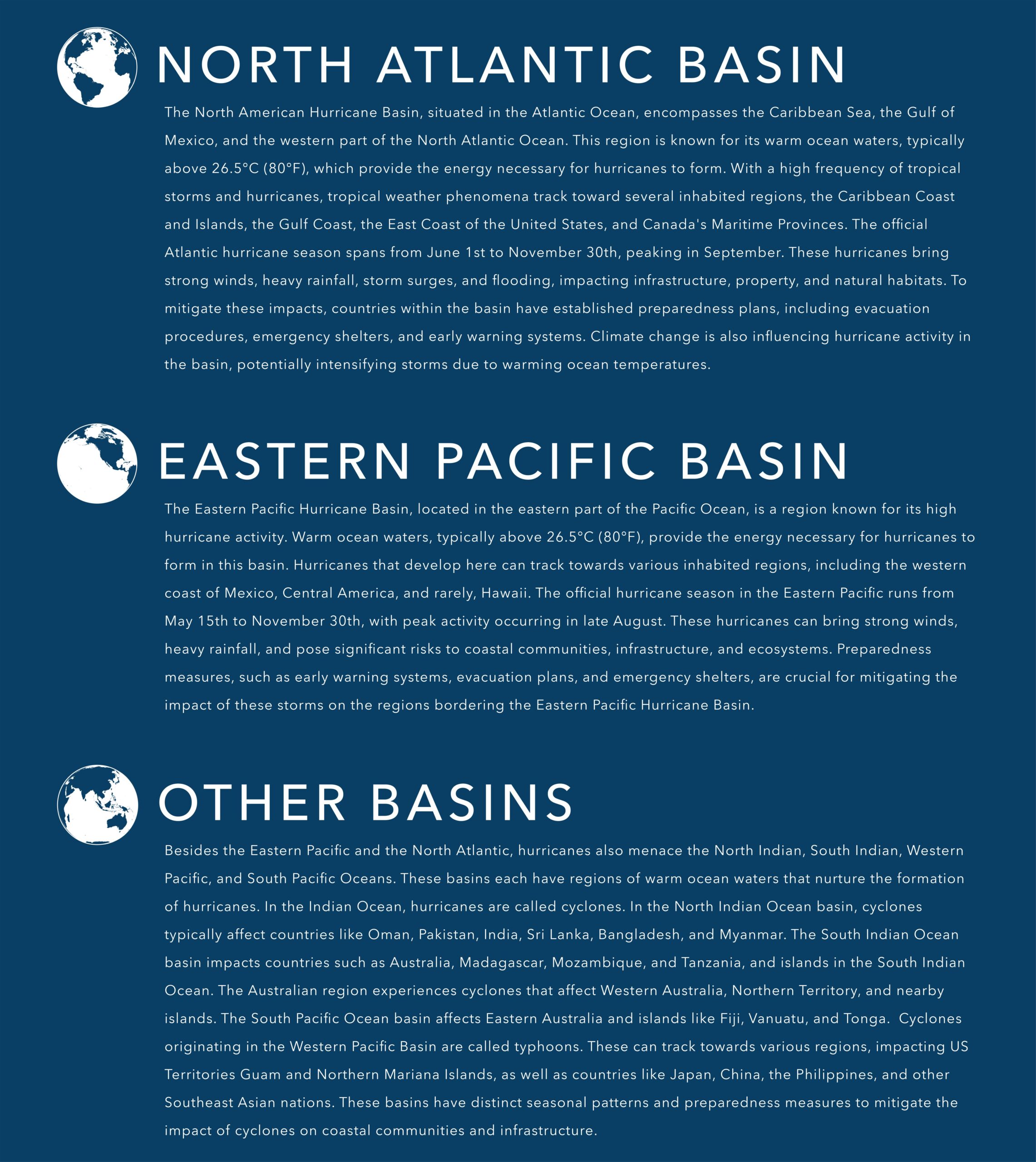
Create layouts for the Eastern Pacific and Other Basins maps and follow the same steps by erasing and exporting each of these as .png or .svg files. We now have three custom orthographic map icons.

Voila! You made your own custom royalty-free graphics that can be used and repeated ad infinitum as icons in graphics, charts, or reports.
Please reach out to us with comments or questions. We hope you enjoy making orthographic map icons as much as we do!


Article Discussion: