It was the early 2000s. I was freshly graduated, living in the basement of my in-laws’ house. As the weeks turned into months I would scan each day’s new job listings in the GIS Jobs Clearinghouse with an accumulating sense of futility. Why was I not hearing back from anyone? It felt like I was typing up thoughtful, enthusiastic, positive, individually-tailored introduction emails, including a resume and cover letter, and throwing them into the abyss.
Then one day, I got the sense that my emailed or web-formed invitations to prospective employers to check out the attatched resume and cover letter just didn’t feel…quite…right. That’s how you spell attatched, isn’t it? Of course it is, but let me just check…
A T T A C H E D.
A cup of ice water, poured right down my back. How many times had I confidently invited the reader to review my…attatchments? Maybe hundreds. Not professional. Not corporate.
Don’t be like me.
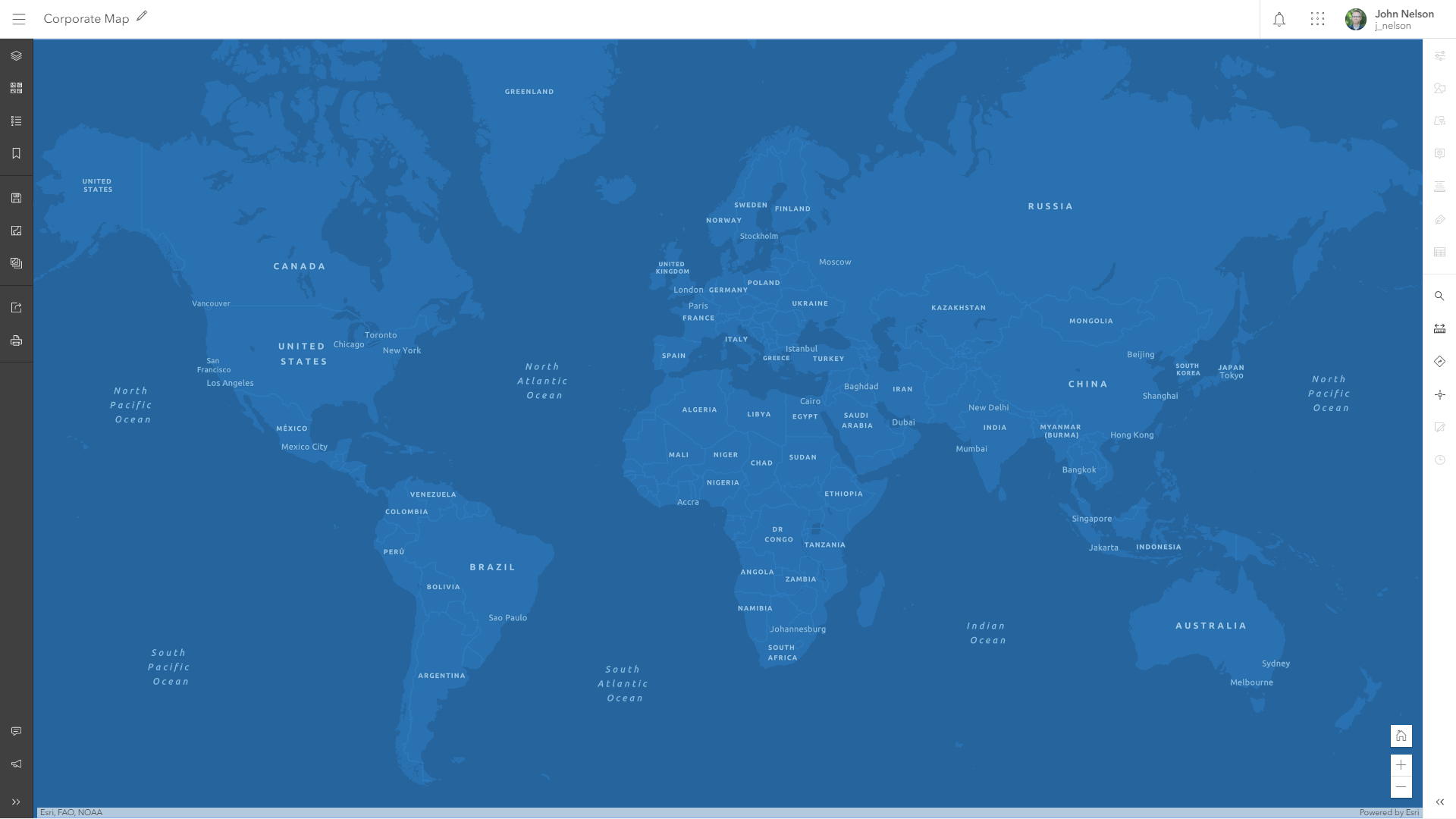
Corporate Map
The Corporate Map is a cool blue-themed web map all ready for your professional, crisp, handsome applications. Be extra synergistic in your corporate aura and try it out in the grand and glorious Map Viewer Beta. You can also find it, and the vector basemap all by itself, in the Living Atlas.

Makes me want to collaborate and find new markets and engage in solutions. It says to me, “sure, I’m professional and I get the job done, but I’m not intimidating—I’m just a friendly web map, out there trying to make things happen. Connecting dots. Approachable; ready for business. Can I help you find one of our regional offices?”
And I know that when I zoom way down into a web map, I like to have a better sense of context than a basic road map; at that scale, show me streets and buildings and parks and imagery like a real bird’s eye view. Corporate map just does that for you. A handy hybrid approach. Where’s that coffee shop? Ah, right there.

Rebranding
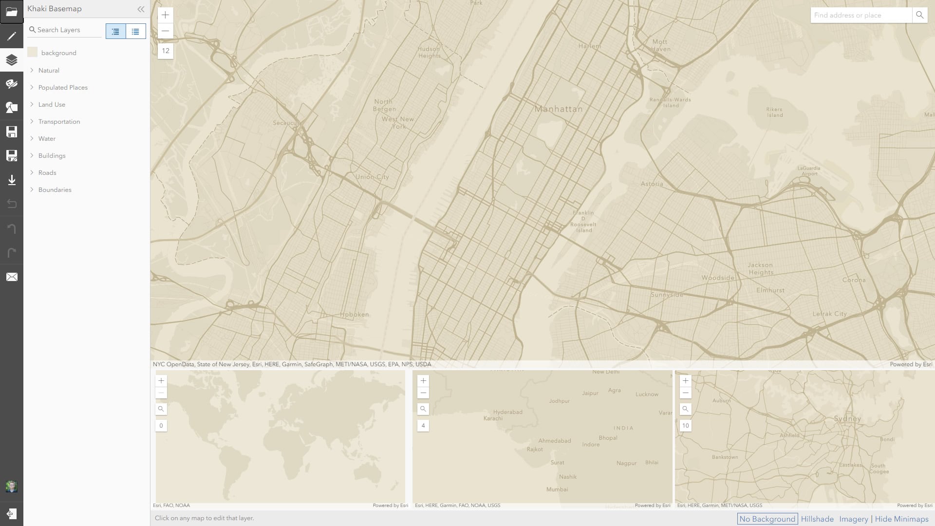
Blue not your look? If you like the monochromatic quality of the Corporate Map, and how it helpfully feathers into imagery at close scales, but you’d like to match it to your own brand, you can open up the underlying Corporate vector basemap in the Vector Tile Style Editor and change it to whatever palette you need. Here is a direct link to the editor, with the Corporate basemap in it, ready to rock. Just change up the colors and save it as your own vector basemap. Then swap out the your Corporate Map’s blue basemap with your newly recolored one.

For example, this Khaki basemap was a quick recoloring of the Corporate basemap.
Nice, professional, business-like. Unlike my job application emails of yore. Don’t worry about me, I found something eventually and I have a rewarding life, however strewn with cautionary tales. It’s the sourness of failure that provides a richer context for the sweetness of success. That’s what I tell myself, anyway.
Yours Very Professionally,
Mr. Nelson

Article Discussion: