In the first four parts of this series, we’ve introduced a collection of multidimensional layers featuring WorldPop’s gridded population estimates, shown how to get started using these layers, and shared an example where these layers were applied to better understand women’s access to health services in Ghana.
Here in Part 5, we are sharing our response to the most common request we’ve received regarding WorldPop layers. Within a few weeks of publishing the layers in November of 2021, we received several requests for a “fast-drawing cartographic version”. These requests included that such layers needed to integrate with basemaps and work well with the new layer blend modes and effects.
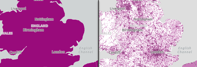
To meet these needs, we created two new layers using the 2020 slice of WorldPop’s Population Density 100-m layer:
How to Use these Layers
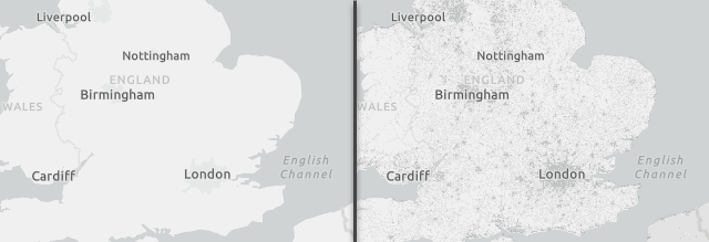
The easiest way is to use these layers with 75 to 85% transparency with the light gray canvas map:

Tip: Move one or both of the footprint layers into the base map.
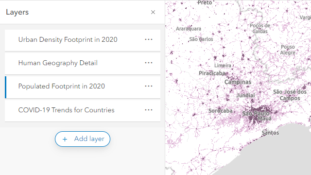
Another option is to use the Composite Blend Modes with a polygon layer to better focus maps that should highlight population-based phenomena. Here we applied this idea to the COVID-19 Trends Countries Layer:

To make this above map, we used the following drawing order of layers in our webmap’s table of contents:
- Urban Density Footprint in 2020 (Destination Over blend mode)
- Human Geography Detail layer (75% transparency; this adds the gray background and labels)
- Populated Footprint in 2020 (Destination In blend mode and 75% transparency)
- COVID-19 Trends for Countries
- Basemap: Light Gray Canvas

There many other ways to mix these layers into your maps using blend modes – have some fun experimenting. Check out these blogs that share more about using the blend modes:
How we Made these Layers
The item page descriptions for the populated footprint and urban density footprint layers provide the steps we used to create each layer. The processing for both layers included reclassifying the data to 1-bit integer rasters, which makes them very efficient to draw. We tested using an 8-bit image with percentile density values and found it drew more than four times slower. That made it easy for us to choose the option of two 1-bit layers.
How we Hosted these Layers
We took advantage of a relatively new capability: ArcGIS Image for ArcGIS Online. All we needed to do was create the 1-bit TIFF files of each footprint of population and then use ArcGIS Online to upload and tile them.

Article Discussion: