Go outside. Breathe deep.
It’s probably safe to do that where you are right now. How do I know? This map:
New to ArcGIS Living Atlas of the World is Recent Conditions in Air Quality (PM2.5). This layer brings in the latest PM 2.5 air quality measurements from OpenAQ, an organization that aggregates data from national networks such as the EPA. The layer updates each hour with information from over 3,500 stations worldwide.
What is PM2.5?
Let’s break down the term a bit.
PM = particulate matter, which can be anything from smoke, dust, pollen, soot, chemical aerosols, salt spray, water droplets, etc.
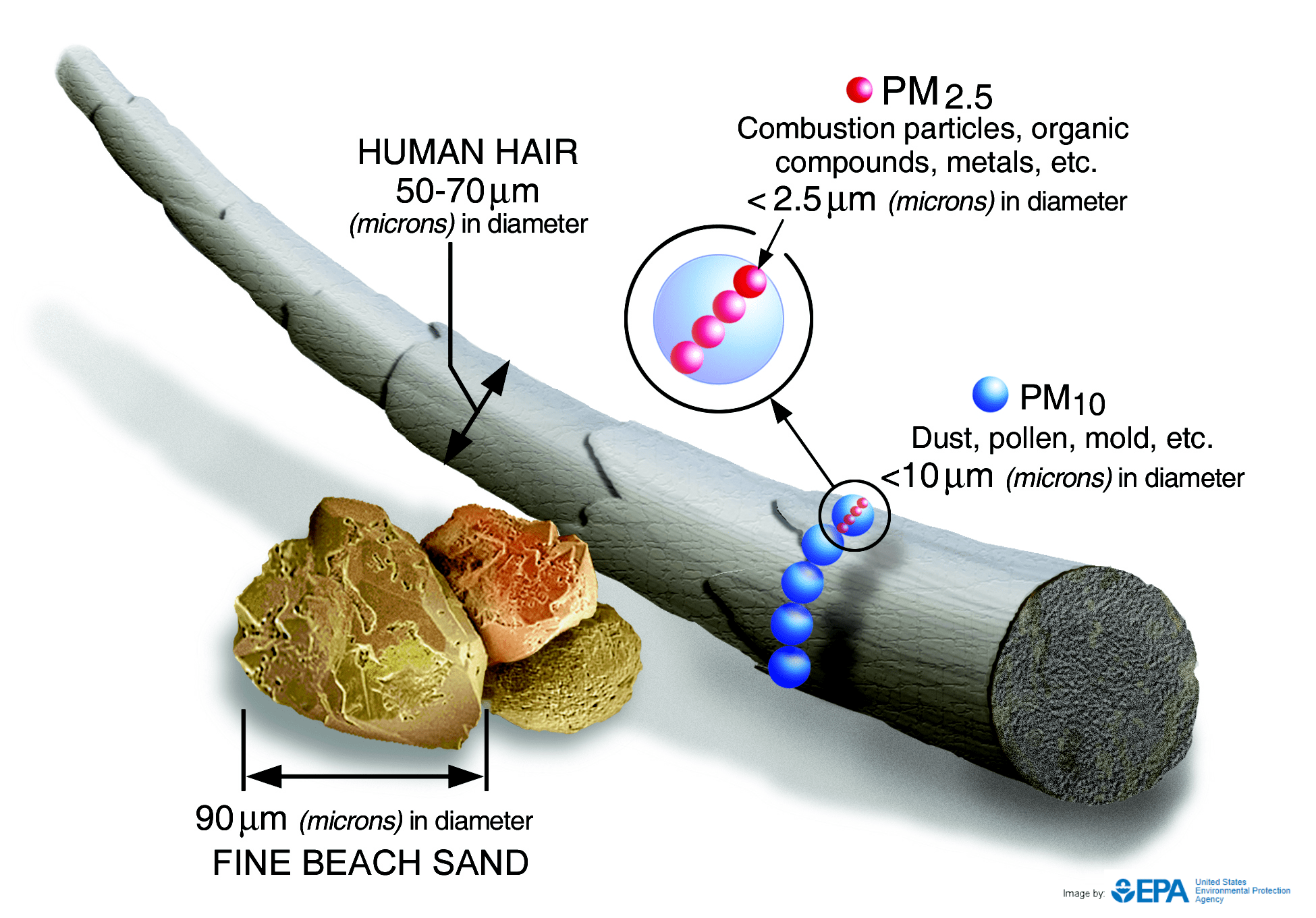
2.5 = the diameter of the particle in microns. How big is 2.5 microns?

As you can see, 2.5 microns is pretty small. So small that these particles can penetrate deep into airways, damage tissues, and get into the bloodstream.
Human exposure to high levels of PM2.5 increases the risk of respiratory and cardiovascular illnesses. The World Health Organization (WHO) guidelines provide long-term and short-term exposure limits to PM2.5:
- Long-term: 10 µg/m³ annual mean
- Short-term: 36 µg/m³ 24-hour mean
Typically, we see urban and industrialized areas far exceed these limits. One positive note of the global pandemic shutdown has been the reduction in PM2.5 for many areas as emissions have been reduced and lingering particles fall out with rain or are dispersed. PM2.5 will gradually rise as industry opens back up and people start driving more, so this map will become especially useful as industry and outdoor recreation become more common.
Of course, PM2.5 is only one component of air quality. Other major indicators that go into a more comprehensive Air Quality Index include PM10 and ground-level ozone. And while this layer only shows “now” there are some new layers in Living Atlas that provide more historical context for PM2.5 in the United States. Check out this recent blog to find out more.
You can post questions or comments below or on our GeoNet.


Article Discussion: