*Note – An updated Version 1.0 was released by the Council on Environmental Quality (CEQ) on November 22, 2022 and is now available in Living Atlas here. There are still eight categories but many revisions to their criteria, and two additional ways a tract can be identified as disadvantaged. See the Justice40 Initiative criteria for details. The older versions discussed below and published by Esri remain publicly available in ArcGIS Online.
Esri recently released the latest Justice40 Tracts from the Council on Environmental Quality (CEQ) into ArcGIS Living Atlas of the World. Maps made with this important data help anyone see maps of communities that are disadvantaged according to Justice40 Initiative criteria in the U.S. and its territories. Tracts have been identified as disadvantaged across eight different categories:
- Climate change
- Clean energy and energy efficiency
- Clean transit
- Affordable and sustainable housing
- Reduction and remediation of legacy pollution
- Critical clean water and wastewater infrastructure
- Health burdens
- Training and workforce development
Use this layer to help plan for grant applications, to perform spatial analysis, and to create informative dashboards and web applications. The layer and map are free to use, and suitable for dashboards, apps, stories, and supporting material in grant applications.
The data was released on the CEQ website as a shapefile, Excel file and CSV file April 6, 2022. This map uses 2010 census tracts from Version 0.1 of the source data downloaded April 15, 2022. The Living Atlas Policy Maps team uploaded the shapefile to ArcGIS Online, but added significant value along the way. (UPDATE: a newer version was posted on the CEQ website in early May 2022, and is now available as a new layer and web map. There were a few schema changes to the data, so the April 2022 layer and web map remains available, giving you time to migrate to the new version when able.)
The team added field aliases and long field descriptions to the layer, so that users of this data do not have to look that information up in various supporting documents. Field names like “TPF” are clearly marked “Total Population” in the field alias, and with a description “Total population. Source: Census Bureau’s American Community Survey, 2015-2019” to clarify where the figure came from.
The Living Atlas Policy Maps team also wrote a few simple Arcade expressions to tell the data’s story in pop-ups and simple cartography. Details of each tract’s assessment are provided in the pop-up for every census tract in the United States and its territories American Samoa, Guam, the Northern Mariana Islands, Puerto Rico, and the U.S. Virgin Islands.
The Justice40 feature layer
In the layer, pop-ups describe each tract’s status, with supporting charts that show criteria used. The pop-up also provide additional information including which of the eight categories the tract is flagged for, as well as some county and state numbers.
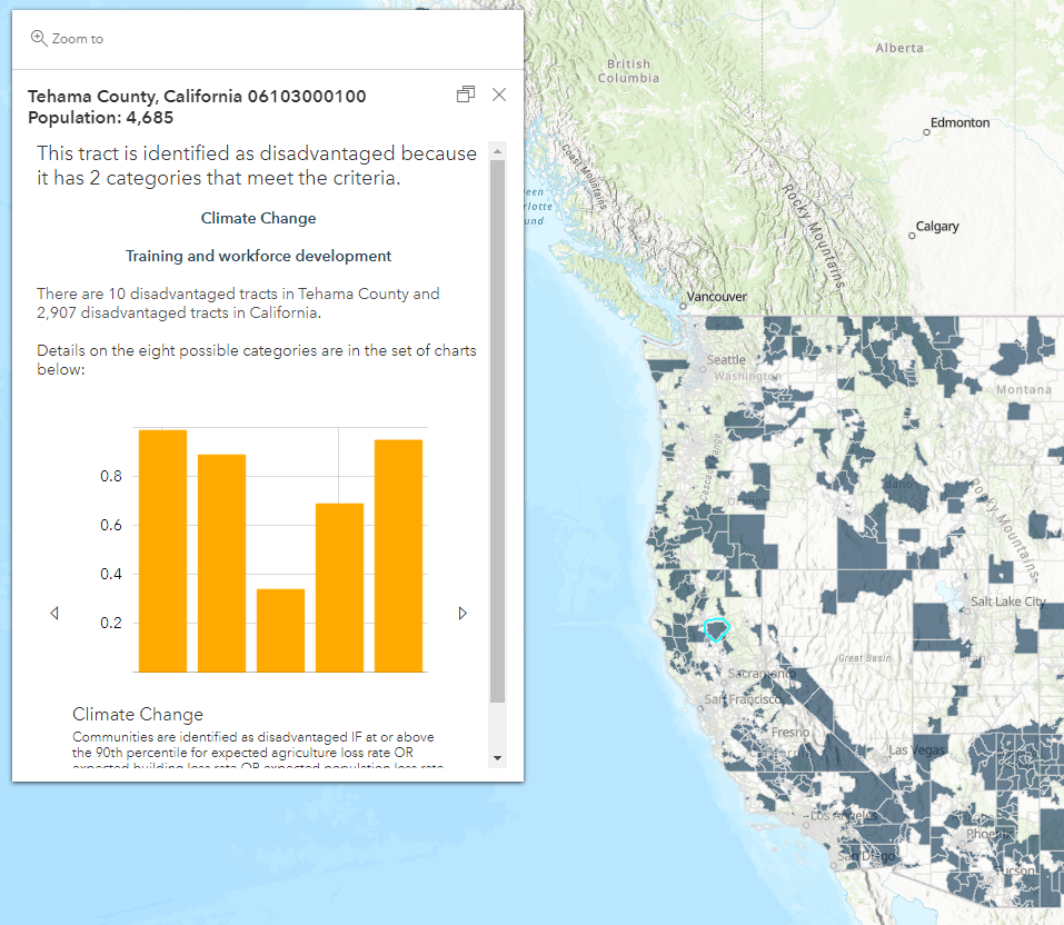
Census tracts that meet the criteria are shaded in a semi-transparent blue to work with a wide variety of basemaps.
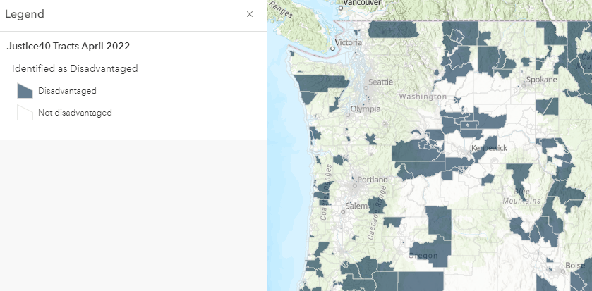
Add this layer to your map, filter it to your state or county, and save your web map for use in a story map, app, or dashboard. Additionally, this layer can be used in spatial analysis to answer many types of questions. Typical questions that grant writers often need to answer are:
- What percent of our service area’s/attendance area’s population live in tracts that are identified as disadvantaged? (Use the Summarize Within tool.)
- Which of our sites/locations are in tracts that are identified as disadvantaged? (Use Join Features based on spatial relationship.)
- What is the top category that tracts in my community are disadvantaged in? (Filter to tracts in your community. Then from the Attribute Table, get statistics on each of the eight categories and check Sum of Values to see the counts of tracts in each category.)
The Justice40 web map
The web map is ready to use in any app, story map or dashboard, and features a solid blue color for tracts that meet the criteria on the Human Geography Basemap. This basemap is optimized for use with statistical data like Justice40 because its neutral colors do not compete or distract from the colors used in the Justice40 symbology. The roads and labels show on top of the blue tracts, and when you zoom in far enough building footprints appear, reminding the reader that this is about neighborhoods.
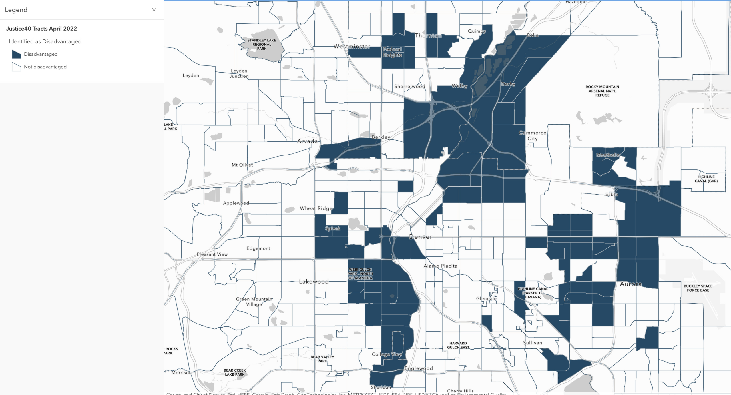
You are welcome to open the web map, filter the Justice40 Tracts layer to your state or county, and click “Save As” to then use your web map in a story map, app or dashboard. Smart Mapping within ArcGIS Online enables interactive data exploration. Choose the attributes you want to show, and experiment with different drawing styles to create the map you want.
Living Atlas provides high-quality GIS content to you
These items are free to use and modify to suit local analysis work, support grant writing, incorporate into dashboards, apps, and stories. See layer and web map in Living Atlas here. Learning from previous experiences in March with a February version of this data, we were able to confirm the value of the many schema changes delivered by CEQ in this latest version.
These are some of the newest items in ArcGIS Living Atlas of the World: a collection of maps, apps, and data layers to support your work. The three major sources of Justice40 data – CDC PLACES, FEMA National Risk Index, and many American Community Survey estimates – are also available in Living Atlas.
#CEQ #GIS Equity & Social Justice #Environmental Justice #policymaps.



Article Discussion: