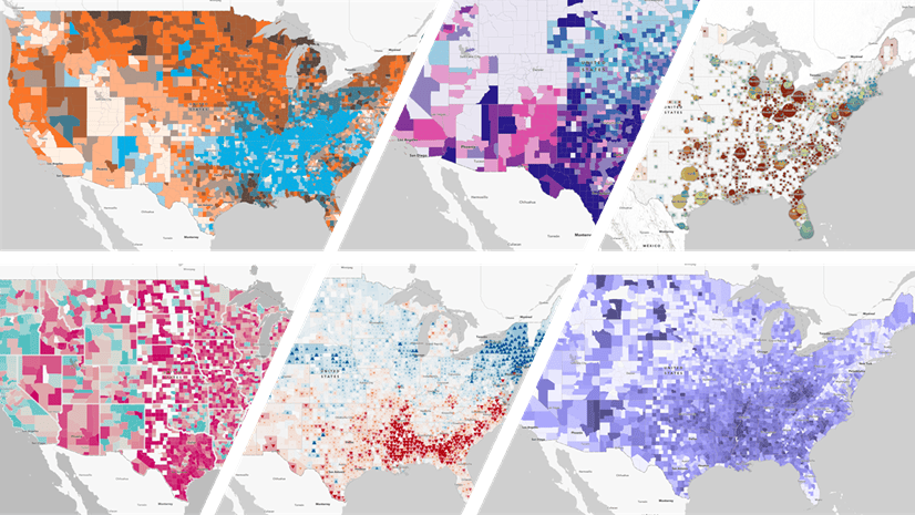
At the heart of most GIS analysts’ work is helping and supporting communities to thrive. Local government, urban planners, utilities & healthcare organizations, transportation agencies, and nonprofits are just a few of the many actors who have a direct impact on our communities. A dataset often used to understand communities is the County Health Rankings & Roadmaps Annual Data Release. As such, it’s been available in Living Atlas as a feature layer and in various maps for several years. We are pleased to announce that the 2024 feature layer is now available.

If you had the 2023 layer marked as one of your favorites, now is the time to add the 2024 layer there as well.
Contributed by the source
This year’s layer has been contributed to Living Atlas from the source: County Health Rankings & Roadmaps (CHR&R), a program of the University of Wisconsin Population Health Institute with support from the Robert Wood Johnson Foundation. This means the Item Page and field metadata contain first-hand information from the curator of the dataset. Because CHR&R has published the layer in ArcGIS and shared it directly, you do not need to go find this data on the Internet, download it and prepare it for use in ArcGIS – you can simply search for the layer in Living Atlas and add it to your project immediately, saving you time and effort. You can still download the data if needed, but the upfront cost of looking at the data in ArcGIS is just a couple clicks away.

CHR&R joins many other organizations who are contributing their content directly to Living Atlas to make it more accessible to you. These organizations include: Centers for Disease Control and Prevention (CDC), National Oceanic and Atmospheric Administration (NOAA), National Center for Education Statistics (NCES), Federal Emergency Management Administration (FEMA), and the Environmental Protection Agency (EPA), along with non-governmental organizations such as NatureServe and University of Richmond. This speaks to the high GIS capacity and GIS leadership of these institutions.
All these Living Atlas contributors are building and maintaining a global GIS, accelerating data sharing and decision making. Thank you very much, County Health Rankings & Roadmaps!
An updated approach
Over the last decade, CHR&R ranked the health of counties within each state to communicate differences in health. CHR&R replaced that method with a sharper tool that allows comparisons of a county’s health with other counties, whether that’s in the same state or across the nation.
We're excited about this sharper tool because it helps people identify meaningful similarities or differences between counties. Counties experiencing similar conditions can mobilize to combat inequities together so that everyone has opportunities and resources to live long and well.
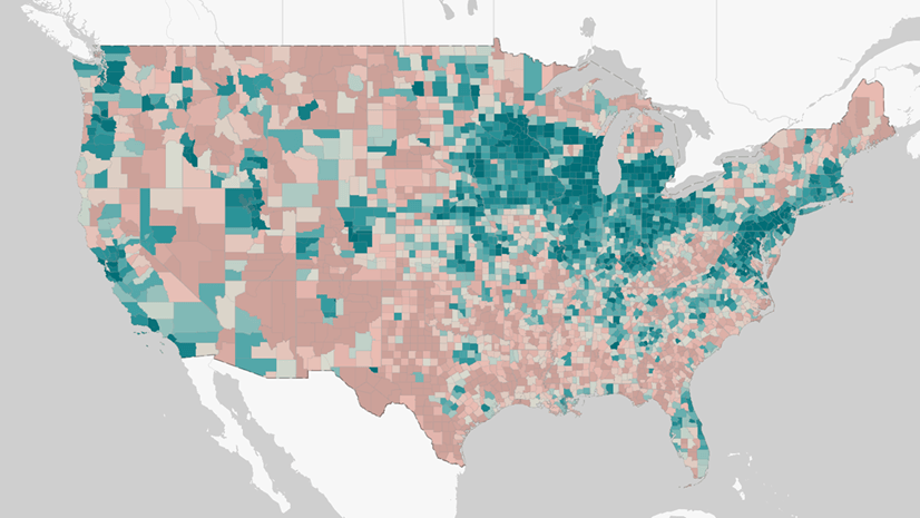
Counties are now grouped into data-informed clusters that allow comparisons across counties in the nation. Differences among the clusters are more meaningful than differences in the ordinal rankings. For those interested in diving even deeper, explore the analytic file and associated materials. A report on civic health, county comparison tools, and other goodies are on CountyHealthRankings.org to support your work in helping your community thrive.
Even though you won’t find rankings in the 2024 layer, counties are still measured on many health outcomes and health factors. And in fact, this year’s release contains even more disaggregations.
More racial and ethnic disaggregations
The CHR&R dataset has been a prime example of disaggregated data by racial and ethnic groups. In recent years, many health measures have been provided for five racial/ethnic groups when available. Two additional groups in the 2024 dataset are “two or more races” & “Native Hawaiian or other Pacific Islander” for measures when available.
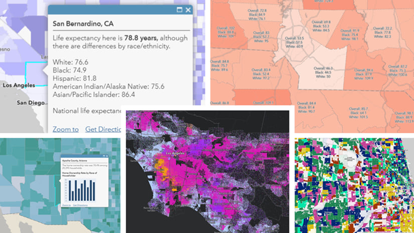
Display these racial and ethnic disaggregations in charts, pop-ups, and labels in your maps. For example, this map of areas to focus on improving life expectancy now includes data for the Native Hawaiian or other Pacific Islander group.

In San Bernardino County, two very different values are displayed: a life expectancy of 74.2 years for Asians, and only 67.3 for Native Hawaiians and other Pacific Islanders. This difference of nearly 7 years was previously hidden when these two groups were combined. This pattern holds for many other counties, and for many other measures.
Use County Health Rankings & Roadmaps content in your GIS work
The 2024 County Health Rankings layer is the latest and greatest of a larger body of CHR&R content in Living Atlas.

All these layers and maps are available to the ArcGIS community. Living Atlas is the foremost collection of GIS content to support your mapping and spatial analysis workflows. Combine the layer with others to make a map that reveals even more nuance.
What insights will you uncover to help your community thrive?

Article Discussion: