Data on gender identity and sexual orientation has been long awaited. Now, the wait is over! ArcGIS Living Atlas now contains a feature layer that shows Household Pulse Survey data on gender identity and sexual orientation for the nation, states, and the 15 largest metro areas. The Household Pulse Survey was designed to deploy quickly and efficiently, collecting data to measure household experiences, particularly during the pandemic. Data is collected by the U.S. Census Bureau, in collaboration with multiple federal agencies.
Before we dig into the data, let’s establish a shared understanding of some of the key terms and definitions. Gender identity is the internal perception of gender, and how one identifies based on how one aligns or doesn’t align with cultural options for gender. This is a different concept than sex assigned at birth. Sexual orientation is the type of sexual attraction one has the capacity to feel for others, generally labeled based on the gender relationship between the person and the people they are attracted to. This is not the same as sexual behavior or preference.

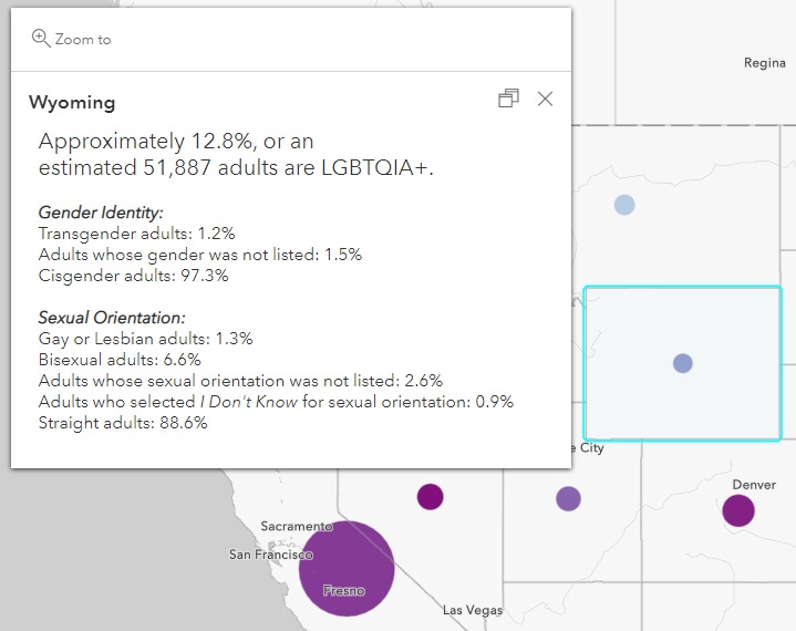
This layer is symbolized to show the percent of adults who are lesbian, gay, bisexual, or transgender (LGBT) as well as adults whose gender or sexual orientation was not listed on the survey (LGBTQIA+). The color of the symbol depicts the percentage and the size of the symbol depicts the count. The pop-up lists out the various groups:

A web map is also available for users who need a simple map to use in an instant app, ArcGIS StoryMaps story, dashboard, or hub site.
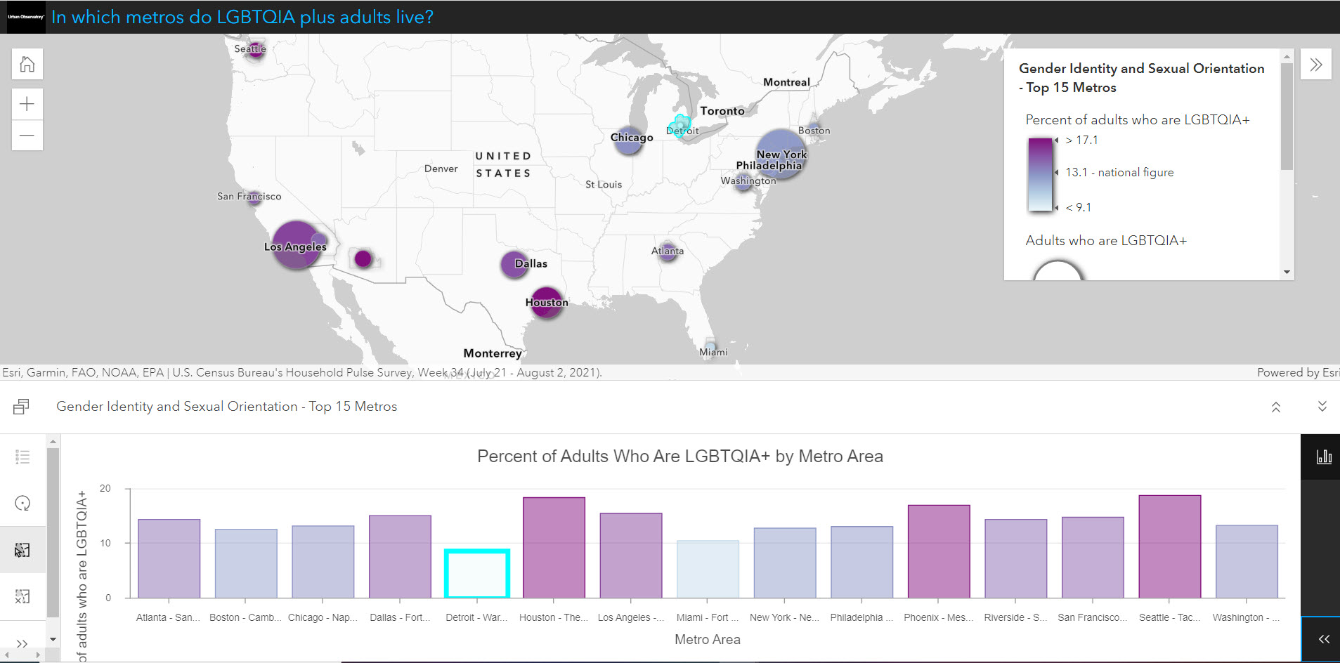
We’ve also created an interactive chart viewer app for the metro-level data:

Create your own maps and apps
Just like all feature layers in Living Atlas, anyone with an ArcGIS Online Creator account can use this layer in your custom web maps to fit your needs. To start, simply add this layer to a web map. Take advantage of all the attributes in this layer, along with ArcGIS Online’s dozens of basemaps, numerous smart mapping styles, pop-up configuration options, labeling, blending, layer effects, and more. View the long field descriptions for clarification on definitions without having to leave the Map Viewer. Or, start with the web map and modify it to your liking, then click Save As to store it in your content.
Once you have your map, take a few extra minutes to put that map in an app for a focused, interactive viewer experience. Use ArcGIS Instant Apps such as media map, countdown, or chart viewer (as we did, above).
Questions about this layer?
For more information and details, see the layer’s Description, as well as the long field descriptions for each attribute. Head over to Esri Community’s ArcGIS Living Atlas space to ask other GIS analysts and professionals who use Living Atlas content, or share how you’re using this layer. These are just some of the newest items in ArcGIS Living Atlas of the World: a collection of maps, apps, and data layers to support your work.
Many thanks to Sarah Scher, Katelyn Seitz, Jenna DeWitt, Helen Thompson, and Clinton Johnson for review and support.
Cover photo by Mercedes Mehling on Unsplash


Article Discussion: