A popular use-case of GIS is defining boundaries. These boundaries go by many names: service areas, sales territories, attendance areas, caseloads, wards, legislative districts. This blog post will walk through a simple workflow designing areas in the state of Virginia to serve the veteran population.
To follow along, start with a new project and a blank map in ArcGIS Pro.
Add, explore, filter, and symbolize data
Step 1: Add layers from ArcGIS Living Atlas
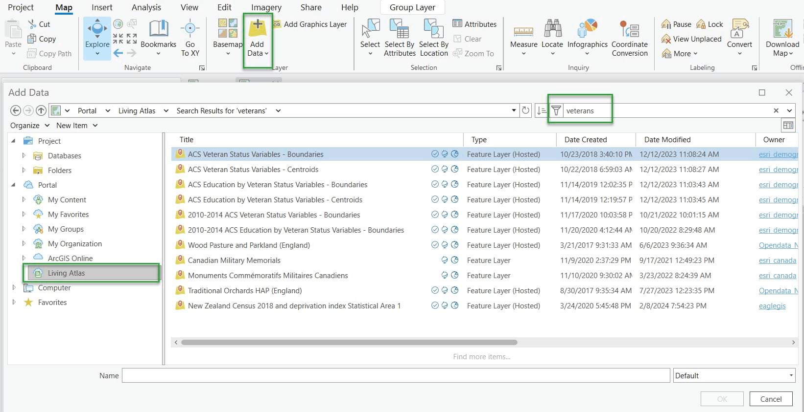
First, you need some baseline data about where veterans live. The U.S. Census Bureau does an excellent job maintaining data about this important topic. Fortunately, ArcGIS Living Atlas has many pre-configured layers containing data from the Census Bureau to get you started. You’ll add one of these layers to your map. From the Map tab, click the top half of the Add Data button to bring up a dialogue window. In the window that appears, under Portal, click Living Atlas, and in the search bar, type veterans. Click the first item in the search results, the layer named ACS Veteran Status Variables – Boundaries, to add it to your map.
Step 2: Explore the spatial data
This is a multi-scale layer containing data for 3 levels of geography: state, county, and census tract. It has visible scale ranges set so that appropriate geography levels are shown and hidden as users zoom in and out. Zoom out to see data at the state level become visible. Then Zoom in and see data at the county level. Zoom in further to see the data at the tract level.
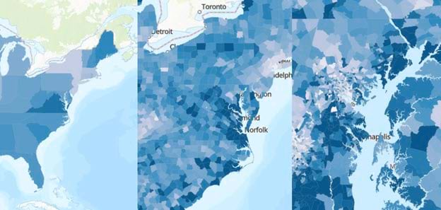
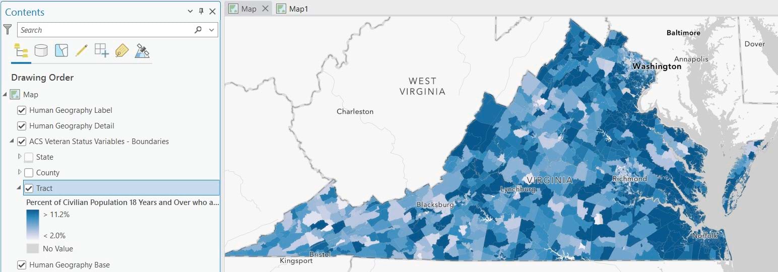
This layer is also symbolized to show the percent of the adult population with veteran status. Darker blue areas have a higher percentage of adults who have formerly served in the U.S. military. Notice that the state of Virginia is one of the darker blue states, indicating a large percentage of veterans.
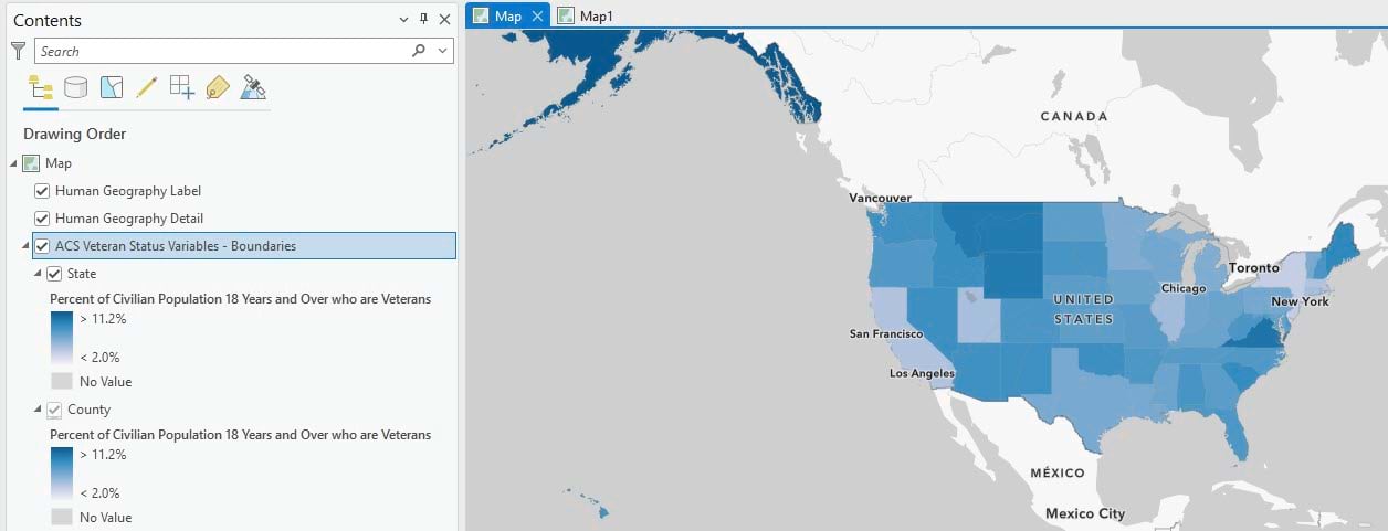
On the Map ribbon, switch the basemap to Human Geography or Light Gray Canvas. These neutral basemaps help to make your map easier to read, since they don’t compete visually with your thematic data. The Human Geography basemap also places city/state labels on top.
Step 3: Use a definition query to show only Virginia tracts
Zoom to display Virginia in your map.
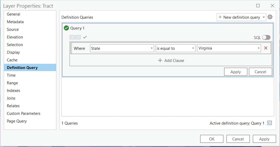
In order to design our service areas, we want to start with the most granular level of geography we can. In this case, the finest level of geography is tracts. Turn off the State and County layers by unchecking them in the Contents pane. Now we will filter all the tracts in the U.S. down to just those in the state of Virginia. In the Contents pane, right-click Tract and click Properties. Add a Definition Query that reads Where State is equal to Virginia.
Before closing the Layer Properties window, click the General tab and choose the Show layer at all scales option. This will always show tracts no matter how zoomed in or zoomed out your map is.
The map now only shows tracts for Virginia.
Step 4: Symbolize by count rather than percent
In order to design service areas, we will be working with the count of individual veterans. The layer is symbolized by the percent by default, but we can modify this. Right-click on the Tract layer in the Contents pane, and click Symbology. The Symbology pane appears. It shows that the layer is currently symbolized with the Unclassed Colors method and a percentage field. The unclassed colors symbology method is a great way to display percentages and rates, but not so great for showing counts. Change the Primary symbology to Proportional Symbols. This type of symbology uses size rather than color, which is more intuitive for depicting differences in counts. Change the Field to Total Veterans 18 Years and Over.
The symbols on the map are currently too large and crowded. You will adjust the symbology settings to get a clearer visualization. The goal is to see where there are high counts of veterans and where there are low counts. Change the minimum size to 1 pt. See the symbols get smaller.
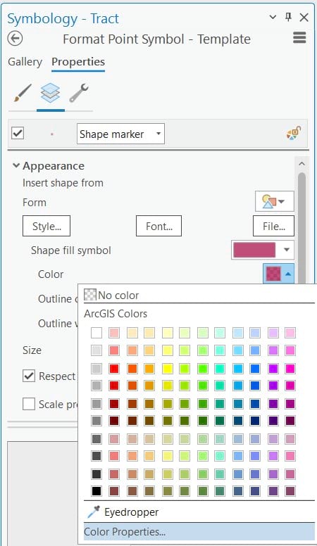
Next to Template, right-click the circle symbol and click Color Properties.
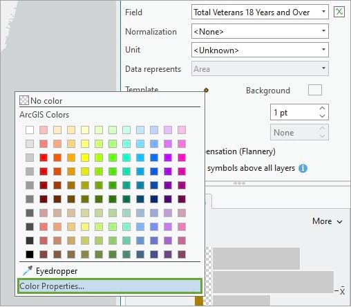
In the Color Editor window, increase the transparency to 30%.
Changing the transparency helps reveal overlapping symbols representing where data values are large. This visualization shows that there are large groups of veterans around the Norfolk and the Arlington areas in particular.
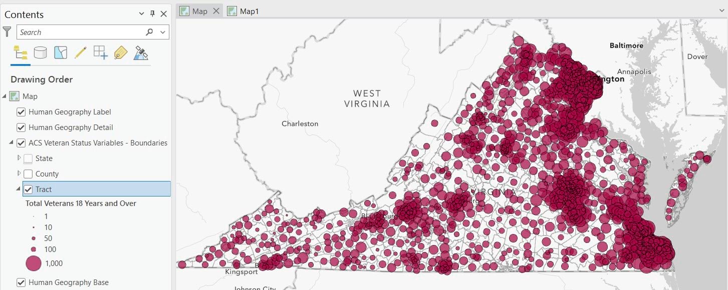
In the Contents pane, the legend shows that each symbol can represent anywhere between 1 and 1,000 veterans. In the Symbology pane, the histogram shows that the minimum value is 3. This means that there’s a tract somewhere in Virginia with only 3 veterans. On the other side of the distribution, the maximum value is 1,642. There’s another tract somewhere in Virginia with 1,642 veterans.
Note: this layer is updated every year, so exact counts may vary.
Use geoprocessing tools to design areas
Now that we have an understanding of how Virginia’s veteran population is distributed across space, we can use geoprocessing tools to perform analysis. We will use two tools in this workflow: Build Balanced Zones and Dissolve.
Step 5: Set parameters and run the Build Balanced Zones tool
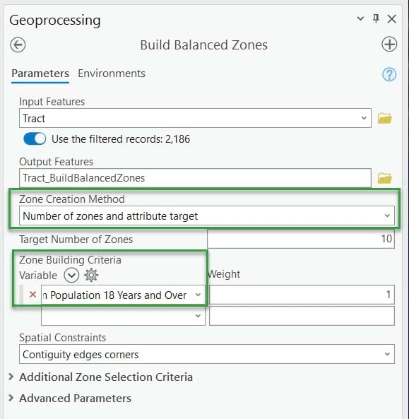
From the Analysis ribbon, click Tools. This will open the Geoprocessing pane. Search for and open the Build Balanced Zones tool. Set the Input Features to the Tract layer. Note the Use the filtered records: 2,186 toggle that appears after this. Keep this toggled on. This means that we will only be running this tool on the 2,186 tracts in Virginia rather than all tracts the entire U.S.
Point to Zone Creation Method and click the “i” button that appears next to it. Read the detailed information about this parameter in the window that appears. Here’s where we will input whether we want an attribute target (e.g. as balanced as possible for a specific attribute), or a defined number of zones (e.g. 10 zones and only 10 zones), or both. The defined number of zones option is helpful when you have a fixed number of resources, for example, regional directors, campuses, or field offices. For this exercise, change the dropdown option to Number of zones and attribute target. For Target Number of Zones, type in 10.
The Zone Building Criteria is where we’ll tell the tool to consider which attribute(s) we want it to consider. In the dropdown under Variable, select Total Veterans 18 Years and Over. The tool will now generate zones that are balanced with respect to the sum of veterans from all the tracts. The result should be ten zones containing roughly equal numbers of veterans.
Click Run. This should take about 2 to 3 minutes.
Step 6: Examine output
This tool completed with warnings. Click View Details. These details are the messages that you would get in a log file if running this programmatically. The main message here is that that are some zones that are disconnected groups. They are not contiguous, as Virginia contains some island and peninsula areas. That is okay. We will still have output that we can evaluate.
Note: It’s possible that users could get 10 zones that look a little different. It’s also possible that it could complete with a warning and the results contain 9 or 11 zones.
Let’s look at the output. A layer and two charts were added to the map. Turn off the Tract layer so that the Tract_BuildBalancedZones layer can be seen more clearly. Open the first chart whose title starts with Sum of Variable.
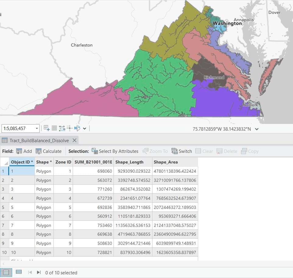
Because this tool is run using a random seed, the results will be slightly different each time. In the example below, we have ten zones, and the sum of veterans ranges from 508,630 in Zone 9 to 771,260 in Zone 3. The number of tracts in each is listed in the Contents pane, for example, Zone 2 contains 200 tracts.
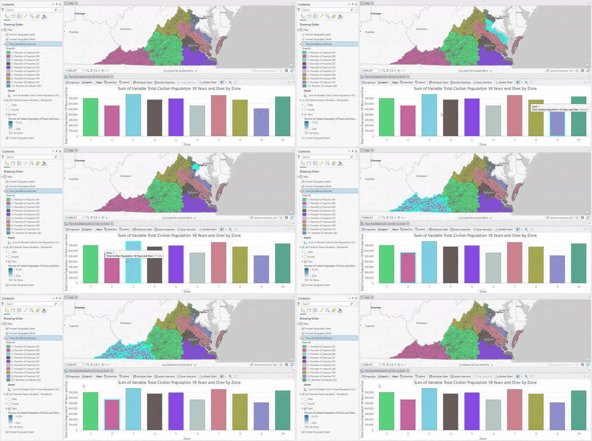
Turn the Tract layer back on and explore the map. Notice that the smaller zones (near Norfolk and Arlington) have the largest groups of proportional symbols. There are more veterans in these areas than in other places within the state. The tool has generated zones based on the veteran population, while at the same time, keeping the zones as contiguous as possible.
In the Contents pane, right-click Tract_BuildBalancedZones and click Attribute Table. There are 2,186 tracts in this layer. A field called Zone ID assigns each of them a value of 1 through 9.
Optional: Fine-tune your zones
Experiment with different parameters in the Build Balanced Zones tool and re-run. You can see that some zones are elongated/stretched out, not as compact. More compact zones can help with canvassing, better drive times, administration, etc. If you want to run the tool again, this time choose zone selection criteria as compactness.
There are many more options available with this tool, particularly the spatial constraints. Read the official help doc for more information. Feel free to fine-tune your zones as much as you’d like.
Step 7: Dissolve the zones into new polygons
Our final desired output is a new polygon layer of our balanced service areas. In this case, we will end up with a layer containing 9 polygons. In the Geoprocessing Pane, click the Back arrow. If you closed the Geoprocessing pane, on the Analysis ribbon, click Tools to open the geoprocessing pane again. This time search for and open the Dissolve tool. This will dissolve the 2,186 tract polygons into 10 zone polygons.
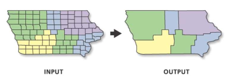
Set the Input Features to your finalized results from the previous step, Tract_BuildBalancedZones. For Dissolve Field, choose Zone ID. The tool will create output polygons that group together input polygons based on their Zone ID values.
Finally, set the Statistics Fields. We want the the output layer to include a field that shows the total number of veterans in each zone. To achieve this, set Field to Total Veterans 18 Years and Over and set Statistics Type to Sum.
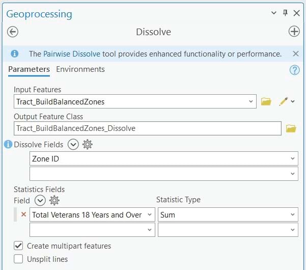
Click Run. This one runs in a few seconds. The result is a layer with ten polygons, and a field named SUM_B21001_002E that stores the total veteran population for each.
Take it further
You have seen how to use ArcGIS Living Atlas content and geoprocessing tools in ArcGIS Pro to design custom service areas. From here, there are endless possibilities.
- Create a map series of reference maps of each zone using the highways, county boundaries, and more with the Human Geography basemap.
- Export and publish a feature layer of these zones to ArcGIS Online and share it within your organization.
- Combine this layer with your organization’s data on the locations of facilities, assets, and places of interest.
- Enrich this layer to bring in even more demographic, consumer spending, or psychographic data specific to your cause or your business needs.
- Create infographics for each area using Business Analyst.
Have you designed service areas for your work? Let us know in the Geoprocessing Esri Community.
Article Discussion: