By Mamata Akella, Esri Design Cartographer
Flow maps show the movement of some phenomenon, normally goods or people, from one place to another. Lines are used to symbolize the flow, typically varied in width to represent differences in the quantity of the flow. In broad terms there are three main types of flow map: radial, network and distributive. Radial flow maps have a spoke-like pattern because the features and places are mapped in nodal form with one place being a common origin or destination. Network flow maps are used to show interconnectivity between places and are usually based on transportation or communication linkages. Distributive flow maps typically show the distribution of commodities or some other flow that diffuses from origins to multiple destinations.
In this blog, I show you how to create a radial flow map that depicts multiple origins converging on a single destination. For these types of flow maps, the precise route of flow is not as important as the general direction. A good example of this type of map is the airline route map you might see in the back of an airline magazine with multiple origins travelling to an airline hub.
The map that we created to demonstrate this concept was made for this year’s Making Beautiful Maps technical workshop at the Esri International User Conference. Entitled ArcAttendees: The 2011 Esri UC Global Gathering, the map shows what cities people came from to attend the User Conference (figure 1).
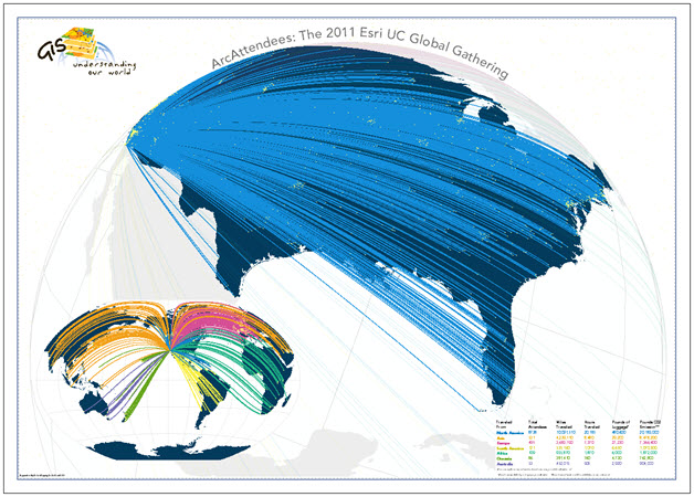
Figure 1: A radial flow map showing the city of origin for attendees to Esri UC 2011 in San Diego, CA.
This blog covers the following topics to show how this map was made:
- Data requirements
- Flowline construction
- Data processing steps
- Symbolization
- Projection and layout
Data requirements
Esri’s Marketing Department supplied a table of attendee data (figure 2), that contained the following information:
- a field GEONAMEID that is a unique identifier connected to our cities dataset;
- the city and country that attendees were coming from (FIRST_ENG, FIRST_CNTR,);
- the xy coordinates for each city of origin (POINT_X, POINT_Y); and
- the xy coordinates for the destination city, San Diego, CA (DESTINATION_X, DESTINATION_Y).
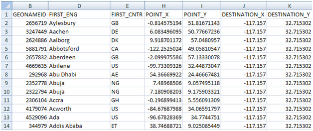
Figure 2: 2011 Esri UC attendee data
We also used a feature class of cities also attributed with the same GEONAMEID field that exists in the attendee data; and a continent feature class used to symbolize the flow lines according to continent of origin. The continent feature class was also used to symbolize the background on the final map.
Flowline construction
To create the flowlines, we used the new XY to Line tool in ArcGIS 10. The XY to Line tool uses origin and destination values as inputs from a table and creates a new linear feature class that represents the path connecting these two points.
The XY to Line tool is located in the Data Management Toolbox > Features Toolset. Figure 3 illustrates the parameters we defined for the tool:
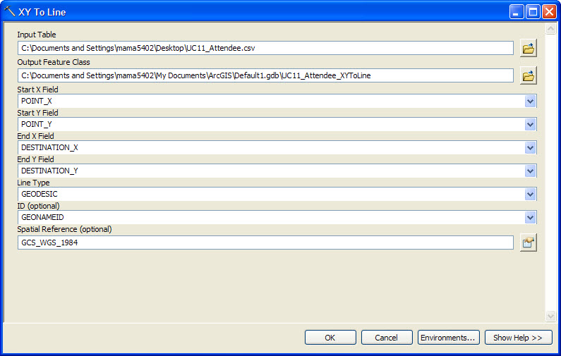
Figure 3: XY to Line Tool
- Input Table: Attendee data (in .csv format)
- Output Feature Class: feature class named UCAttendee_XYtoLine
- Start X Field: POINT_X field from the attendee data
- Start Y Field: POINT_Y field from the attendee data
- End X Field: DESTINATION_X field from the attendee data
- End Y Field: DESTINATION_Y field from the attendee data
- Line Type: here there are four options: GEODESIC, GREAT_CIRCLE, RHUMB_LINE, or NORMAL_SECTION. For this map we needed to create curved lines that represent the shortest great circle path between the origins and destinations. Geodesic lines create a straight line based on a spheroid. Great Circle lines are similar but are used for spheres. A rhumb line calculates the line of constant bearing and normal section creates a straight line directly on a spheroid. For this application, any of the first three of the options would work to approximate the arc of a great circle between the origin and destinations. We used GEODESIC lines simply because it gave us the best appearance when projected.
- ID (Optional): here we added the GEONAMEID field from our data to give each flowline created the same ID as the input table which is important for later steps
- Spatial Reference (Optional): we kept the default GCS_WGS_1984 (we’ll describe later in the blog how we modified the projections for our maps).
Figure 4 shows the results of running the XY to line tool on the attendee data displayed using the default GCS_WGS_1984 coordinate system and figure 5 shows the associated attribute data for the new linear feature class. There were 1532 unique origins in the attendee data with a line created between each of those and the destination in San Diego.
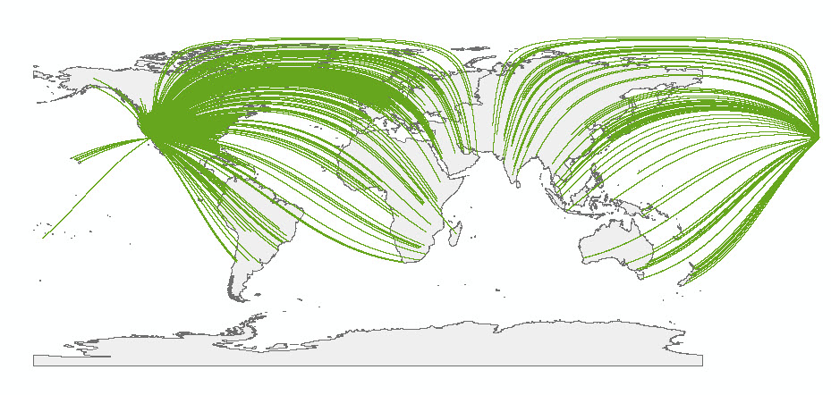
Figure 4: Result of the XY to Line Tool
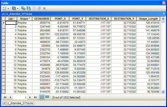
Figure 5: The attribute table for the results of the XY to Line Tool
So we now have our basic lines and can begin to attribute, project and symbolize them to show the data effectively.
Data Processing and Symbolization
Since we wanted to symbolize the unique lines by continent of origin and also add some points to the map to indicate the cities of origin, we joined the city dataset attributes to the flowline dataset attribute table based on the GEONAMEID field. This adds the continent field data to the flowline dataset giving us a way to differentiate each flowline qualitatively on the final map.
Symbolizing the Flowlines
We symbolized the flowline features using Categories > Unique Values (figure 6) and the Continent field we joined to the flowline data. We chose highly saturated colors that contrasted well with the dark blue background being used to symbolize the map background (figure 7).
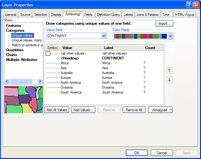
Figure 6: Unique colors assigned to the lines by continent
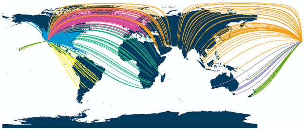
Figure 7: Vivid colors used to symbolize the flowlines contrasted well with the dark blue background map detail
Symbolizing the City Points
We symbolized the city points using a circle from the Esri Default Marker font. We set the size to 3 points and made them a bright yellow (figure 8). The use of a highly saturated yellow was chosen to compliment the flowlines and create a fiber optic appearance.
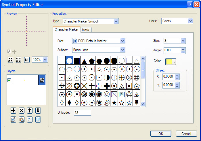
Figure 8: The Symbol Property Editor dialog for the city point symbology
Projection and layout
The way in which we arrange the data on the final map needed careful consideration given the distribution of the flowlines. Figure 9 illustrates the data focused on the USA and shows clearly that the lines coalesce to the extent the effect is seriously compromised. We needed to find a way of disentangling some of this detail.
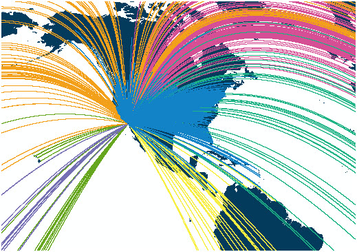
Figure 9: The majority of attendees are from the contiguous 48 United States
The majority of attendees came from the contiguous 48 United States. As figure 9 illustrates, this data obscures a lot of other detail and, in particular the pattern in relation to international attendees. Here, then, is a perfect example of the need for using two maps to show the different distributions: an inset map for attendees from outside the contiguous 48 and a main map of those from the contiguous 48. The decision was taken to illustrate the data this way due to the higher number of attendees from the contiguous 48 states while ensuring prominence is given to international attendees on a separate map.
The world inset map is projected using the Winkel tripel projection that allowed the lines to curve in a visually appealing way. It’s a good compromise projection where shape, area, distance and direction aren’t highly distorted (figure 10). We modified the central meridian to -120 degrees to center the map on San Diego, CA.
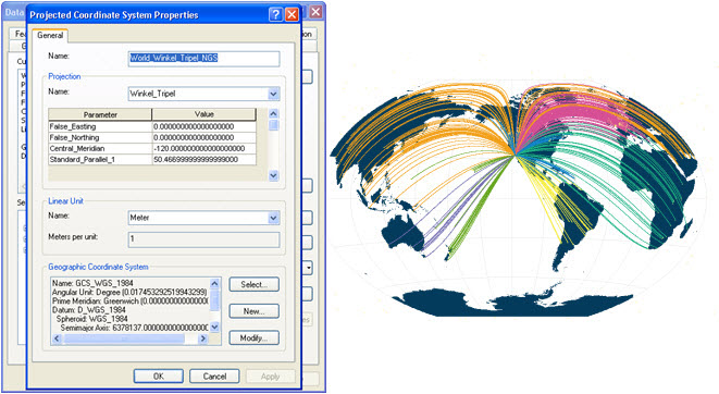
Figure 10: Defining a World Winkel tripel projection for the world inset map
For the map of the contiguous 48 states, we used the World Vertical Perspective projection to create the effect we often see in airline route maps of flowlines moving towards a hub. Here, we wanted San Diego on the horizon with lines travelling towards the city. The fact San Diego is in the lower left corner of the USA meant we were able to modify the projection to achieve this effect as all lines were originating between north and east of the destination. We adjusted the Longitude of Center to -90 degrees (near the tip of the Yucatan Peninsula) and the Latitude of Center to 25 degrees (around southern Louisiana). Finally, we also modified the Height value to give the finished effect (figure 11).
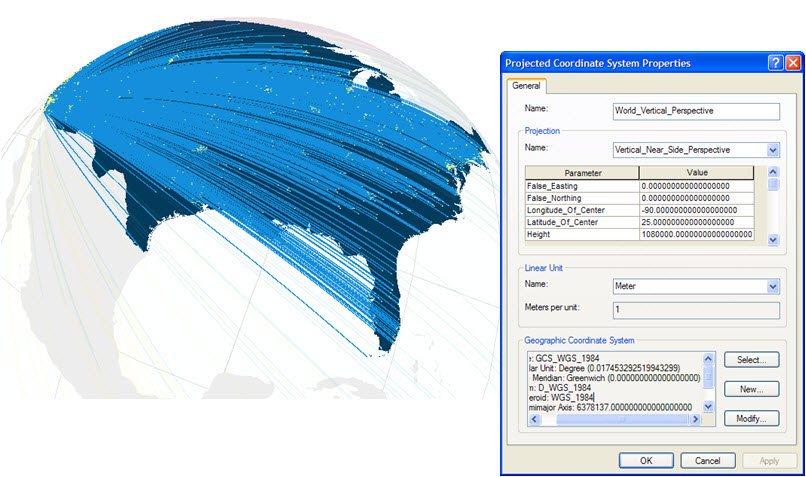
Figure 11: The Projected Coordinate System Properties for the contiguous 48 map
The final flowline map is a combination of using new tools in ArcGIS, an interesting dataset and a focused design to create a visually stimulating and effective representation. With the addition of some tabulated statistics summarizing travel information by continent for the Esri UC attendees and arranging the saturated map foregrounds against a light gray background and white map surround we created a strong figure-ground. The use of the new XY to Line tool provides a powerful way to begin to visualize data in innovative ways using ArcGIS, in particular to begin to explore the use of flow maps to depict the characteristics of related points.
Future blogs will explore ways of using ArcGIS to create distributive and network maps where our focus turns to displaying different flowline quantities either between an origin and destination of through a transportation network.

Commenting is not enabled for this article.