
Here’s a question that has, in various forms, been posed on Ask a Cartographer: “I have a map that has a hillshade and a DEM drawn with transparency on top of it. I cannot figure out how to make a legend that properly shows the final colors on my map; how is this done?”
First, there is no automated solution to this like there is for adding a legend for other layers to your map. The legend in this case needs show the final colors of the DEM, which is used to show the elevation or hypsometric tints as they appear on top of a hillshaded layer. In ArcGIS, the main problem is that the hypsometric tints assigned to the DEM will appear in the default legend as the colors that would be in the map before any transparency has been applied. On the final map, however, the colors appear more subdued because of the transparency that is used to allow the hillshade to show through.
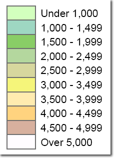
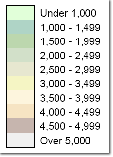
The left example above is the default legend for an elevation raster; the second is a legend that shows the colors that are actually on the map as they appear with a transparency set. The colors in the second legend were captured using the Eye Dropper tool. Another graphical improvement to the second example is that there are no outlines around each legend patch. This is a good cartographic convention because it better represents what’s on the map; that is, there are no lines around the edges of an elevation band on the map, so there shouldn’t be in the legend either.
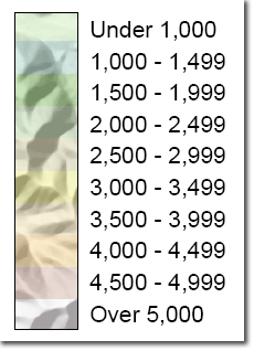
One final graphical improvement we could make to the legend would be to show the full range of tints (e.g., black to white) for the underlying hillshade for all elevation band colors – that is, show the colors for the elevation bands over a background that has the full range of tints in the underlying hillshade (usually a continuous range from black to white or gray to white).
The example that has this graphical improvement was not created as an ArcMap default raster legend. Instead, it’s a graphic that is composed of 1) the text from an ArcMap legend (that was converted to graphics), 2) the color patches (created as geographic features that are assigned the same colors and transparencies as the DEM raster on the map), and 3) a data frame (resized and repositioned to contain only a segment of the hillshaded raster.)
Here is how to make this legend (note that this is for a map that uses discrete, classed colors rather than continuous, smoothly blended colors to show the elevation – see the tip at the end of this blog entry for how to modify this procedure for maps that use continuous colors):
- First symbolize your DEM exactly how you want it on your map (if you make the legend before you make any final modifications, you have to make the modifications to the legend as well – extra steps!) This usually means that you want to apply a color ramp with colors that appropriately correspond to different elevation bands to the DEM of elevation values, then you want to apply a transparency to it so that you can see the underlying hillshade through the DEM.
- To create the background hillshade for your legend, create a new data frame and Activate it. Paste a copy of your symbolized hillshaded layer into this new data frame.
- If you aren’t in Data View already, switch to it.
- To create the transparent colors that will be shown over the hillshade, you need to use geographic features that are the same size and shape as the patches in the legend (since transparency can only be applied in ArcMap to features in a layer). The legend colors will actually be applied to polygon features. Make the rectangles roughly the same proportion as the rectangles you want in your legend.
- You can start with this sample data set, which will save you some time if you want to make a legend that uses ten or fewer classes and has the same proportions as the examples above. When I made these data, I used the Rectangle tool to create the first rectangle, then the Copy Feature tool (both on the Advanced Editing toolbar) to create exact copies; then I aligned them by zooming in on the corners and making the final adjustments.
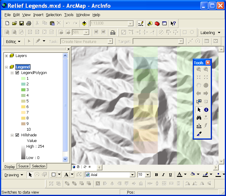
- If you use the sample dataset, you can select the number of polygon features that correspond to the number of legend patches you need, and then edit the location of the polygon features so that they overlay your hillshaded data. You may also need to resize them relative to the resolution of your data (you would have to scale one feature and then copy and paste it and rearrange them in the order and orientation that you want). The image below shows what the legend polygons looked like on my map before I colored them to match the hypsometric tints.
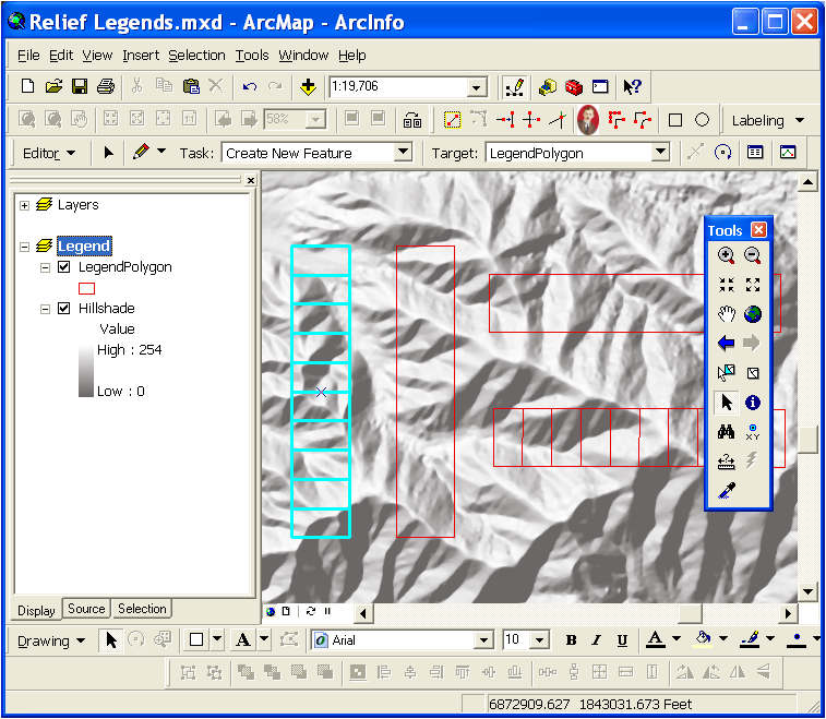
- Look for a location on your hillshade that ranges from lower to higher elevation in the same orientation as your legend boxes. Also see if you get the location to range from low where you have low in your legend to high where you have high. For the selected set of boxes in the example above, the lower elevation legend patch will be at the top – this is placed over a valley area, and the higher elevation box is at the top of a ridge. Select the number of polygons you want to use in your legend and move them to that location on the DEM. That will ensure the colors in your legend look more natural because the low elevation will really be a lower place on the hillshade, and the higher elevation will really be higher.
- Assign the same colors that you used to symbolize the hypsometric tints to the polygon layer and set the outline to a width of zero. In the sample dataset, the polygons have an attribute (“xxx”) that contains values from 1-10, making it easy to use unique values symbology. The image below shows what the legend polygons looked like on my map after I colored them to match the hypsometric tints.
- Zoom in so that your legend polygons are located in the center of your data view. Now switch to layout view.
- To get the text for your legend, activate your main map data frame and insert a new legend that just contains the DEM symbolized with the hypsometric tints – use the settings below:
- Resize the legend so that it is the correct size for your map.
- Set the vertical spacing between legend classes to zero.
- Change any other formatting for the text on this legend as appropriate to the design of your map.
- Right-click on the legend and choose Convert to Graphics. Right-click again and ungroup the result. Continue ungrouping until you can select just the text. Select the text you want to use in your legend and Group it together again.
- Next select the legend patches from the ungrouped legend and group them – you will need this grouped graphic element in Step 12 to set the size of the hillshaded data frame you are using in your legend.
- Select the new data frame you created in Step 2. Then select the legend patches you grouped together in Step 10.
- Click on Drawing on the Drawing toolbar, click Distribute, and then click Make Same Size. This will make the data frame the same size as the grouped graphic element that you created from the legend patches. Delete the grouped graphic element as it is no longer needed.
- You’ll need to adjust the scale (zoom or set the Map Scale on the top bar menu) of the legend data frame and pan so the colors appear properly within its extents. It will be a trial and error process as you home in on the optimal scale. Once you get it right, it’s a good idea to open this data frame’s properties and on the Data Frame tab, set the Extent property to Fixed Extent; this will lock the extent.
TIP: For elevation layers that use Stretched symbology to show the elevation with continuous, smoothly blended colors, the sample data setcontains two elongated polygons – you can see these in the image that shows the selected legend boxes above. You can use the elongated polygons to show the continuous color legend. Just use a gradient fill symbol for this polygon layer in your legend data frame. Use the same color ramp for the gradient fill as you did for the DEM to show the hypsometric tints.

Commenting is not enabled for this article.