UPDATE: A new beta has released since this blog was published. You can learn about the capabilities of the new beta refresh in the blog Operations Dashboard for ArcGIS Beta – October Update.
Operations Dashboard for ArcGIS is an app that enables you to monitor, track, and assess your assets and daily operations. We’re delighted to announce that we just refreshed our beta for the next generation Operations Dashboard app. This beta empowers you to make visually stunning dashboards that enable operational decisions at a glance, all within your web browser. Sign up for the Operations Dashboard beta program and check out the beta through Esri’s Early Adopter site.
Highlights of the new capabilities are:
Author and share dashboards, all within a web browser
You can now create a dashboard from scratch and share it with users, all from your web browser. There is no need to download and install anything locally. This new web architecture means Operations Dashboard is more closely integrated with your ArcGIS organization. For example, now you can launch Operations Dashboard from the ArcGIS Online app switcher. You can also browse for and manage your dashboards within your ArcGIS organizational content, in addition to the new Operations Dashboard homepage. You can also start creating dashboards from the homepage. These enhancements make working between Operations Dashboard and your ArcGIS organization seamless and easy.
Create stunning dashboards
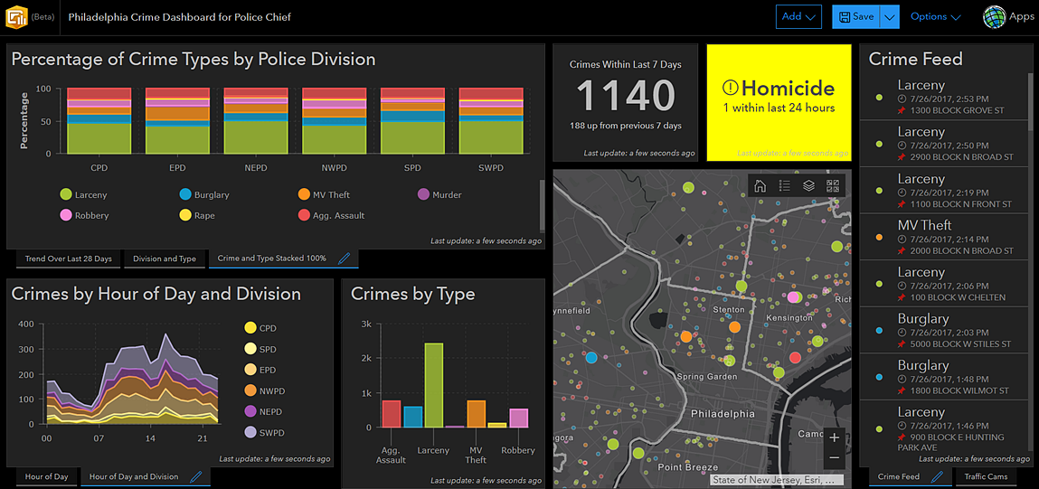
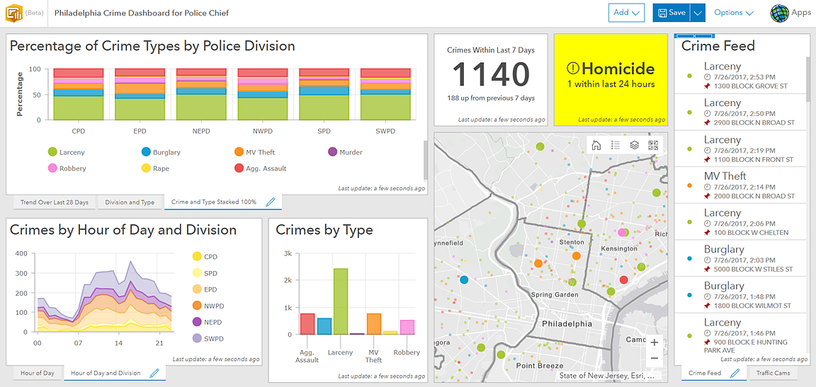
You can easily create stunning information products with this beta. Each visual element you add to a dashboard includes attractive and intuitive default style options. However, if you need more control over the look and feel of your dashboards, there are many configuration options to play with. You can adjust font sizes and colors, as well as use rich text, custom icons, and HTML symbols in your visual elements. You now have the option to display the last update time on each visual element, which improves situational awareness by informing users how current the data is. In addition, this release includes a redesigned dark theme, shown below, that makes your dashboards pop in dimly lit rooms. Simply put, you now have the power to create the dashboard best suited to your organizational needs.


Leverage the latest web map capabilities
You can now include map elements in your dashboards that take advantage of all the powerful new web map functionality, such as heat map renderers, stream layers, and vector basemaps. You can also use Arcade expressions to enhance map labels and symbology. In short, you can now include more clear, useful, and attractive maps in your dashboards.
Create advanced charts
This beta offers many sophisticated charts of various types and styles to include in your dashboards. Click through the images below to see the new charting capabilities.
Use the enhanced indicator element 
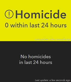
The new indicator element merges the capabilities of the Summary and Indicator widgets in operation views, and includes additional functionality that makes it easier to understand the status of an asset or operation. The new indicator supports conditional formatting, which causes its appearance to change based on your data. For instance, if you want to easily tell whether a homicide has occurred, you can configure the indicator to turn bright yellow when the number of homicides is more than zero, as shown in the image to the top right. Conversely, you can configure the indicator to turn black when no homicides have occurred, as shown in the image to the bottom right. The indicator can also better facilitate comparisons, by showing how a current measurement or value compares to a historical measurement. Last, the indicator has greatly enhanced aesthetics, with more options to customize text and add pre-made or custom icons, as shown in the top right image.
This beta update represents a huge step forward in the evolution of Operations Dashboard, but over the next few months, we will continue to offer more functionality. We will provide more options to interact with your data, refine the dashboard authoring experience, develop highly responsive map tools, and add more data visualizations. We are aiming to release the first official version of the new web experience in Q4 of 2017, to coincide with the ArcGIS Online update planned for that month.
To use the new capabilities described here, and ensure that we continue to make the next generation of Operations Dashboard useful and exciting for your organization, check out the beta on the Early Adopter Site. We look forward to seeing your questions, comments, and ideas.
Sincerely,
The Operations Dashboard Dev team
Article Discussion: