Exciting Updates in ArcGIS Dashboards: February 2025 Release
Esri customers, get ready for an enhanced experience with the February 2025 update of ArcGIS Dashboards!
This update brings a range of improvements, including new features, bug fixes, and performance enhancements designed to optimize your data visualization capabilities.
Let’s dive into the highlights of this update.
____________
Dual-Axis Charts
One of the standout features in this update is the introduction of dual-axis charts. This functionality allows you to create multi-series feature serial charts, enabling you to visualize two distinct data series on separate axes. Here’s how it works:
- When you add two or more series to a feature chart, a Secondary value axis becomes visible.
- Through the Series tab, you can assign one of the series to the Secondary axis, clearly representing how different data sets relate to each other.
This feature is particularly useful when comparing metrics with different scales, offering a more comprehensive view of your data.

____________
Element Headers and More Information Tool
To enhance the clarity and presentation of your dashboards, element headers are now available in the General tab.
This feature ensures consistent styling for your titles, making dashboards more visually appealing.

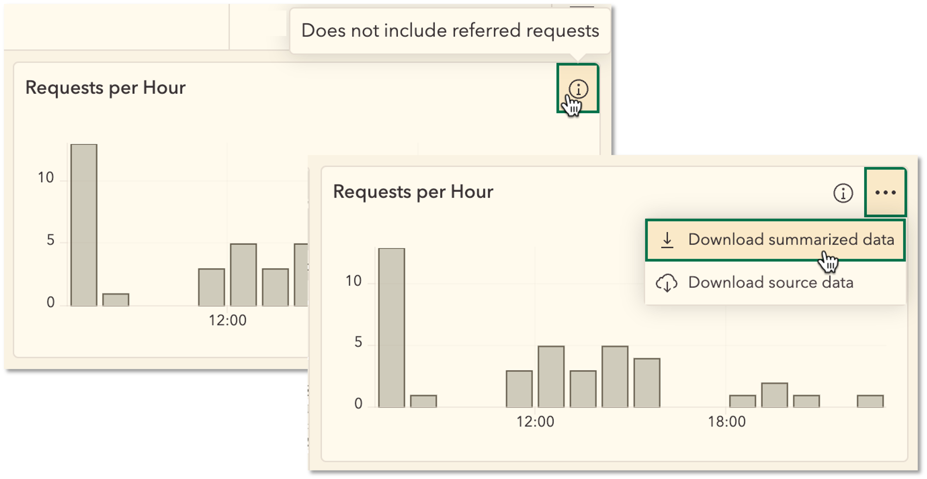
The new More Information tool allows authors to include important context alongside their metrics or charts.
You can add disclaimers, metadata, or background information, making it easier for your audience to understand the data presented.

To learn more, see Introducing Element Headers: What You Need To Know.
____________
Web Analytics Integration
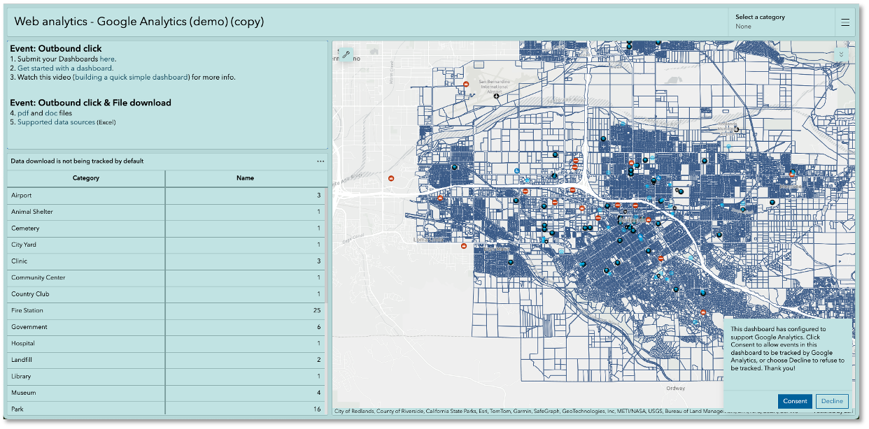
Dashboard authors can now easily integrate Google Analytics into their dashboards!
By using a measurement ID, you can track and analyze user interactions and behaviors right from within your dashboards.
This integration is located under the Analytics section on the action bar, adding a powerful layer of insight to your data visualization efforts.

____________
Conclusion
The February 2025 update of ArcGIS Dashboards represents a significant step forward in data visualization and analytics.
With features like dual-axis charts, enhanced styling options, and Google Analytics integration, users can create more informative and engaging dashboards.
Be sure to explore these enhancements and take full advantage of the new capabilities to elevate your data storytelling.
Stay tuned for more updates and happy dashboarding!
____________
More resources
To learn more about ArcGIS Dashboards check out the resources below:

Article Discussion: