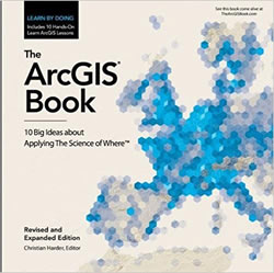
If you haven’t checked out the new ArcGIS Book: 10 Big Ideas About Applying the Science of Where I think you ought to.
It’s a multi-format extravaganza of the how and why of spatial science. In that spirit, wouldn’t you like to learn how the cover map was made? Hang on, we’re going in!
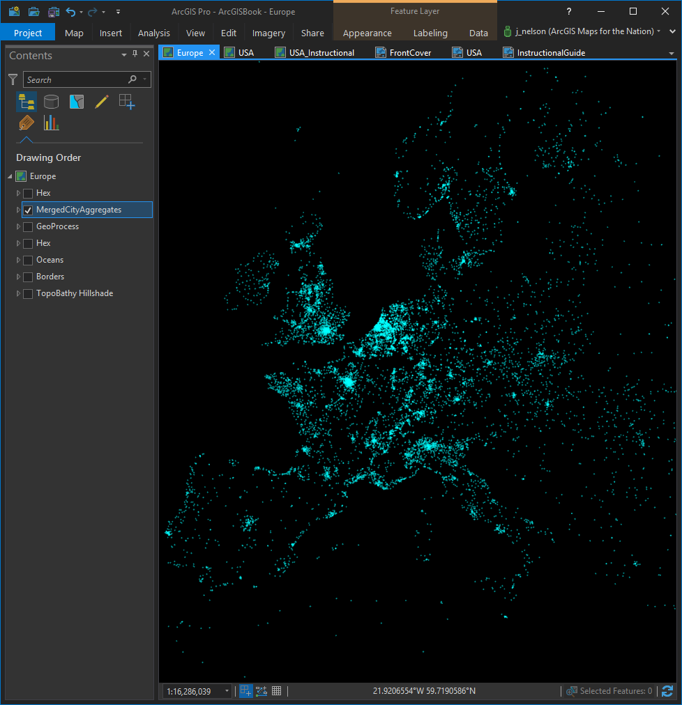
This is a point layer showing the source locations, over a 24-hour period, of web requests made to Esri’s services. It paints in a de-facto map of the global Esri user community. What better data subject than that of the actual humans who are doing incredible things with GIS?
Here in ArcGIS Pro, we’re zoomed in to the European continent.
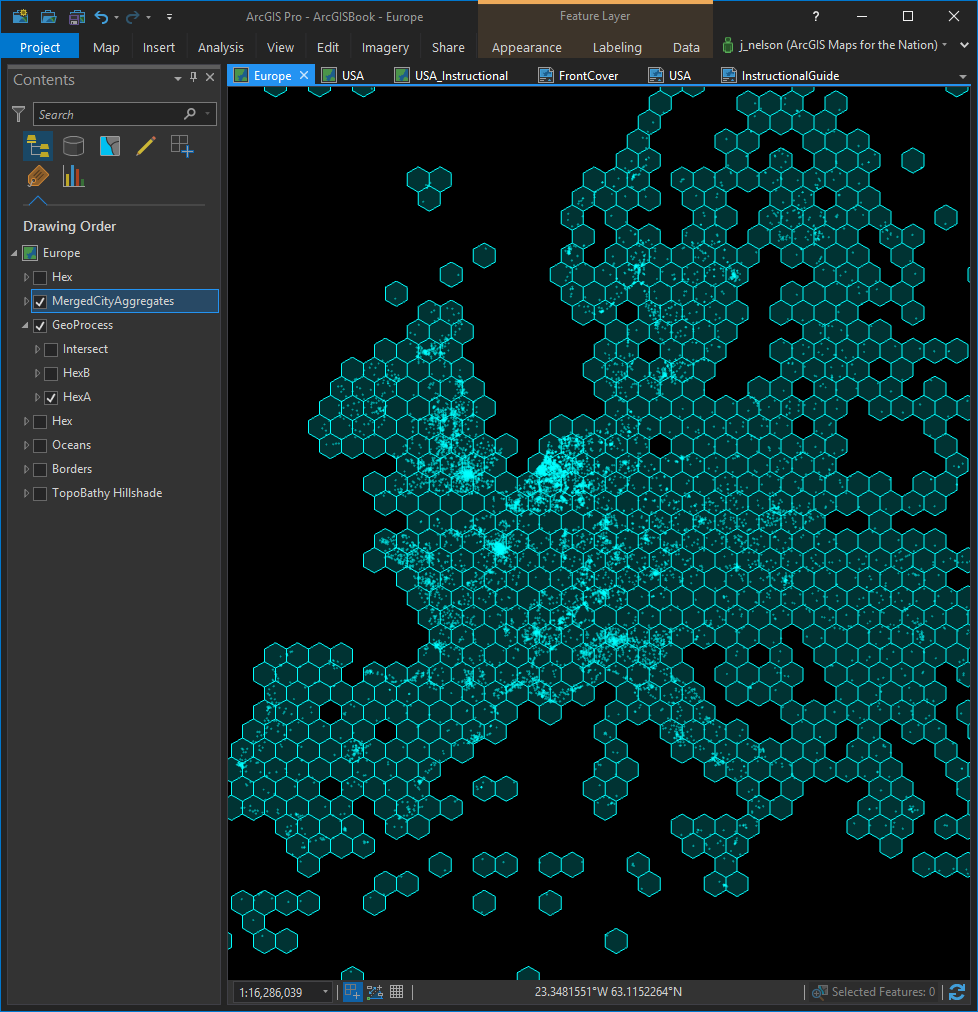
That’s a beautiful pointillist map of a vibrant user community. Let’s see if we can sauce it up with some aggregation. This is for an illustration after all. Of course the mathematically grand and mysterious hexagon is a lovely shape within which to pack these points. Did you know that the hexagon, as a tessellation shape, is a beautiful balance of geographic compactness but geometric complexity? 10 kajillion bees can’t be wrong. So, here is our hive…
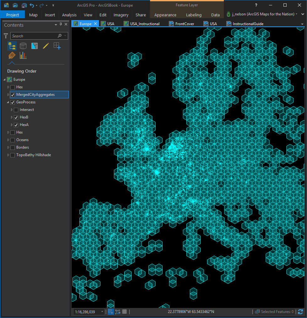
Ok, we could stop here and just get on with the aggregation. But we’d be missing out on some interesting, and visually appealing, nuance. Time to make yet another hexagonal tessellation, but translated over just a bit. If one hexagonal tessellation is nice, would a second, offset, version make it twice as nice? Absolutely it would…
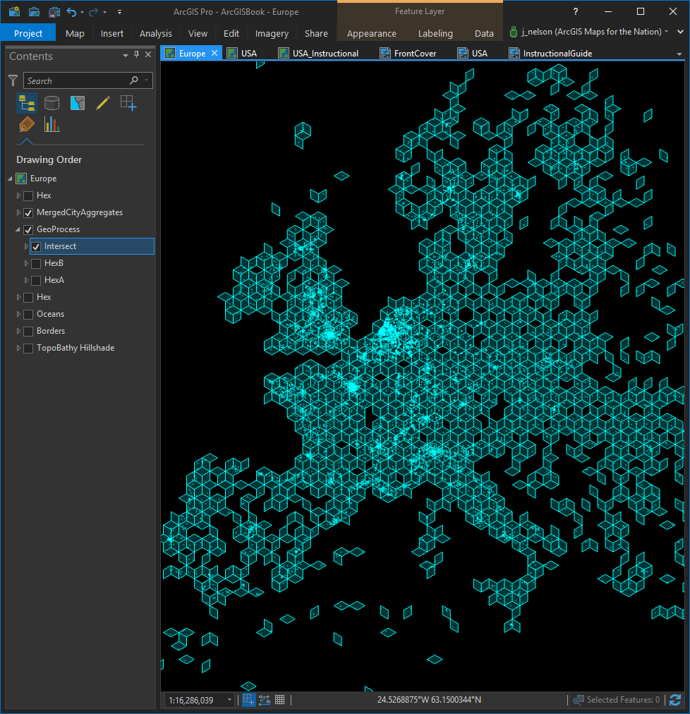
Now we can cookie cutter those shapes together and save just the intersections as delicious little diamonds. If you are feeling dangerous, check out this absurd post on splitting hexagons. Anyway, here they are…
Ok, we can put away the spatial scissors (including the rare and coveted ones marked “lefty“). It’s all aggregation and styling from here on out.
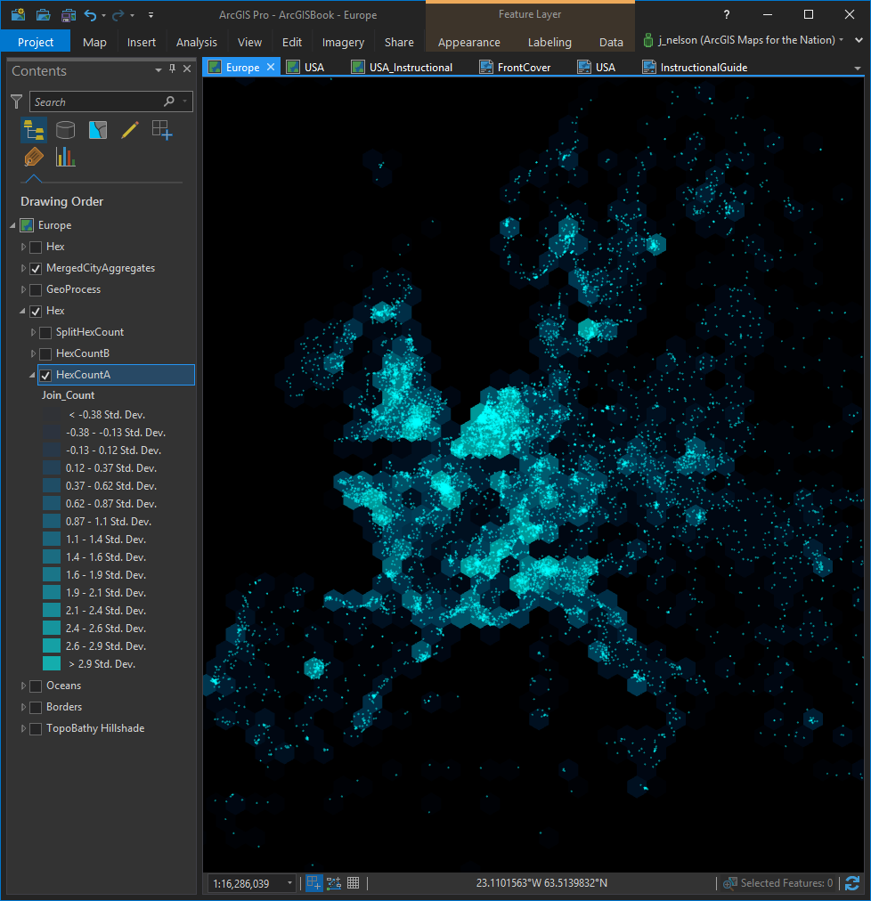
So, how many pings happen within each of these shapes? Here is an aggregation into the original hexagon mesh, with a nice color scheme ranging from bright opaque hexagons for lots of hits, and mostly-transparent dark hexagons for few hits.
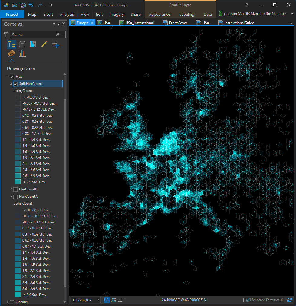
Snappy! Let’s see how it looks when we aggregate into the little diamonds we made by intersecting our two hexagon layers…
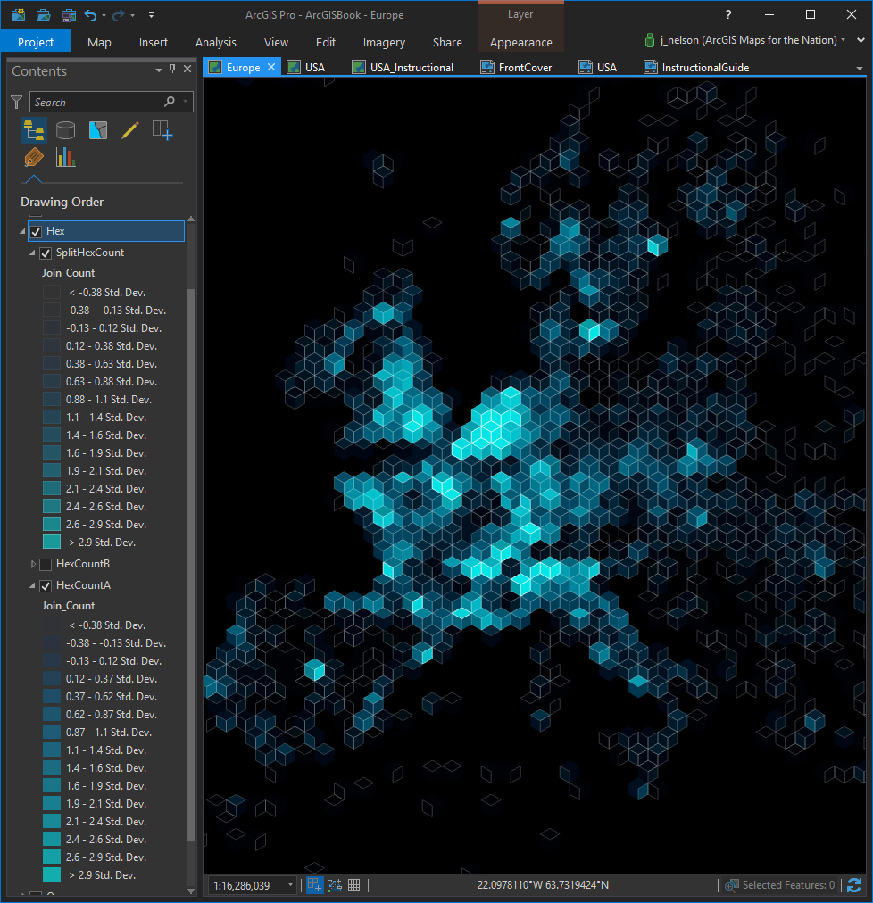
Also snappy! Imagine if we lived in a world where you could turn on both of these snappy looking spatial aggregation layers and see what they looked like at the same time. We don’t have to imagine! The technology of the checkbox enables this very feat…
Heyyyyyy. I like what I’m seeing. Also, wait a minute…YES! They look at little bit like cubes sort of! Wow, no matter the lengths we go to to create a map that is outside the box, ironically we end up with a map that is composed entirely of little boxes. Perhaps physics will have the last laugh.
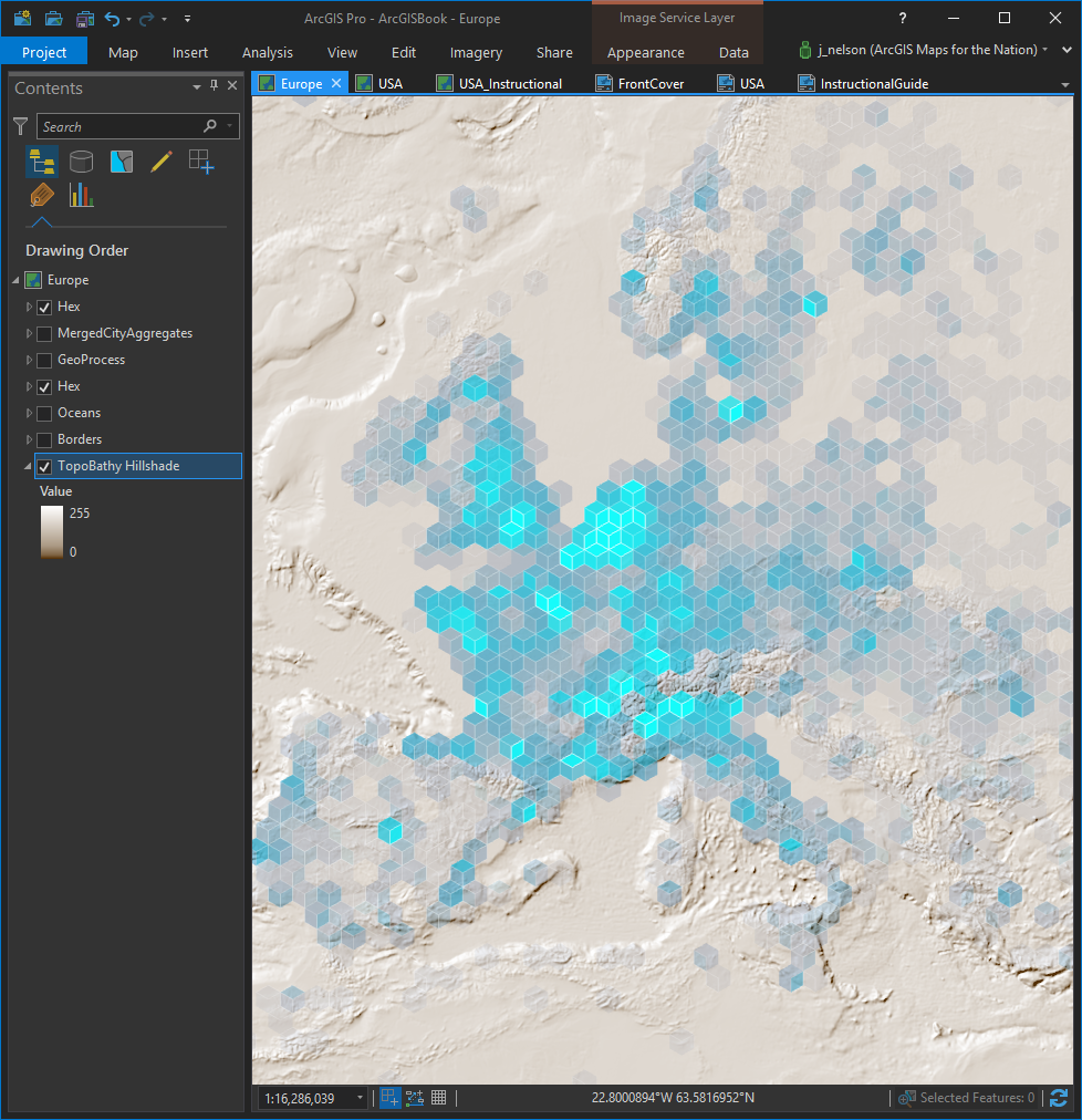
That’s a pretty drab dark background, though. What if we pulled in an epic topographic/bathymetric service from the Living Atlas? And gave it a butter-like color scheme (butter makes it better)?
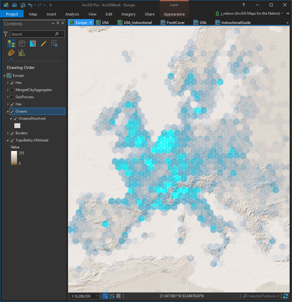
Sweet! A bit of context is nice. But maybe we have a little too much context now. Let’s tamp down that bathymetry a bit by overlaying a semi-transparent layer of oceans…
Cut! Print! That’s a wrap! Harder needs this yesterday!
That’s that. Start to finish. Now I hope you go diving into the unparalleled riches that this book has to offer, but first, get ready to live!
Happy Mapping, John

Article Discussion: