Introduction
At this point, we are finally ready to do some machine learning. Let this blog series be a reminder of just how much work may be required to prepare your data prior to getting to any of the fancy stuff!
In the original paper, the authors used two machine learning techniques back-to-back to create the final climate region map: Principal Components Analysis (PCA) and cluster analysis. PCA is a technique used to reduce highly dimensional datasets into smaller, uncorrelated dimensions, while attempting to maintain as much of the variation (e.g. information) in the original data as possible. Cluster analysis is a technique used to group similar observations together. The objective is to take a dataset of individual data points and create subgroups (or clusters) of data points, where the data points within each cluster are more similar to each other than to the data points in other clusters.
Principal Components Analysis (PCA)
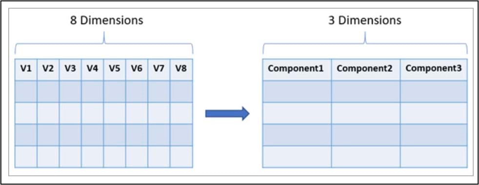
Recall that our final gridded precipitation dataset contains 16 precipitation variables (4 precipitation variables x 4 seasons), so we’ll use PCA to reduce the dimensionality of this dataset into fewer components.
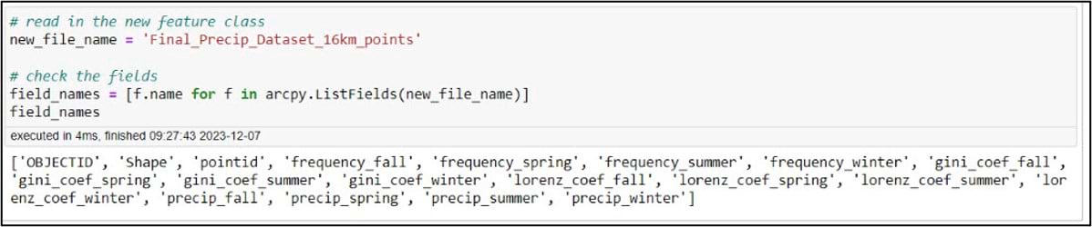
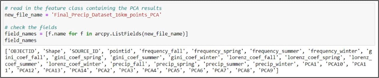
Back in the notebook, we’ll create a variable for our gridded precipitation dataset, then use ArcPy to make sure we have all the necessary fields.
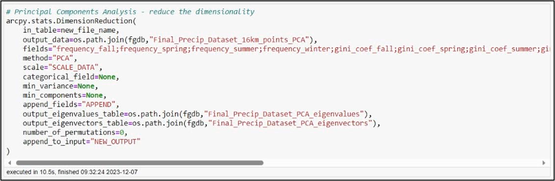
In ArcGIS Pro, PCA can be performed using the Dimension Reduction tool. We’ll specify our input and output datasets and choose all 16 of the precipitation variables for the “Fields” parameter. The “Scale” parameter gives you the option to transform all the input variables to the same scale, which can ensure that all variables contribute equally to the principal components. This is important in a situation like ours, where our precipitation variables have different units such as millimeters of precipitation, number of precipitation days, and Gini/Lorenz Asymmetry Coefficients that range in value from 0 to just over 1. The tool also has the option to output eigenvalue and eigenvector tables, which can help you interpret the results of the PCA. For more information on how all this works behind the scenes, check out the documentation.
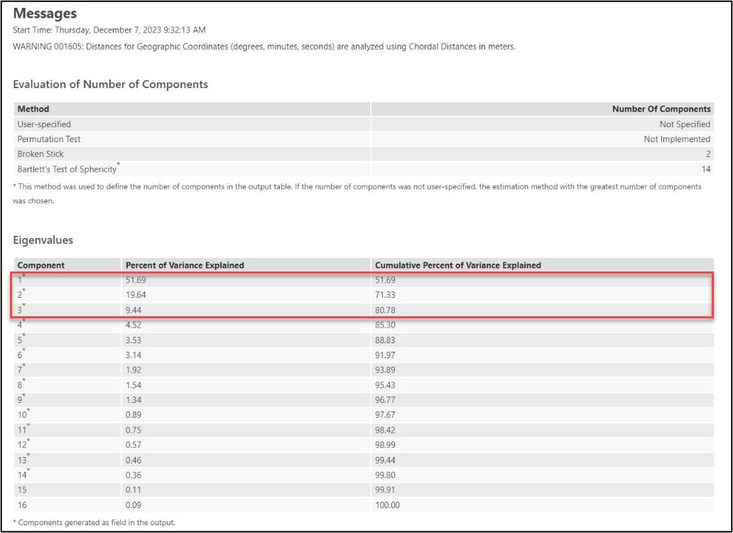
When you run a geoprocessing tool from within a notebook in ArcGIS Pro, you will see the tool result displayed as a rich representation directly within the notebook. This makes it easy for you to see all the information that helps you understand and interpret the tool results the same as you would if you ran the tool from the geoprocessing pane.
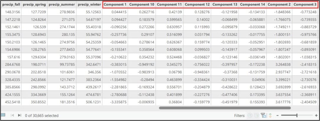
Looking at the PCA results in the notebook, we can see that the first three principal components account for over 80% of the variance in the original 16 precipitation variables.
While there is no hard and fast rule for deciding how many of the principal components to retain (e.g. how many it takes to adequately represent the variance in the data), there are a few methods and strategies available to help you do so. One example is to examine the scree plot, which is automatically created for you when you run the Dimension Reduction tool and specify the “Output Eigenvalues Table” parameter. It plots each principal component (x-axis) against the percent of variance explained by that component (y-axis).
You can use the scree plot to help you decide on how many principal components to retain by locating the point at which the curve begins to flatten out, which in our case is around PC3. This aligns with the authors’ decision from the original paper, where they chose to use the first three principal components as input into the subsequent cluster analyses.
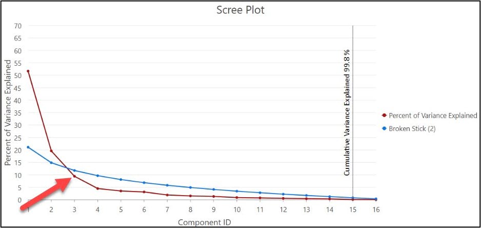
The “Output Eigenvectors Table” parameter may also be helpful for understanding the results of the PCA. It provides a graphical representation of the loadings (e.g. weights) for each component, which gives you an indication of how much the original variables are contributing to each component.
Cluster analysis
Broadly speaking, cluster analysis is a technique used to group together individual objects, entities, or data points into meaningful subgroups (e.g. “clusters”). The end goal is for each data point within a cluster to be more similar to the other data points within that cluster than to the data points in any other cluster. In the context of this case study, the aim is to cluster the gridded precipitation dataset into climate regions, where each region has similar historical precipitation characteristics over the 30-year period from 1981-2010.
In the field of data science, there are dozens of clustering techniques and algorithms to choose from. Some make specific assumptions about the statistical properties of the data points, while others are more data-driven and fall under the category of machine learning. The common thread among all clustering techniques and algorithms is: What does it mean for two data points to be “similar”? (e.g. how do we define “similarity” between two data points, and how does this inform the creation of clusters?)
In the context of cluster analysis, similarity is most often measured using correlational measures, association measures, or distance-based measures—with distance-based being the most common. From a purely data science perspective, the term “distance” refers to statistical distance, which is simply the distance between observations in multivariate attribute space (e.g. the difference in the data values). To geographers and GIS professionals, however, distance refers to geographical distance, the physical distance between observations or data points on Earth’s surface. As it turns out, there are clustering techniques and algorithms that use one or the other, or blend the two together.
In ArcGIS, for example, you have access to clustering tools that group spatial data based solely on the data attributes (e.g. Multivariate Clustering), or solely on their locations (e.g. Density-based Clustering). There are also several tools that perform clustering based on both the attributes and locations of the data. For example, Build Balanced Zones and Spatially Constrained Multivariate Clustering take a machine learning approach, while the different flavors of Hot Spot Analysis and Cluster and Outlier Analysis take a statistical approach. Additionally, the Time Series Clustering tool applies many of these concepts and more to time series data.
As with any other form of analysis, it’s up to you as the analyst to choose the most appropriate clustering technique or algorithm based on the problem you want to solve and the properties of your data.
Cluster analysis using open-source Python libraries: Hierarchical clustering
Following the workflow in the paper, the first cluster analysis technique we’ll use is hierarchical clustering. Fundamentally, hierarchical clustering methods operate by iteratively merging or dividing a dataset into a nested hierarchy of clusters. There are two main varieties of hierarchical clustering: agglomerative and divisive.
Agglomerative hierarchical clustering (e.g. “bottom-up”) begins with each data point as a member of its own individual cluster, then successively merges similar individual clusters together until all data points form one large cluster. Divisive hierarchical clustering (“top-down”) initially treats the entire dataset as one large cluster, then splits this large cluster into successively smaller clusters based on the dissimilarity between them.
In the paper, the authors experiment with several different agglomerative clustering algorithms, each of which uses a different “linkage algorithm”. In a nutshell, these linkage algorithms define how the distance (in multivariate attribute space) between clusters is calculated. You can learn more about the different linkage algorithms in the Hair, Jr. et al. (1998) and O’Sullivan and Unwin (2003) textbooks referenced in Part #1 of this blog series. You can also watch a great explanation by Luc Anselin in his 2021 Spatial Cluster Analysis course at the University of Chicago.
We saw in the previous section that there are many clustering techniques available in ArcGIS, but hierarchical clustering is not one of them. Because I am working with Python in an ArcGIS Notebook, however, it’s very easy to hook into the Python ecosystem and take advantage of its powerful open-source data science libraries. In this case, I’m going to call a specific hierarchical clustering algorithm from one of the most popular of these libraries, scikit-learn.
Back in our notebook, we need to import a few more Python libraries.
- matplotlib – creating data visualizations (graphs and charts) and plots
- numpy – scientific and mathematical computing, working with arrays and matrices
- scipy – scientific computing for mathematics, science, engineering
- sklearn – the scikit-learn machine learning library
You may notice that for several of these libraries, we are importing only certain subsets of functionality. In the SciPy import, for example, we call only the cluster submodule so we can use the functions for hierarchical and agglomerative clustering in the hierarchy module. From the scikit-learn cluster module, we are importing only the AgglomerativeClustering class. From Matplotlib, we import only the pyplot class.
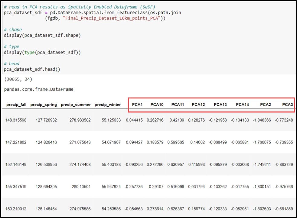
Prior to using SciPy and scikit-learn for cluster analysis, we need to ensure our GIS data is in the format they require, which in this case is the NumPy array. At this point, our gridded precipitation dataset (which now includes the principal components score of each observation) is a geodatabase feature class, so there are a few data conversion steps we need to do.
First, we’ll use the ArcGIS API for Python to convert our gridded precipitation dataset into a Spatially Enabled DataFrame (SeDF), which is essentially a Pandas DataFrame that contains the spatial geometry of each row. We pass the feature class into the .from_featureclass method on the ArcGIS API for Python’s GeoAccessor class to convert it to a SeDF.
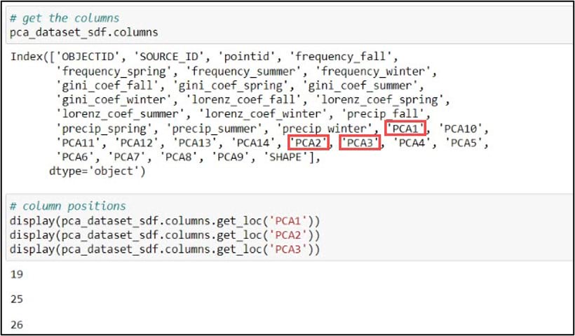
Next, we’ll print the DataFrame column names using the .columns attribute, then use the .get_loc method on this .columns attribute to print the index position of the column we specify. Because we’ll be using the first three principal components in our subsequent cluster analysis steps, we need to get the index positions of “PCA1”, “PCA2”, and “PCA3”, which are 19, 25, and 26, respectively.
The last steps before cluster analysis are to subset the DataFrame to include only the columns we need, then convert these columns to a NumPy array. For this subset/selection step, we can use either the .loc or .iloc functions. You can think of these functions as a more flexible version of an attribute query. The .loc function allows you to select rows and/or columns of a Pandas DataFrame using the row and column labels, while .iloc performs the selection based on the row and column integer positions.
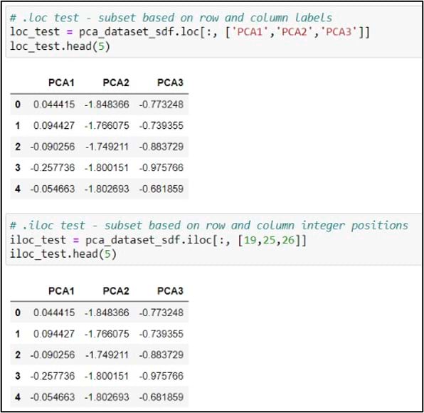
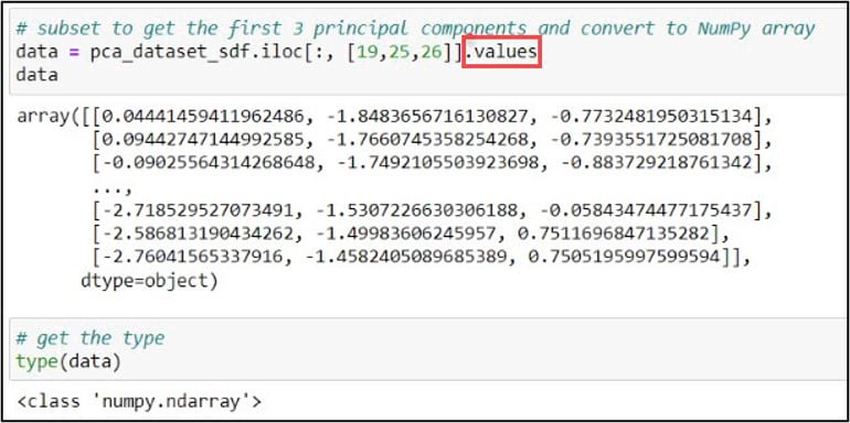
In my case, I chose to use .iloc and the integer positions, but either would do the job. Last, I can add the .values attribute to this line of code, which creates a NumPy representation of the DataFrame subset. With the new variable “data” pointing to a NumPy array containing the first three principal components, we are ready for cluster analysis.
One of the defining characteristics of all hierarchical clustering methods is that they do not require you to choose the final number of clusters up front. In the paper, the authors calculated a few measures of cluster cohesiveness to help them with this choice, but most often this is a subjective decision. A common approach for deciding on the optimal number of clusters is to use a dendrogram. A dendrogram is a tree-like representation of the nested hierarchy of clusters, where you can visualize the steps in which data points get iteratively merged into (agglomerative) or removed from (divisive) clusters.
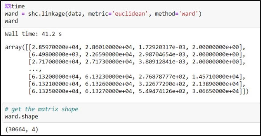
To create a dendrogram, we’ll first use the .linkage function from SciPy’s cluster.hierarchy submodule. This function is used to build a linkage matrix, which shows you which clusters combine to form successive clusters, the distance (e.g. “similarity”) between them, and the number of original observations within each.
In the .linkage function, we pass in the NumPy array, a metric to quantify distance between individual data points, and a linkage algorithm which determines how these distances are aggregated as new data points get merged into clusters (e.g. the distances between clusters). We follow the authors’ steps from the paper, using “Euclidean” as the distance metric and “Ward’s” as the linkage algorithm. Unlike some of the other linkage algorithms that are based on simple distances between clusters, Ward’s Method focuses on minimizing the variance within clusters as they are updated, and is often cited as one of the best performing of the linkage algorithms (Hair et al. 1998).
We then pass this output NumPy array into the .dendrogram function, which allows us to visualize the cluster hierarchy as a dendrogram. Note that we are also utilizing several of the functions for plot formatting from within the Matplotlib pyplot class.
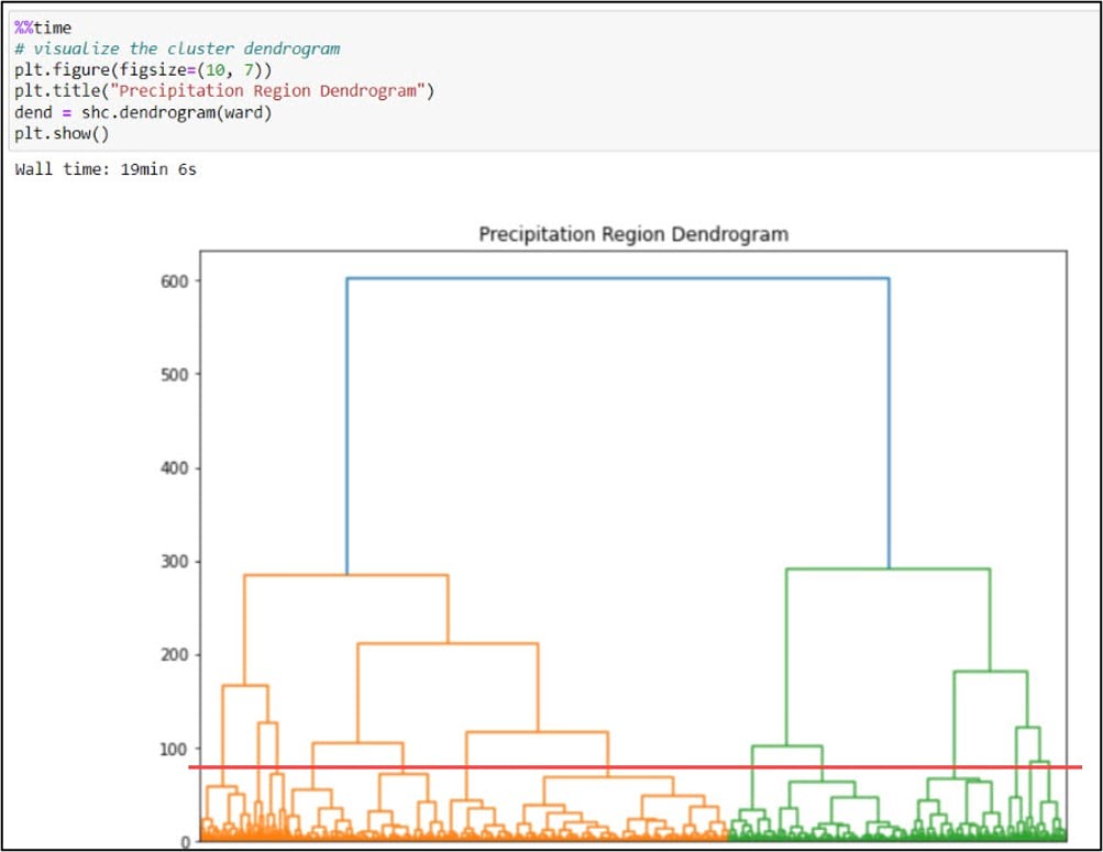
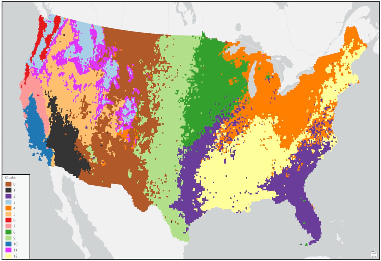
As mentioned above, choosing the final number of clusters in hierarchical clustering is subjective and is often driven by your data and the problem at hand. In the paper, the authors experimented with three different linkage functions and numbers of clusters to retain (Complete Linkage-15, Average Linkage-13, Ward’s Method-16). We decided on our final number of clusters with these numbers in mind and based on our dendrogram. The graphic above shows a red line that “cuts” the dendrogram at 13 clusters. While there is no hard and fast rule for where to cut a dendrogram and it tends to feel more like art than science, one common approach is to make the cut where the vertical lines first become longer (e.g. where there is more dissimilarity and separation between the clusters). Think of the dendrogram like a tree. All of the individual data points at the bottom are the individual leaves and twigs. As you move up the tree, each leaf and twig is associated with a larger branch, representing a cluster. Our tree has 13 “branches”.
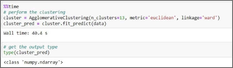
With this decision in mind, we are ready to perform the clustering. Using scikit-learn’s .AgglomerativeClustering function, we’ll create our estimator (e.g. “cluster model”) by passing in our desired number of clusters (13), the distance metric, and the linkage algorithm that we used in the previous step. The .fit_predict method is then used to fit this clustering model to the “data” variable, which points to the NumPy array containing the first three principal components. In addition to fitting a model to your training data, .fit_predict also predicts the cluster labels that are assigned to each data point and returns these values as another NumPy array.
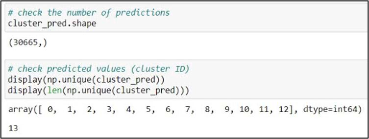
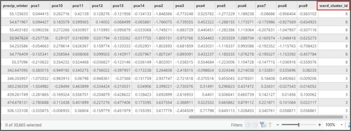
We can explore these results further using some basic NumPy functionality. First, we’ll use the .shape attribute to check the dimensions of the array. In our case, the cluster analysis output is a 1-dimensional (1-D) array containing 30,665 elements that represent a cluster label for each row in the 16km by 16km gridded precipitation dataset. Next, we’ll use the .unique function to confirm that there are 13 unique cluster labels. Looks good!
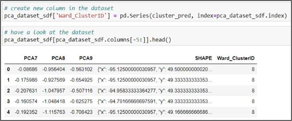
At this point, we have a NumPy array that tells us which cluster each of our original gridded precipitation points belongs to. Now we need to get this information attached to the Pandas DataFrame that contains all of the other attributes. This is a common workflow when performing other types of machine learning or predictive analysis (e.g. linking the output results in the form of a NumPy array back to the Pandas DataFrame that contained the original values that were input into the algorithm).
We pass the NumPy array containing our cluster labels into the .Series function to make it a 1-dimensional Pandas Series, and set the index argument to match the index of the DataFrame. The result of this function is assigned to a new column in the DataFrame called “Ward_ClusterID”.
Last, we’ll use the ArcGIS API for Python’s .to_featureclass() method to export the SeDF containing the Ward’s Method cluster labels as a feature class in a geodatabase so we can use it for further analysis and mapping in ArcGIS Pro.

Cluster analysis using ArcGIS Pro: K-means clustering
The second clustering technique used in the paper is K-means clustering, which is considered a form of partitioning clustering. Unlike the Ward’s Method discussed in the previous section, K-means is nonhierarchical, which means that it does not rely on the treelike hierarchy of clusters that is constructed through either agglomeration or division. Rather, K-means clustering typically begins with a set of random “seed points” that iteratively grow into larger clusters.
Initially, all observations in the dataset are assigned to the random seed point they are closest to (closest in multivariate attribute space). The mean center of each cluster is then calculated, and each observation is then reassigned to the new closest mean center. This process continues until individual data points are no longer being reassigned to different clusters (e.g. the clusters become stable).
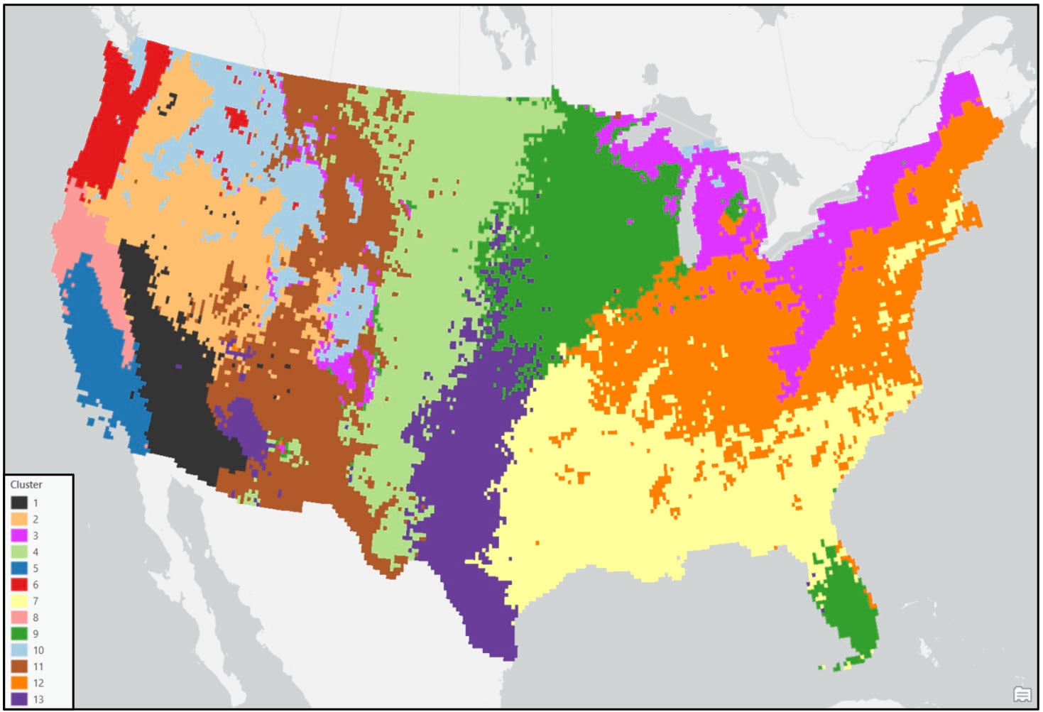
Unlike the hierarchical methods discussed above, one the defining characteristics of partitioning methods is that the desired number of clusters is specified up front, via the seed points. For the purposes of this blog, we’ll use the same number of clusters (13) in K-means as we used in the Ward’s Method above.
In our notebook, we’ll create a variable for our gridded precipitation dataset containing the PCA result columns, then use the ArcPy ListFields() function to make sure we have all the necessary fields.
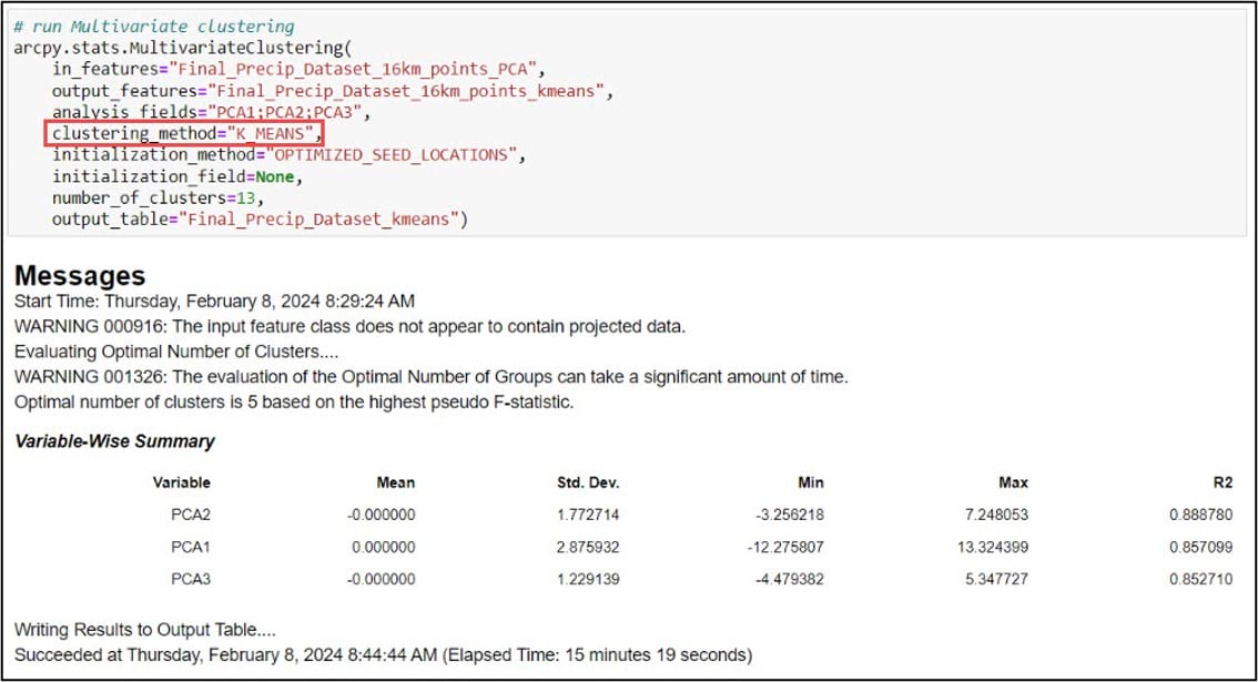
We’ll then input this feature class into the Multivariate Clustering tool, which is the implementation of the K-means clustering algorithm in ArcGIS Pro. Here is a bit more information on some of the important parameters:
- analysis_fields – the first three principal components, following the workflow in the paper and what we used in the Ward’s Method
- clustering_method – specifying K-means. K-medoids is also an option
- initialization_method – how the initial cluster seeds are created (random, optimized, user-defined)
- number_of_clusters – desired number of clusters
Post-processing
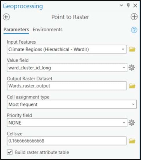
Before comparing and interpreting our final precipitation region maps, we’ll do a few post-processing steps to clean up our data. Both the Ward’s and K-means clustering algorithms were run on vector feature classes, so our first step will be to convert them to rasters. We’ll use the Point to Raster tool to convert the 16km grid points to a raster, specifying 0.166 to represent a 16km by 16km raster cell size. The Value field parameter specifies the attribute that will be assigned to the output raster, which in this case is the cluster ID. The Cell assignment type parameter specifies which value will be given to each new raster cell based on the underlying grid points. Unlike our previous use of this tool to spatially aggregate (e.g. calculate the spatial average) a 4km grid dataset into a 16km grid, here we are not changing resolution so we assign the cluster ID of each grid point to its underlying raster cell.
We apply the same steps to the K-means clustering output, and apply an appropriate symbology for a categorical map.
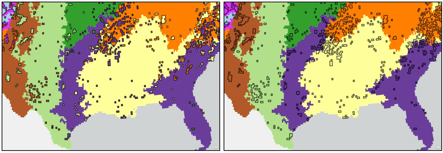
In both maps, the precipitation regions look relatively homogeneous. However, there are several locations that appear noisy and speckled due to the “salt and pepper effect”—e.g. individual isolated raster cells or small groups of raster cells of one precipitation region (cluster) within larger contiguous areas of another region. In the original paper, the authors attempted to solve this issue by overlaying a 2° by 2° fishnet grid on top of the 16km gridded cluster maps and assigning each 2° grid cell the majority cluster that falls within it. For this blog, we’ve taken a slightly different, more granular approach.
We first convert the raster cluster maps to vector using the Raster to Polygon tool, choosing the “non-simplified” output to ensure that the polygon edges will be the same as the raster cell edges. We then run the Eliminate tool to clean up some of the noisy areas in our maps. This tool works by merging small polygons with neighboring polygons that have either the longest shared border or largest area.
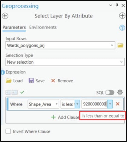
When using the Eliminate tool, your input polygons need to have a selection applied to identify which small polygons will be merged in with their larger neighbors. To create this selection, I needed to determine some threshold value (e.g. polygon size) below which all smaller polygons will be eliminated. After a bit of manual exploration around the cluster maps, I was able to determine that the threshold values for the Ward’s and K-means cluster maps are 9,200 km2 and 10,300 km2, respectively. These values were used in the Expression parameter of the Select Layer By Attribute tool to apply a selection to each cluster map, then these layers were passed into the Eliminate tool to remove the small polygons.
The resulting dataset can then be input into the Dissolve tool to aggregate all polygons assigned to the same cluster into one polygon representing that cluster.
Results
Following these post-processing steps, the final output maps appear cleaner and much less noisy. Generally speaking, both clustering approaches produce visually similar results, with some noticeable differences in the Northwest, Southeast, and Northeast. For example, portions of the Northwest in the Ward’s cluster map are much less compact than in the K-means cluster map.
When comparing either of the two clustering solutions to the original 9-region NCEI map, it appears that precipitation regions are much more compact and contiguous in the eastern US, while there is much more spatial heterogeneity and local variation west of the Rocky Mountains. It’s clear from these maps that using a data-driven approach to delineate climate regions provides a much more robust picture of the climate geography of the US than by simply grouping together state boundaries.

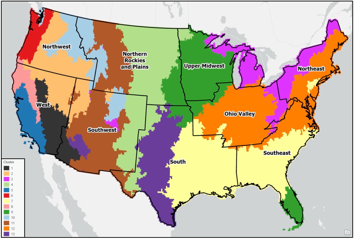
Other notable findings and observations:
- In general, the regions are mostly spatially contiguous, despite the fact that both clustering algorithms operated on only the input attributes (e.g. there were no spatial constraints enforced). For example, portions of the Southeast and South (cluster 2 – purple) belong to the same cluster in the Ward’s map, while portions of the Southeast and Upper Midwest (cluster 9 – green) are members of the same cluster in the K-means map. Clearly, the underlying geography matters!
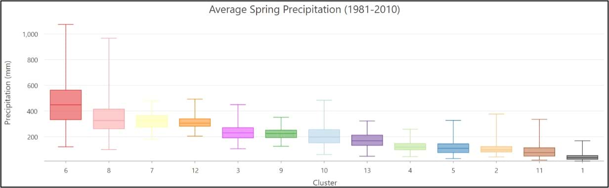
- Apart from the Pacific Northwest, precipitation amount and frequency is on average highest in the Southeast and Northeast, and lowest in the southern West and Southwest.
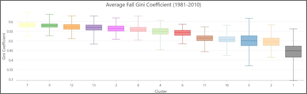
- On average, the Gini Coefficient values decrease moving from east to west across the US, while the Lorenz Asymmetry Coefficient values increase slightly from east to west. This means that in the East there are generally many small precipitation events, with more variability in the amount of precipitation received from event to event. In the west, there are fewer large precipitation events, with each event having a similar amount of precipitation.
Conclusion
This blog series detailed how you can combine Esri technology and open-source Python and R to perform an end-to-end spatial data science project. I hope that it not only taught you a few new techniques and workflows, but also inspired you reproduce research and keep advancing the science of GIS!

Article Discussion: