If you’re an organization Administrator, paying attention to details early on often pays large dividends over time. As organizational assets grow in number, whether they be shared items or groups, the ability to quickly and easily identify them and recognize what they are and how they are used can save time and increase management efficiency. An easy way to accomplish this is to use visual cues.
Thumbnails
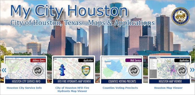
Thumbnails are an easy visual cue that helps brand what your organization publishes, and also what item types or sources they include. Below is an example from the City of Houston, Texas. The gallery ribbon is displaying item thumbnails that include the organization’s logo (or brand) to help identify authoritative content published by the organization.

The thumbnails also include a color-coded type that also helps identify the content.
Using good thumbnails is also key to quickly identifying your organization’s content. Of the three thumbnails below, the two on the right provide a better visual indicator of the map contents, in this case hospital locations.

Other graphics may be applied to thumbnails to help users in your organization quickly identify item types and how they can be used. Below, the graphics indicate (from left to right) a 3D scene, a story map, and a shapefile.

Marking authoritative content
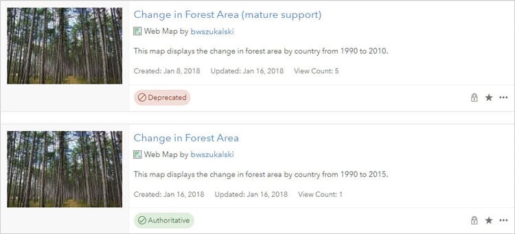
Items in your organization can be marked as authoritative or deprecated, making it easier for others to find authoritative items while discouraging the use of items that are out of date. When marked, an easy-to-view badge is included in the item pages.

Organization administrators and those with administrative privileges to update content can specify that an item is authoritative using the Mark as Authoritative button. If you are the item owner or an administrator, or you have administrative privileges to update content, you can use the Mark as Deprecated button to designate an item as deprecated.
Group graphics
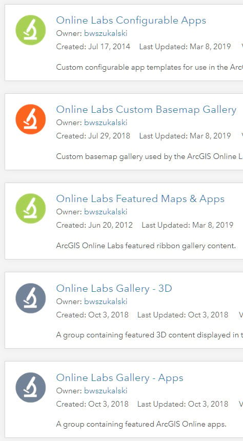
The visual design notions described above can also be applied to groups. A practice worth considering is to use your organization’s logo as thumbnails for the group building blocks – the groups that are used to populate the featured content, gallery, and other core groups. Consistency in naming is also a good practice, so they appear grouped when listed alphabetically.
Below are several groups that have been created by the organization administrator using different thumbnails to indicate use or purpose. Building block groups for the organization can be easily recognized by the common graphic representing the organization. Further information is represented visually using color; orange identifies internal building block groups, green represents groups that are public and contain public content, and blue are groups used to manage content within the organization.

What works for you?
Experiment to see what works best for your organization. While these practices take a little extra effort, as your organization grows and its assets increase it will save administrative time and help others in the organization identify content. Not every group or item needs to follow these conventions, but for core organizational assets these simple visual cues help distinguish them easily, and help keep your organization organized.
More information
For more information see:
This post was originally published on January 6, 2013, and has been updated.

Commenting is not enabled for this article.