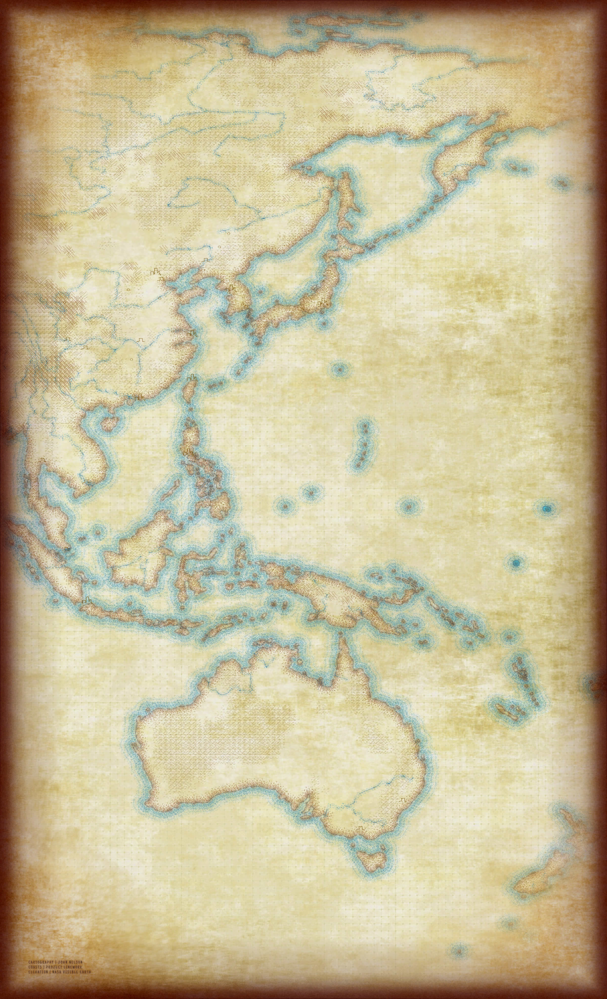
Of course it’s the very nature of a fantasy map insert to be revealed via a cover turn, smelled, and traced with a curious finger. So when it comes to creating a fantasy map that begs to be ripped out, annotated on, and jammed into a trapper keeper for closer scrutiny on the bus ride, you just have to go full bore on the textures.
In this series about creating reasonably passable fantasy maps, we’ve covered mountainification and scratchiness. In this final chapter, we’ll drag ourselves across the skeuomorphic landscape of touchability, and we’ll get there via texture images. You can download the (200MB) project package and follow along if you are so bold.
Map Deconstruction
Maybe the best way to talk about layering texture into maps is to peel them back one at a time and have a look…
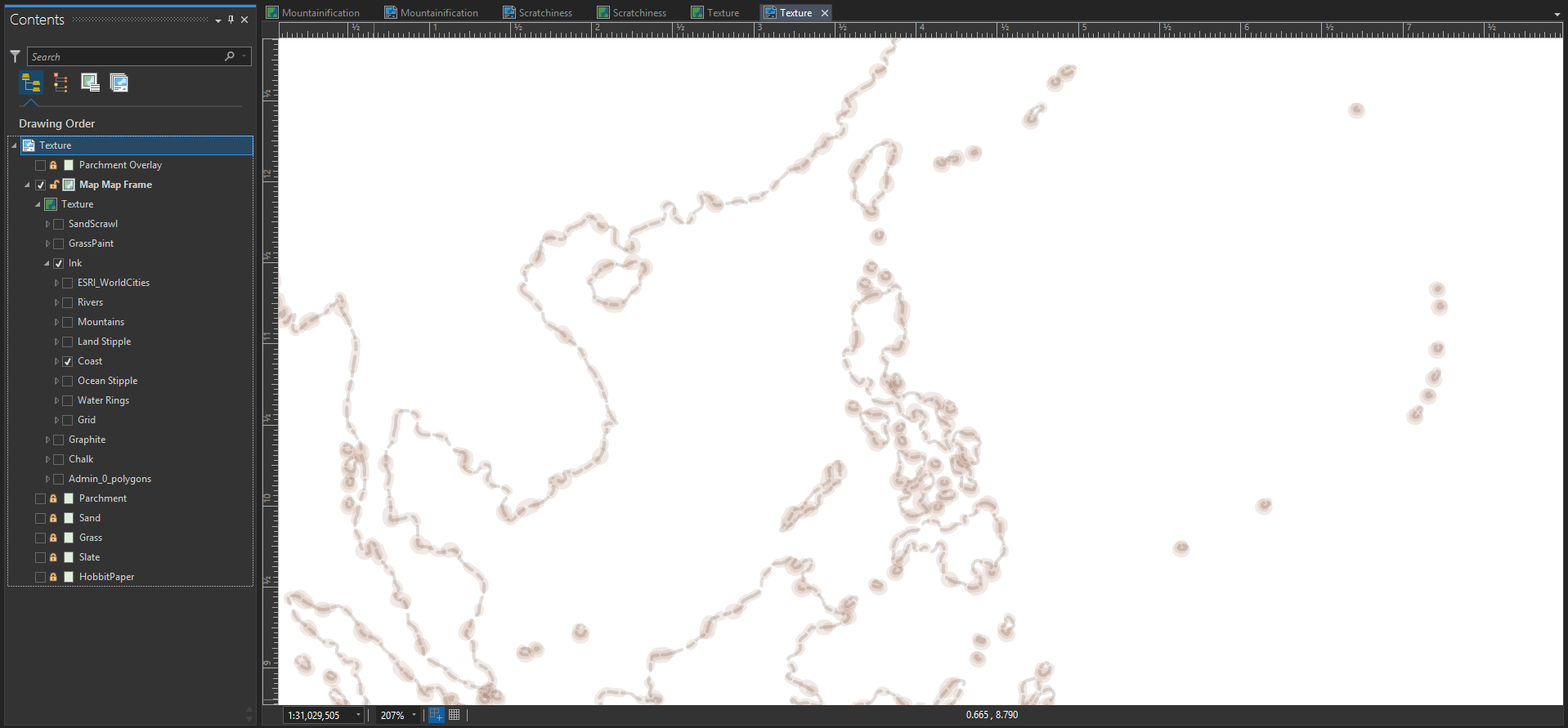
Stacked Dashes
Here’s a vector shapefile of coasts. I’ve stacked a couple semi-transparent copies of it with varying thickness and dash patterns. You can read more about that technique here.
Offset Picture Stroke
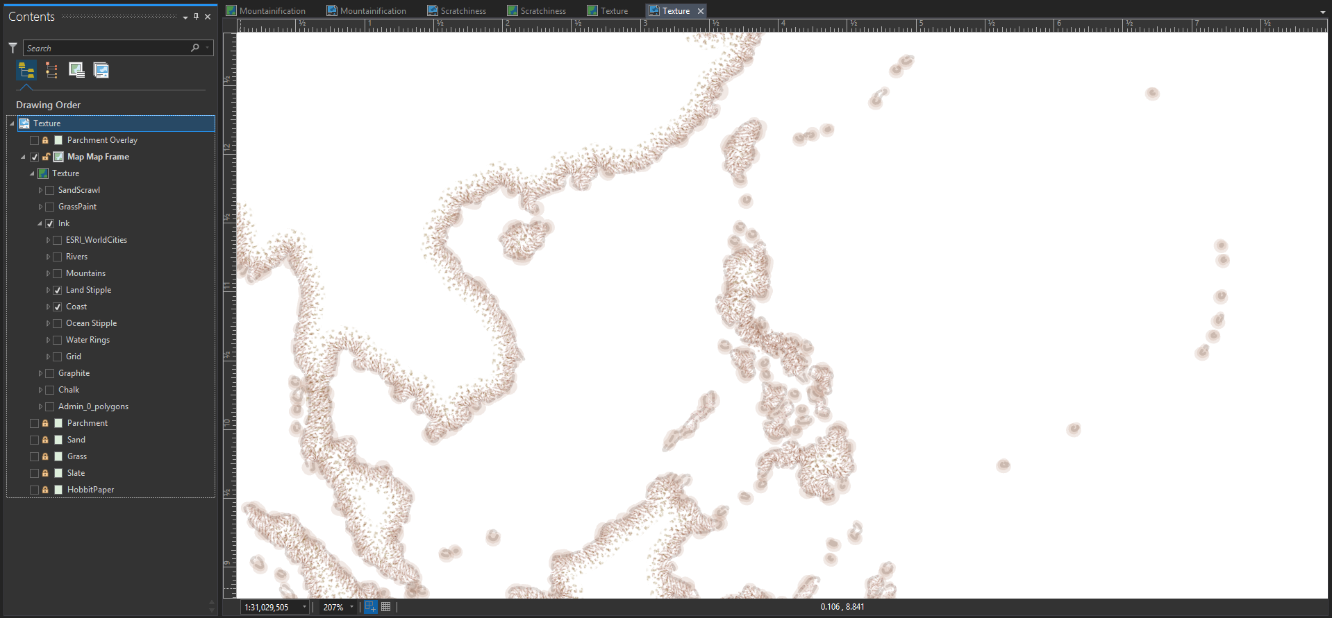
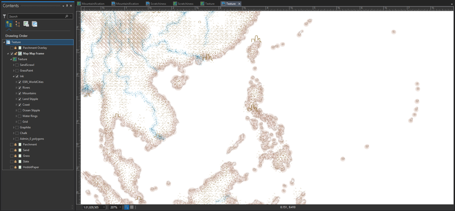
Hey, this is interesting. Land stipple! It’s super easy; a combination of two techniques: Picture stroke and offset.
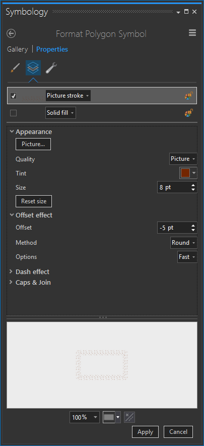
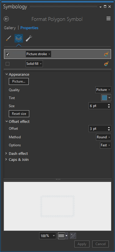
A picture stroke is a style of rendering a line that just repeats an image over and over. I fed it an image I drew that looks like chalk dust. You can download all of the line textures used in this map, here. I tinted the picture brown, then (and this is key) I gave it an inner offset. This draws the line inside of the land polygons at whatever distance you tell it. The result is a nice inner stippling of land features -a hallmark of sweet sweet fantasy maps.
Then I added some inland features, like rivers (using stacked dashed lines and picture strokes, like the coastline), places (here are the three city symbols I drew for them), and elevation (using the snaky hack of the vector field symbology covered in part 1).
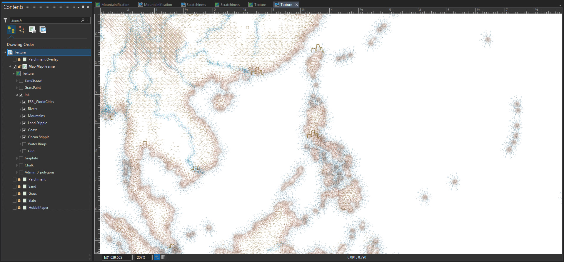
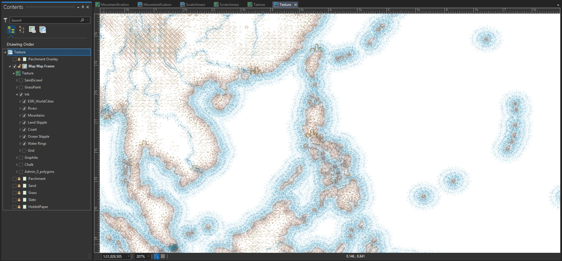
Then, just as we used an inner offset to make the beachy stipple shading inland, we can do the same thing in reverse to add some coastal water stippling.
For the water stippling, just use a positive number for your line offset, and the stroke will render outside of the land polygon, which is where water lives.
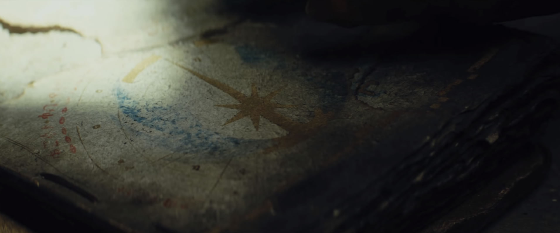
Hang on a second. I should tell you where I sampled the colors used in this map. I didn’t make them up. I, like you, was just blown away by the latest Star Wars The Last Jedi trailer, where I noticed, as you did, a fleeting clip of a worn ancient parchment bearing the symbol of the Jedi order. In fact, go check it out. I’ll wait.
Water Lines
Next, to add some fantasy map oomph to these coasts, I generated a series of buffered rings, at increasing distances. How far should your water lines go, and at what rate? I defer to the esteemed Daniel Huffman on this. They get the standard treatment of stacked up dashed and picture stroke layers. And here we go…
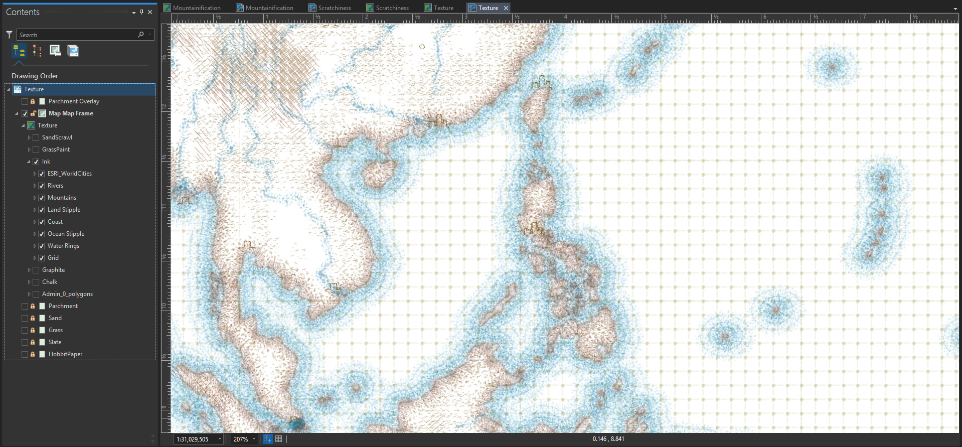
Often a reference gird can add some technical punch to the fantasy land being depicted. Here’s a lat long grid painted in with really semi-transparent dashed lines. I even added a picture stroke to give it a white stipple effect. It just felt like the right thing to do.
Surface Texture
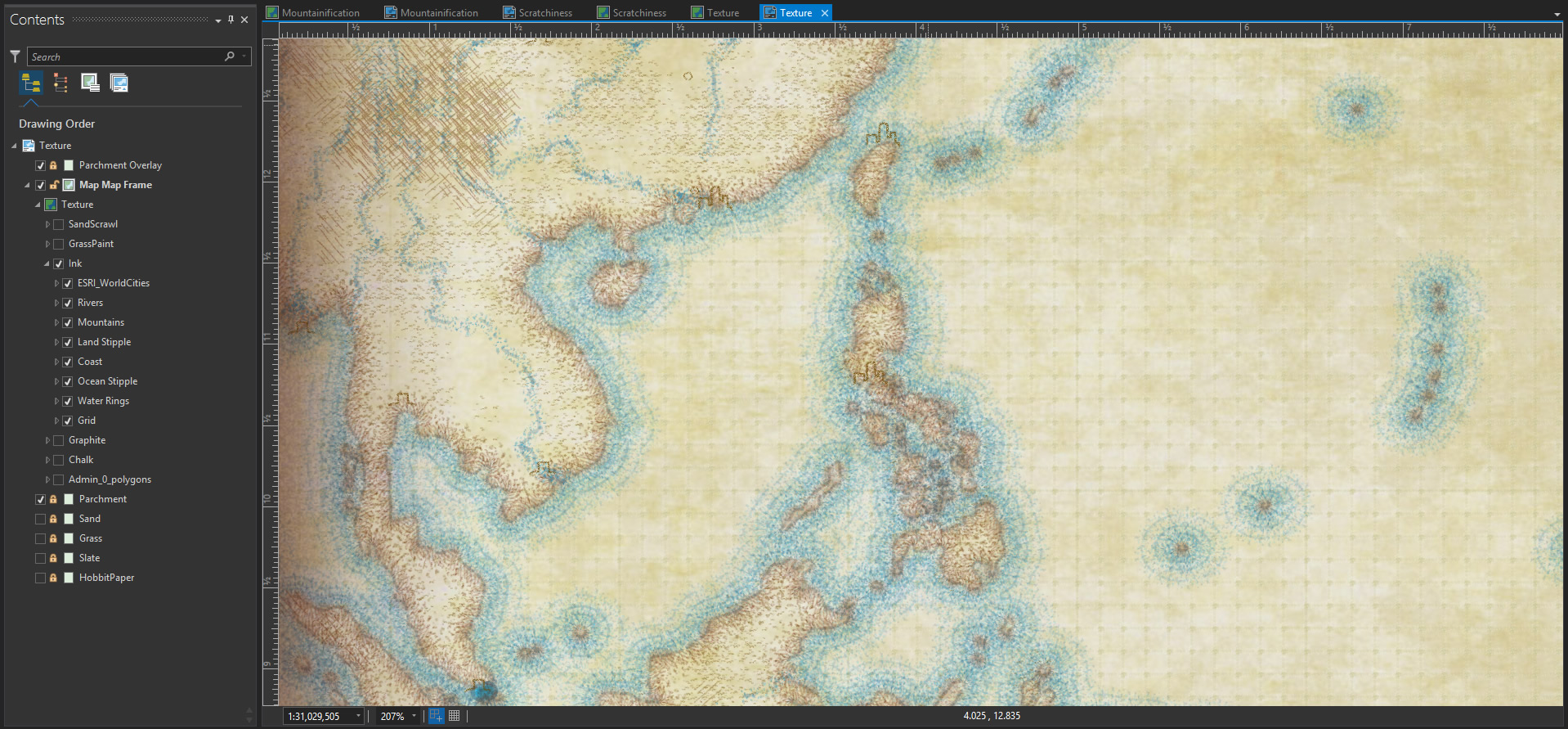
Those grid lines look a little drastic though, right? Well, not once we add in the coup de grâce…a physical texture background! Even the most grizzled dead-on-the-inside brutalist has to concede that when it comes to constructing a legitimate fantasy map, some sort of vellumy papery parchmentish material is key.
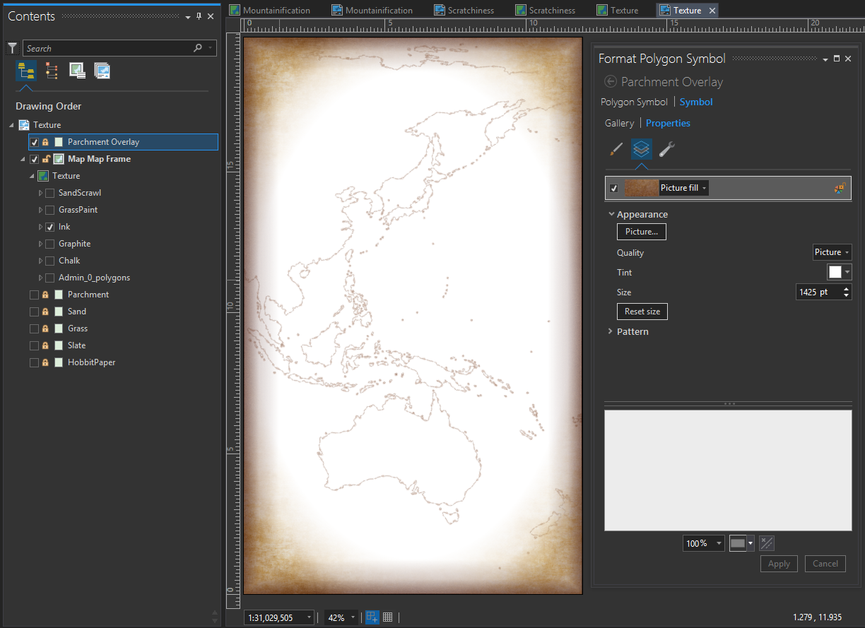
Ah, that’s so much better. How to do it? In the Layout of an ArcGIS Pro project, you can insert an image behind the map view. If you want your image to repeat, then draw a rectangle and use the image as the fill.
But I gave this map two image textures. The background is straightforward. It’s a hunk of parchment. But on top of the map I added an image to give the effect of fading out map content at the edges -just like a real drawn map!
You can download these (background parchment and overlay parchment) texture images here.
Anyway, that’s the deconstruction of the map! I hope the peeling revealed some helpful tips. It’s all about the process.
Other Touchable Textures
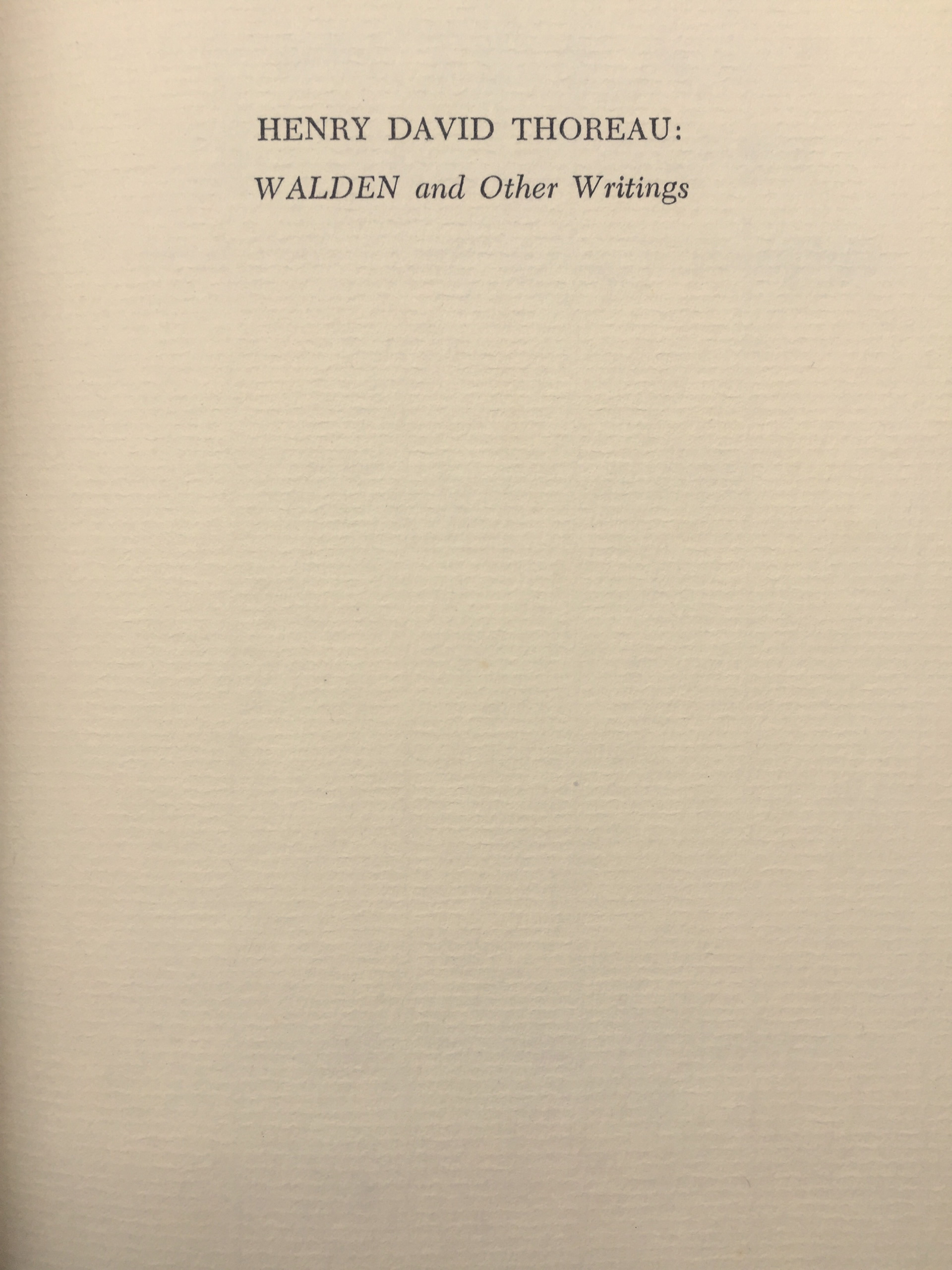
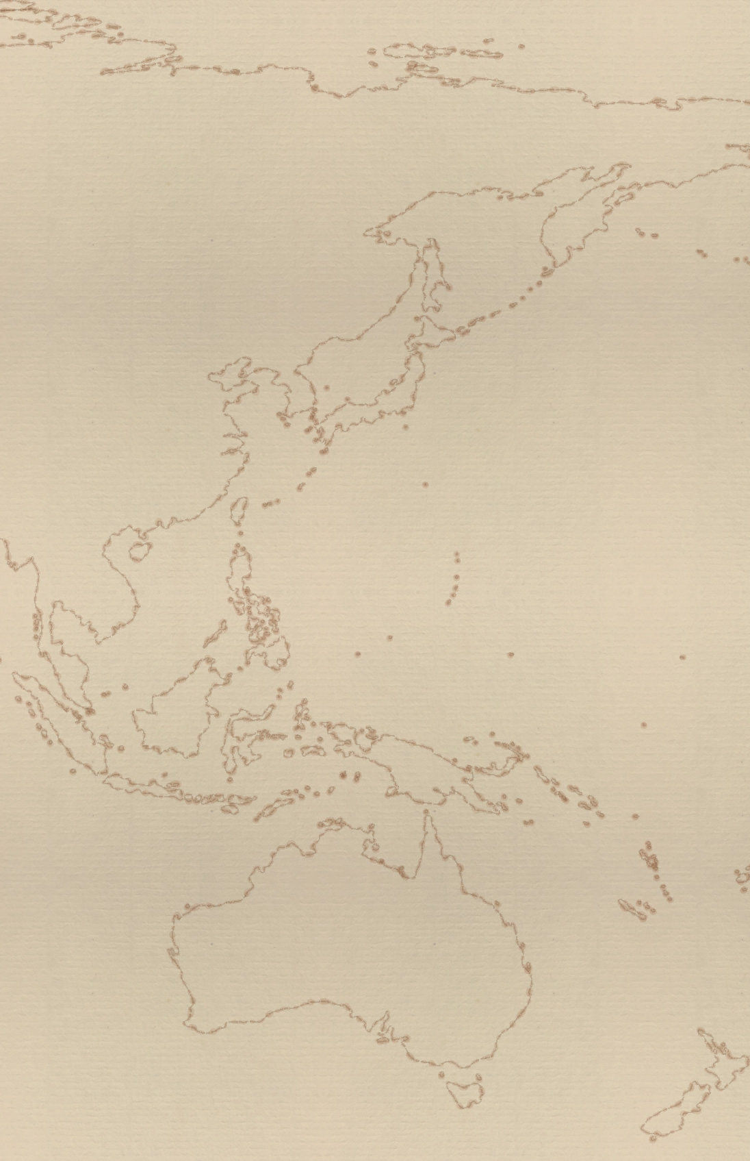
Here’s a photo I snapped on the title page of Walden. I cropped it for use as the background in previous posts.
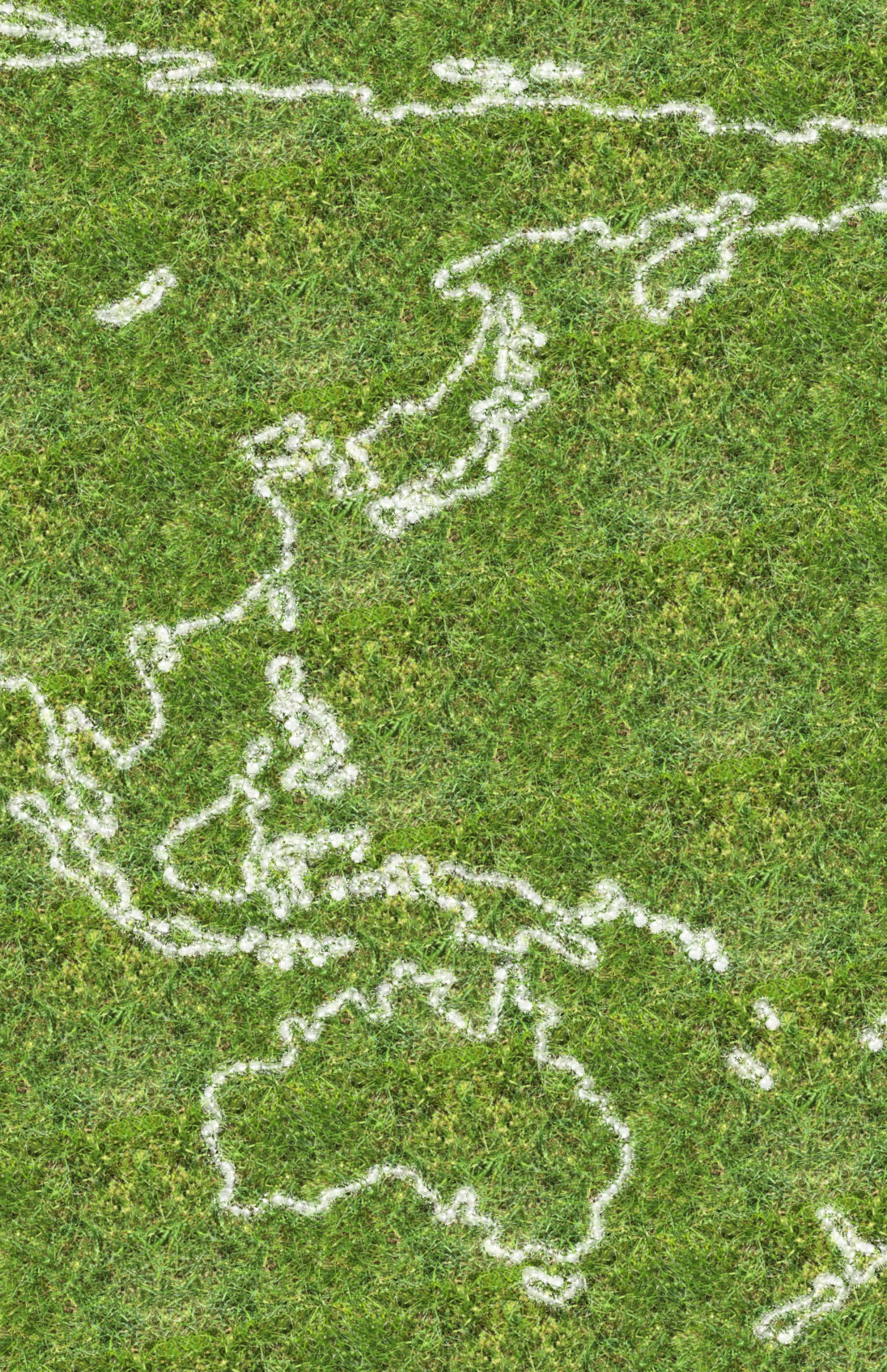
But why stop at plausible textures?
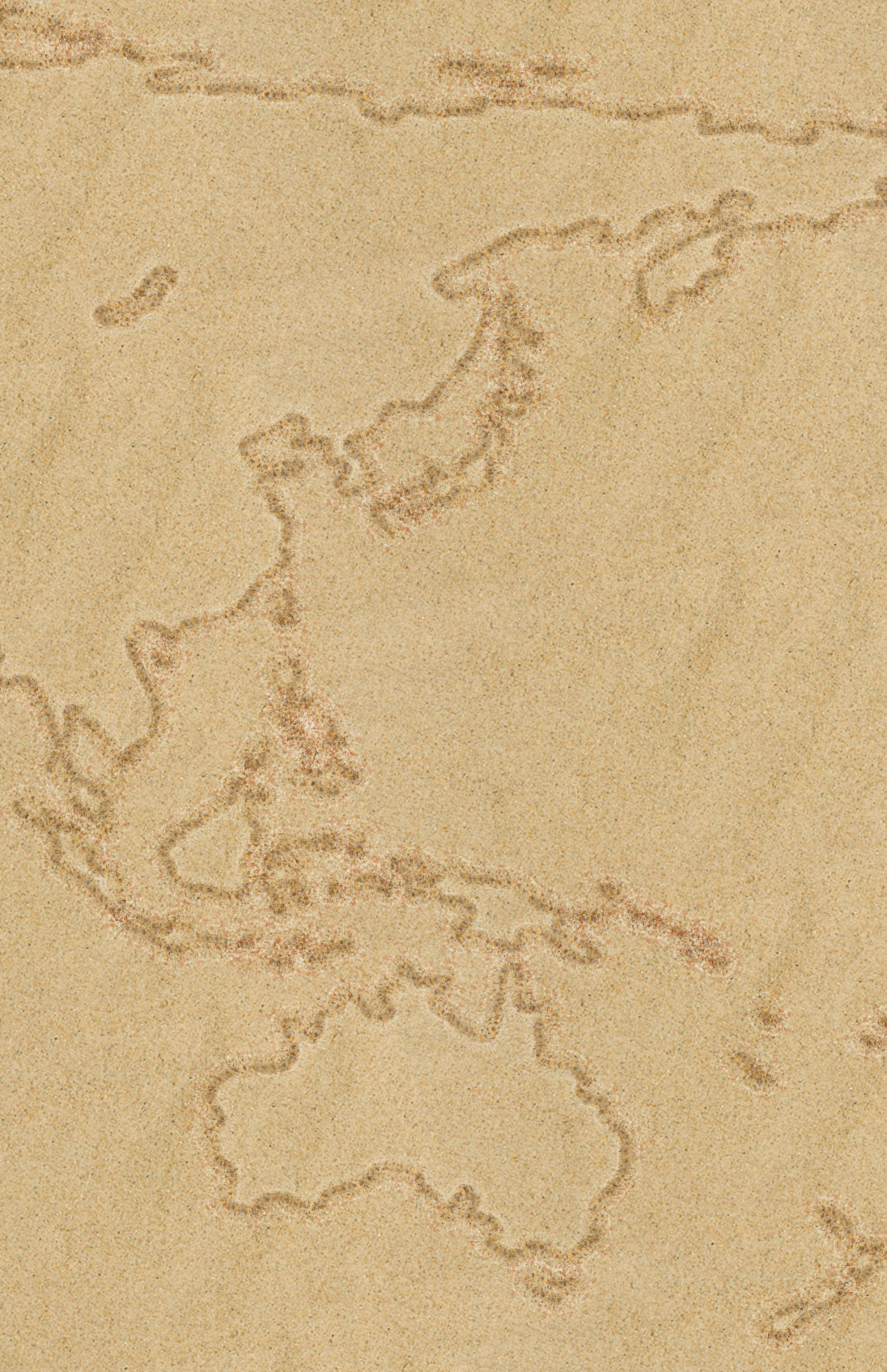
Who hasn’t drawn lines in the sand with a stick, toe, or finger? Maps scratched in the dirt are probably the original ones.
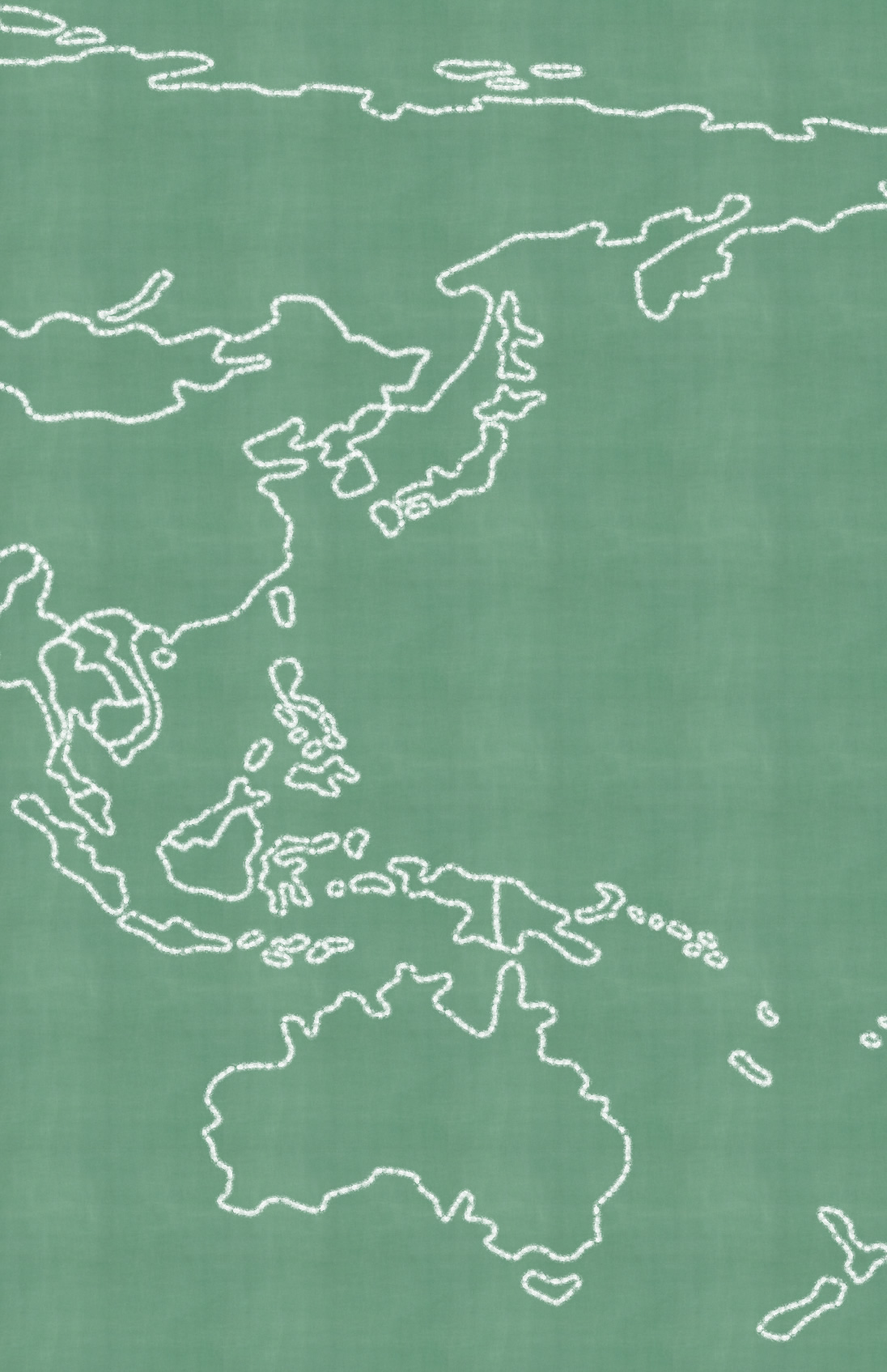
While we’re feeling retro, how about a slightly more recent era, when we learned on chalkboards?
Then when the bell rang we’d rush outside…
Anyway, you get the point. The background texture used as a material support to your cartography has a huge impact on how is it perceived by readers.
In Closing
This series has been an awful lot of fun to create for and to write. If you’ve made it this far I hope you gleaned some interesting and useful tidbits and are willing to give some of them a try. Cartography is inherently an awesome adventure. Our maps don’t always have to be tame or traditional. We have the tools, resources, and reach, to make fun things for folks. Thanks for following along on this fantasy map adventure!
Happy Fantasy Mapping, John

Article Discussion: