We are on a bold quest to reconstruct the Fantasy Map asesthetic in ArcGIS Pro. In Part 1 we hacked the Vector Field symbology to approximate hand-drawn mountainification. Here, in Part 2, we’ll talk about adding hand-drawn scratchiness to the map linework.
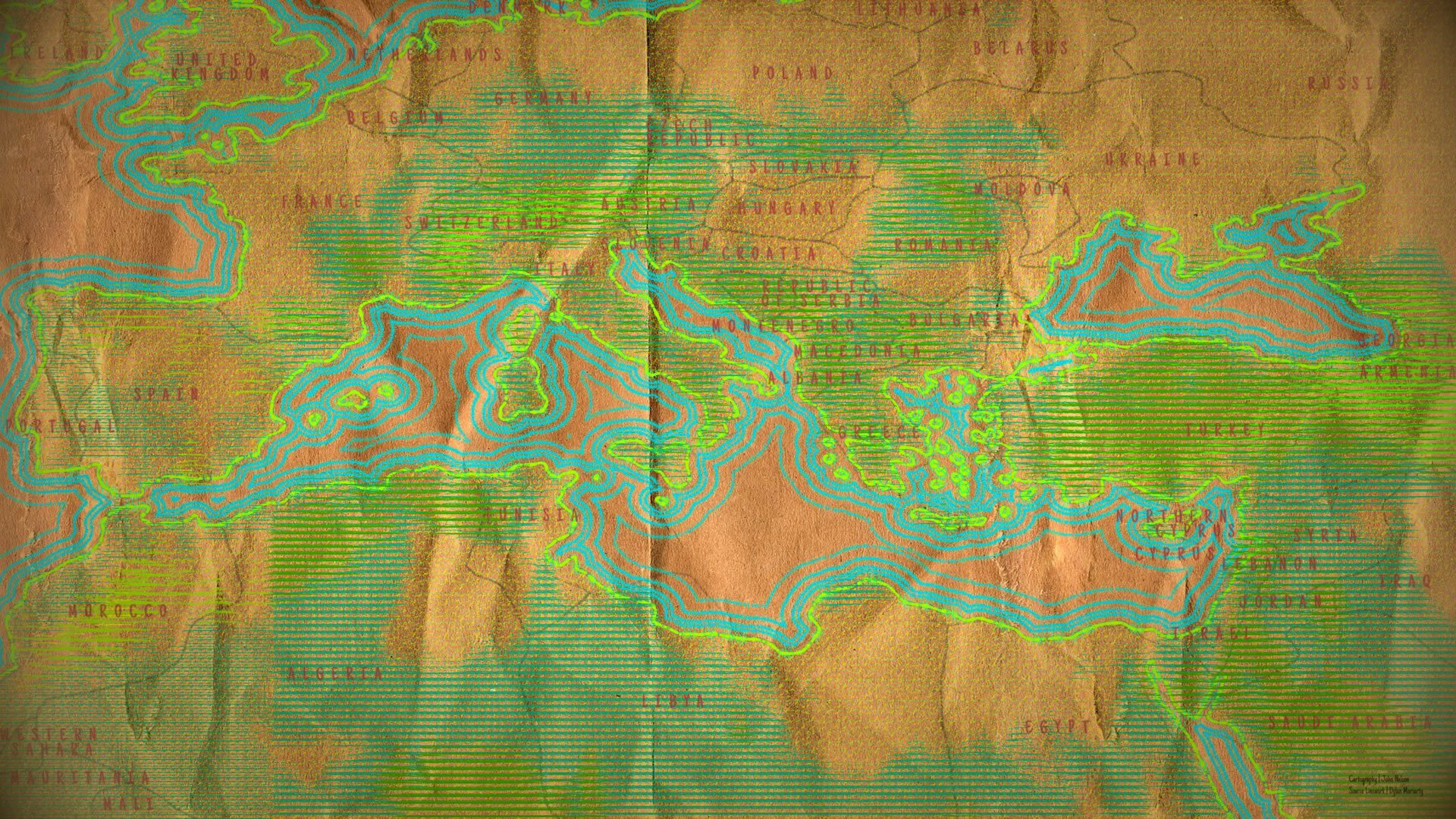
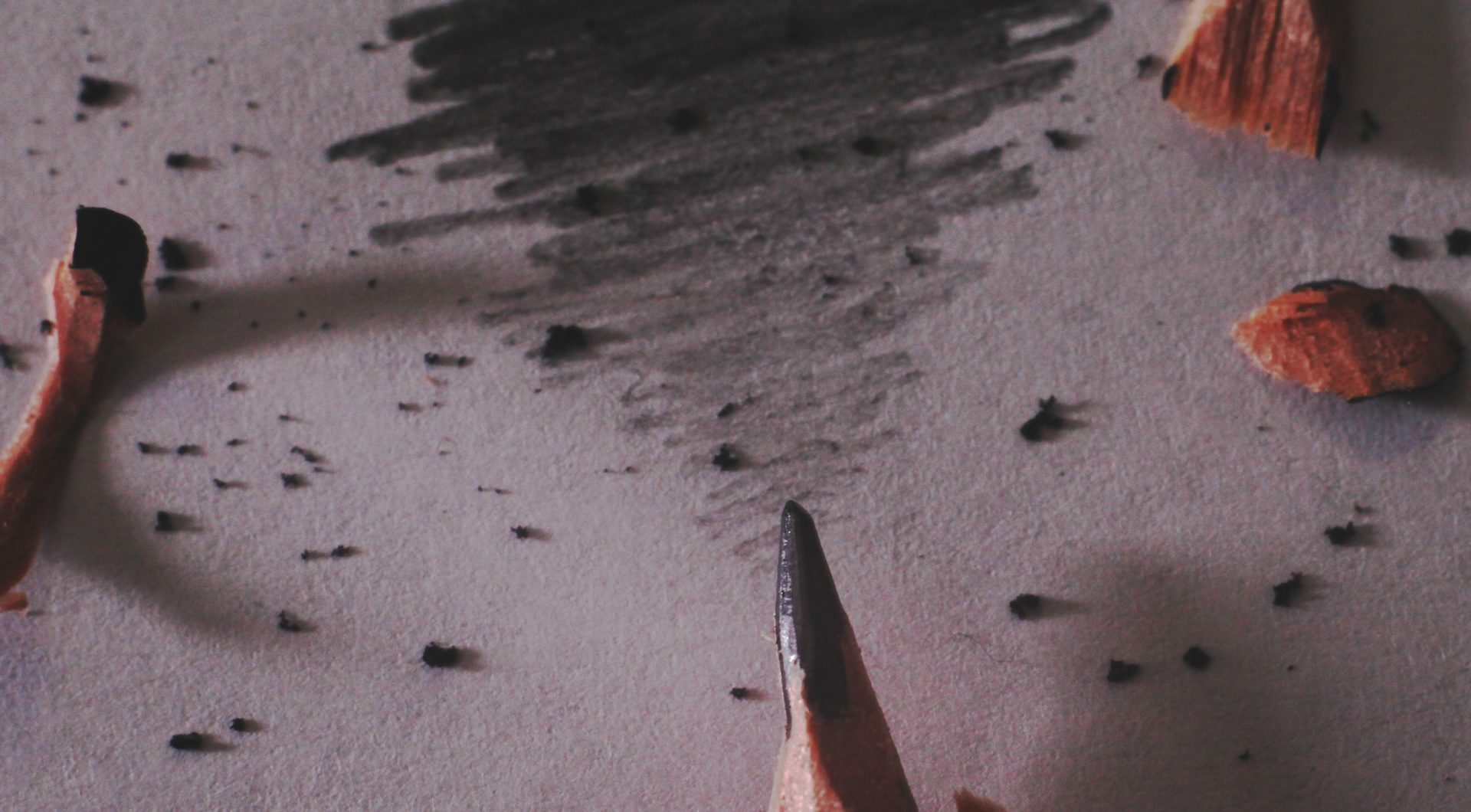
Here’s a map hastily rendered in colored pencils on a paper bag. When inspiration hits you grab what you’ve got!
The hallmark of a good old fashioned fantasy map book insert is its hand-drawn quality. These maps, which are often completely invented realms, are demarcated by the author’s (or illustrator’s) careful and inventive hand. Pre-print-historic methods are the best for maintaining that willing suspension of disbelief. So that means coasts, boundaries, and features are scratched onto something like vellum or yellowed paper with something like a quill or charcoal.
Here are some thoughts on how you can replicate that sort of candle-lit smokey aesthetic via ArcGIS Pro. Because that would rule! Prepare yourself mentally and emotionally. Here is the source project if you want to download it and follow along. We’re going in…
Source GIS Linework
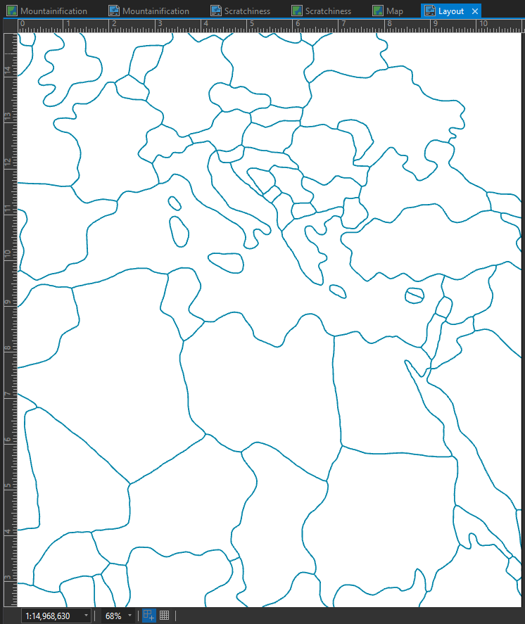
Starting with a set of layers that is less geometrically precise than you and I are accustomed to working with is a terrific head start. An overly precise layer can be a digital giveaway. We’ll need to rough our vector layers up a bit. But how? Try a somewhat random sequence of simplifying and/or smoothing until you get something sufficiently humanized.
Alternatively, you can browse this tremendous set of layers that have already been hand drafted by Daniel Huffman and other cartographic artists. In these examples I’m using “Moriarty Hand” by the talented illustrator/cartographer Dylan Moriarty.

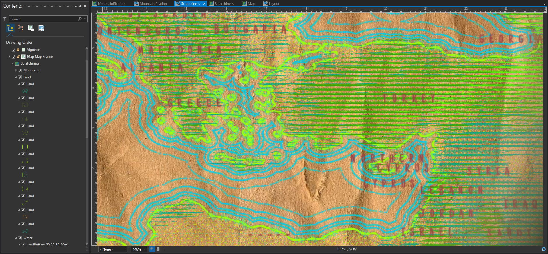
Here it is in Pro…
Scratchiness via Stacked Dashed Lines
When you take a good close look at any hand drawn line on a physical surface, you’ll notice a fine variation in the amount of drawing material deposited. Depending on the medium, there is a smooth or chunky scratchiness to the line. Let’s consider ink of paper…
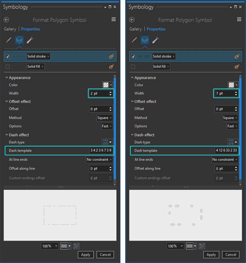
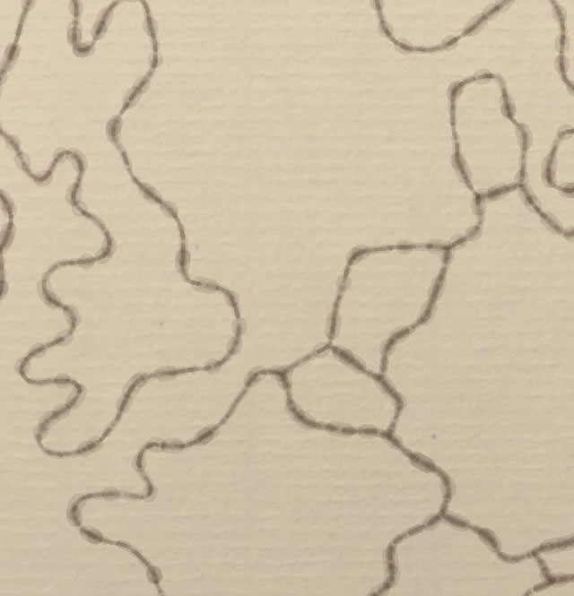
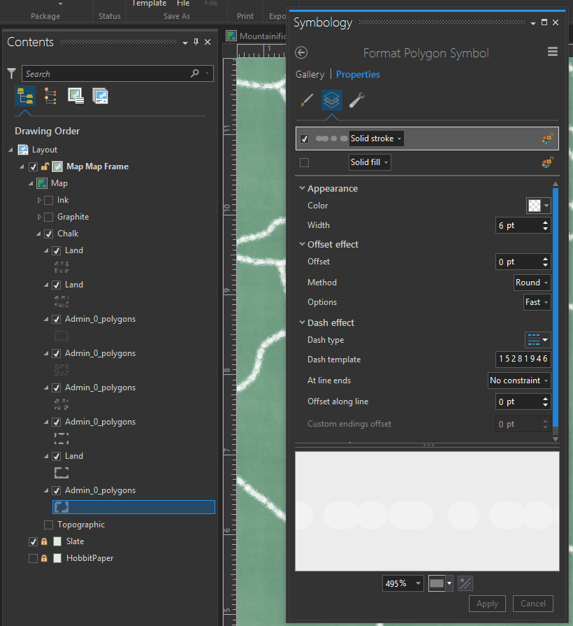
Ink is a rather fluid material and it is absorbed into the varying texture of the paper. It’s pretty smooth in its deposition, so we can try to replicate that by stacking up a few copies of the layer. Each layer has a semi-transparent stroke and a random dash pattern. Make some of the layers thin with a random dash pattern, and some of the layers thicker with a more sporadic dash pattern.
In ArcGIS Pro, you can create your own custom dash pattern by adding numbers (separated by a space) to the “Dash Template” input. The numbers correspond to “on” and “off” distances. Think of it like a moving pen that you can tell how long to touch and not touch the paper.
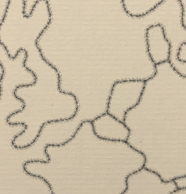
Here’s a close-up of the resulting stack of layers (over a paper texture), each with a different dash pattern and thickness…
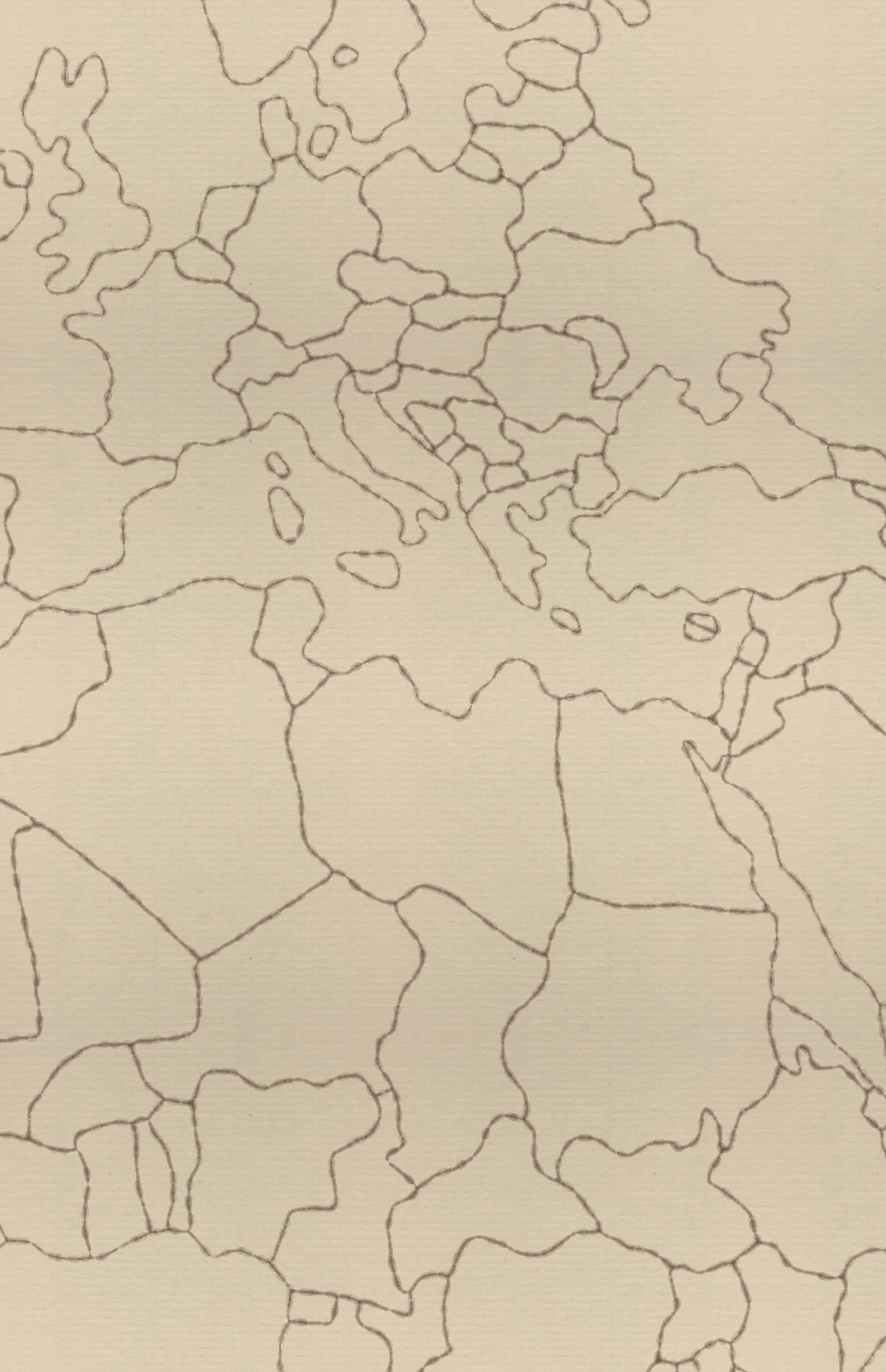
Taking a step back…
Hey alright, that looks pretty inky!
Scratchiness via Stacked Picture Stroke Lines
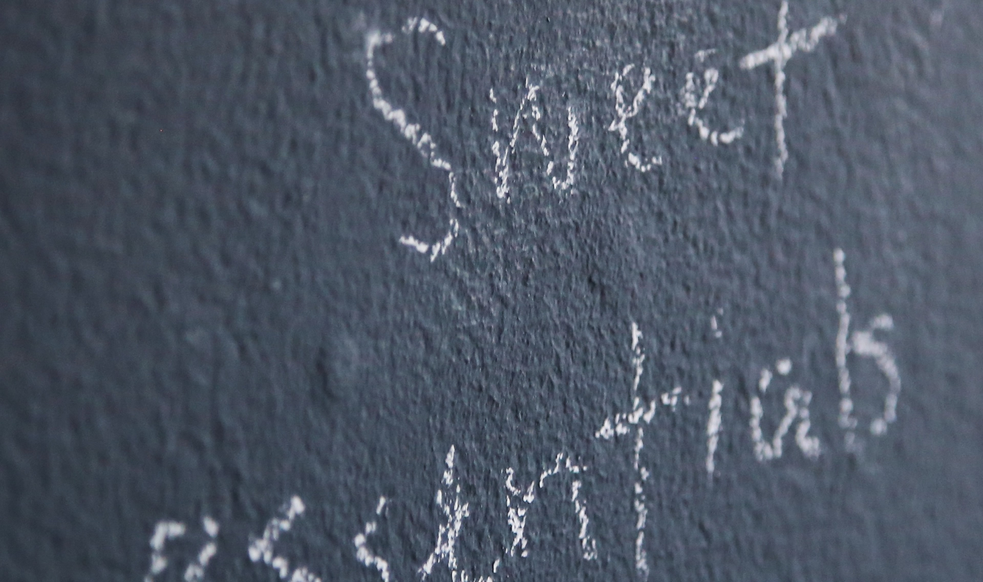
Ink is sort of easy. But when I think about chalk scraped over slate, the texture us much more irregular and dusty.
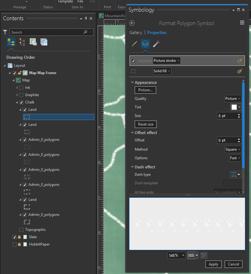
The more uneven surface of slate and the dry powdery nature of chalk makes for a thicker, more irregular line. So rather than just relying on stacked up dashed lines, we need something more spotty. In this case I like to use the “Picture Stroke” option for symbolizing a line. This is how I styled undersea cables to look like cord in a previous map.
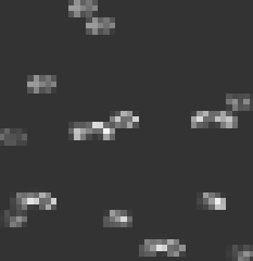
Here is an image I scribbled that looks like little floating specks of chalk. You can download it here.
When I make a bunch of copies of this layer using this image as a Picture Stroke, with varying size, it stacks up to sort of look like chalk.
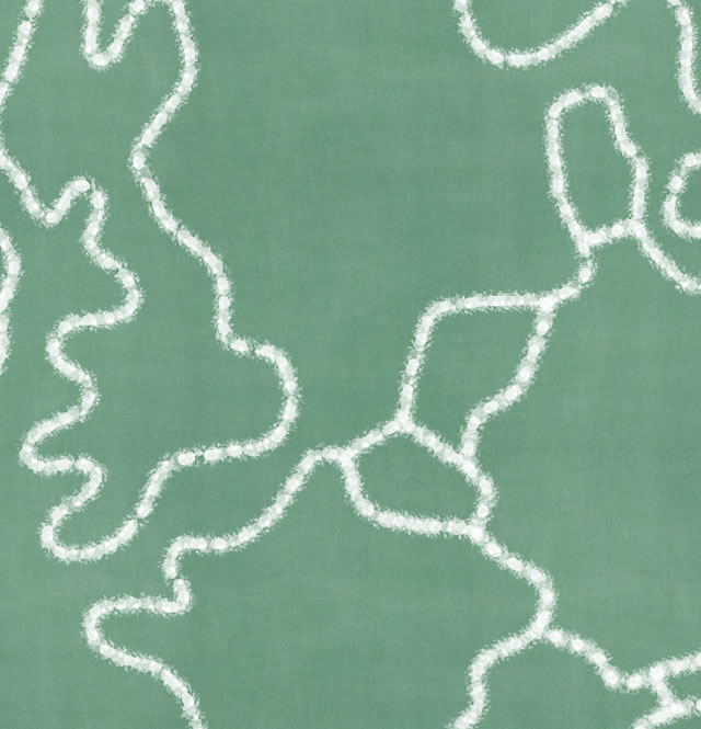
I included a couple dashed lines via the technique, above, too fill in the chalkiness.
Here’s a detail snapshot from Pro (with a chalkboard texture behind)…
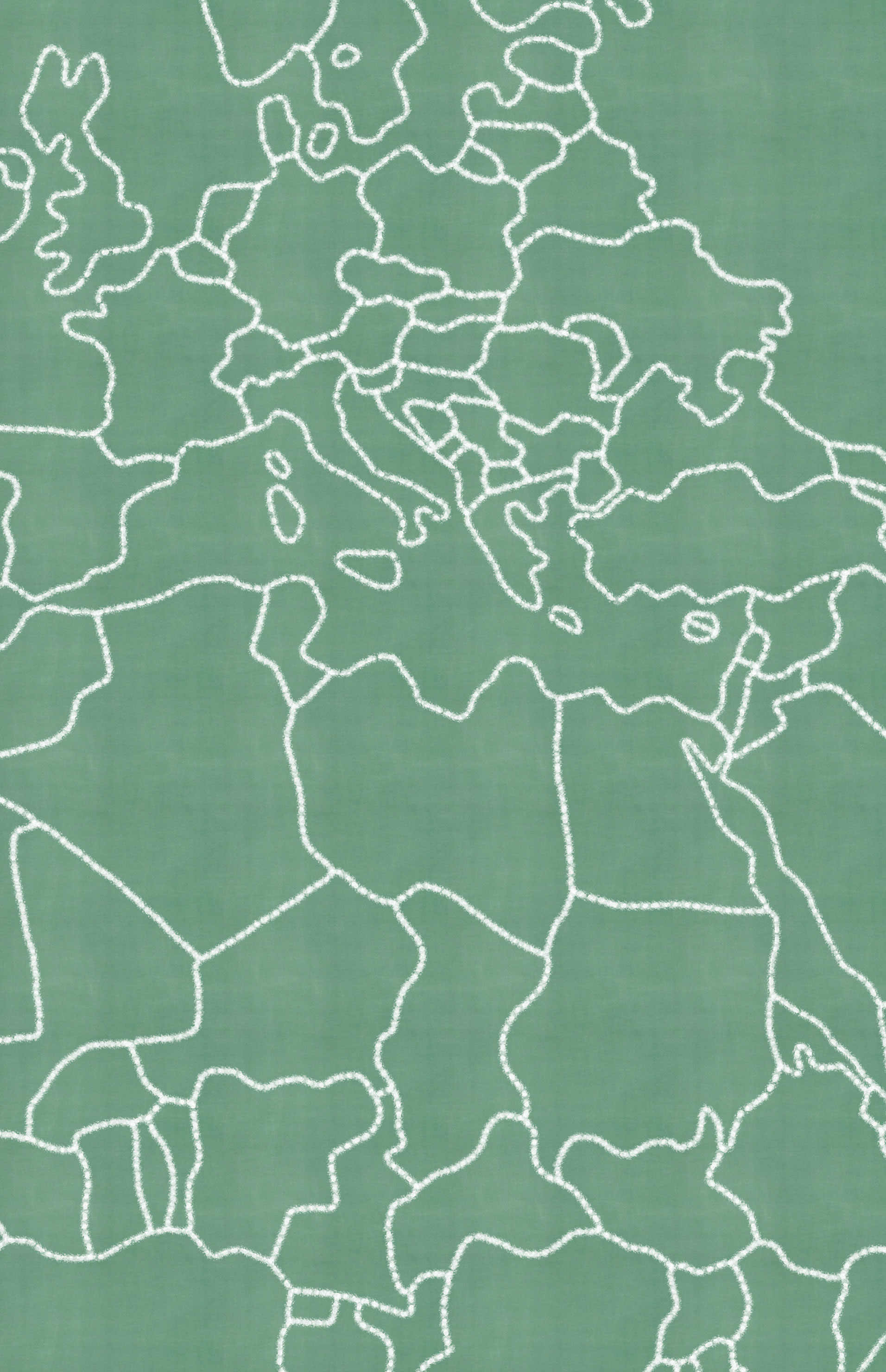
Taking a step back…
Heyyyyy. I like it. Looks like you can just drag those fingernails right down this map. So what about pencil? What might a line of graphite dragged over rough stock paper look like in ArcGIS Pro?
I think of graphite as sort of in-between the smoothness of ink and the grit of chalk. When I look closely at a line drawn by a pencil, I see a shimmering stroke of graphite with powdery detritus dusted around it.
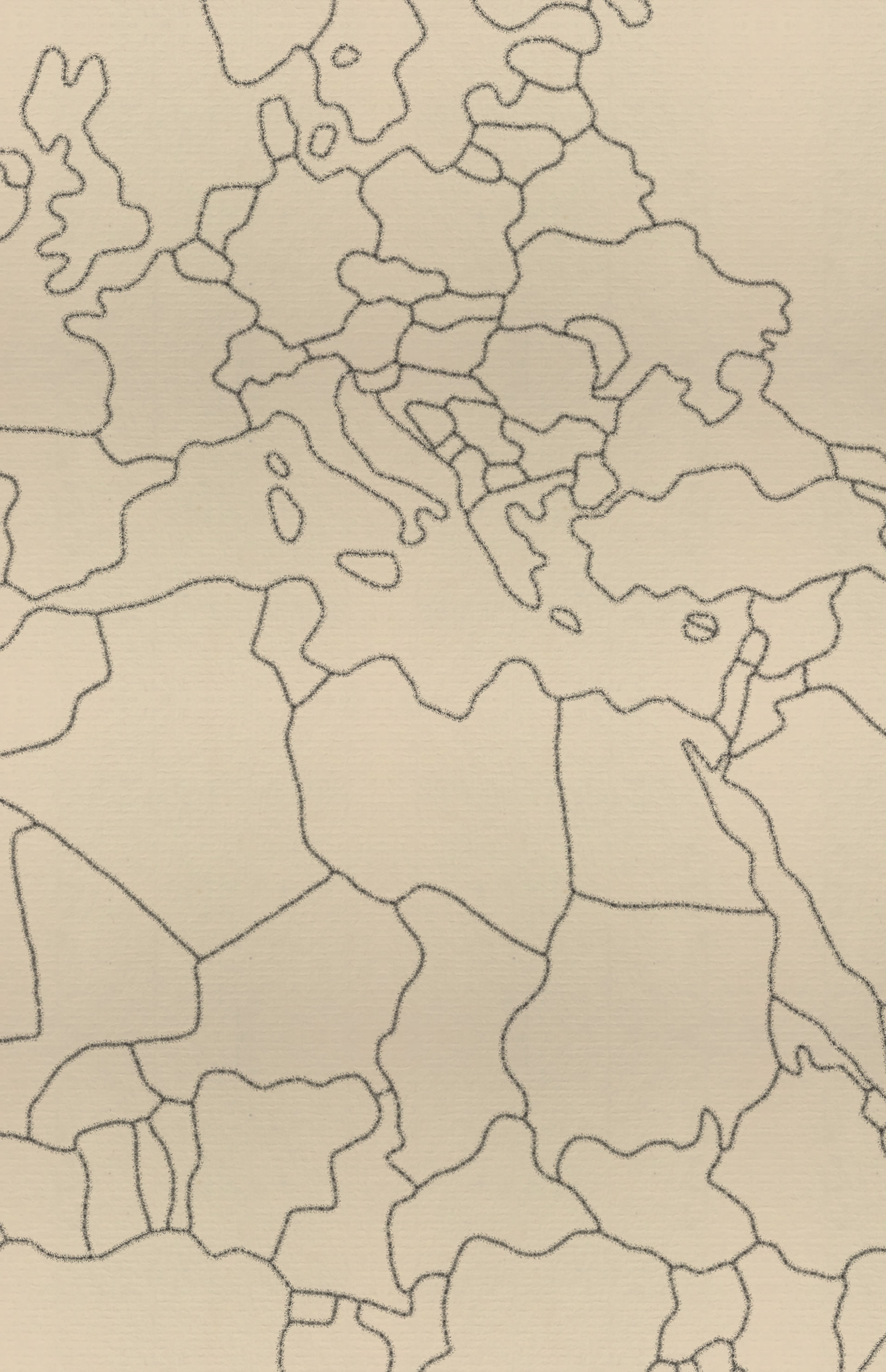
So, using a technique similar to the chalky one, above, I stacked in a munch of varying dashed lines and a few layers with dusty picture strokes -all of them a dark graphite gray.
A look at the overall effect tells me it looks pretty pencil-ish!
Playing With Color
So, I was happily banging away on scratchy line textures when Allen Carroll and Cooper Thomas showed me an amazing sketch by Erwin Raisz in a story map of hand-drawn treasures from the Harvard Map Collection. I am new to Raisz but am just blown away by the mastery of his careful craft.
Of course I couldn’t approach something this awesome, but I wanted to try out these techniques over a butcher paper roll with bold hue oil pencils, in an homage to the beauty of this map. It was so much fun.
Which works out to be this thing…
Well, in our quest to tease out the Fantasy Map Illustration Style, we’ve covered Mountainification in Part 1. We just covered Scratchiness here in Part 2. And Part 3 is going to be all about the glories of Texture. See you then!
Happy fantasy mapping, John


Article Discussion: