Have you ever found a table of data with some basic spatial fields like ZIP Codes or states and thought, this would be really interesting data to map? After assigning geospatial locations, have you wondered about the best way to highlight the most compelling locations in your dataset? Whether it’s the highest or lowest values or the most recent dates, there are characteristics within datasets that show the significance of your data to your audience. This two-part blog will outline best-practice workflows to turn tabular data into a geographical listicle using the Geo List configurable app.
The first blog, reviewed how to create a polygon ZIP Code dataset from a CSV file. This blog will illustrate some best practices for creating an engaging app to present the hosted feature layer created in Part 1 using Geo List, which is available in the configurable apps gallery. The app guides users through features based on a ranking system determined by the app author. The author can choose to show a user-defined number of the highest or lowest values of a specific field in the dataset.
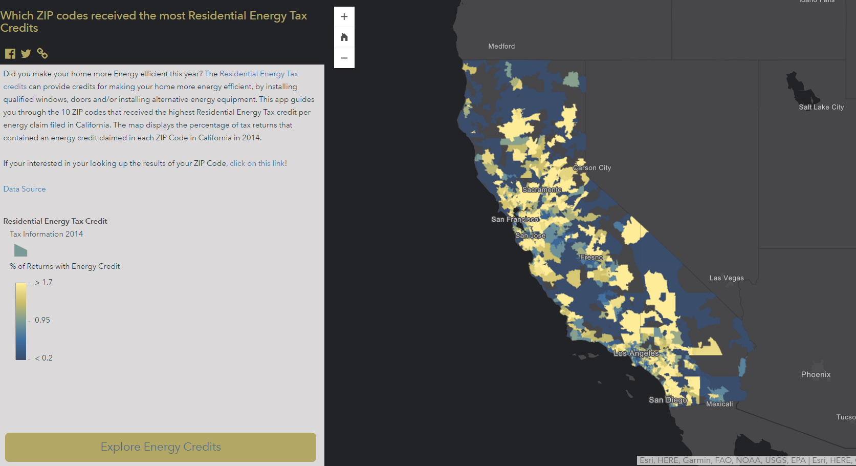
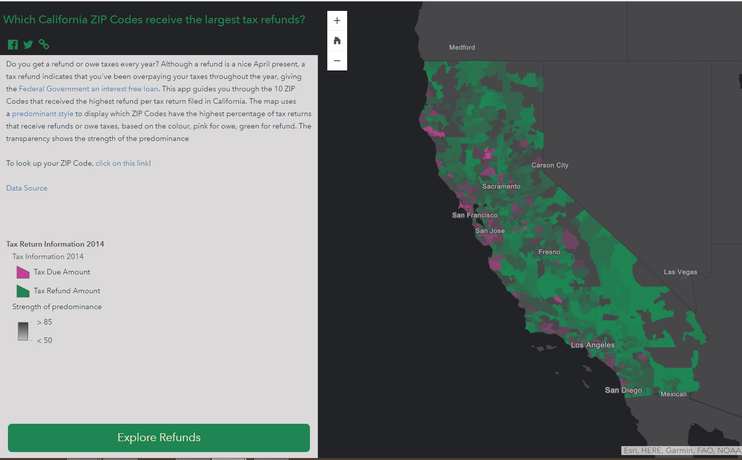
The app below guides users through the California ZIP Codes that received the highest Residential Energy Tax Credit per energy claim filed in California in 2014.
Part 2: Configure Geo List
- Define the purpose and message of your app
The first step to creating any great app is understanding the message and interaction that you want to communicate to your audience. For this project, I want my users to navigate through ZIP Code locations and understand the ZIP Codes where residents received the highest tax refund.
- Create the web map
The next step is to build your web map and symbolize the data so that it is easy for your audience to understand.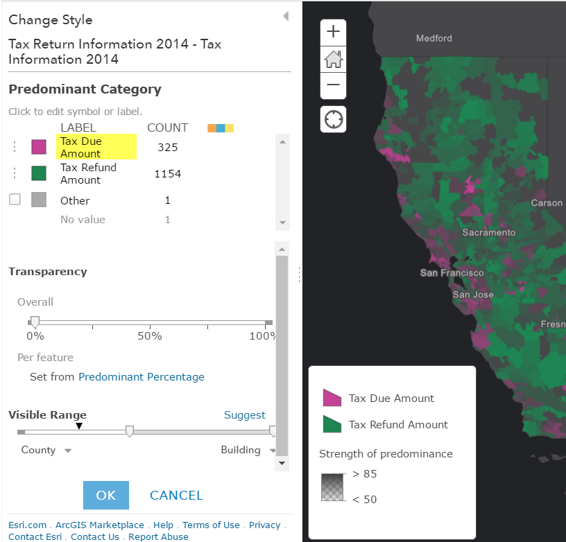 Add the layer created in Part 1 of the blog, by navigating to the layer item page and opening the layer in Map Viewer.
- Click the Basemap button and pick your desired basemap. Tip: Solid coloured basemaps like Dark Gray Canvas and Light Gray Canvas enhance the look of thematic maps because there is minimal variation in colour underneath the feature layer.
- Symbolize your data using smart mapping. There are a lot of great options to display your data and smart mapping takes the guess work out of colour and classification selection. For this app, predominant categories were used to show which areas predominantly received tax refunds or owed taxes. Tip: Modify the label in the options panel of the change style dialog. This will determine the labels used in the legend in the app.
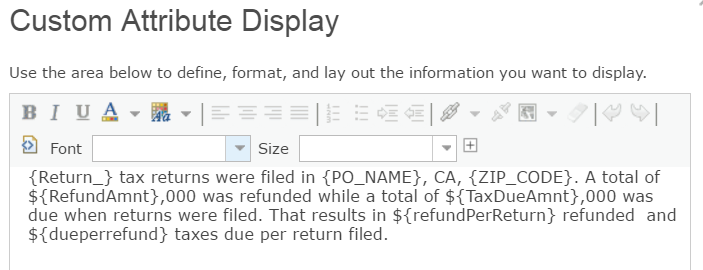
- Create an informative pop-up. Geo List displays pop-up information in a side panel. Construct the pop-up to highlight interesting information in the data using a custom attribute display or table (list of fields).
Tip: If you are displaying a table, modify the attribute titles to use full words instead of data labels using the Configure Attributes button in the Pop-up Configuration
Optional Tip:
Use a tile layer to display complex data at small scales. The California ZIP Code layer contains over 250, 000 vertices. For this reason, a tile layer at small scales and the feature layer at large scales were used to ensure the map layers were ready to go viral.
- Create the app
- Once you’ve created and saved the web map, click the Share button, and select the Create a web app option. Click the Explore/Summarize Data filter and click Geo List (beta).
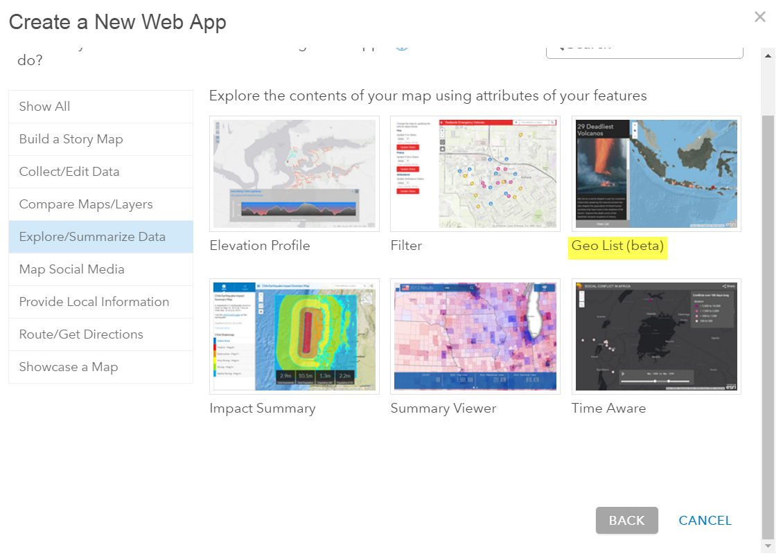
- Once you’ve created and saved the web map, click the Share button, and select the Create a web app option. Click the Explore/Summarize Data filter and click Geo List (beta).
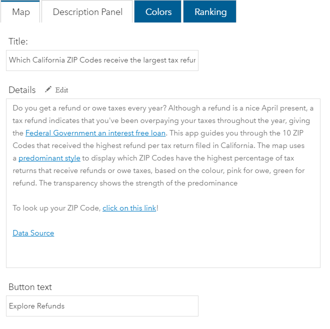
- When the app configuration wizard appears, add a unique description, title and button text to help your users understand the purpose of the app and entice them to go on the guided tour. The title and description will be imported from the webmap by default but can be changed in the Description Panel. Tip: Add a look up app link if you want users to be able to search for specific ZIP Codes.
- Pick colours or use your pre-configured shared theme to brand your app.
- Configure ranking
The last step is to configure the ranking in the Geo List app. This will dictate which data the app highlights in the guided tour.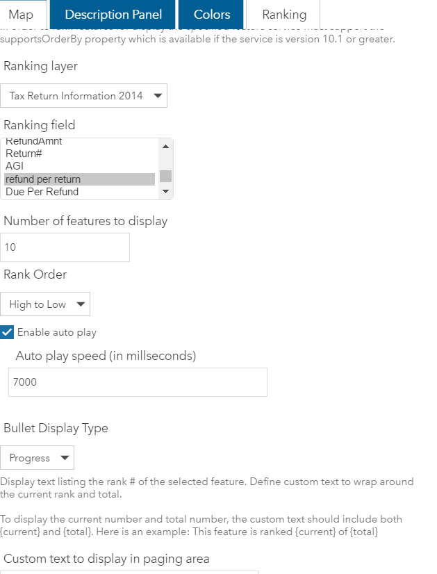
- Choose the feature layer and field that you would like users to be guided through. For this web map, Tax Return Information 2014 was selected from the drop-down list and the refund per return field. This field includes an average refund amount per return filed per ZIP Code.
- Type the number of features that you would like the app to guide users through in the number of features to display text box.
- Choose a Rank Order option to indicate whether the app should show the highest value features, High to Low or the lowest value features, Low to High. The High to Low option was selected to show the highest refund values.
- Next choose whether you would like to enable auto-play to automatically progress users through the features and pick your bullet display type of choice.
- Share your app
Test your app to ensure that everything is set up with the desired user experience and refine the colours or map position as needed. Then share your app with your audience so they can see your great work.
Additional examples:
Story Map Series of multiple Geo List apps about taxes
Where are you most likely to go to jail?
Martian Craters
Largest Changes in Female height

Article Discussion: