Soon, the people of these United States, along with interested multitudes worldwide, will find themselves in the throes of the second-ever college football playoff. Friends, family members, co-workers will find be pitted against one another in choosing their favorite.
Geography will play the largest role in determining who roots for whom. Where did you grow up? Where did you go to school?
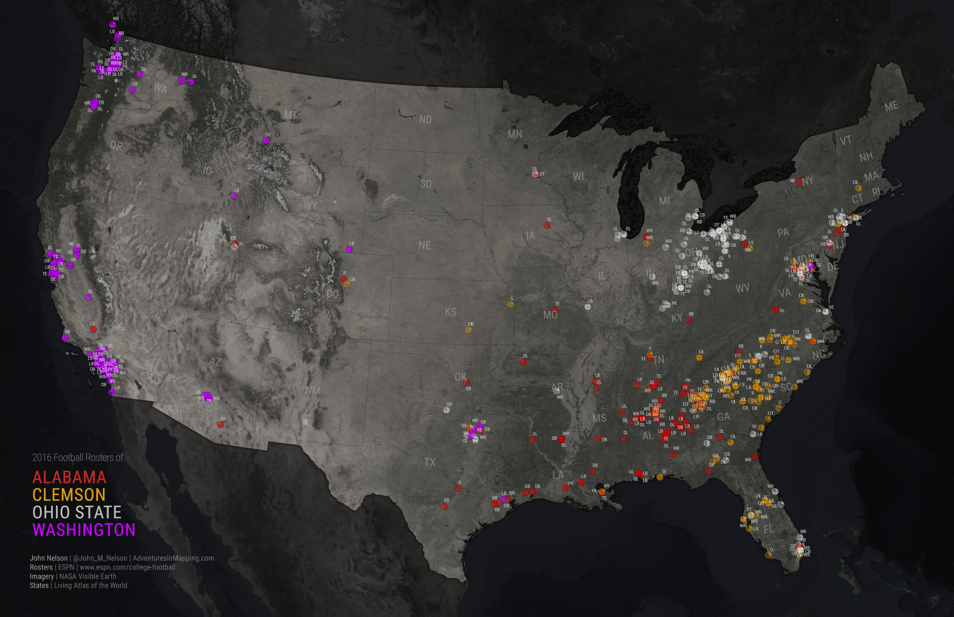
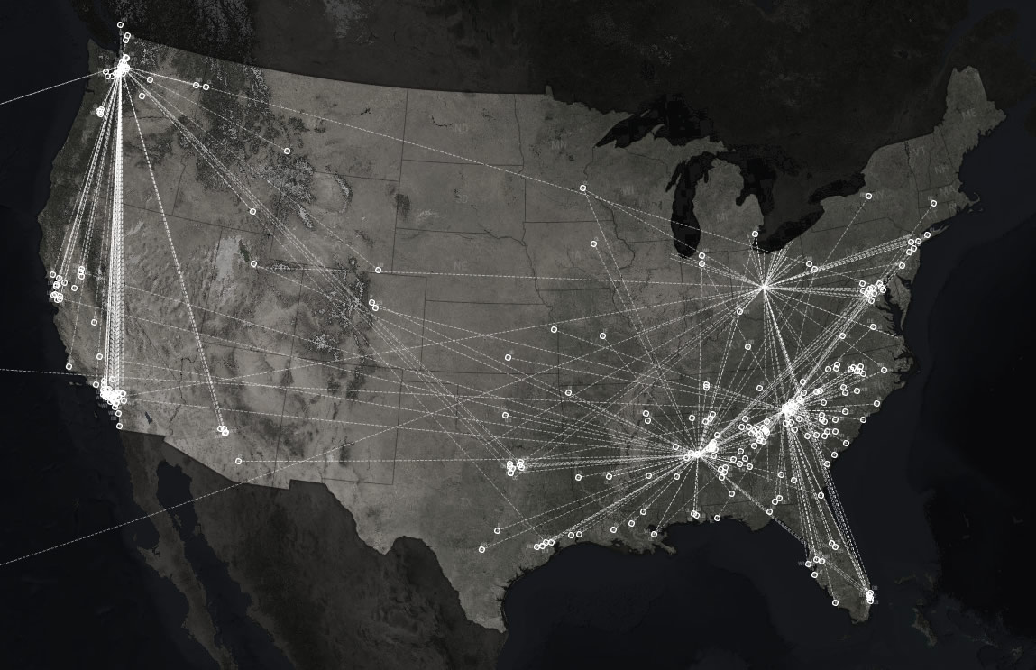
Geography also plays a massive role in the recruitment of players to these football programs. Local kids tend to draw the attention of nearby schools. Occasionally standouts from far flung locations get recruited, but it becomes rarer with increased distance. It’s the first law of geography. How do the recruitment footprints of the top four teams compare? Here’s a look…
Wow, that is actually a really well-distributed constellation of players! Let’s take a closer look at each team’s players, and quantify their hometown footprint with something called the Air Mile Index.
The Air Mile Index (AMI) is a unitless number describing the far-flungedness of a team’s players. An AMI of around 12, for to-tier programs like these, indicates a wealth of local talent. An AMI approaching 30 indicates a massive national reach. I’ll show you how to calculate it later on in the post.
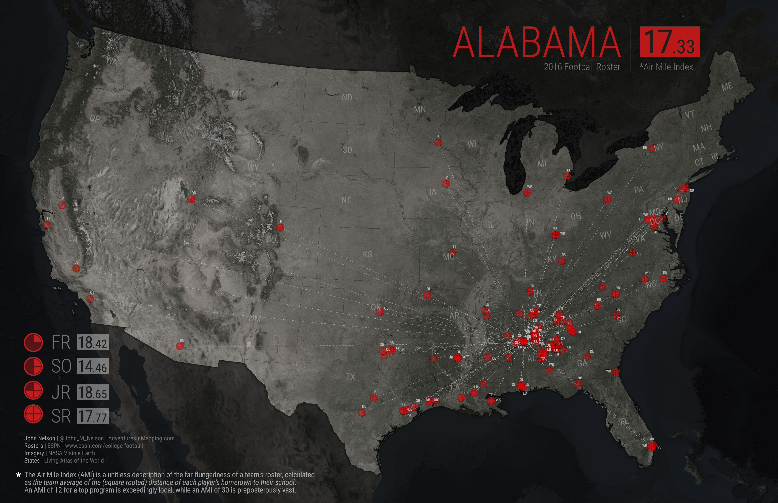
Alabama
Alabama recruits regionally, and has done so consistently across all four recruiting classes. Most players are from nearby, in the deep south, with slight recruiting clusters in the Metro DC area and Dallas/Ft. Worth.
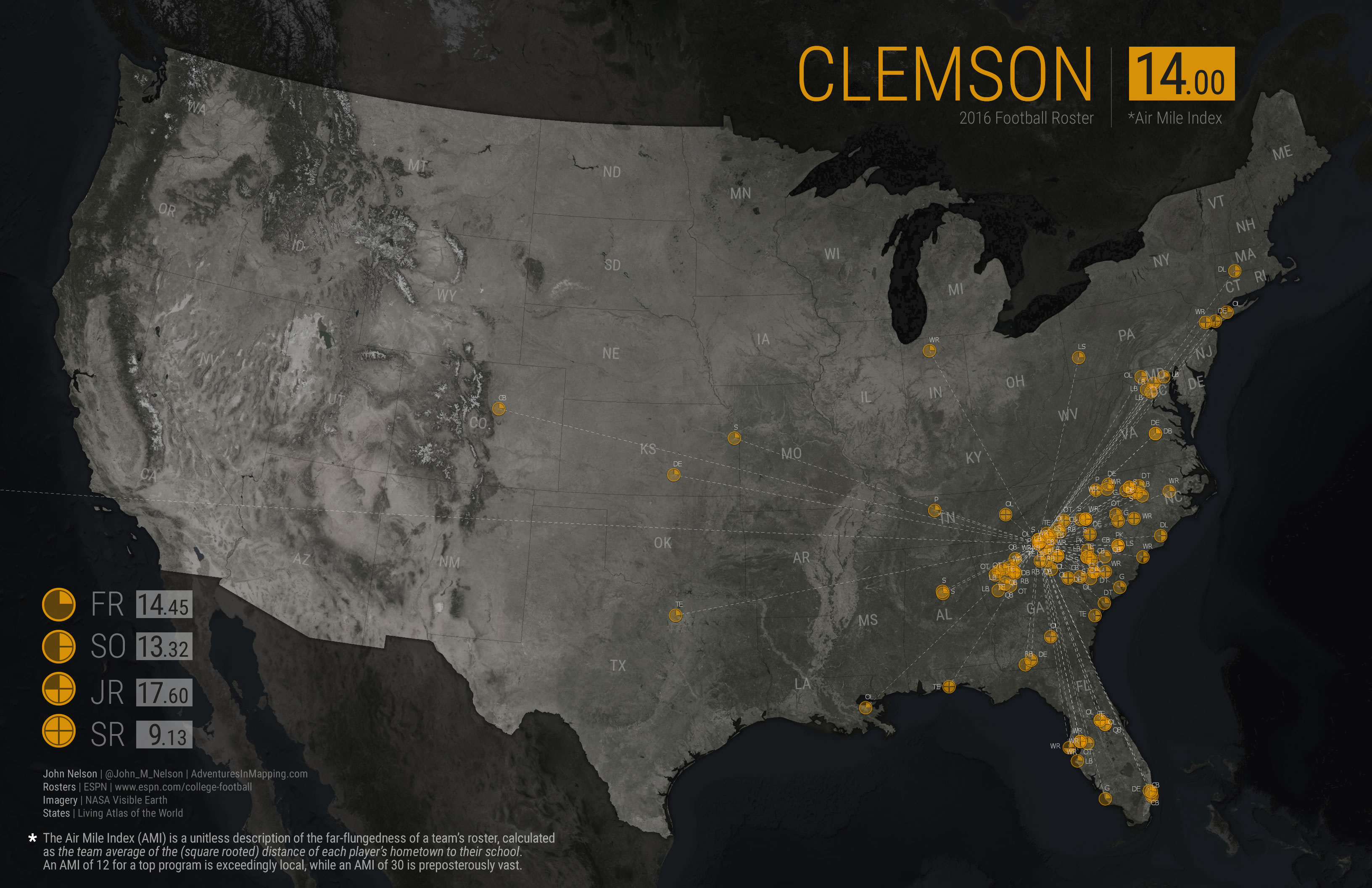
Clemson
Clemson’s recruiting footprint is highly local, the smallest AMI of the tournament teams, with recruiters drawing strongly from within the Carolinas and from the fertile football grounds of nearby Metro Atlanta. Westward recruiting is rare. The senior class is a profoundly local group.
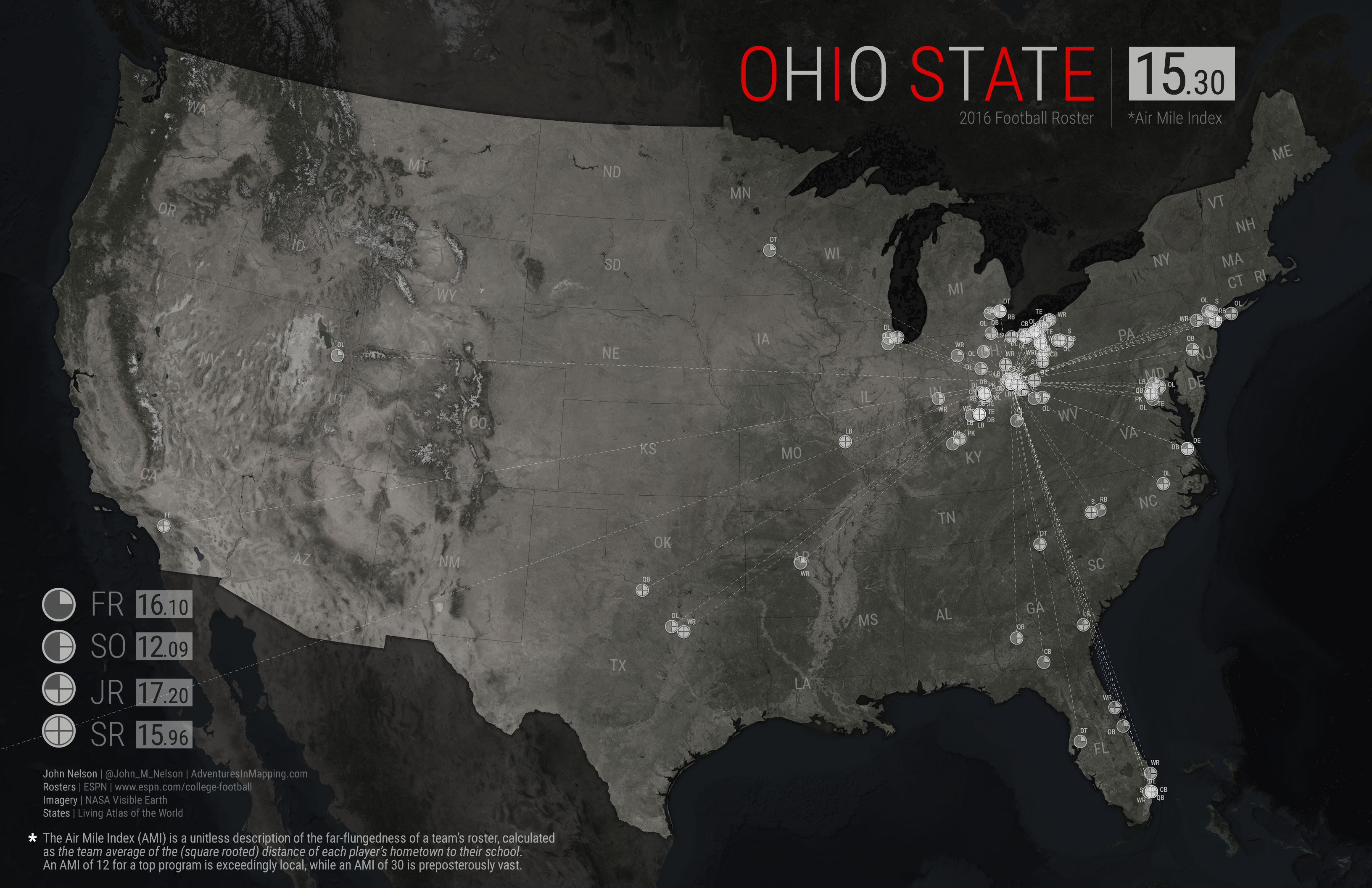
Ohio State
Ohio State enjoys a strongly in-state footprint, only rarely poaching from neighboring states. Otherwise, assistant coaches are booking flights to New York, DC, and Miami.
Washington
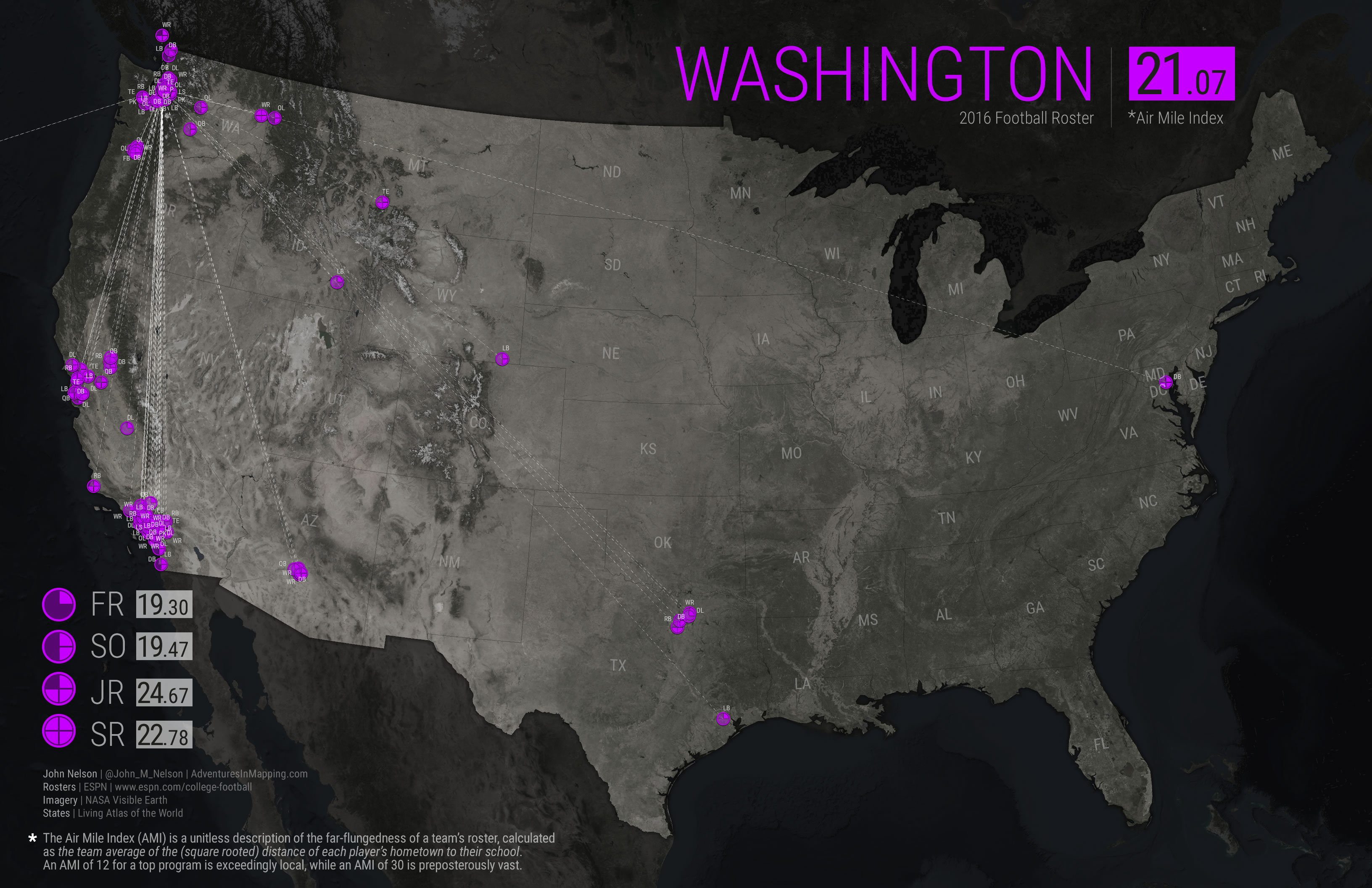
Washington, having the highest AMI of the tournament teams, is comprised almost exclusively of recruits coming from local towns and the two major population centers of California. Only one player has a hometown east of the Mississippi. There would have been essentially no overlap in the Friday Night high school football games attended by Washington assistant coaches and the coaches from the other three tournament teams, except perhaps a couple times in Dallas. But everybody recruits from Dallas.
Geo-nerd Thoughts
Nationally, freshman tend to have a more distant AMI while seniors have a more local AMI. This makes sense, considering the greater likelihood of a player to drop off or transfer, if they are further from home. Interestingly, these top teams don’t appear to have the same distance-attrition as the typical school. Of these 4 tournament teams, only Clemson echoes that trend -though maybe it stared out as a highly local recruiting class.
The AMI will be subject to the first order trend of population centers out west being more geographically dispersed. So western schools will generally sport a higher AMI. Stanford had an AMI of over 32 (though they also recruit broadly across the country, not just from schools in the west). Still, though, it’s a handy back-of-napkin index.
Another school with a relatively broad AMI is Notre Dame. This likely owes to their conference-independence (distant game locations are de-facto recruiting opportunities) and their spatially-diverse cultural draw as a Catholic institution. Conversely, LSU, another perennially strong program, has a super small AMI, drawing talent from in-state high schools.
Curious how other schools stack up? Here’s a set of AMI maps from the top teams at the beginning of the season. And here’s a AMI style map from the Army/Navy game, made by Armando Drain. Wondering how the AMI works for other sports? Brian Kingery made this award-winning AMI story map of Major League Baseball teams.
In addition to AMI, some more robust stastical measures could tell us a lot about these recruitment footprints. K-means clustering? Principal Component Analysis? Oh yeah. But for now, this is a tidy little measure that is picked up easily by just about anyone.
How-To
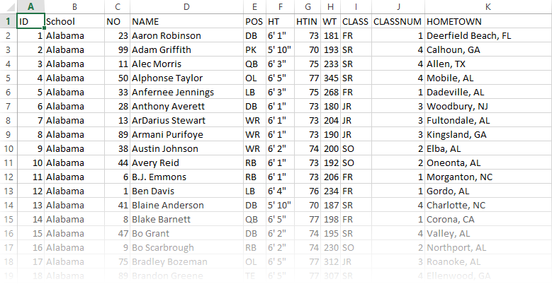
These maps started out as the team roster pages at ESPN. I copy/pasted the top ten football teams into a good old spreadsheet. I added a unique “ID” field so that I could join this data to spatial data, later on.
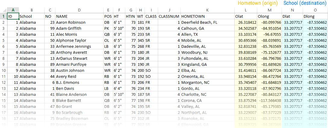
I geo-coded the hometowns of all the players, and the stadiums of each team. When we make the lines in a bit, we’ll use them as the start and end inputs.
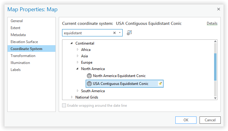
Fire up the mapping engines! I’m using ArcGIS Pro, so I created a new project and set the coordinate system to an “equidistant” projection. Because distance is the crux of Air Mile Index maps.
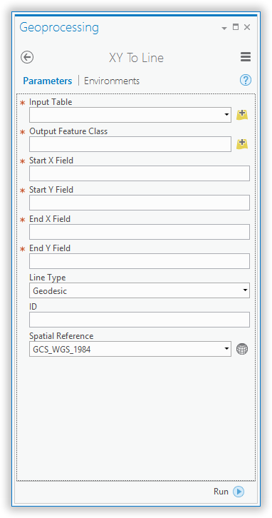
Time to breathe some geographic life into that static Excel table. There is a tool in ArcGIS Pro called, “XY To Line”. And it is a wonderful thing. Its sole mission is to chew up boring tables of latitude and longitude, and spit out an enlivened magical spatial spiderweb of meaning.
Point it at the spreadsheet’s origin lat/long, destination lat/long, and ID, then prepare yourself emotionally…
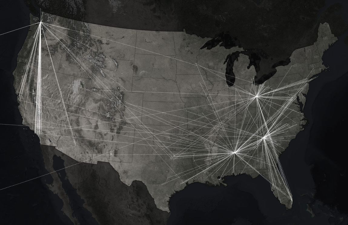
So much better than a spreadsheet! To see a map born, of rows and columns, will never get old. It reminds me of being in the dark room long ago, and watching an exposed photographic sheet reveal itself suddenly when dipped into the developer chemical tray. Now, instead of a sterile list of names and towns, we get a picture of travel. An illustration of hundreds of kids working and sweating for years to make the stomach-turning choice of moving hundreds, or thousands, of miles from home to join other kids from all over who have made the same choice.
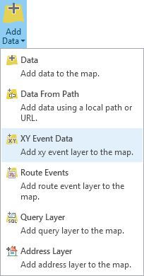
Back to it! Next, we’ll bring in the same spreadsheet data again, but this time as a point file -to mark the locations of all these player hometowns. There’s an option to add “XY” data…
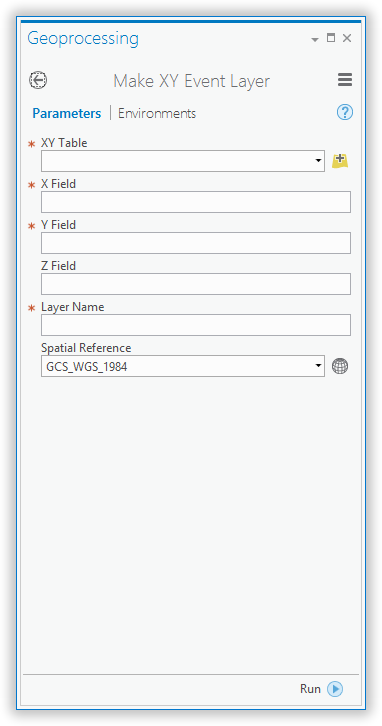
…which launches a little form asking you where the data table lives, and which parts are latitude and longitude.
Boom. The table is added to the map once again, this time as the hometown points. In addition to a web of lines converging at top national programs, we see a constellation of proud towns, the launching points of over four hundred players.
If you look at the attribute table of your lines, you’ll notice that none of the other fields (name, school, position, etc.) made it through the line-making process. Just the coordinates and that trusty ID field you gave it back when it was a spreadsheet.
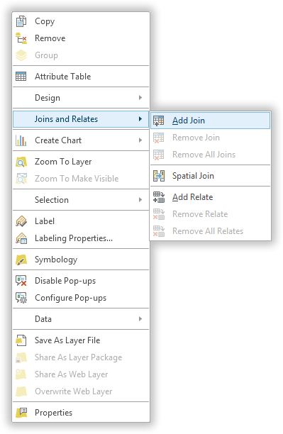
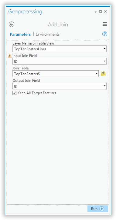
Thankfully, you can just borrow the attributes of the hometown point file you just added, by joining it using the ID field. Right-click the line layer, and choose “Add Join”.
Then you just Join your line file to your point file’s attributes, using their common ID field. Now it’s inherited all that good information about each player.
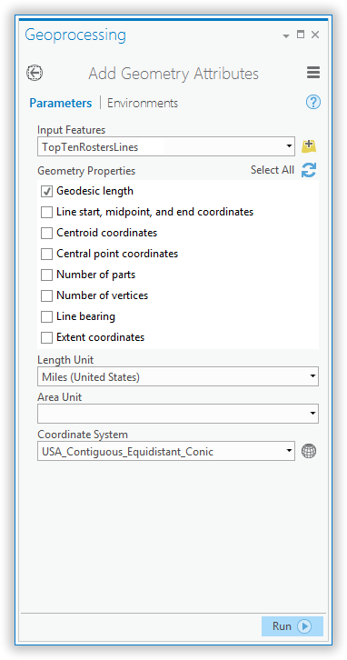
Time to measure the distance of each line -we use that to calculate the Air Mile Index. There’s a tool called “Add Geometry Attributes”. We’ll use that to measure the length, in miles, of each line connecting a hometown to a school.
There it is. The (exquisitely precise) length of each line.
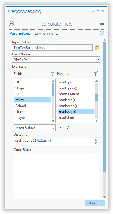
To spatially normalize this a bit, tamping down the influence of cross-country kids or international kids, we’ll need to calculate the square root of the mileage. So, make a new field, and use the field calculator to get the square root of the mileage.
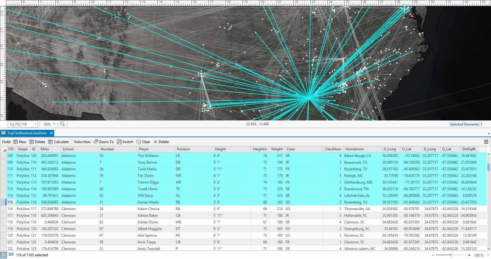
There it is. The square root of each player’s traverse to school. Take the average of this for each team and you have the Air Mile Index.
But look what a mess it is showing all those team lines at once. You’re better off separating the spaghetti map into ten separate school maps. In the attributes table for the lines, just manually select the rows for a team (or do a select by attribute).
Then, when those guys are selected, right-click the line layer and export them as their own file.
There we go, nice tidy maps of team Air Mile Indexes. Indices? The internet tells me both are acceptable. Indexes.
Now you can spam the world with Air Mile Indexes of just about anything with a remote-location/home-base nature.
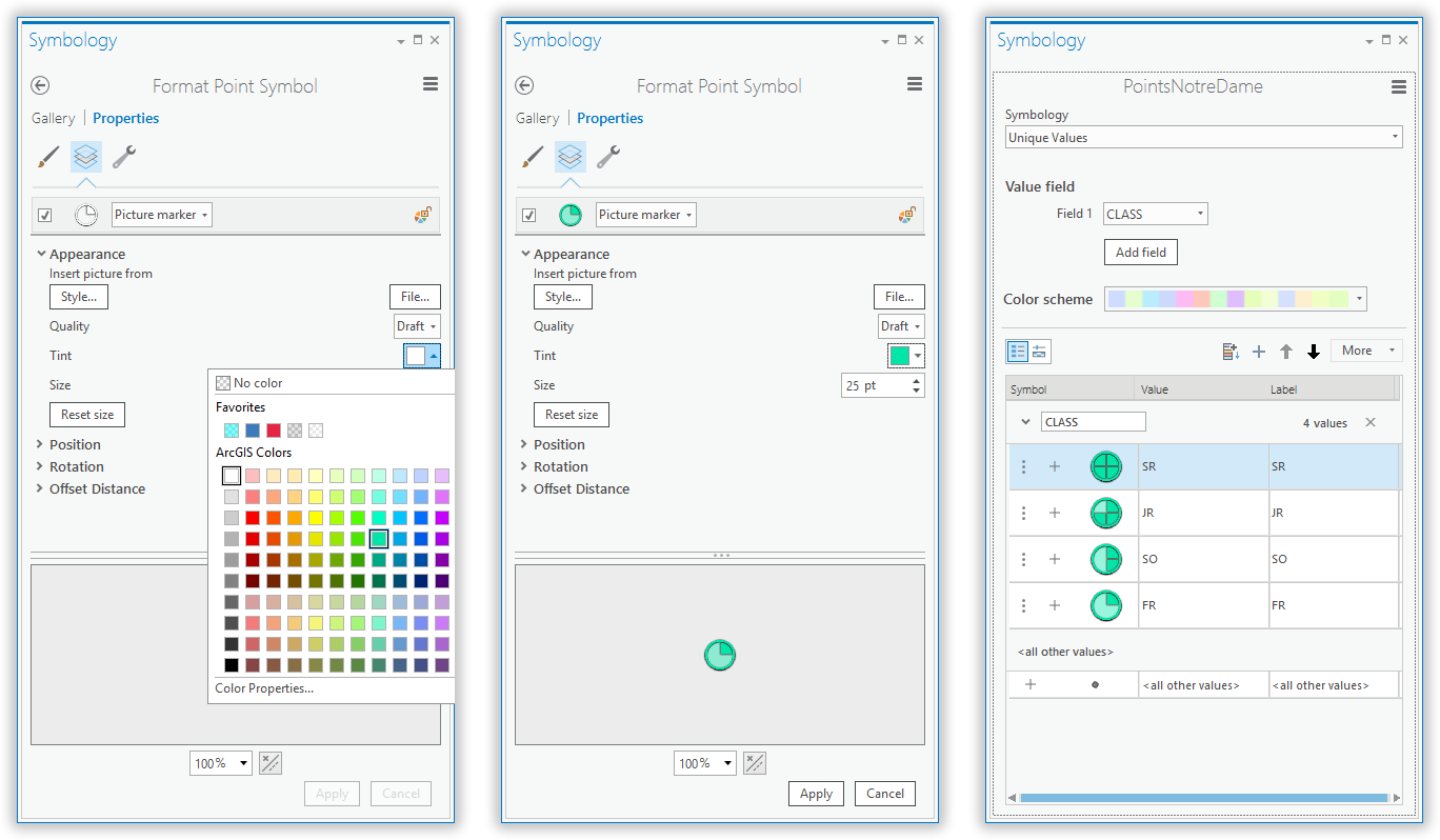
After this, all there is to do is apply some symbology to the player hometowns, thematically representing what class they are. You can use my images as point symbols if you want. And here’s how you can shade them by their school color…
And there it is! A picture marker for each player, showing what class year they belong to, tinted by team. In these maps I also labeled the points by player position.
So that’s everything you need to know about cranking out your own Air Mile Index Maps, which I hope you do. Happy Air Mile Indexing and Happy mapping!
Cheers, John




Article Discussion: