Updated December 15, 2016: The Esri Vector Basemaps are no longer in beta release and are now available to use in production web maps and apps. The best way to access them in ArcGIS Online is through the Esri owned Vector Basemaps group, which contains the latest set of web maps and tile layers. See What’s New in Esri Vector Basemaps (December 2016) for information related to this update.
—
Making vector basemap design changes that support your map or story.
To experience this blog as an interactive story map, go here.
Esri now provides a set of vector basemaps of the world for you to use.
One of their features is the ability to customize both the look and the content. It gives you the opportunity to create some distinctively different basemap looks, and to have some fun! And we’ve been playing as well – You can find a set of customized maps that we have created here.
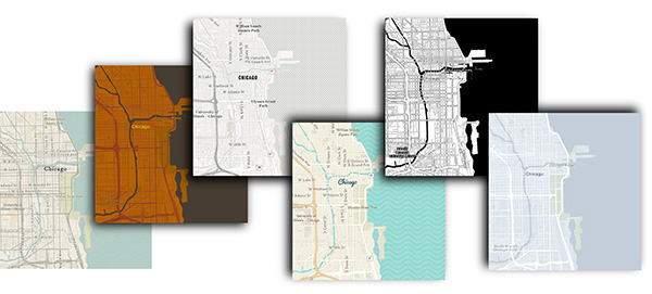
But beyond just having fun, vector technology offers an opportunity to tailor your basemap to get the most out of a particular map or story.
Recently I updated a Story Map on some of my favorite places to visit in Great Britain. To support it I created a custom vector basemap, and I’m going to talk about my design process here. I’m not going to look at the technical aspects of how this is done. For that you can check out some of our other blogs, or follow a presentation we gave at the 2016 User Conference.
The Requirements
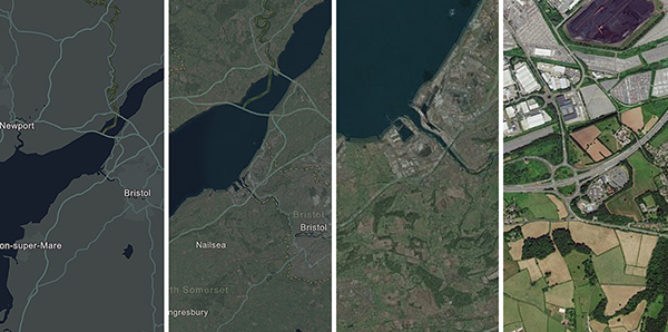
The story map construction was complex, involving 7 separate map journals within a tabbed layout. So I wanted to limit myself to just one map … but I needed it to perform more than one function. At the smaller scales I wanted a clean basemap that would complement the strong and colorful icons I was using. When zoomed in, I needed imagery to provide the local context. Within the web map, I needed to merge one map into the other.
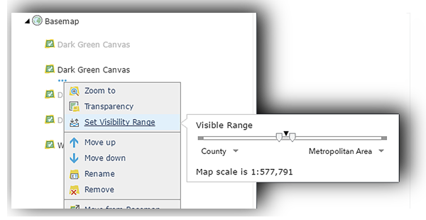
To achieve this I copied a basemap layer 3 or 4 times within the web map, added progressive scale restrictions and increased the transparency as the scale increased. Eventually I removed the basemap leaving just the imagery.
Building the Basemap
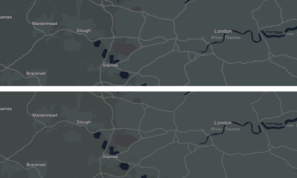
The starting point for this work was the Dark Gray Basemap, which sets off the bright icons I use for locations. I wanted it to merge into imagery as seamlessly as possible. The interaction with the Dark Gray is a bit harsh, so the first thing to consider was a change of color.
Imagery tends to have a varied palette of earth tones, but in Great Britain it tends towards the green. So my starting point for the map was to change the land color to a dark green. Water tends to be a dark blue-black at larger scales in imagery, so that was adjusted as well. It still needs to function as a basemap, so I did not stray too far from the tonal values used in the Dark Gray version.
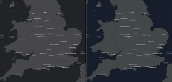
This was only the start of the process! There is no guarantee that other symbols on the map will work with these new colors, so it should be checked at all scales. In this case, urban areas and boundaries were the first to need some attention.
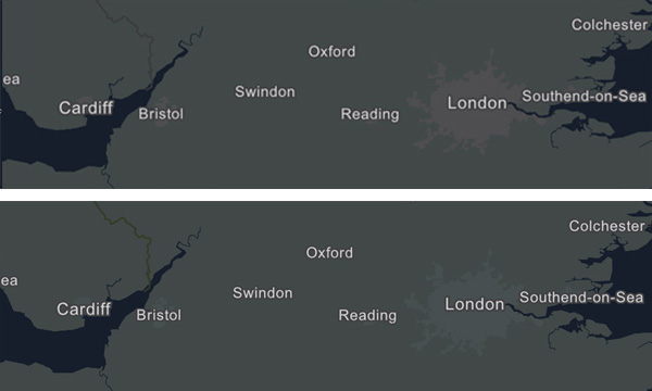
And zooming in, roads, parks and other symbols came under consideration. I adjusted most of them to colors that were more complementary to the green background. In this image the roads were changed to a green-gray. It’s subtle, but I think it helps.
Finally I redesigned the map at the larger scales. These were not needed in my story map because the basemap transitions into imagery, but the layer is public, and other users may want to use it for different work. It’s always best to have a comprehensive and finished product available.
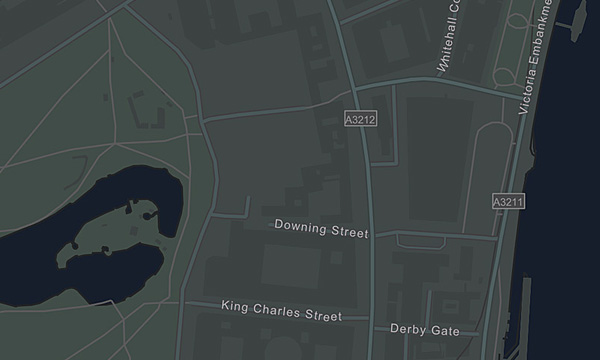
The final map is really just a green-tinted version of the Dark Gray Map, but getting there entailed some careful examination and adjustment at all scales.
Promoting Basemap Content
Our basemaps are designed to work in a narrow tonal range, so that they remain in the background and your subject information is promoted. However, with the customization capability of vector basemaps there is no reason why some of the basemap content can’t become part of the map subject. I adjusted a couple of items to work with my map:
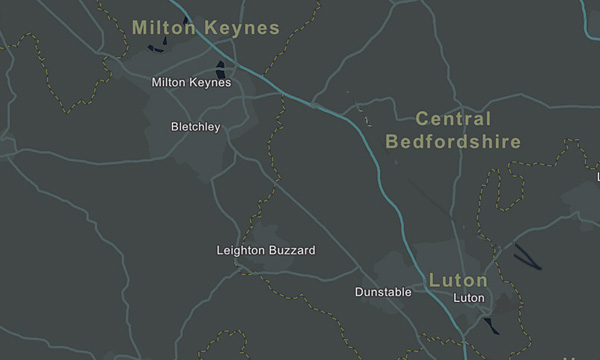
I picked out the Motorway/Highway category of road in a brighter blue to give a sense of where my locations sit in relation to the major road network. I featured third-order boundaries (counties in the UK) using a dashed yellow line, and enlarged the county names to match the line in prominence.
This worked well in the context of my map, but it was not so good in other parts of the world. In France, for example, the 3rd-order boundary labels (e.g., ‘Seine-Saint Denis’) are much stronger than the 2nd-order boundary labels (e.g., ‘Ile-de-France’).
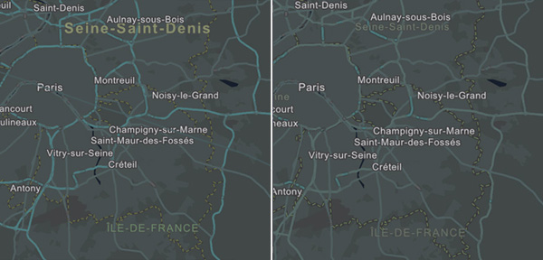
I wanted to keep my approach to the county names as a feature in my map, so, in case anyone else wants to use it, I have maintained a separate version of the basemap without these custom adjustments . It is available as a stand-alone vector tile layer, or in a web map with the imagery transition effect.
Summing up …
The process in general terms:
- I created a custom version of an existing vector basemap with a different color palette to serve specific functions within my map.
- I was careful to examine all map symbols at all scales to make sure that they were still working together.
- That included scales and areas outside of my particular requirements, so that another user could use this as a starting point for their map (In other words I created a complete multi-scale basemap).
- I used color and size adjustments to promote some symbols, so that they became part of the subject of my map.
Building a custom basemap can be a fun process, and it gives you the opportunity to have full control over the look of your final product. But know in advance what you are letting yourself in for. Frequently there is a ‘knock on’ effect caused by changing even one map symbol, and this can be magnified in a multi-scale service. Don’t feel you have to over-engineer your new map, but be prepared to examine all aspects before using it, and certainly before releasing it to a larger public.

Article Discussion: