We are now living in an era where half of website traffic is generated by mobile devices and half by desktops. Does your dashboard look good on both?
Dashboards made with ArcGIS Dashboards can be a compelling tool for displaying the metrics pulled directly from feeds of data. All too often, we overdo it and pack in too much information into a single screen. For dashboards designed for desktop users with a large landscape screen, this isn’t really a problem—there is plenty of real-estate to work with.
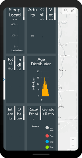
The issue presents itself when the dashboard is opened on a mobile device. While a dashboard made in Operations Dashboard is highly responsive (it will resize to practically any screen), you are best suited to create a separate dashboard that is optimized for mobile viewing. This leaves you with two URLs for two dashboards—one for mobile and one for desktop.
ArcGIS Experience Builder
ArcGIS Experience Builder is a new way of building web apps, providing a drag-and-drop workflow for creating powerful information products. With it, you can add in text, media, multiple maps, surveys, and other types of content, all within one unified web experience. It is adaptable and mobile friendly, where the builder gives you tools to adjust your application for desktop, tablet, and mobile views.
In other words, the app detects if the user is looking at the content on a large or small screen and delivers content specific for that device. This means we can combine a desktop dashboard and a mobile dashboard into a single application that will select the appropriate content for the screen. Two dashboards, one intelligent URL.
Getting Started
The first step is to build two dashboards in the ArcGIS Dashboards application—one for desktop, and one for mobile—following these guidelines for mobile dashboards. Hint: stack everything vertically. This example is a dashboard that looks at candidate locations for a mobile health clinic. We want the analysts in the office to see it on a desktop, and for citizens to be able to view it on their mobile devices.
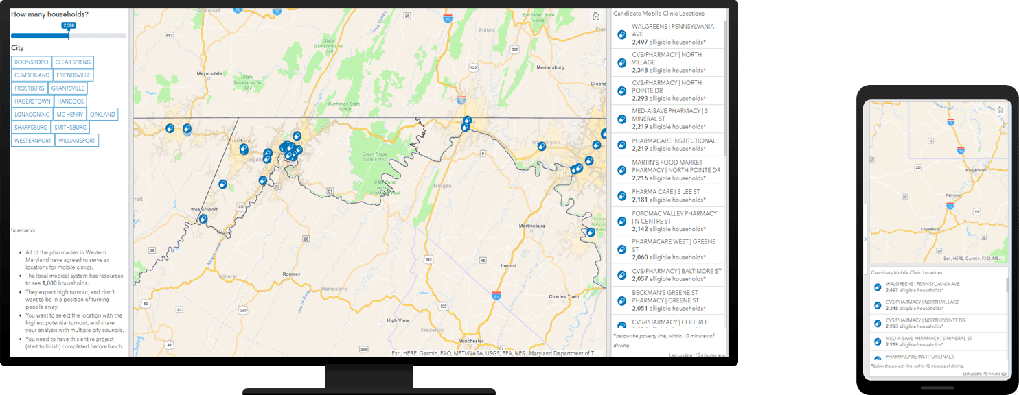
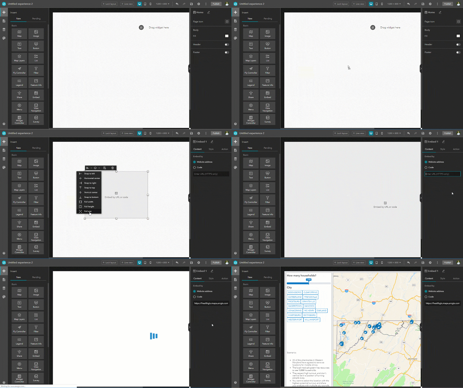
Once the dashboards are constructed, open ArcGIS Experience Builder. Because this application is fairly simple from the standpoint of Experience Builder, you should select the option to create a Blank Full Screen App.
The next two steps are easy to follow: On the desktop page for large screen devices, add a basic Embed widget by dragging and dropping it into the main workspace. Click on the new frame and select the option to enlarge it to full-screen. Add the URL for the desktop view of the dashboard as the Website address.
For the mobile view we will follow the exact same process, but first toggle to the view for small screen devices and select Custom mode.
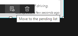
Now move the content to the pending list (do not delete it) in the window and add in a new, full-screen embed window. This time, add the mobile view of the dashboard as the Website address.
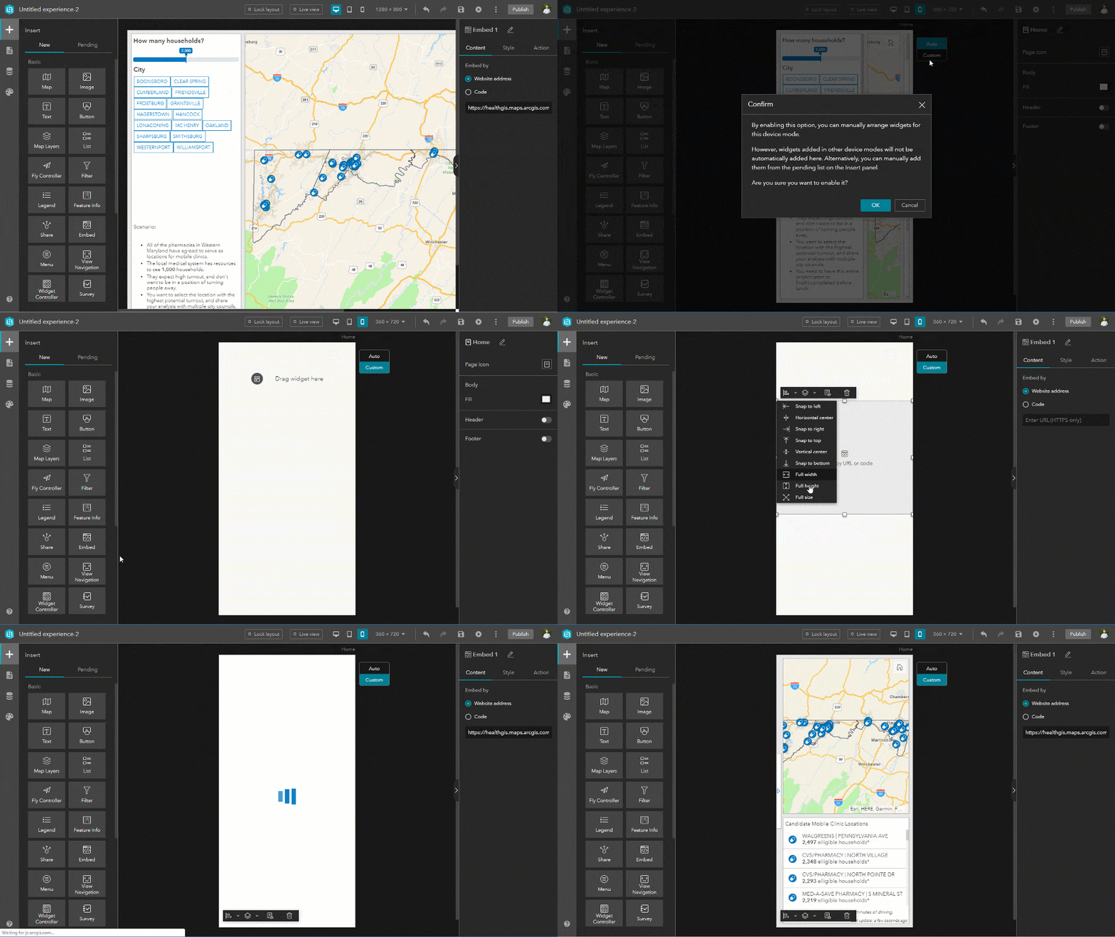
Once you save and publish the Experience, you now have a single URL that connects to two dashboards, dependent on the users’ screen size!
Try this live example (on mobile and on desktop), and learn more about how ArcGIS Experience Builder can combine multiple apps into one immersive experience for your users.
Note: Microsoft and Esri recommend using Microsoft Edge (instead of IE11) to view Experiences, as it will impact performance.


Article Discussion: