With the March 2016 release of ArcGIS Online, anyone can analyze and map multiple columns of related data, in order to make a thematic map showing the highest, or predominant, value for each feature. Try a predominance map any time you see multiple columns of data that share a common subject and unit of measurement.
What is a predominance map? An election map is an example of a predominance map, where we want to know which of two or more vote totals is higher, and by how much.
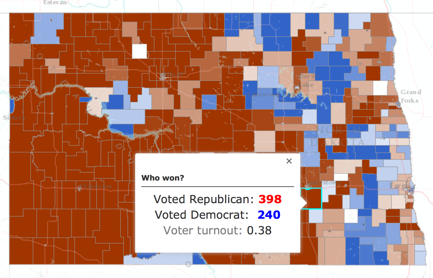
The thematic map above shows the North Dakota 2008 Presidential Election results, using the Predominance map style. Majority rules in this map – the color is determined by the party with the highest vote, and the strength of the color is based on the margin of victory: 60% of the vote nets a full color. Anything less fades to white as it nears 50% of the vote.
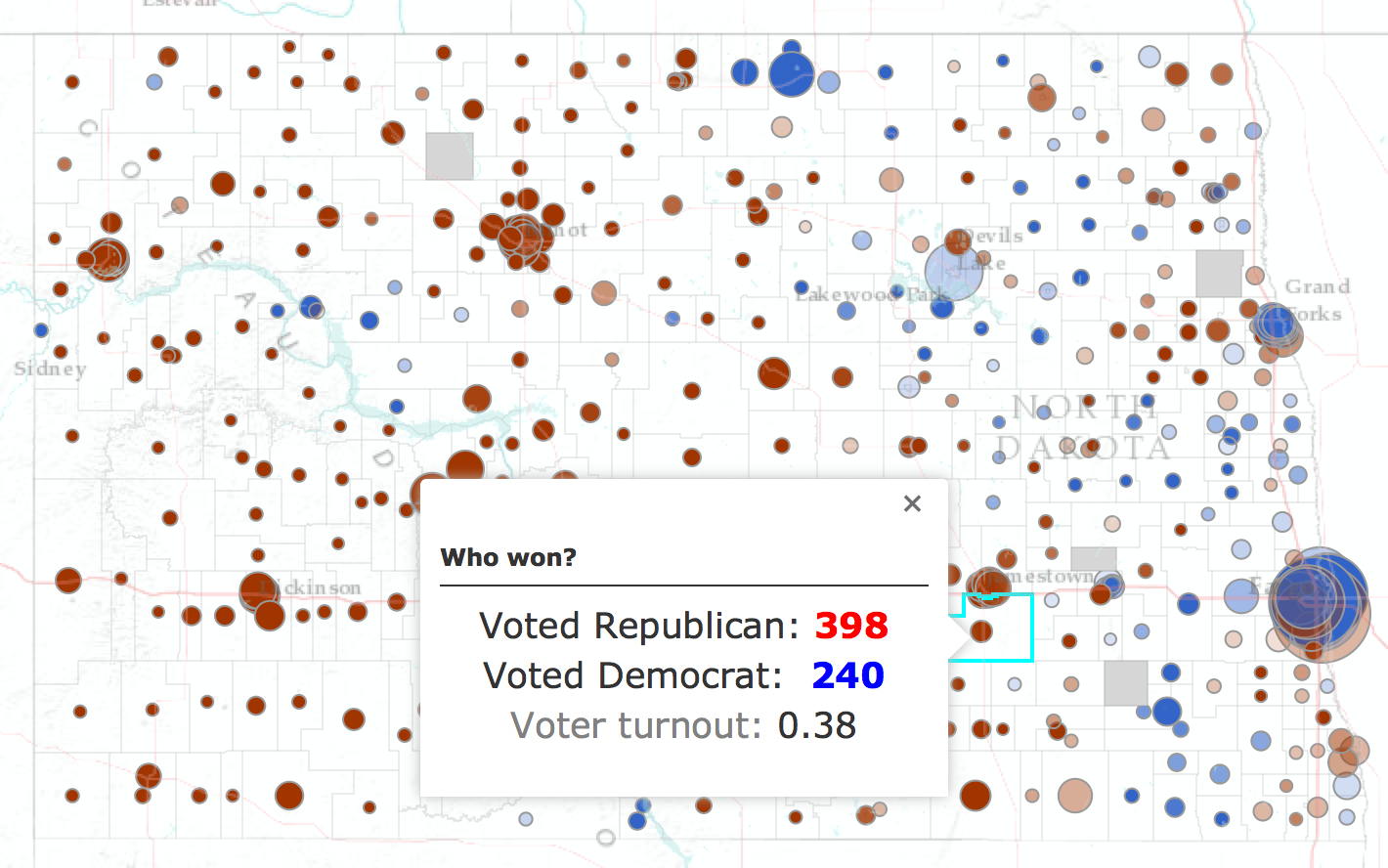
The thematic map below shows the same data, using the Predominance and Size map style. Unlike the map above the urban areas stand out, as they generally do in elections.
Included in the March 2016 release of ArcGIS Online are two new smart mapping styles that illuminate multiple attributes in your data. Use Predominant Category and Predominant Category & Size to compare multiple attributes in a layer, and show the predominant attribute.
You can see what these new thematic map styles are all about, and share them with others, from this story map.
Smart mapping empowers data experts, project managers, business analysts and many others to explore their data by simply mapping one, or more, attributes in that data. Your knowledge of, or curiosity about, the data is all you need to start making a useful map that illuminates the subject.
To start making a predominance map, look for the Change Style option in your layer (see below).
The map in ArcGIS Online responds immediately, offering different map styles in response to which attribute(s) in your data you touch.
In this release you will find two new map styles that help you reveal patterns hidden among two or more attributes. These new options are enabled when you choose two or more attributes to map and explore.
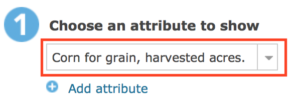
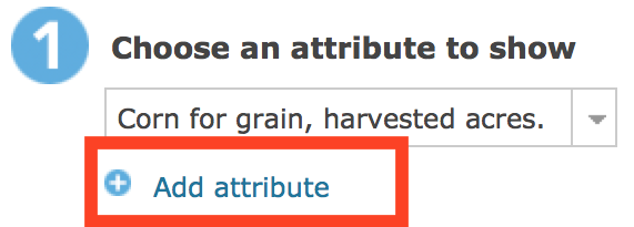
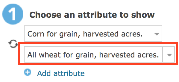
Choose a second attribute:
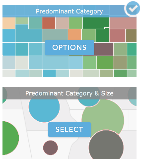
As soon as you choose that second attribute, look for the two predominance map styles and select one to try it out:
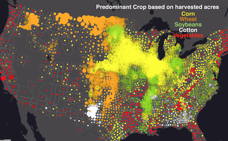
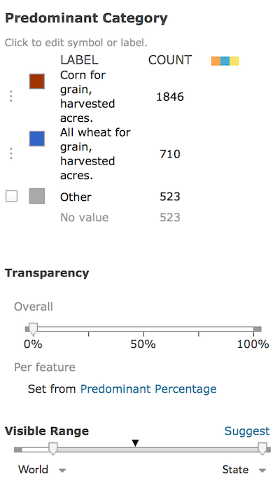
Click on “Options” to fine-tune the symbols, colors, outlines, and transparency settings to align with your map’s topic. Below, we see that Corn is the predominant crop in 1,846 counties, while Wheat is predominant in 710 counties.
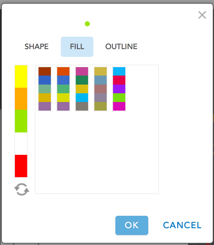
Additional color ramps for predominance maps are included in this release. As patterns in your map become visible, you can choose a color ramp to emphasize what you want people to see in the map first, and de-emphasize what is less important. You can also change any of the colors individually as needed. As always, you can apply a data filter to completely eliminate unimportant data from the map.
See plenty of examples in this excellent story map about the new predominance map styles.


Commenting is not enabled for this article.