Utilities have a lot of facility information that needs to be visualized which traditionally has been done with paper maps. If the utility manages different business areas such as generation/gathering, transmission, and distribution, the paper maps just scaled in multitude. In the case of an electric utility, if overhead and underground assets are managed separately, the map count has just doubled.
Putting facility asset information in GIS has completely changed the visualization landscape for utilities. Instead of producing maps which become almost instantly outdated as they are printed, GIS can show information near real time. By publishing this GIS information to the web, web GIS maps and apps can be disseminated to everyone in the organization. Even field crews can have this information readily available on a tablet for inspections.
A simple problem still exists, however. How do you visualize large amounts of data by different classifications or type? For example, most electric utilities store all conductors together (low, medium, and high voltage). To show all medium voltage on circuit RTM001, a definition query needs to be setup in the map document or web map for those feature classes. If a grid operations manager wants to quickly switch and see low voltage on circuit RTM001, the GIS administrator now has to change the definition on the layers and republish again. Optionally, the GIS admin could create sets of layer for low and medium voltage for users to toggle. This is the traditional way it is done which in turn increase map management drastically. For utility maps, which usually have lots of layers, this can quickly balloon as potentially hundreds of layers need to be made for the different asset types.
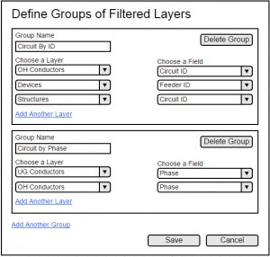
This is where the Map Filter widget for ArcGIS Web AppBuilder comes to the rescue. This widget is currently in development and will be available soon. With Map Filter, the GIS admin defines a group of layers to apply a definition query to. Each group can contain any number of layers and multiple groups can be defined this way.
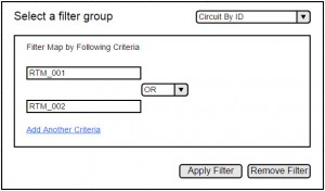
The grid manager can switch between groups quickly and easily. He/She can type in a value to apply as a filter on all the layers in the group. Optionally, the grid manager can add additional textboxes for single queries. Each textbox is then joined together with a conjunction (AND, OR, etc), allowing for more complex definition queries to be built.
An electric utility grid manager, armed with this widget, can quickly isolate a circuit and all devices and structures on that circuit. The grid manager, by using another group, can filter to show only main lines. A quasi Single Line Diagram can even be produced if all the layers are defined correctly. Map Filter can be used to select the conductors’ voltage rating to visualize those network segments. In the same widget, the grid manager can switch groups to filter the network by phase. All these filtered views provide a system of insight on the state of the utility’s network which aids in maintaining system reliability and ensuring crew safety.
Once again, this widget is currently in development. It should be available before the 2016 Esri User Conference as a widget in ArcGIS Web AppBuilder through ArcGIS Online. A preview will be available before that time on github. For the preview, you will need to have Web AppBuilder Developer Edition in order to add this widget to the existing pool of other widgets. Visit GeoNet to keep up with the latest information about the Map Filter wdiget as well as other utilities related news.
Now it’s your turn: What workflows can this widget be used in within your organization? What additional features or functions do you want to see added? Provide your comments below!


Article Discussion: