The best thematic maps answers specific questions. How are you using ArcGIS Online to ask, and answer, the specific questions that are most relevant to your organization?
The November 2015 release of ArcGIS Online includes additional smart mapping options to help you ask and answer those key questions. Check out this short video to see the new options in action.
Smart mapping empowers data experts, project managers, business analysts and many others to explore their data by simply mapping one or more attributes in that data. Thematic mapping has never been easier. Your knowledge of, or curiosity about, the data is all you need to start making a useful map that illuminates the subject.
To start, look for the Change Style option in your layer.

The map in ArcGIS Online responds immediately, offering different map styles in response to what part of the data you touch. You don’t have to learn HTML5 or CSS to make a good map – ArcGIS Online works with you to style the thematic map and give you instant feedback as you try out different options.
Simply add your data to the map, explore your options under Change Style, and apply your knowledge (or curiosity) to the map’s settings.
In this release you will find three new thematic mapping options allow you to explore relationships between different parts of your data. These new options are enabled when you choose two attributes to map and explore.
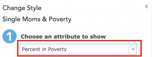
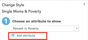
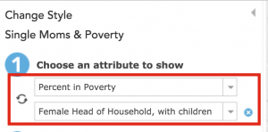
As soon as you choose that second attribute, suitable map styles are suggested:
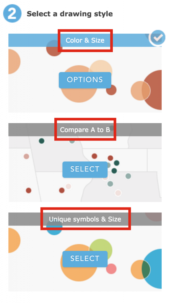
Why choose more than one attribute to map? Fair question. It’s useful to explore the measures found in your data, see how they relate to one another, and look for patterns on the map that reflect that relationship. It’s useful to explore other dimensions of your data, such how a measure varies by membership in a group or class. Some examples follow.
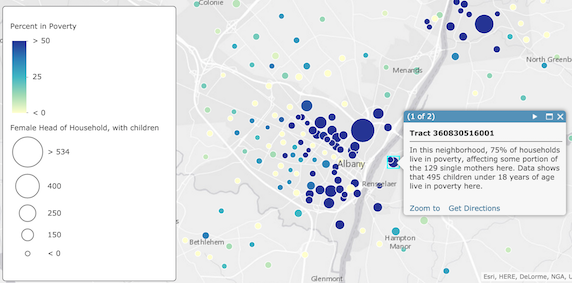
The Color & Size style is a good style to use when you want to show count information and rate information on the map together. The map below shows where large numbers of single-parent households exist within high-poverty neighborhoods. In this example, the point symbols vary in size based on the number of single-parent households, and vary in color based on the poverty rate.
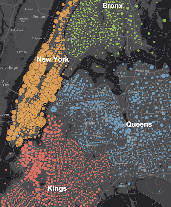
The Unique Symbols & Size style is a good style to use when you want to show count information on the map, in relation to a text or numeric field with unique values (e.g. NAME or TYPE or DISTRICT). The map below shows where large numbers of people with a bachelor’s degree reside in the New York boroughs. In this example, the number of people with a bachelor’s degree is indicated by the size of the symbol, while color is used to show which county they reside within.
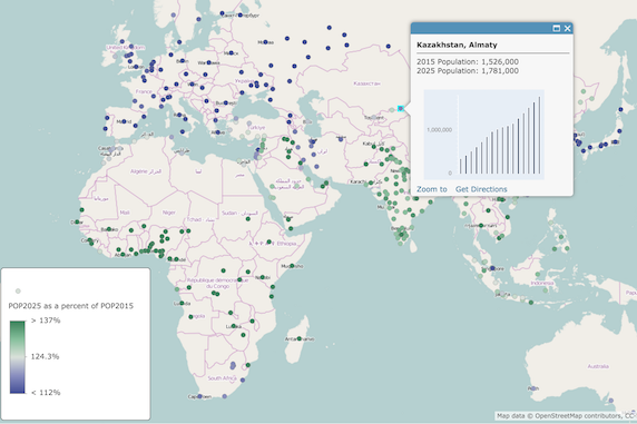
The Compare A to B style is a powerful style to use when you want to understand one number in relation to another: as a ratio, or as a percentage. The map below shows which cities around the globe are expected to grow in population, or shrink, in the coming decades. In this example, the 2025 population is divided by the 2015 population, and shown as a percentage.
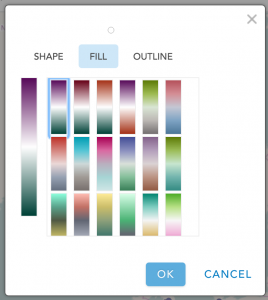
Additional color ramps for each basemap are included in this release. As patterns in your map become visible, you can choose a color ramp to emphasize what you want people to see in the map first, and de-emphasize what is less important. As always, you can apply a data filter to completely eliminate unimportant data from the map.
See plenty of examples in this excellent story map about What’s New in Smart Mapping. Try out these new options in ArcGIS Online with your own data.

Article Discussion: