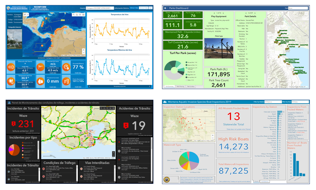
Operations Dashboard for ArcGIS is a configurable web app that allows you to use charts, gauges, maps, and other visual elements to reflect the status and performance of assets, personnel, services, and events in real time. A dashboard enables you to monitor the activities and performance indicators that are important to your organization’s business objectives and workflows, within a single display. It is a great way to provide end users with an interactive dynamic display of data.
Many organizations have leveraged dashboards to effectively convey information in many different industries, supporting a variety of workflows (beyond operations management). Dashboards are great for operational (e.g., event monitoring) use cases, but can also be used for tactical (e.g., tracking crime/environmental trends), strategic (e.g., project summaries), and informational use cases. Essentially dashboards can be leveraged by everyone.

To explore some real customer deployed dashboard examples, click the links below:
- Government Themed Dashboards
- 311 Citizen Request Dashboards
- Business & Commercial Dashboards
- Real Estate Development Dashboards
- Crime Data Dashboards
- Transportation Themed Dashboards
- Government Elections Dashboards
- Environmental Management Dashboards
- Forestry Related Dashboards
- Flood Gauge Monitoring Dashboards
- Informational Dashboards
- Health and Human Services Themed Dashboards
- Opioid Epidemic Themed Dashboards
- Bird Count Volunteer Crowdsource Dashboards
- CDC Social Vulnerability Index Dashboard
- Ebola Dashboards
- City Cancer Challenge Impact Dashboard
- Iowa DOT Winter Operations Dashboard
FYI: a good resource to get started and learn some best practices for dashboards
Operations Dashboard for ArcGIS – Useful Links
To get started with dashboards, you can leverage some awesome industry focused dashboard templates from the ArcGIS Solutions team, Dashboard templates.
For the past many months, the development team has been hard at work making important behind-the-scenes changes that will enable dashboards to take advantage of the latest and greatest features the ArcGIS platform has to offer. One example is Arcade; targeted for release early next year, dashboards will respect all Arcade expressions authored in web maps and web layers for styling, labels and popups. Dashboard authors will also be able to use Arcade to improve the explanatory value and formatting of dashboard elements. Stay tuned for these and other enhancements coming in early 2020.
Happy holidays,
The Dashboard Dev team


Commenting is not enabled for this article.