When creating thumbnails for items, you can go beyond the basics and establish a unique style or brand. Thumbnail style can be thought of as a distinctive visual appearance which can provide context for the content behind it. Branding is a practice in which an organization creates a unique design that is easily identifiable, making one organization’s contributions easily distinguishable from others. Your style and brand can reflect upon you as an individual, or on your organization as a whole.
While some of these thumbnails use a lot text, it’s always best to simplify and use less text, not more. A good brand focuses on visual elements, not words.
Here are different style and brand ideas that you can consider, and apply to your thumbnails.
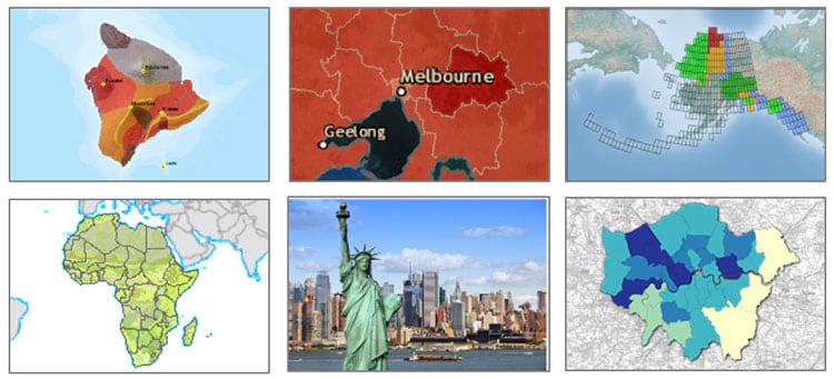
Geographic context
Each of these thumbnails provides an obvious visual reference to the geographic context of the map, helping the user anticipate the geographic context for what they will see. While most use a map to show that context, the New York City example uses an easily recognizable graphic.
Content hints
Sometimes thumbnails provide a visual cue to the content we will find. Below are examples of thumbnails representing content about insects, weather, wine, fish, fire, and traffic. These graphics deliver an expectation of subject matter.

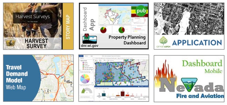
Apps, tools, and capabilities
The thumbnail might also provide an indication of the functionality or tools within an application. We can easily recognize story maps, dashboards, apps, and models from the thumbnails below. Those details will also be listed with the item, so you may not find them useful. However visitors to your home or hub may find those visual cues useful.
Organizational branding
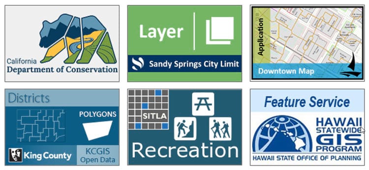
An interesting and useful thumbnail concept is organizational branding, and is recommended for top-tier authoritative content shared by an organization. Each map below employs a visual brand (the organization logo, colors, and text) which provides an indication of the authoritative source for the map. The organizations behind the thumbnails can be easily recognized.
Many of the ones below also include hints as to the content using words, and maps. Do you prefer to see geographic context along with the thumbnail, or are words and a logo sufficient?
Branding consistency
An important aspect of branding is consistency. Organization thumbnails don’t need to be identical, but must carry forward a branding theme, be it color, logos, or other graphic elements. These examples from organizational galleries show the strength of branding, and how it enables viewers to easily recognize the publisher, and find authoritative content.
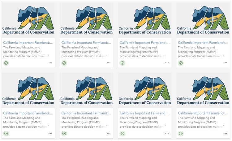
California Department of Conservation
This first example is from the California Department of Conservation, using the same logo for all content. While the consistency helps to identify the source, the viewer must read the item description to understand more about the content.
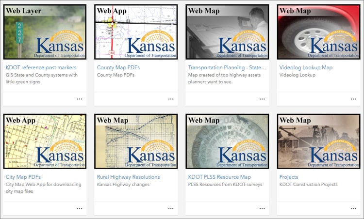
Kansas Department of Transportation
Kansas DOT uses unique thumbnails, but carries through their logo as a design element which helps to unify the collection, delivery recognition and an authoritative tone.
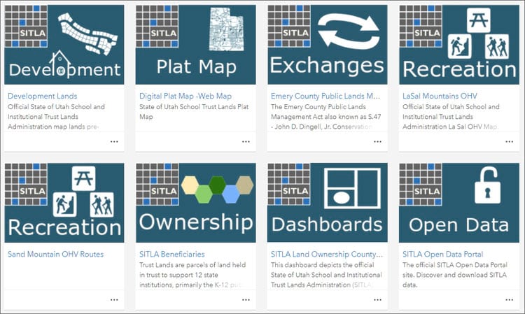
Utah SITLA
The state of Utah School and Institutional Trust Lands (SITLA) uses strong colors, design, and logo branding, but also uses text and graphics to help identify different content types. This distinctive style enables their content to be easily recognized, and understood.
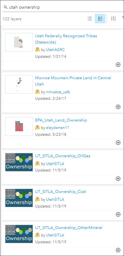
The importance of branding can be seen in the search results below. While authoring a map and searching for “Utah Ownership,” the following results were found. Which are the easily recognized authoritative search results?
Summary and more info
Each style and branding approach offers ways to help users find and anticipate content, and also distinguishes your organization from others. For more information about thumbnails, see Put your best thumbnail forward.
This blog article was originally published on November 12, 2019, and has been updated.

Commenting is not enabled for this article.