About the author: Elizabeth Della Zazzera is a Mellon/ACLS Public Fellow and Digital Producer at Lapham’s Quarterly. She holds a PhD in History from the University of Pennsylvania and is a really big fan of maps.
Travel literature invites readers on a journey, carrying them from location to location so they might experience the sights, sounds, adventures, and trials alongside the author. Readers can engage in this vicarious meandering through the pages of a travelogue, adventure story, memoir, or guidebook. But they can also do so through slavery narratives, which—by telling stories of self-liberation and of movement from lands where slavery was codified to those where it was outlawed—tell stories of travel.
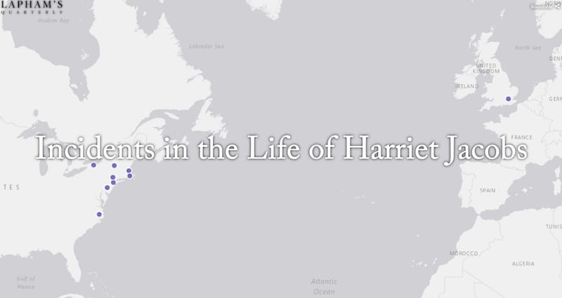
As arguments for abolition, slavery narratives ask readers to step into the shoes of enslaved people, to hide, walk, and run as they do; to hop trains and board ships with them. They recount stories of cruelty, desperation, and perseverance, challenging any notion that the people on these journeys are any less human than the reader. It was one of these stories, specifically the one told by Harriet Jacobs in her book Incidents in the Life of a Slave Girl, that I sought to recreate in my story map “Incidents in the Life of Harriet Jacobs.”
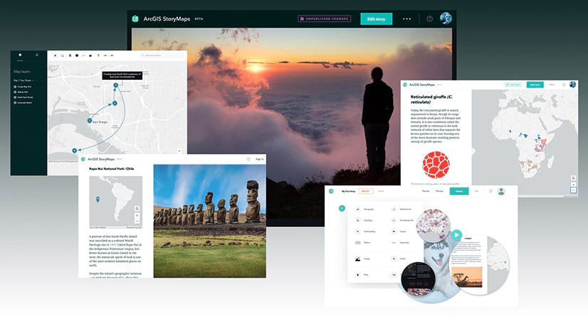
Travel narratives lend themselves well to the kind of geographic storytelling for which Esri Story Maps were designed. When I had the idea to create a series of virtual tours of travel literature—of which “Incidents in the Life of Harriet Jacobs” is the first—I knew Story Maps would give me an ideal platform. (The story has since been chosen as Esri’s Story Map of the Month for May.)
Form, function, and flexible storytelling
I had originally planned to put this together using Story Map Tour, but found myself constrained by both the character limit and the template’s relatively rigid styling options. One of the major draws of Map Tour’s side-panel layout is that its mobile version eschews all horizontal scrolling in favor of vertical navigation, and I knew I wanted to use a template that would do the same. Story Map Cascade, therefore, seemed the obvious choice.
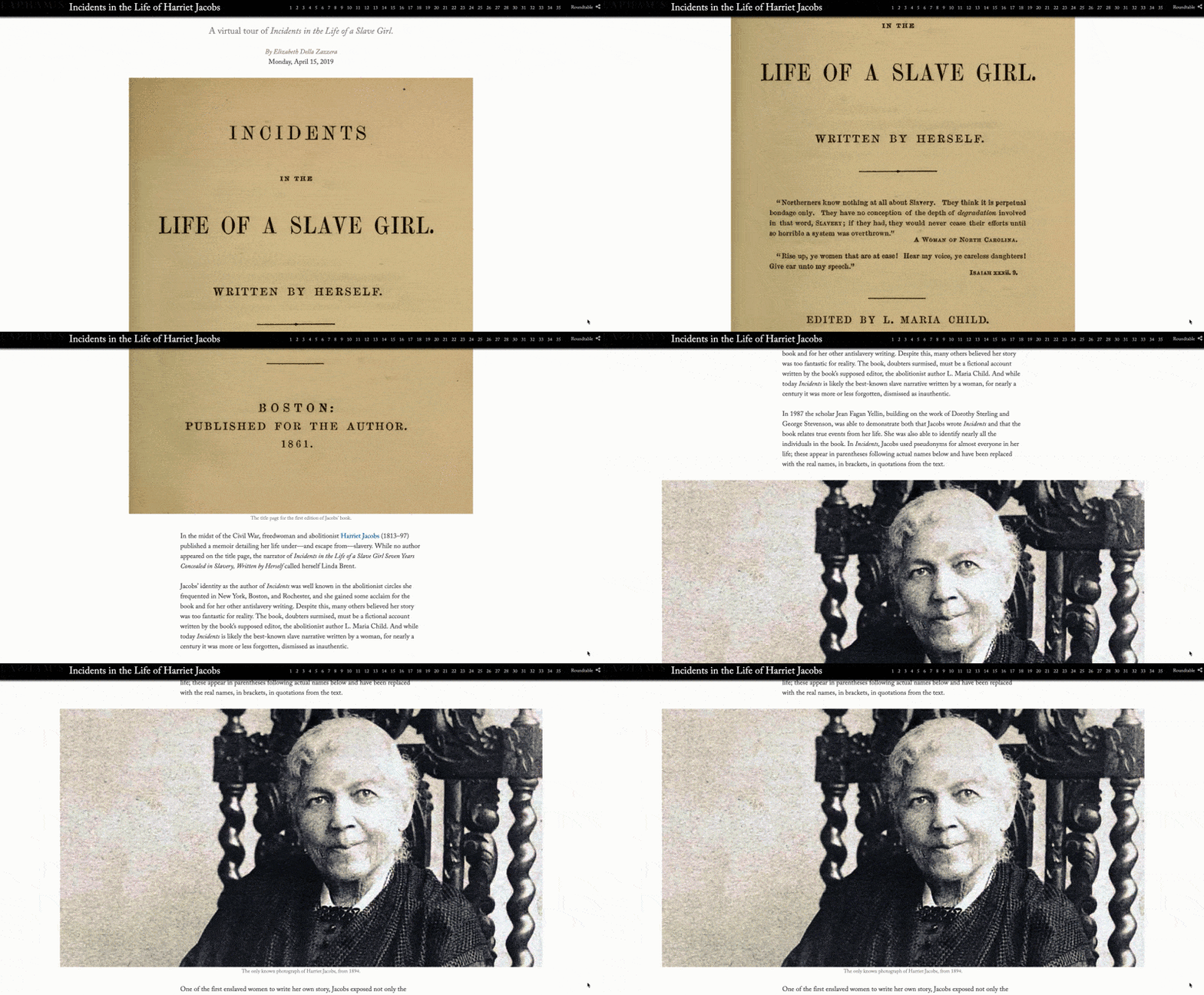
Cascade, perhaps more than any of the other Story Map templates, offers a lot of narrative flexibility because it is made up of different types of content blocks that can be arranged in all kinds of combinations. It also has flexible image integration. Images can be small, medium, or full screen; they can appear in immersive sections where panels of text float over them, and images can be added to those floating panels as well. I wanted to combine descriptive sections, block quotes, maps, and images, and Cascade gave me complete control over the order in which those appeared, depending on what worked best for each section of the story.
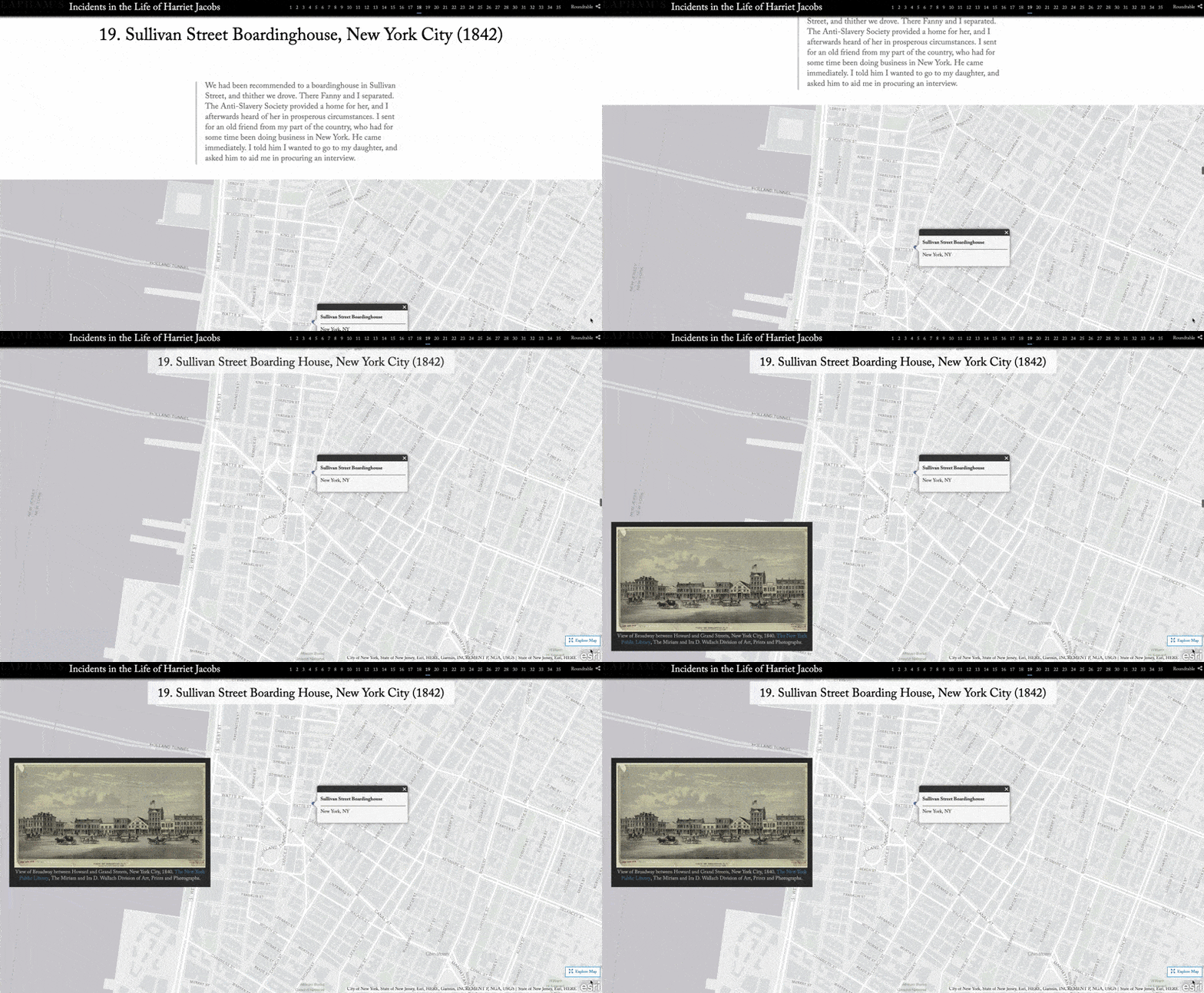
To keep the narrative cohesive, though, I made sure that every section included most of the same elements. Each one begins with a numbered title and date, followed by a narrative section with block quotes from Jacobs’ writing. The story sections also feature locations where she lived, went, or discussed in her memoir, in sequence. Most of the sections have an immersive map showing the precise location of the places she describes, and all have accompanying images. Some have images as part of the immersive map section, others have full screen narrative images. While each section of the story is clearly delineated, and all of them are around the same length, they showcase enough variety to avoid feeling repetitive.
Historical content meets modern GIS
Assembling the story map in Cascade was in fact one of the easiest parts of this project. Perhaps the greatest challenge, as with most historical GIS endeavors, was geo-locating historical addresses.
Anyone attempting to map the life of Harriet Jacobs is lucky that many scholars, librarians, and archivists have come before her. The Historic Edenton State Historic Site Visitor’s Center offers a self-guided walking tour of important locations from Jacobs’ life in Edenton, complete with handy map. Jean Fagan Yellin’s meticulously researched biography of Jacobs, Harriet Jacobs, A Life frequently provides street addresses for places Jacobs lived and went—she tells us that Jacobs and her children lived at 87 Chambers Street in Boston, that Reverend Durham and his wife lived between Tenth and Eleventh on Barley in Philadelphia, and that after he married his second wife, Cordelia, N.P. Willis moved to 198 Fourth Street, in New York.
But finding an address is not the end of the research process. Chambers Street still exists, but Barley does not, and Fourth Street is now divided into West and East Fourth Streets—with that division came new lot numbers. With the aid of repositories that track old street names we learn that Barley is now Waverly, and a detailed 1854 map of Manhattan shows us that 198 Fourth Street is now approximately 144 West Fourth.
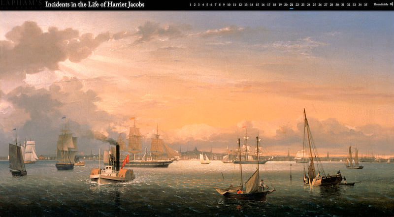
Another challenge was finding images that were relevant to the story and provided additional context for the reader while also being visually interesting. Some are depictions of the actual places Jacobs went—Astor House in New York City, the Grinnell Mansion in New Bedford, the beach at Far Rockaway, a map of 1840s Brooklyn—while others try to evoke aspects of Jacobs’ life or her descriptions of it—a quilt made by two enslaved sisters, a painting of a cloudy sky over a troubled sea by the African American artist Edward Mitchell Bannister.
Organizational branding and customized design
One of the challenges of using an off-the-shelf tool to create content for a publication with an established aesthetic is adapting the tool to replicate that aesthetic. Lapham’s Quarterly, a magazine of history and ideas, where I serve as Digital Producer, has a particular look and feel that carries from the print magazine to its website. While Story Maps make it possible to go beyond the confines inherent in a content management system without having to build (or pay designers to build) new pages or content types from scratch, they also have their own particular look and feel.
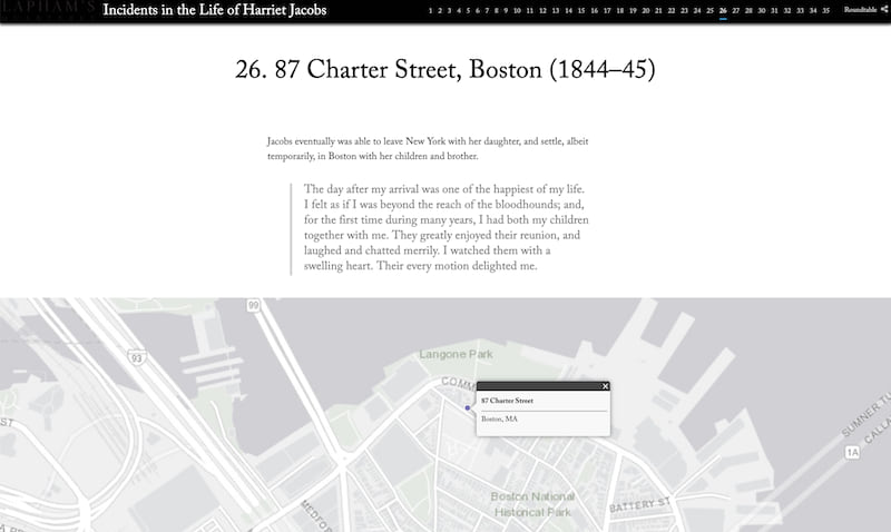
One of my goals in creating this story map was therefore to match our style as much as possible and make it feel like an LQ piece. Some of that branding is easily done, like adding our logo so it appears in the top left corner of the screen. Other aspects, like custom fonts or text styling, required adding lines of CSS to the story’s code. By hosting “Incidents” on our own server I was able to change the font to the one we use for LQ’s website and magazine, and do some additional custom styling (adding a vertical line to blockquotes, getting rid of the white space at the beginning of narrative section images) to make the story map look precisely how I wanted it.
But these details—the map, the images, the narrative framework, the custom design elements—are really only there to highlight Jacobs own words. Together, they give aesthetic embellishment and context to those words, which are asking us to empathize with Jacobs, and to travel along with her.


Article Discussion: