Web content that is accessible matters for everyone. If your organization uses ArcGIS Hub or ArcGIS Enterprise Sites to create sites and pages, understanding and applying the principles of accessible web design supports you in providing the best experience for everyone. This applies whether or not a person has a situational, permanent, or temporary disability.
What is accessibility?
From sighted individuals to aging generations, easily accessible, usable content is imperative to providing equal access to people everywhere. This is why many countries around the world seek to improve the accessibility of their web content by adhering to the Web Content Accessibility Guidelines (WCAG).
The WCAG is a set of international standards that have been used to inform regulations in Canada, Germany, New Zealand, and many other countries. While regulations may vary slightly by country, the goal of inclusion remains the same.
In this article, we’ll use accessibility as an umbrella term to refer to WCAG 2.2, Section 508, and Title III of the Americans with Disabilities Act (ADA). In the United States, WCAG sets the foundation for Section 508, a federal regulation that applies to all federally produced web content. Section 508 is also the recommended practice for ADA compliance.
Accessibility and the layout builder
Our layout builder and drag-and-drop cards enable you to feature a range of content on your sites and pages, including web maps, images, video, and text. But designing for accessibility is always a partnership. The Hub team strives for WCAG 2.2 AA compliance by putting in work behind the scenes to make the site building experience navigable for sighted keyboard users and those using assistive technologies. However, it is worthwhile to consider several guidelines as you customize your site.
Site settings and theme
If you are using ArcGIS Online’s shared theme or Enterprise’s shared theme, any sites created through Hub or Enterprise Sites automatically import the shared theme. These themes allow you to compare the contrast between foreground and background colors. Contrast helps individuals with varying visual abilities access your information.
According to the WCAG guideline 1.4.3 Contrast (Minimum), color luminance contrast between text and background color should be greater than or equal to 4.5:1 for small text and 3.1 for large text. The guideline 1.4.11 Non-Text Contrast extends the 3:1 ratio to icons and graphical elements.
If you set a theme for the site, you may want to verify the contrast of your selected colors with an external tool. Various free color contrast analysis tools are available online. For example, you can use WebAIM’s Color Contrast Checker to compare two hexcodecolors, or install TPGI’s desktop app, which supports comparison of hex, RGB, HSL, and HSV colors, along with eyedropper tools to extract colors from any part of your screen.

To ensure that your entire site has an accessible theme, verify that you’ve passed regular text contrast requirements for header text and background, global navigation text and background, body text and background, and body link and background. These pairings are used to generate the theme that is applied to all components.
Organize an accessible content structure
As you use the cards available in our layout builder, you can utilize the WCAG guidelines 2.4.4. Link Purpose (In Context) and 2.4.6 Headings and Labels to create a structured narrative that’s easy to navigate. On each page you publish, include at least one <h1> heading to provide context to visitors.
Row card
Row cards are the building blocks of your site. They can be filled with any combination of additional cards, such as the web map, video, image, text, and chart cards. When configuring the settings for a row, you can set a background color or upload an image. Whichever you choose, ensure that there is sufficiently high color contrast between the background and any content displayed by other cards, such as the Text or Category cards.
Tip: Not sure if your row background image provides enough color contrast? Add a light or dark background color to your row and adjust the color’s transparency.
Automated accessibility testing tools cannot check the legibility of text on background images, so you may want to do this manually. Additionally, if you have a background image and automated tools are reporting failures, check your background and foreground color contrast. These tools compare colors as if the background image does not exist (some people do browse the web with images disabled).
Text card
Narratives connect your audience with the information they need to understand your message and to take necessary action. When using the Text card, create an accessible content structure by following these recommendations.
- Use sections to structure your narratives so that screen readers can more easily navigate text. Use heading levels to provide information hierarchy. Avoid skipping heading levels. Do not use headings decoratively to increase font size.
- If you link to additional resources, such as external sites and pages, ensure that your text describes the link’s purpose or destination. Rather than saying, “click here”, invite people to follow the link with phrasing such as: “to learn more about x…” This helps assistive technologies that may be using shortcuts to rapidly navigate through all links on a page without needing to read the surrounding context.
- Provide a notice when a link opens in a new tab or window, as this is a change of context (On Input 3.2.2, G201). It’s also helpful when the destination is a different type of file format, such as a PDF. Use text or an icon to provide this warning.
When an aria-label is used on a link, the aria-label will overwrite the link text when communicated to assistive technologies. This means that either the launch icon needs to be a stand-alone icon with its own label inside of the link:
<calcite-link href=”#” target=”_blank”>Get started <calcite-icon icon="launch" text-label="opens in new tab" scale=”s”></calcite-icon></calcite-link>
Or, if the icon-end slot is used for a visual indicator, then the actual text of the link needs to be included in the aria-label for programmatic context:
<calcite-link href=”#” target=”_blank” icon-end=”launch” aria-label=”Get started, Opens in new tab”>Get started</calcite-link>

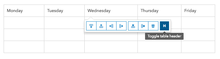
- Avoid using tables to structure your content in a layout. Tables should be reserved for basic data. Use the Table header toggle (H) option that comes with our Text card table to structure your tables for an optimal experience for assistive technologies.
Learn more about adding and formatting text in the text card documentation.
Category card
Category cards can help to visualize groups of similar datasets. Upload your own image for your category card or choose from our library of icons. Our icons are Scalable Vector Graphics (SVGs), an image file format that can be scaled to different sizes without affecting image quality. We automatically mark icons from our library as decorative since the link text provides more context.
Don’t forget about checking color contrast. You can adjust the color of your Category card’s link text by selecting Theme on the Customize panel and adjusting the Body link color.
If you want to use your own image, provide a URL for an SVG or transparent PNG file. Add alternative (alt) text if the image provides supplemental information or leave it blank to indicate the image is decorative.
All visual content, unless decorative, requires a text equivalent (Non-text Content 1.1.1) often referred to as alt text. This is used to describe the image to those using screen-readers.
Share accessible visuals and media
Adding images and media is a common and simple way to enrich your sites and pages. When choosing types of visuals or media to add, prioritize content that provides unique, rather than redundant information.
Images
The Image card settings provide you with several options for customizing the display of your image, including the option to provide Image alt text. When writing alt text, consider these best practices:
- Describe the image succinctly.
- Do not include the words “picture / image / graphic of” in your description. This will be communicated automatically.
- Provide details relevant to the context. Don’t copy and paste the image caption as alt text, as it is different than a caption (and the screen reader will read the same thing twice). Alt text is an objective description of a non-decorative image. Captions are more subjective descriptions of what the image conveys.
- If using the image as a link, describe the destination or purpose of the link, not the image. Also, having links open in the same tab makes it easier for non-sighted individuals to navigate.
Learn more about adding and formatting images in the documentation.

Gallery card
Gallery cards are used to display a range of content types such as apps, dashboards, webmaps, documents, and additional sites and pages. However, returning to content structure (Headings and Labels 2.4.6), you may want to adjust the Gallery card’s title headings to improve the information hierarchy of your content. This does not change font size but can assist with nested headings.
Learn more about using Gallery cards in the documentation.

Video card
WCAG guideline 1.2.2 Captions requires that you add captions to any videos that you include on the Video card. Hub supports YouTube, Vimeo, and Facebook video. You can find out more about captioning YouTube videos on their support page, which offers instructions on how to upload caption files or manually transcribe and sync captions with video.
Embedded content should always contain titles so that people using assistive technologies can decide whether to enter that section of the page. Use the Title setting on our Video card to describe the content of your video.
Tip: The same recommendation applies to any content embedded through the Iframe card. Always add a title describing the content within the iframe as it won’t be read automatically for those using screen-readers. They will have to elect to enter the iframe.
Learn more about adding and formatting videos in the documentation.
Social media card
With the Social media card, you can add Facebook or X posts as inline content in a layout. We cannot affect the content being shown from either of those platforms, so you may observe some color contrast violations. We have included a toggle for the X Dark Theme, which does pass color contrast requirements.
Learn more about using the Social media card in the documentation.
Automated accessibility testing tools
Several tools that can run automated tests of your entire webpage to check for accessibility violations. The Hub team uses aXe by Deque as part of our development process. Deque offers an aXe browser plugin that can be used with Chrome, Firefox, or Edge.
Get started and share feedback
Create a new site or review existing sites for ways to improve accessibility. If you have any questions or comments, reach out to us on Esri Community. We update our changelog regularly to reflect the changes we make to our product related to accessibility.
For more information, refer to these resources:
- ArcGIS Hub Accessibility Status Report
- Hub documentation
- ArcGIS Enterprise Sites Accessibility Status Report
- Enterprise Sites documentation
Interested in learning more about what ArcGIS Hub can do for your community? Take the Hub readiness assessment and learn more about Hub capabilities.
Whether you’re new to Hub or have been with us since the beginning of Open data, let us know what you think. We’d be happy to hear from you.


Commenting is not enabled for this article.