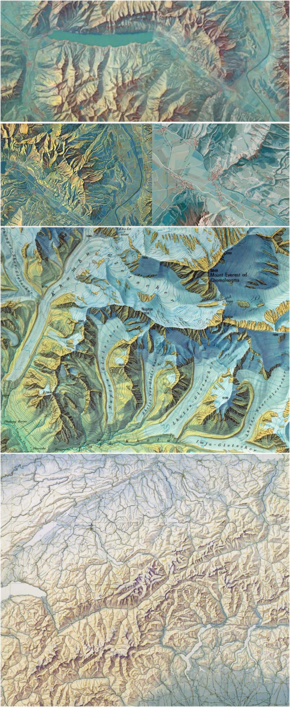
Eduard Imhof was a remarkable Swiss cartographer renowned for his beautiful impressionistic topographic mapping style. He used hues to create a sense of sun-bathed warmth and cool shadow and feathered a sense of atmospheric perspective into his hillshades that rendered directly-illuminated peaks as crisp golden angles and blanketed valleys in the blues and greens of scattered incidental light.
Here is a little glimpse of how amazing his work was.
Easy, right? 😉
In an attempt to learn more about his style, I have been feathering terrain layers together with some Imhof-inspired colors and transparencies. And it’s been a total blast! As a creature totally unable to keep fun and interesting news to himself, I of course am excited to share the method and resources that I found most effective. Get ready to live!
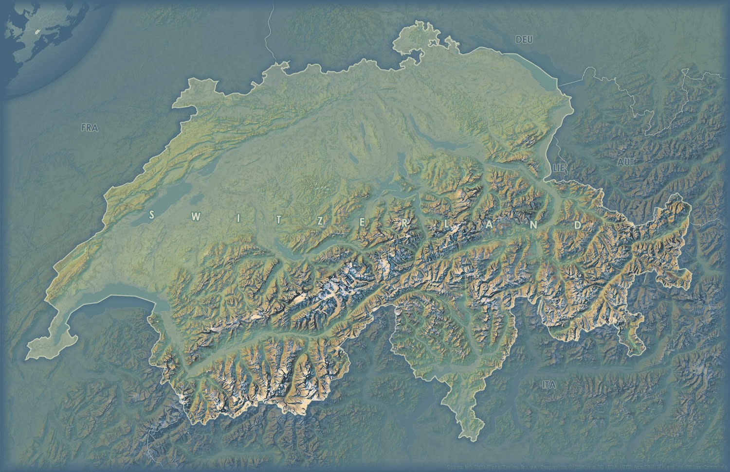
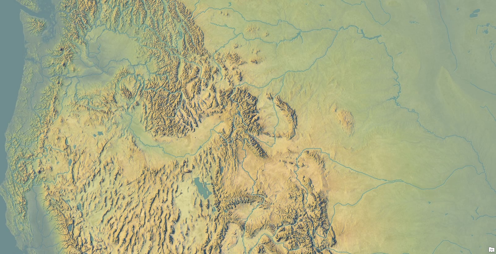
Here’s a map that uses these layers, colors, and opacities, in a manner somewhat reminiscent of Imhof”s. Sort of like fan fiction, but with maps.
Color Schemes
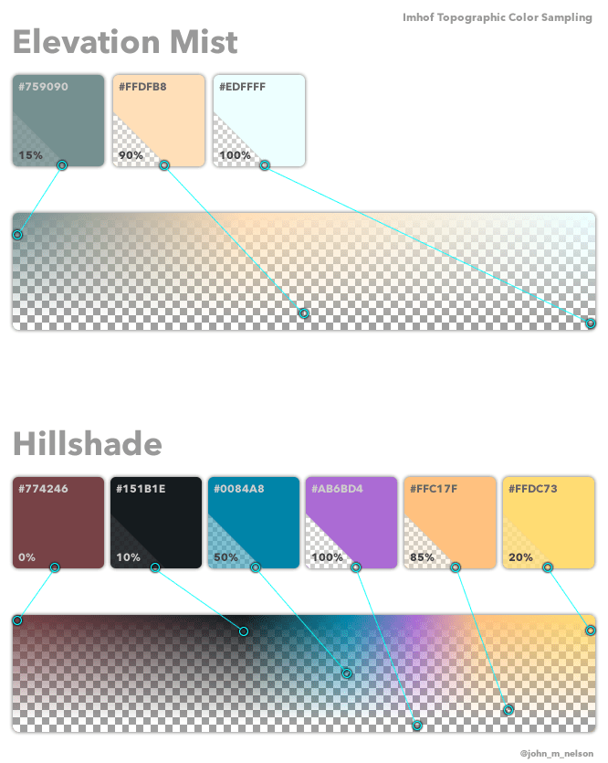
I sampled a range of colors from the crisp higher elevation peaks, for sunlit slopes, shadow, and several intermediate (largely transparent) stops. I then sampled the overall incidental light mist color predominant in Imhof’s valleys. From these colors I produced two color schemes. One for hillshade and the other for elevation mist. Here is a schematic…
Hillshade
I found that Imhof’s formidable cognition/hand did a remarkable job of representing the larger order topographic character of an area while still capturing the fine grain of it. He did this because he was an artist, familiar with the sfumato-layering and blending of paints to create a realistic sense of depth and light. In my experience, conventional hillshading techniques do a fair job of capturing that overall landform, while a multi-directional method teases out the local nuances well. I was comparing their relative merits when I just decided to use both layers concurrently…
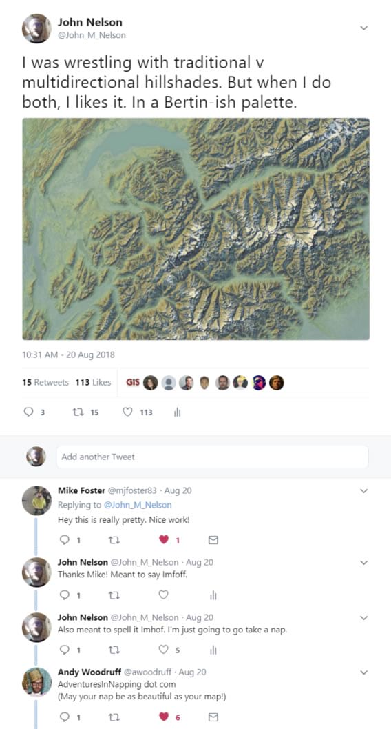
Here are the ingredients…
- Imagery base
- Traditional Hillshade
- Multi-directional Hillshade
- Elevation Mist
(if you don’t want an imagery service you can just apply hillshade techniques to these sweet NASA geotiffs)
Which, when given Imhof-inspired palettes look like this…
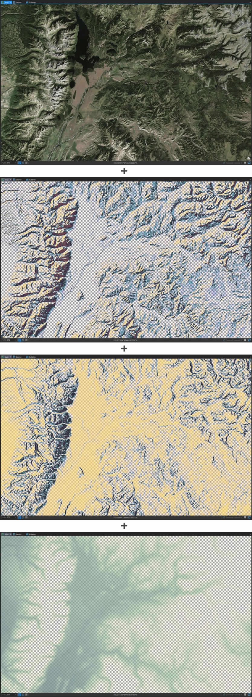
And stack up to look like this…
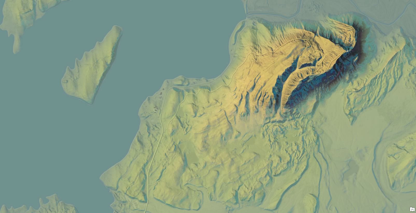
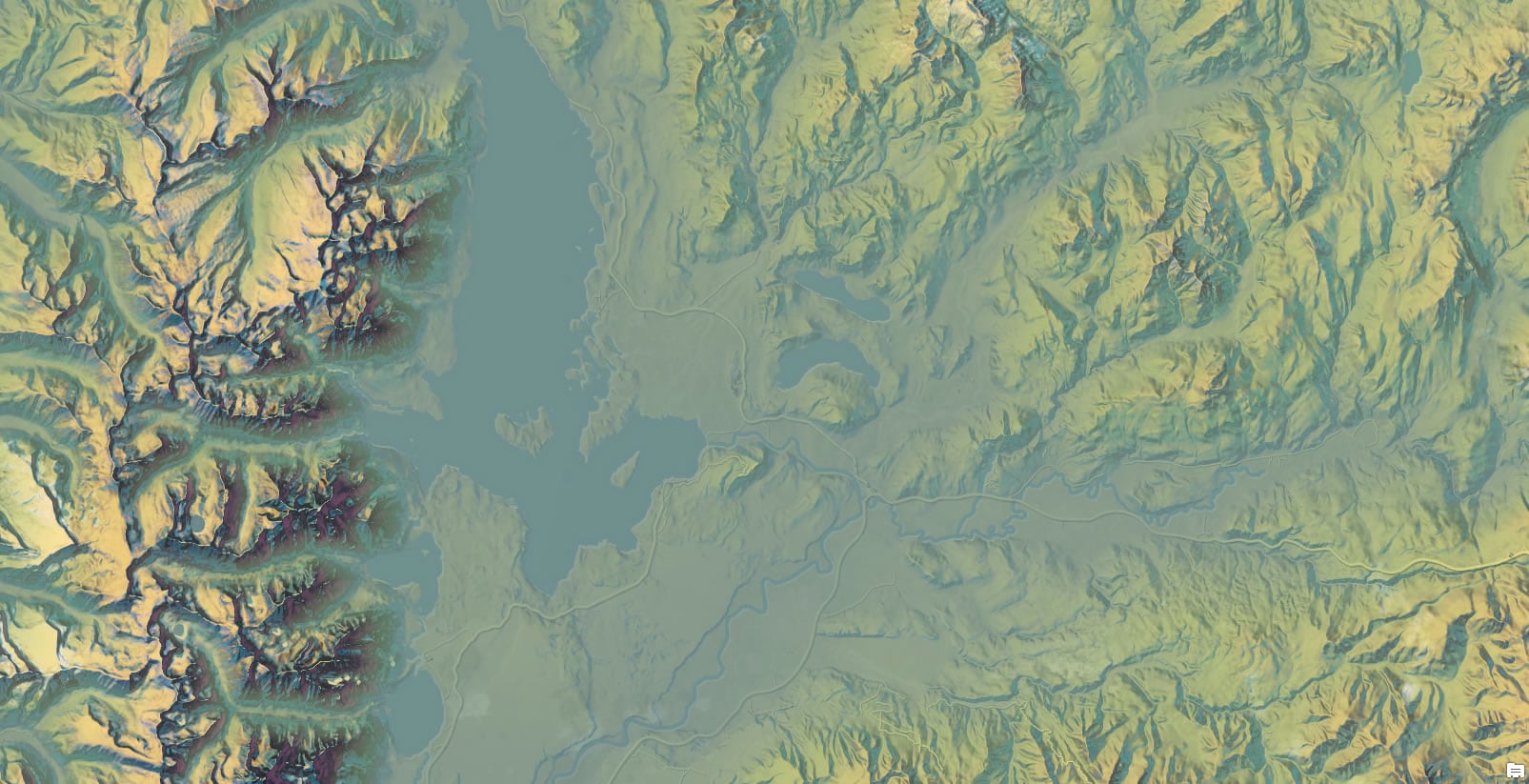
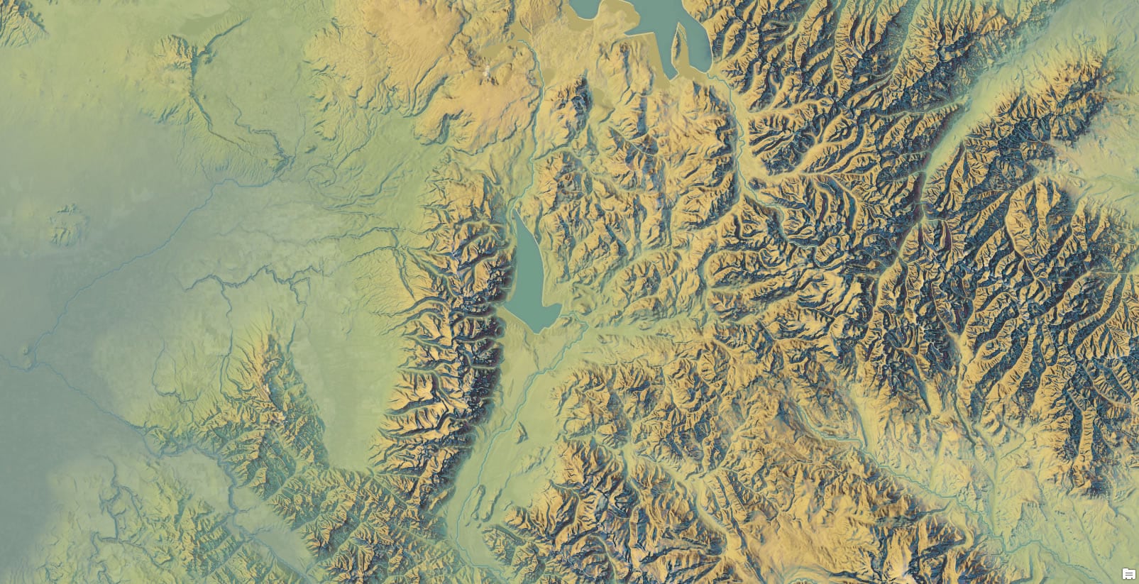
And it scales!
Style
Here is the ArcGIS Pro style, jam packed with all the symbology you need to take your DEMs and Hillshades to the Hall of the Mountain King. Download the style file to your machine, add it to your ArcGIS Pro project, then apply any of the Imhof symbologies from the symbol panel’s gallery to your layers.
You’ll be breathing spruce-tinged Swiss topographic life into your relief maps in no time. If you are thirsty for more, here is an assortment of maps in the Imhof style.
Happy Painting! John Nelson
P.S. Alternatively, if you can’t be bothered to assemble these layers and download/install that style file, then you can just download my Pro project and start cranking out Imhofs in minutes.

Commenting is not enabled for this article.