Ever dip your foot into the ocean and think, “This water is perfect…I bet it’s about 82 degrees.” Well, there’s one way to be sure for any place around the world: satellite sea surface temperature data.
Besides hunting for prime beach spots, SST is a key climate and weather measurement used for weather prediction, ocean forecasts, tropical cyclone forecasts, and in coastal applications such as fisheries, pollution monitoring and tourism. El Niño and La Niña are two examples of climate events, which are forecasted and monitored using sea surface temperature maps.
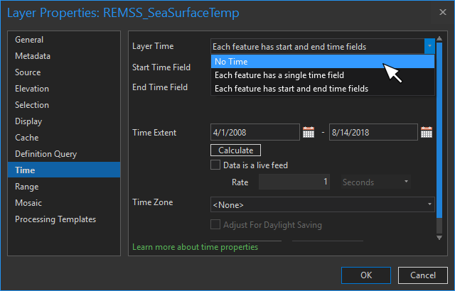
A daily updated SST analysis is available in the Living Atlas (with an archive going back to 2008). By default, time animation is enabled. But if you disable time in the Properties, you can take advantage of the layer’s multidimensional settings using definition queries on the time to return just that particular layer. This selection works in ArcGIS Desktop or Online.
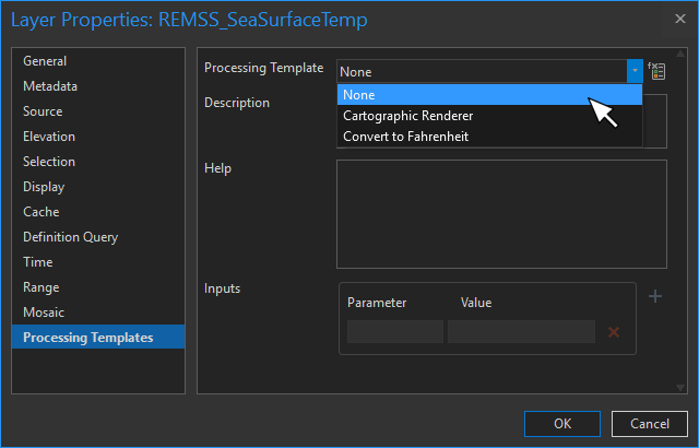
In addition to time analysis, this layer can be used for visualization online in web maps and in ArcGIS Desktop. Two server-side processing template options can be used to help in these visualizations: cartographic vs analytic renderer, and convert Celsius to Fahrenheit. Convert C to F is pretty self-explanatory. The cartographic render presents the map as RGB values stretched from 0-255, which displays efficiently for fast visualization. The analytic renderer provides the map as its range of temperature values (-2 to 34.5). Using the analytic renderer means you can change the display of the data (e.g., range, color, etc).
In ArcGIS Pro, access these options from the Processing Templates in the layer Properties.
Or in ArcGIS Online, you’ll click on Image Display to access the processing templates.
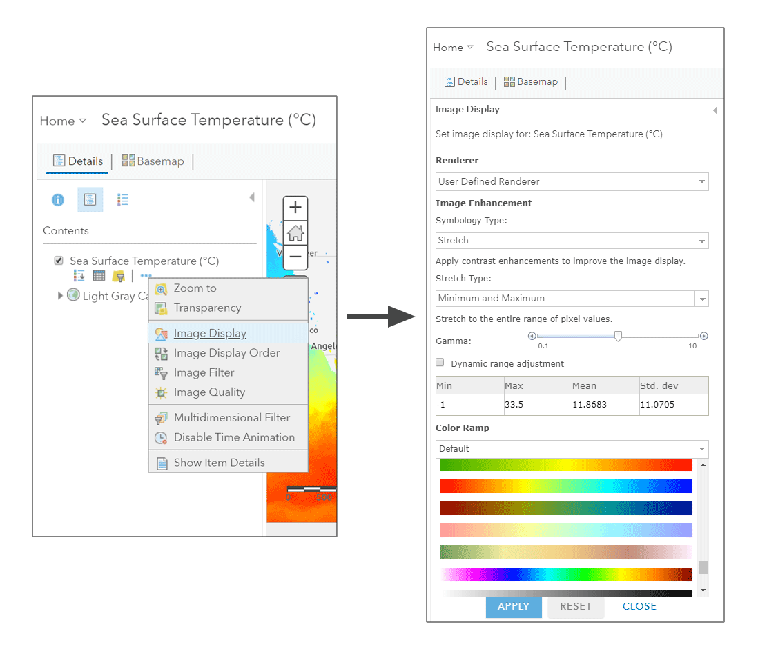
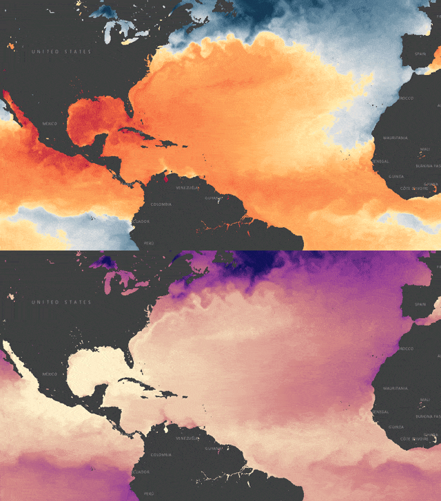
Since I’m iridisophobic, I use this render option to quickly change the color palette…maybe to something like my favorite “hurricane formation zone” color palette with a break at 26oC, or a luminance-controlled palette from dark purple to bright yellow.
Additionally, many other analyses can be performed using this layer, including:
- Apply contours using Raster Functions
- Chain together several operations using the Raster Function Editor and Model Builder.
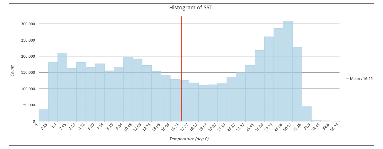
- Generate summary statistics
- Plot a graph of temperatures
In other words, use the archive of SST as if it were local on your desktop. Combine it with other layers from the Living Atlas or your local data to explore the Earth-system or author beautiful maps. You can also quickly browse SST data in the Daily Sea Surface Temperature time aware application.
Have questions or comments about this blog? Post them in our GeoNet.


Commenting is not enabled for this article.